I must echo 2009net's sentiments here! For post-Walt films, 'Hercules' stands out head and shoulders above the rest in terms of style. The use of lines, inspired by the work of Gerald Scarfe (perhaps my favourite living artist and an enormous influence on my own work), is absolutely inspired. The characters, even the hero and heroine, are caricatures, making the best use of the animated medium. Eric Goldberg and Nick Ranieri in particular seem to have enjoyed this visual freedom (look particularly at Ranieri's Hades when he's been 'inflamed'), and it is one of the few films where the minor characters all shine - Nancy Beiban's animation of the Fate's is particularly evocative of Scarfe's style. The hurdle 'Hercules' fails to overcome is in colour styling. I think the post-Walt film that makes the best use of colour is probably 'Pocahontas', which nevertheless fails in a lot of other respects.
'Aladdin' is also a fine example of the animators choosing a style that compliments and is complimented by the animation. As we know, the line-work here is very Hirschfeld-influenced, and it works perfectly. The design of the characters, particularly the Genie and Jafar, shows that the animators relished the use of smooth, calligraphic lines to describe both form and movement. This style is taken a step further in 'Fantasia 2000''s Eric Goldbereg-directed 'Rhapsody in Blue', which shows the animators at their best, in my opinion. From the Hirschfeldian line describing a clarinet trill to the little wisps of steam curlicueing from a coffee mug, it's styled beautifully and again shows how well lines can be used not only in design but in personality animation. I love the colour styling in 'Rhapsody in Blue' but I'm not sure about the use of blocks of colour in the background, which tends to make the lines bleed. The other sequence in 'Fantasia 2000' which stands out is 'The Carnival of the Animals': also by Eric Goldberg, and just as lively, but this time using blocks of shapes much more than lines; I think much of this was hand-crafted, and it shows in the watercolour style.
Out of all the Disney features that rely on lines, '101 Dalmatians' still stands out to me as the best, because of the styling of the backgrounds and the animation. I love Walt Peregoy's colour-styling for the film; not only do the colours perfectly complement the mood of a scene (see particularly the harsh oranges and reds when Pongo and Perdita face the Baduns), but the shapes of the blocks of colour suggest where the light falls and describe forms perfectly. The animation in '101 Dalmatians' is among my favourite of all the Disney films' - the style here is that of cartoonist Ronald Searle (and, to bring things full circle, Searle was a big influence on Gerald Scarfe's style). As with 'Hercules', all the characters are caricatured in some way or another and even the minor characters are memorable in their own right. There's also Marc Davis' greatest masterpiece in Cruella De Vil; it's clear from the animation that he was quite at home with this style. The look of some of the earlier features wouldn't have worked here; '101 Dalmatians' is satyrical and unpretentious, particularly when compared to 'Sleeping Beauty', and the style used in this film (though it angered Walt) marries perfectly to the tone of the story and the nature of its characters.
As we know, though, "Walt hated lines" and much preferred the style we see in most of the films before '101 Dalmatians'. My personal favourite of all the Walt-era films in terms of style is (surprise, surprise) 'Pinocchio', which is heavily influenced by European illustrators like Arthur Rackham, John Bauer and Gustave Dore, as well as German Expressionism such as the films of F. W. Murnau and Friz Lang, with slightly American approach taken to the European sources. One of the reasons I think films like 'Pinocchio' and 'Fantasia' succeed so well stylistically is their use of expressionism. Though this is more obvious in the segments of 'Fantasia' it can also be seen in sequence's like Snow White fleeing through the forest, the Queen drinking the potion and Lampwick turning into a donkey. In an interview with Marc Davis it is suggested that Disney was even more successful at expressionism than live-action films were, because animated films can create a completely new envirionment to suit the film. There's a wonderful part in 'Pinocchio' where he's just been thrown in the cage; the lightning flashes outside and projects the shadows of the other puppets on the wall behind the cage: their silhouettes resemble corpses hanging from the gallows. 'Pinocchio' is the Disney film that has given us both the most disturbing sequence - Lampwick's transformation - and the most cosy, warm sequence - Gepetto and friends bidding each other good night and tucking themselves into bed. The mise en scene created in the film and others of the pre-war era are the result of an extroadinarily skilled group of artists (Joe Grant, Albert Hurter, Gustaf Tenggren, Kay Nielsen et al) colour styling and designing to perfection, and represents such extraordinary skill that I think is gone forever now.
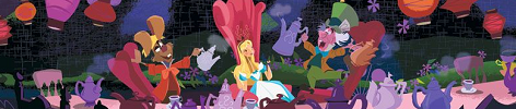
I generally don't hold the 50s films in as high regard as either the films of the Golden Age or '101 Dalmatians', but there is still a lot to appreciate. I love Mary Blair's art, but it seems to have been of limited use to the animators, who apparently struggled to assimilate her style in movin images - I think Blair's art work's best as a static image. For this reason I love the backgrounds in 'Alice in Wonderland' in particular, and, of course, her colour styling is a big part of the appeal of many of the 50s features. I don't think 'Sleeping Beauty' succeeded stylistically and it seems to have limited the animators - Frank Thomas and Ollie Johnston were particularly unhappy working on it - and Maleficent is really the only character who benefits from the strong vertical design of the film. Though I think the film is largely unsuccessful both stylistically and story-wise it is clear that the animators who worked on it were at the top of their game, restricted though they were - Milt Kahl stands out, as usual, as the best draughtsman of all; Prince Philip may be insufferably boring but his design and movements, like those of the rest of the cast, show the skill of the animators at this time.
Stylistically I think the weakest films are probably in the period from Walt's death up to and including 'Beauty and the Beast'. The early part of this period consists of xerox films which, unlike '101 Dalmatians' didn't benefit from the medium and did not succeed in creating a coherent style. Once the new generation of artists and animators arrived they seem to have taken time to find their feet - most of their early films are rather generic in design, not really seeming to have any specific style in mind - as a result the design of the characters and the animation is occasionally inconsistent. 'The Black Cauldron', however, has some beautiful backgrounds, and many of the environments in 'Beauty and the Beast' are beautiful, with Glen Keane's Beast a definite highlight in the cast. 'Aladdin' seems to be the first time, however, that the new generation of animators decided to give each film a style of its own, though 'The Lion King' and 'The Hunchback of Notre Dame' fall back into a more generic mode of design, in my opinion.
EDIT, after seeing post length: And if you read through all that rigmarole, you deserve points for stamina.


