I decided to start this when I looked at Ultimate Disney (or are they DVD Dizzy, now?)'s review of Cujo: 25th Anniversary Edition. And WOAH that is one awesome cover. I liked it soooo much, I just had to post about it, and decided to make this thread:
COVER ART (The Best & The Worst)
And talk about why you like or don't like the covers! So, here's the gems that inspired me.
I don't know, but I think this is the preliminary/temporary/store version of Cujo: 25th Anniversary Edition:
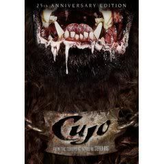
I've only seen some of the film, and for whatever reason either didn't watch enough of it or can't remember much of it, but it doesn't matter. This cover art is so awesome it's an instant favorite of mine. The dogs mouth looks more gruesome and horrifying than it probably did in the film, but the real cleverness was to set it up so we only see his mouth, it's not his face centered on the cover. It make the dog seem senseless, without eyes to see what it kills (senseless killing machines are scarier than those that think and have feelings or motive), and it's more realistic since, in life, we never see all of what's coming at us clearly. It makes the dog more mysterious, which fits since what happened to the thing (monster rabies from some rabbit?) is never completely revealed. It's just very terrifying, and finally, the collar used as the logo for the title is a perfect touch.
But more than that version of the cover, I like this version of Cujo: 25th Anniversary Edition:
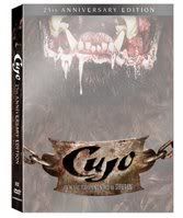
I don't know if this is the actual version people hold in their hands, but I hope so. It has even more going for it than the other one. The white, faded dog makes it look ghostly, which fits because it is sort of a ghost, a demon, a monster, with supernatural ferocity. Also, the faded picture makes it seem even more myterious, like we can't quite get a good look at him, and yet, in the dull white, it somehow brightens his gruesome mouth and highlights more details! Also, the white just makes it look shiny, which goes with the whole anniversary, special edition glamour.
Now, I think this thread should allow some Disney covers, because this is for the best of the best, our favorites of the favorites, and that includes everything, not excluding Disney. Most of my love of Disney comes from the look of their characters and the art, the visual ideas they come up with, and so their I like their covers like I like their movies, and the covers should be good!
My favoritest Disney cover of them all is this one for Cinderella:
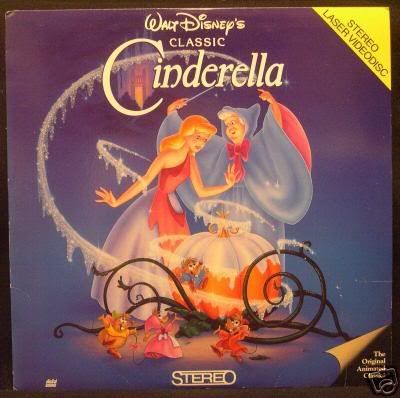
That's the laserdisc, but I own the VHS it was also on. It keeps the blue and purple colors I love from the film, the shimmering, melting Disney dust I love from the film, and the mezmerizing curing tendrils and spiraling vines that I love from the film!
But this one, though I've never owned it, I think is one of Disney's absolute best, of Sleeping Beauty's laserdisc:
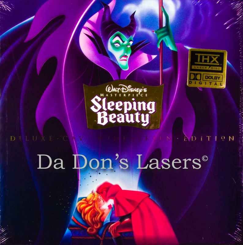
Maleficent looks down at her curse being broken. It's perfect. I don't have to say much about it. It's Sleeping Beauty sleeping, the infamous kiss scene, but Maleficent, the best liked character, featured prominently. The mood is perfect, leering down at the heros with hate, and it's a "big head" cover that really works! Her size is not weird at all, she's a magic fairy after all!


