Cover Art (The Best & The Worst)

Discussion of non-Disney DVD and Blu-ray.
User avatar
Disney Duster
Ultimate Collector's Edition
Posts: 14030
Joined: Fri Jun 17, 2005 6:02 am
Gender: Male
Location: America

Cover Art (The Best & The Worst)

Post by Disney Duster »

Hey there. Well, I searched, and even though there is a thread for the best and worst Disney covers (COVER ART (The Best & The Worst)), there is nothing like that for any cover of any movie, not limited to Disney.

I decided to start this when I looked at Ultimate Disney (or are they DVD Dizzy, now?)'s review of Cujo: 25th Anniversary Edition. And WOAH that is one awesome cover. I liked it soooo much, I just had to post about it, and decided to make this thread:

COVER ART (The Best & The Worst)

And talk about why you like or don't like the covers! So, here's the gems that inspired me.

I don't know, but I think this is the preliminary/temporary/store version of Cujo: 25th Anniversary Edition:
Image
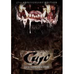
I've only seen some of the film, and for whatever reason either didn't watch enough of it or can't remember much of it, but it doesn't matter. This cover art is so awesome it's an instant favorite of mine. The dogs mouth looks more gruesome and horrifying than it probably did in the film, but the real cleverness was to set it up so we only see his mouth, it's not his face centered on the cover. It make the dog seem senseless, without eyes to see what it kills (senseless killing machines are scarier than those that think and have feelings or motive), and it's more realistic since, in life, we never see all of what's coming at us clearly. It makes the dog more mysterious, which fits since what happened to the thing (monster rabies from some rabbit?) is never completely revealed. It's just very terrifying, and finally, the collar used as the logo for the title is a perfect touch.
But more than that version of the cover, I like this version of Cujo: 25th Anniversary Edition:
Image
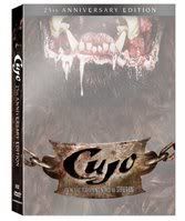
I don't know if this is the actual version people hold in their hands, but I hope so. It has even more going for it than the other one. The white, faded dog makes it look ghostly, which fits because it is sort of a ghost, a demon, a monster, with supernatural ferocity. Also, the faded picture makes it seem even more myterious, like we can't quite get a good look at him, and yet, in the dull white, it somehow brightens his gruesome mouth and highlights more details! Also, the white just makes it look shiny, which goes with the whole anniversary, special edition glamour.

Now, I think this thread should allow some Disney covers, because this is for the best of the best, our favorites of the favorites, and that includes everything, not excluding Disney. Most of my love of Disney comes from the look of their characters and the art, the visual ideas they come up with, and so their I like their covers like I like their movies, and the covers should be good!

My favoritest Disney cover of them all is this one for Cinderella:
Image
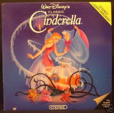
That's the laserdisc, but I own the VHS it was also on. It keeps the blue and purple colors I love from the film, the shimmering, melting Disney dust I love from the film, and the mezmerizing curing tendrils and spiraling vines that I love from the film!

But this one, though I've never owned it, I think is one of Disney's absolute best, of Sleeping Beauty's laserdisc:
Image
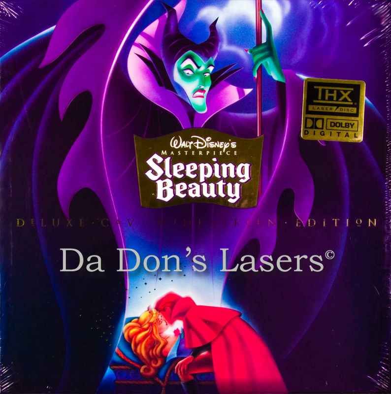
Maleficent looks down at her curse being broken. It's perfect. I don't have to say much about it. It's Sleeping Beauty sleeping, the infamous kiss scene, but Maleficent, the best liked character, featured prominently. The mood is perfect, leering down at the heros with hate, and it's a "big head" cover that really works! Her size is not weird at all, she's a magic fairy after all!
Last edited by Disney Duster on Sun Sep 23, 2007 11:49 am, edited 1 time in total.
Image
User avatar
Siren
Platinum Edition
Posts: 3749
Joined: Sun Feb 13, 2005 6:45 pm
Location: Florida
Contact:

Post by Siren »

WORST:

Image
Okay, let's see, where to start?
First and most importantly, ALL the characters are totally off the form of what they look like in the movie. This looks more like My Little Pony. WTF is with the rainbow???? Oh, right, rainbows and unicorns always go together right? The appeal to little girls is all over this. Give it a rainbow, add the butterfly, make it all cutsey and stupid and little girls will love it! Its a total insult to the artists of the movie. And WTF is Schmendrick holding? Is he pretending to be Gandalf? Why does he have a staff???? At least this was unedited though. The "Damn you!" line is still there. Its only saving grace.

BEST:

Image
Vast improvement. Images are pretty much screencaps that are collaged together. Though, once again, Molly is missing from the cover, but oh well. The unicorn here is beautiful. I'll also point out this is the German DVD cover that was edited to have English titles. Its been around for a while. Unlike the first US DVD release, this one IS edited, the "Damn you!" line is out, apparently a lot of parents complained to Walmart that they thought it was a kids movie and were insulted that Molly says "damn" to the unicorn. Forget the fact that "damn" is all over the Bible and even a few Disney movies. I am a parent and feel shamed other parents act so DAMN stupid. :roll:
User avatar
slyslayer3000
Gold Classic Collection
Posts: 284
Joined: Sat Apr 15, 2006 2:58 am
Location: Hard-Boiled Wonderland

Post by slyslayer3000 »

I'm quite surprised that the great Disney Duster would use sticky caps on her thread title. I have nothing against sticky caps. I just find them unpleasant to the eyes.

WORST of the WORST:

Image

To get back on topic, I now present the worst DVD cover art of probably the worst animated film in worst animated film history. It's plain awful. First, there's this kitschy red curtain background. Fiona looks annoying as well. It could've been a lil tolerable if they remove Pinocchio and Prince Charming from the background. Add in the headless baby (they used its head in the spine) and you'll get the worst DVD cover art in years.


Image

This bad cover art truly gives new meaning to the infamous term, "floating heads." The position of the characters is unbalanced. The two towers desperately need to be emphasized. To sum it all up, it's like a photoshopped artwork by a disturbed green horn.


BEST:

Image

I like the way it looks. There's this grand atmosphere that mind-controls you to watch it again and again and again.
Image
User avatar
Escapay
Ultimate Collector's Edition
Posts: 12562
Joined: Tue Jan 27, 2004 5:02 pm
Location: Somewhere in Time and Space
Contact:

Post by Escapay »

Best of the Best:

Laura: Fox Film Noir 1
Image

*sigh*

Doctor Who: The Complete Third Series
Image

Oh Martha. You run, girl, you keep on running!

The Fantasia Anthology
Image

Who knew Mickey Mouse could look like a musical note? I especially like the beam of light that comes from the conductor.

The Notebook
Image

What can I say? People kissing in the rain is just so...sexy.

Tarzan: Collector's Edition
Image

A lot of people don't seem to like this one for some reason, but I like how it's a sketch, almost as if it's one that Jane drew (since she's seen drawing a whole bunch of stuff).

The Black Hole (Anchor Bay Cover)
Image

I love this Anchor Bay version. It actually makes use of the swirling logo used in the trailer, as well as the green computer grid, and shows the Cygnus better than the Disney one.

Worst of the Worst:

The Black Hole (Disney Cover)
Image

Dull, dull, dull, dull, dull! And the font isn't the right one (this is the new Disney one that they use for ads so that bootleggers don't print them.)

Educating Rita
Image

Believe me, in the actual movie their teeth aren't that white, their skin isn't that smooth, and their expressions aren't as drunk. Great movie, bad cover.

Some Inventive Styles of Cover Art and/or Packaging:

Basic Instinct: Unrated "Ice Pick" Edition
Image

I'm not a big fan of the movie, but the package is just to die for. The case itself is shaped like a block of ice, and the ice pick is really a pen! The disc sits on this nice blue foam so there's no worry about scratches or anything.

Dune: Special Edition Director's Cut
Image

The original release of this set was a very nice embossed and metallic digipak with really good graphics inside the case as well. The new versions you'll find on shelves is a slightly skinner one that's not embossed or metallic anymore. The actual design is one I like, even though it's a floating heads concept. But it looks really good and captures the atmosphere of the miniseries.

Covers that Spoil the Movie/TV Show

Planet of the Apes (1968)
-I won't post the cover because it totally ruins the ending.

Doctor Who: Earthshock
-Again, not gonna post the cover because it ruins two surprises for anyone who's never seen the story or read what happens.

The Passion of the Christ
-Well...it's kind of obvious that he'll be carrying a cross and wearing a crown of thorns. But I'm sure somewhere in the world there's a group of people who live in a cave and have never even heard of the Bible or electricity or television or instant lemonade...and the cover will spoil the movie for them if they ever venture out to watch it based on the recommendation of the group of scientists or religious zealots who find them.

Scaps
WIST #60:
AwallaceUNC: Would you prefer Substi-Blu-tiary Locomotion? :p

WIST #61:
TheSequelOfDisney: Damn, did Lin-Manuel Miranda go and murder all your families?
User avatar
disneyboy20022
Signature Collection
Posts: 6868
Joined: Tue Aug 23, 2005 2:17 pm

Post by disneyboy20022 »

Better than the Shrek 3 DVD cover art...

Image
Want to Hear How I met Roy E. Disney in 2003? Click the link Below

http://fromscreentotheme.com/ThursdayTr ... isney.aspx
User avatar
rexcrk
Anniversary Edition
Posts: 1073
Joined: Tue Jul 26, 2005 11:43 am

Post by rexcrk »

One of my least favorites:

Image


Ok, I'll admit: I love the movie, I think it's great, I love the art style, the songs are catchy... but that cover is just wrong.

There was NO dragon, NO dwarves, and Frodo and Sam DON'T RIDE A PONY!
But the thing that makes Woody special, is he'll never give up on you... ever. He'll be there for you, no matter what.
User avatar
Siren
Platinum Edition
Posts: 3749
Joined: Sun Feb 13, 2005 6:45 pm
Location: Florida
Contact:

Post by Siren »

The Return of the King one reminds me of this cover.

Image

Let's start with the style. The movie's style was in the same way as Last Unicorn and the animated Lord of the Rings movies. Because it was the same animators. Second, the wizard...in the movie he is often referred to as "The GREEN Wizard", for he was the wizard of the Earth. So WTF is he in purple clothes??? And Gorebash, the dragon, WTF? I think that is suppost to be Gorebash, but it looks more like a mix between Smrgyl (the old dragon) and Gorebash. Its hard to tell who they were drawing. Because Smrgyl was reddish-brown with green and Gorebash was green and yellow and the face of the dragon has features of both. Did the cover artist even watch the movie???

Here is a screencap from the movie to show you all I have mentioned:
Image
User avatar
Disney Duster
Ultimate Collector's Edition
Posts: 14030
Joined: Fri Jun 17, 2005 6:02 am
Gender: Male
Location: America

Cover Art (The Best & The Worst)

Post by Disney Duster »

I want to say, I encourage everyone in this thread to comment on other people's posts, so we know if people agree about our covers and see how awesome they are, or we know people have taste and don't love horrible art! But only do it if you have strong opinion, because I don't think we should comment on every single post, that would be overkill and muck up the thread.
slyslayer3000 wrote:I'm quite surprised that the great Disney Duster would use sticky caps on her thread title. I have nothing against sticky caps. I just find them unpleasant to the eyes.
I actually agree with you, it doesn't make anything easier to read. You see, I was typing fast and careless because I had to go, and didn't have time to check what I typed. But I've fixed it now, and my post's other mistakes (mostly spelling). By the way, I am a boy, but the fact that you said "great" Disney Duster made me very happy! You're pretty well known on these boards to, and your name is just awesome!

I've heard many other people complain about that Shrek cover. But an ugly-designed cover fits and ugly-designed movie, right? You're not going to tell me Shrek's fairy tale world is intended to look beautiful. And you said exactly what I thought about the Lord of the Rings covers! The Two Towers one sucks but the Fellowship actually has a good arrangement and no floating heads!

Siren, that cover is bad, and it is interesting they just put in the rainbow and butterfly (though the butterfly is in the film) on there for girl appeal, but then why have the villain, who's rather unappealing to anyone? But in all honesty, I don't think the second cover is much better, except in the on-modelness. I hate it when they just put screencaps on, I hate the collage look. I want new art! And that drahon cover is so bad, I didn't have to watch the movie to get what you were saying! Not only are colors wrong but character features are! Maybe they really didn't watch the movie! They might've just got screencaps handed to them...

Escapay, I don't like posters on covers, especially older posters which all have that "put colored floating characters in an absent white nothingness" design. The poster doesn't quite have that, but I hate how the girl is huge, the there's two guys that look exactly the same so I'll guess they're the same character (which is also bad, two of the same character, only sometimes good like with Simba young and adult on The Lion King) who are much smaller than her, and there's no inkling of a background. Blended colors don't count as a background unless they were in the film. But I do like the Black Hole vortex title one! That is a cool way to do the title! The thing is it looks like a poster but if it's original art that's way better! The ice pick case is also super cool!
Image
User avatar
AwallaceUNC
Signature Collection
Posts: 9439
Joined: Thu Dec 11, 2003 1:00 am
Contact:

Post by AwallaceUNC »

Off the top of my head...

Image

Image

-Aaron
• Author of Hocus Pocus in Focus: The Thinking Fan's Guide to Disney's Halloween Classic
and The Thinking Fan's Guide to Walt Disney World: Magic Kingdom (Epcot coming soon)
• Host of Zip-A-Dee-Doo-Pod, the longest-running Disney podcast
• Entertainment Writer & Moderator at DVDizzy.com
• Twitter - @aaronspod
User avatar
Escapay
Ultimate Collector's Edition
Posts: 12562
Joined: Tue Jan 27, 2004 5:02 pm
Location: Somewhere in Time and Space
Contact:

Re: Cover Art (The Best & The Worst)

Post by Escapay »

[i]Laura[/i] is the face in the Disney Dust / Footsteps that you hear down the hall / The Dust that floats on a Disney night / That you can never quite recall wrote:Escapay, I don't like posters on covers, especially older posters which all have that "put colored floating characters in an absent white nothingness" design. The poster doesn't quite have that, but I hate how the girl is huge, the there's two guys that look exactly the same so I'll guess they're the same character <snip> who are much smaller than her, and there's no inkling of a background. Blended colors don't count as a background unless they were in the film.
Hehe, the cover for Laura is what actually drew me to picking up the film off the shelf and blindbuying it! There's just something so mesmerizing about Gene Tierney that I couldn't take my eyes off her. All the Fox Film Noir titles have this kind of cover, they are usually reproductions of the original poster. Some of them do look a little weird for film noir, then again that's how they promoted films back then. Plus, it's a lot better than the originally planned DVD cover for Laura, when it was to have been a part of the Studio Classics line instead of Fox Film Noir. Like all the other Studio Classics, there was that really ugly plain white background (well, with a washed-out image) with the characters set against it.

(I only have a small thumbnail picture of it unfortunately):

Image

As for the blended background colors, naturally it wouldn't work for Laura, what with being a black and white film noir! :P There are very few black and white movies on DVD that I've seen with black and white cover art, the majority are often in full color like their posters.

And the two smaller figures actually are two different characters. The one with the trenchcoat and fedora is Dana Andrews who played Detective Mark McPherson, and the smaller one holding the shotgun is Clifton Webb as Waldo Lydecker.

Personally, I would have scrapped the entire "reproduce old poster" concept and tried something that utilized the portrait that was part of the film:

Image
Image
Add something inventive here... wrote:But I do like the Black Hole vortex title one! That is a cool way to do the title! The thing is it looks like a poster but if it's original art that's way better! The ice pick case is also super cool!
Yay, another Black Hole vortex title fan! Have you seen the movie yet? It's a bit slow to watch at times, but the effects are quite spectacular for Disney's first foray into scifi, and the actors are all pretty solid, given the rather scientifically-inaccurate-and-at-times-tragically-dull material.

And the ice pick case for Basic Instinct was another seller for me to pick up the film. Geez, the things I do for packaging!

Scaps
WIST #60:
AwallaceUNC: Would you prefer Substi-Blu-tiary Locomotion? :p

WIST #61:
TheSequelOfDisney: Damn, did Lin-Manuel Miranda go and murder all your families?
User avatar
Siren
Platinum Edition
Posts: 3749
Joined: Sun Feb 13, 2005 6:45 pm
Location: Florida
Contact:

Re: Cover Art (The Best & The Worst)

Post by Siren »

Disney Duster wrote:
Siren, that cover is bad, and it is interesting they just put in the rainbow and butterfly (though the butterfly is in the film) on there for girl appeal, but then why have the villain, who's rather unappealing to anyone? But in all honesty, I don't think the second cover is much better, except in the on-modelness. I hate it when they just put screencaps on, I hate the collage look. I want new art! And that drahon cover is so bad, I didn't have to watch the movie to get what you were saying! Not only are colors wrong but character features are! Maybe they really didn't watch the movie! They might've just got screencaps handed to them...
cool!
Yes, I know the butterfly is in the film and his cene was short, but important. But still the addition of the rainbow makes me thing they were simply trying to appeal to little girls. Villains have been put on covers before, little girl's eyes would mostly likely be drawn to the unicorn, butterfly, and rainbow, as well as parents. To think that its a movie just for kids and is gonna be as sweet as My Little Pony. The cover is deceiving.
The second cover I posted, I do agree, it could have been better with original, new art, but its still a mark improvement over the last one. And it does show kids the monster (red bull). As well as a the cat, though not important much, but he is pretty beat up, missing a paw and an eye (though we see in the movie he used the eye patch as an accessory, not a necessity). But at least we see from the second cover, its not all rainbows and butterflies. :)

Onto one of the other covers posted, I absolutely love the Wizard of Oz one. Very well done. And Shrek the Third cover is hideous. I just don't like it.

Another obscure film I'll post about its cover...however, its a VHS, but the DVD covers I have seen from releases out of the country have been the same cover.


Image
First, its a full on screencap, cropped. That's it. As a child, I rented this movie, I was 6. With no clear view what it was about, because of that deceiving cover. It's like Emo-Bambi. The lamb's mother is killed by a wolf, the lamb goes to hunt down the wolf, and the lamb asks the wolf to be trained to be a killer, so one day he can kill the wolf. He grows up to look at the wolf as a father figure instead and is just as blood-thirsty, just as cold and cruel. There is just a very small bit of blood in the movie, however the death toll is about 5 in the movie. If its ever released to DVD in the USA and Sanrio wants to save itself from being sued by parents, they need to give it a proper cover that shows this is a drama/horror more than anything.
ichabod
Diamond Edition
Posts: 4676
Joined: Thu Sep 25, 2003 8:29 am
Location: The place where they didn't build EuroDisney
Contact:

Re: Cover Art (The Best & The Worst)

Post by ichabod »

Escapay wrote:Yay, another Black Hole vortex title fan! Have you seen the movie yet? It's a bit slow to watch at times, but the effects are quite spectacular for Disney's first foray into scifi, and the actors are all pretty solid, given the rather scientifically-inaccurate-and-at-times-tragically-dull material.
And 20,000 Leagues Under the Sea was what? A Rom-com?

The Watcher in the Woods
This anchor bay cover is far better than any other
Image

Snow White and the Seven Dwarfs
The same as above applies for the R2 collector's set
Image

The Haunted Mansion
The film stinks, but the UK cover does rock so much more than the US one.
Image

French and Saunders: Live
Also this deserves points for something!
Image


And now for the bad


Kath and Kim: Series 1
How bland is this?
Image

The Happiest Millionaire
What is this?
Image

Hoppity Goes to Town
Amazing film, but Public domain. What can you do?
Image
User avatar
Escapay
Ultimate Collector's Edition
Posts: 12562
Joined: Tue Jan 27, 2004 5:02 pm
Location: Somewhere in Time and Space
Contact:

Re: Cover Art (The Best & The Worst)

Post by Escapay »

Ichy I have long been thinking / what a good world this might be / If the DPET were all transported / Far beyond the Northern Sea wrote:
Scapy I have long been thinking / what a fine world this might be / If we had some more Doctor Who / On this side the Northern Sea wrote:Yay, another Black Hole vortex title fan! Have you seen the movie yet? It's a bit slow to watch at times, but the effects are quite spectacular for Disney's first foray into scifi, and the actors are all pretty solid, given the rather scientifically-inaccurate-and-at-times-tragically-dull material.
And 20,000 Leagues Under the Sea was what? A Rom-com?
Sorry, I was in my default "scifi = space sometime in the future" mode! :P

Scaps
WIST #60:
AwallaceUNC: Would you prefer Substi-Blu-tiary Locomotion? :p

WIST #61:
TheSequelOfDisney: Damn, did Lin-Manuel Miranda go and murder all your families?
User avatar
SpringHeelJack
Platinum Edition
Posts: 3673
Joined: Fri Nov 10, 2006 3:20 pm
Location: Boston, MA
Contact:

Post by SpringHeelJack »

My Favorites

Image

My Fair Lady - I'm sometimes picky about old publicity material used as cover art, but I just love it here. The intricacy, the color scheme, everything about it is just great in my eyes.

Image

The Silence of the Lambs - I have no real idea why, but the art is fantastic here. I was unsure about buying this, but the cover art was what really did it for me. If only it were a digipack instead of a slipcover, though...

Image

Mame - Though I have many greivances with the film itself, I would buy it simply because I love the picture so much. Despite the fact that Mame is never a red head in the film, it still looks gorgeous.

My Least Favorites

Image

1776 - I love this movie so much. But the cover is terrible. A monkey with photoshop could have done something better, and what's with not even including John Adams and Benjamin Franklin on the cover?

Image

Meet the Robinsons - I guess there's the slight possibility it could look okay in person. But the colors, the design, nothing about it catches my eye at all. If I didn't like this movie, I wouldn't look twice at it in a store.

Image

Oliver! - Just plain goofy. The cover art for the first release was not great, but it was an improvement over this goofy art. The lame bubbles and bright chipper tones really don't convey the proper mood for this film, which is quite dark as musicals go.[/img]
"Ta ta ta taaaa! Look at me... I'm a snowman! I'm gonna go stand on someone's lawn if I don't get something to do around here pretty soon!"
User avatar
jrboy
Anniversary Edition
Posts: 1245
Joined: Sat Sep 10, 2005 7:38 pm
Location: Baton Rouge Gender: Monster
Contact:

Post by jrboy »

ImageImage

I think that this is a really neat idea. At first I didn't like at all, but now I love it.
Last edited by jrboy on Sun Sep 23, 2007 2:30 pm, edited 1 time in total.
User avatar
Escapay
Ultimate Collector's Edition
Posts: 12562
Joined: Tue Jan 27, 2004 5:02 pm
Location: Somewhere in Time and Space
Contact:

Post by Escapay »

:jawdrop:

Okay, first that is AMAZING cover art.

Second...ANOTHER edition of The Princess Bride!!! My god, this is what...release #4?

According to several sites, I've been able to compile the following new bonus materials (in addition to everything from the first SE and the DPE/BE's:
True Love and High Adventure : The Official Princess Bride DVD Game
Princess Bride: The Untold Tales Featurette (a new cast retrospective)
The Art of Fencing Featurette
Fairytales and Folklore Featurette

Scaps

ETA:

This used to say before I checked Amazon and other sites:

Is that an R2 or R4 packaging? Why couldn't we get that instead of the separate Dread Pirate/Buttercup editions?

Harrumph...
Last edited by Escapay on Sun Sep 23, 2007 2:33 pm, edited 1 time in total.
WIST #60:
AwallaceUNC: Would you prefer Substi-Blu-tiary Locomotion? :p

WIST #61:
TheSequelOfDisney: Damn, did Lin-Manuel Miranda go and murder all your families?
User avatar
jrboy
Anniversary Edition
Posts: 1245
Joined: Sat Sep 10, 2005 7:38 pm
Location: Baton Rouge Gender: Monster
Contact:

Post by jrboy »

Escapay wrote::jawdrop:

Is that an R2 or R4 packaging? Why couldn't we get that instead of the separate Dread Pirate/Buttercup editions?

Harrumph...

Scaps
Neither, it the upcoming R1 re-re-release

http://www.amazon.com/Princess-Bride-20 ... 110&sr=1-2
User avatar
Siren
Platinum Edition
Posts: 3749
Joined: Sun Feb 13, 2005 6:45 pm
Location: Florida
Contact:

Post by Siren »

I love the Princess Bride one too! Fantastic!
User avatar
2099net
Signature Collection
Posts: 9421
Joined: Sat Apr 19, 2003 1:00 pm
Location: UK
Contact:

Post by 2099net »

worst
Image

Best
Image

Side-step:
Our Laura cover
Image
Actually all the Cinema Reserve covers are pretty good. They're in steel books (thus the rounded corners) and all have the off-kilter frame design.
Most of my Blu-ray collection some of my UK discs aren't on their database
User avatar
disneyboy20022
Signature Collection
Posts: 6868
Joined: Tue Aug 23, 2005 2:17 pm

Re: Cover Art (The Best & The Worst)

Post by disneyboy20022 »

The Happiest Millionaire
What is this?
Image

My two words for the whole cover art list above... and the NEW Longer Verison and the expression on the Millionaire's Face IS.
VIVA VIAGRA :P
Want to Hear How I met Roy E. Disney in 2003? Click the link Below

http://fromscreentotheme.com/ThursdayTr ... isney.aspx
Post Reply