What's wrong with the coverart Kin? It looks good to me. You do know that Disney probably will make changes to the cover art when DVD release date gets closer.
Oh my god, this really is awful! I hate the cover, it is very amateuristicly done... I wish they would have used the colorful theatrical poster (not the yellow/orange one). Maybe with some of the people characters behind them. Too bad
It looks okay. It's just surprising how different it is from all the advertisements. All the advertisements were bright and fun while this is, well, dark and fun.
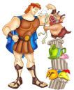
In my opinion, most of the characters (esecially Maggie) looks off model. And the two villains at the top are just taken from their individual character posters/banners. That makes them look weird. Buck and Jack look weird too. But I can't imagine this is the final thing, I'm sure this is only a basic setup of where wich character will be on the final cover. it's ok. Luckily they didnt go cheap by simply using the theatrical poster or something like Brother Bear.
Cheap? I think a lot of people would have loved the theatrical poster in MANY dvd releases instead of THIS cheap cover. This looks like some kids movie on this cover, doesn't look serious or funny enough as it was on the poster...
PatrickvD wrote:Luckily they didnt go cheap by simply using the theatrical poster or something like Brother Bear.
Brother Bear didn't use the theatrical poster.
"Fifteen years from now, when people are talking about 3-D, they will talk about the business before 'Monsters vs. Aliens' and the business after 'Monsters vs. Aliens.' It's the line in the sand." - Greg Foster, IMAX chairman and president
I don't like that cover, either. It reminds me of one of those low budget DTV cartoons made by other studios. They usually have cheap looking covers like that. We'll most likely see this altered 50 times before the release, though.
PatrickvD wrote:Luckily they didnt go cheap by simply using the theatrical poster or something like Brother Bear.
Brother Bear didn't use the theatrical poster.
The characters poses from that cover were from the promotional material, Hotr's character poses ar new (except for the two in the corner) I should have explained what I meant sorry, because you're right; Brother Bear doesnt copy the theatrical poster, just the characters from the material.
I'm happy they're designing a new cover for HOTR and to Jens; in my post I said that I'm sure this isnt final, now of course it looks bad but at least they're showing us they're working on it like they do with Aladdin and did with Lion King. If this indeed IS the final cover... well in that case: ew...
on the links below you can see what I meant about Brother Bear
I don't like the "idea" of the cover. The colors are too dark! The original poster with the yellow sunrise would be perfect for the DVD! The floating heads don't work either, It It looks too cheap, i hope they make something nicer.
PatrickvD wrote:The characters poses from that cover were from the promotional material, Hotr's character poses ar new (except for the two in the corner) I should have explained what I meant sorry, because you're right; Brother Bear doesnt copy the theatrical poster, just the characters from the material.
I'm happy they're designing a new cover for HOTR and to Jens; in my post I said that I'm sure this isnt final, now of course it looks bad but at least they're showing us they're working on it like they do with Aladdin and did with Lion King. If this indeed IS the final cover... well in that case: ew...
on the links below you can see what I meant about Brother Bear
Alright, well now I know what you mean. Thanks for clarifying. What I don't know is why you're using the numbers and not our domain (ultimatedisney.com) to browse the site.
"Fifteen years from now, when people are talking about 3-D, they will talk about the business before 'Monsters vs. Aliens' and the business after 'Monsters vs. Aliens.' It's the line in the sand." - Greg Foster, IMAX chairman and president
PatrickvD wrote:The characters poses from that cover were from the promotional material, Hotr's character poses ar new (except for the two in the corner) I should have explained what I meant sorry, because you're right; Brother Bear doesnt copy the theatrical poster, just the characters from the material.
I'm happy they're designing a new cover for HOTR and to Jens; in my post I said that I'm sure this isnt final, now of course it looks bad but at least they're showing us they're working on it like they do with Aladdin and did with Lion King. If this indeed IS the final cover... well in that case: ew...
on the links below you can see what I meant about Brother Bear
Alright, well now I know what you mean. Thanks for clarifying. What I don't know is why you're using the numbers and not our domain (ultimatedisney.com) to browse the site.
lol, when the site switched to a new address I saved the website with the numbers, I still have to bookmark the normal ultimatedisney.com sans numbers lol I know its silly. It's been so long now


but at least they're showing us they're working on it like they do with Aladdin and did with Lion King. If this indeed IS the final cover... well in that case: ew...


