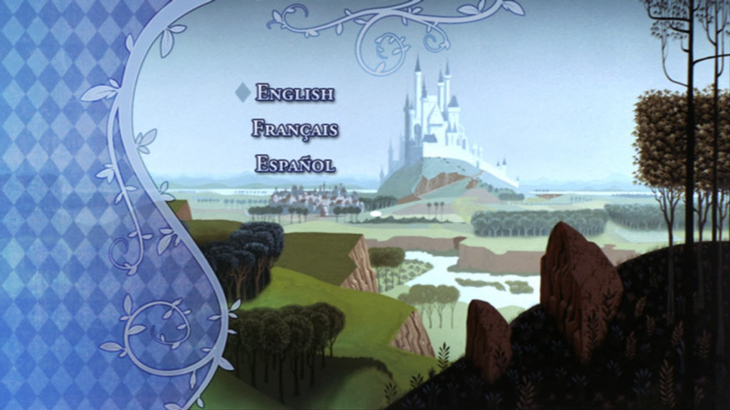
First off, thanks so much, lighthousemike for once again providing preview caps! I especially enjoyed the menus for Backstage Disney as it confirmed that the Eyvind Earle and Sequence 8 features are in the DVD and not part of the Blu-Ray's Cine-Explorer!
Could you possibly post a menu cap for the "Picture Perfect" documentary so we know what all the different featurettes for that is called?
Also, is the "Theme Parks" gallery preserved anywhere in second disc? I know that DVDTimes gave a list of the different art galleries, but it didn't mention the Theme Parks one, so I'm hoping it's either in the Art Galleries subsection, or the Castle Walk-Thru subsection.
Thanks in advance!
Anyway, to start the ball rolling on the restoration discussion (hehehe), I compared the 2008 title card to the 2003 title card (mainly because it's the only cap from the film I've got on photobucket!), and I just have to wonder now...Will the real colors of the main titles please stand up?

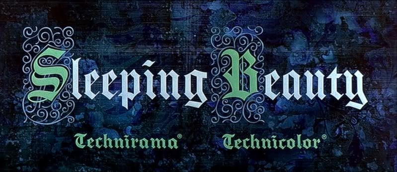
As far as I can tell, lighthousemike's cap is not modified at all (like the colors adjusted or anything), and mine has not been touched up either. I took the cap of the 2003 title card cause someone on UD asked - like many moons ago - for all the title cards of the DACs, and I provided several of them and saved them in photobucket. I'm surprised that the 2003 version is not only sharper, but also less blue than the 2008 version. Then again, it could be that his monitor settings are different from mine, as was the case for another cap comparison I did once (I think it was his caps of the new
Robin Hood: Most Wanted Edition versus my caps of the old
Robin Hood: Gold Collection). Or it could be Disney messing with the colors again and calling it "beyond its original brilliance" or whatever line they're feeding these days.
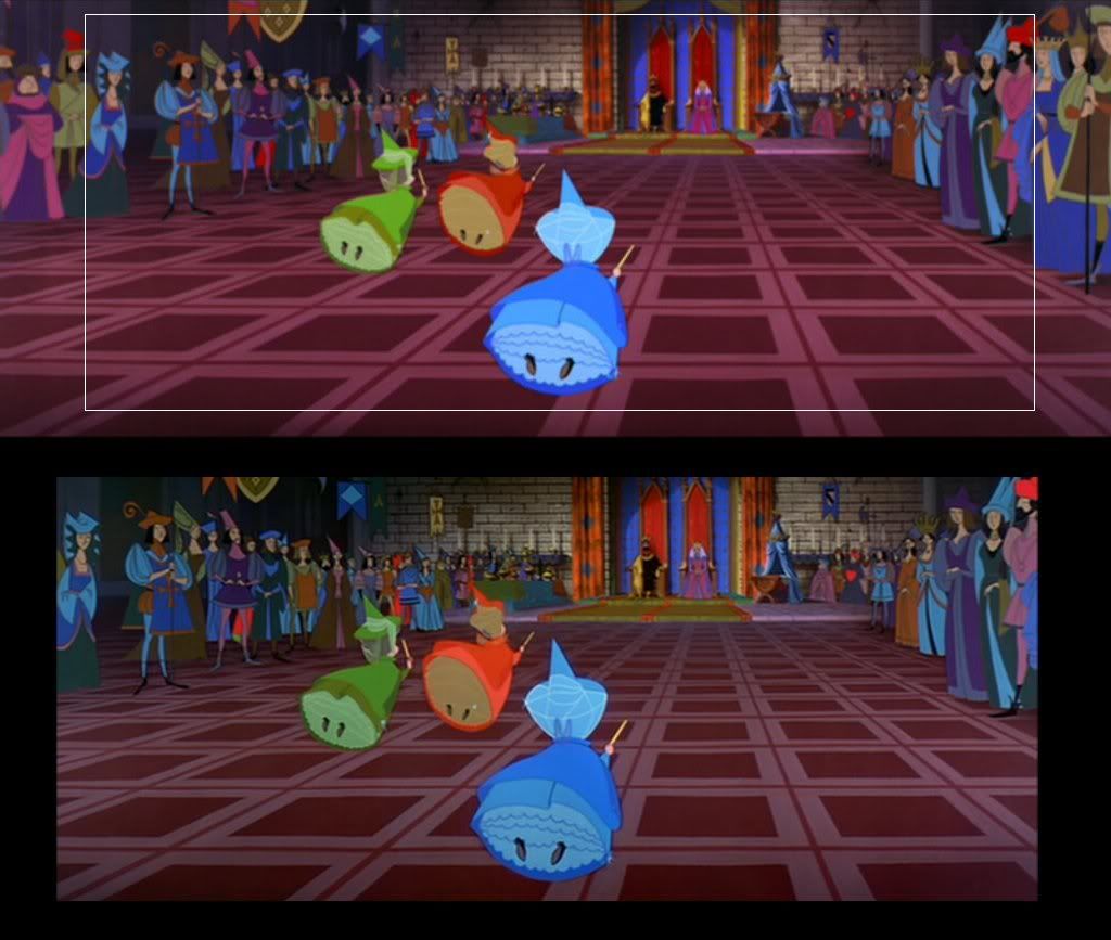
The amount of image that's gained is no surprise. The 2003 DVD was from a 35mm reduction print so it already lost image from the 70mm prints, and comparing it to the 2.55:1 camera negative will obviously show that more image has been cut off. Either way, I'm still annoyed at Disney for just providing the 2.55:1 ratio and not the 2.20:1 theatrical ratio. They're so damn indecisive on which camp to please.

Oh well, hopefully they didn't include a pan-and-scan version again.

ETA:
Okay, I took one of lighthousemike's caps and made a comparison cap to the 2003 DVD to show the difference in not only the framing (of the 35mm reduction print vs. the 35mm camera negative) but also in the colors between the two (it's less drastic than the main title).
The top cap is from lighthousemike, from the 2008 DVD. The white rectangle is an approximation (I'm using Paint as I have yet to re-install PhotoStudio to my computer) of what the 2.35:1 reduction print ratio is based on the 2003 DVD, which is the bottom cap. And yes, I'm aware that the 2003 cap is slightly larger than the area within the white rectangle, so sue me.
Also, the black border around it is not indicative of the 2.55:1 frame that is cut off, it's just empty space.
Anyway, make of it all what you will...
albert