Comparing Home Releases Cover Arts

All topics relating to Disney-branded content.
Marce82
Anniversary Edition
Posts: 1475
Joined: Sun Jul 03, 2005 1:48 pm
Location: Los Angeles

Re: Comparing Home Releases Cover Arts

Post by Marce82 »

Hey guys,

I'm sorry, I couldn't bring myself to rate the TS2 covers. I LOVE that movie... but the covers are pretty pathetic. They are all just clip art with no background. Really sad.

Monsters Inc got a better deal...

1) Blu ray1: Great cover. I love the idea of ALL those monsters in your closet. Normally, I would say this composition is off balance, all the characters on one side... but it works here. I think it's because the title is on the other side... and we get a sense of the room. Doesn't feel empty. I specially like the colors... feels like night time, but it's not ALL blue.

2) Collector's Brazil: I LIKE this one. It's a tie with Blu ray 1. I don't love the grey background, but what I LOVE is the poses of Mike, Sulley and Boo. They feel like a fun team, like it it THEIR adventure, all 3 of them. And what a colorful team it is!

3) DVD Japan: I might be wrong, but I think this was also the dvd/vhs cover in latin America. It is a slight improvement on the US dvd cover, simply cause Boo is in it. And this is her film too!

4) Dvd: I like this cover. Represents the movie well, even the color palette. I wish there was a teeny bit more pink/red. Boo's shadow is a wee bit too subtle for my taste.

5) 4K UHD: It doesn't represent the movie well, but I like the character poses, the lighting... and that abstract background works really well with the colors!

6) 3D blu Japan: Hahaha... it's a crappy cover, but it makes for a very funny visual gag for the 3D version.

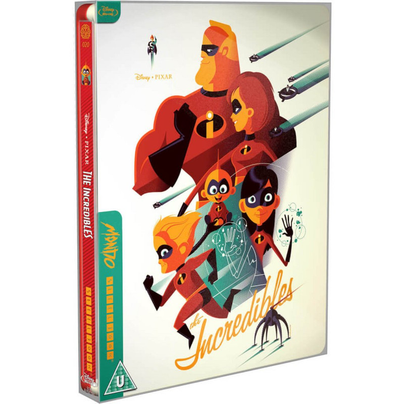
7) 4K Steelbook: I give this one credit, cause I suspect it is drawn, and not just a CG render. But darn... that grey background makes it look so bland... so boring. So flat. But I like the concept.

8 ) 3D blu: Hmmmm... the layout and lighting give it a bit of a "poltergeist" tone... which doesn't fit. Boo's pose is very stiff. BUT... I do love that the title is distorted as if it was painted on the door. :-)

9) Blu ray 2: it's kinda bland. Really? Characters giving a thumbs up? Sulley looks really stiff. It's a very bland cover, for a really fun film.

10) Blu ray 3: No. Just no.

So I didn't do all of them... I did most of them.

Are people still reading these? :-(
User avatar
Farerb
Signature Collection
Posts: 5179
Joined: Sat May 19, 2018 2:09 pm

Re: Comparing Home Releases Cover Arts

Post by Farerb »

I still read the thread. I always like reading other people's input on the covers even if I don't comment myself. I didn't really have much to say because the covers so far weren't that interesting, but I think I will in future movies because some of them are my favorites - Incredibles, Ratatouille, WALL-E...
User avatar
blackcauldron85
Ultimate Collector's Edition
Posts: 16689
Joined: Sat Jun 17, 2006 7:54 am
Gender: Female
Contact:

Re: Comparing Home Releases Cover Arts

Post by blackcauldron85 »

I agree with farerb. It's interesting to hear everyone's opinions, but I guess the Pixar movie covers aren't as exciting as the Disney ones...not to knock Pixar because I do love them. I definitely agree with you, Marce82, that Boo belongs on the covers since it is her story as well!
Image
User avatar
D82
Signature Collection
Posts: 6311
Joined: Fri Aug 16, 2013 10:07 am
Location: Spain

Re: Comparing Home Releases Cover Arts

Post by D82 »

I still read all the comments as well, and like farerb and blackcauldron85, I really enjoy doing it. I haven't participated in the thread the last few weeks because some personal matters have required my time and attention, but now I'll start to do it again. I've been making my rankings of the previous Pixar films and catching up with what has been said in the thread; now I just need to write my comments down. I'll try to post them soon.

It's sad that we've finished with the Disney films, but I love Pixar too and personally I'm excited to discuss their covers as well. In my case, especially for the first Pixar films because I have fond memories of getting them on VHS and later on DVD as a child/teenager, but I like the more recent ones too and it'll be interesting to discover and compare all their covers.

By the way, the other day I noticed it's been more than a year since farerb created this thread. I can't believe it's been so long. Comparing the covers has been so much fun that the time has really flown.
User avatar
Farerb
Signature Collection
Posts: 5179
Joined: Sat May 19, 2018 2:09 pm

Re: Comparing Home Releases Cover Arts

Post by Farerb »

Finding Nemo:

Collector's Edition DVD:
Image

Blu-ray 1:
Image

Blu-ray 1 (DVD Packaging):
Image

Blu-ray 2:
Image

3D Blu-ray:
Image

4K UHD:
Image

4K Steelbook:
Image

DVD (Australia):
Image

Future Shop Metal Box (Canada):
Image

DVD (France):
Image

Heroes Cover (France):
Image

3D Pop-Up Box (Germany):
Image

Collector's Box Set (Japan):
Image

3D Blu-ray (Korea):
Image

Blu-ray combo (Korea):
Image

VCD (Hong Kong):
Image

DVD + Book (Brazil):
Image
User avatar
Farerb
Signature Collection
Posts: 5179
Joined: Sat May 19, 2018 2:09 pm

Re: Comparing Home Releases Cover Arts

Post by Farerb »

I think most of them look really good. I'm going to rank a few:

1. Blu-ray combo (Korea) - these teaser "concept" posters have always been my favorite.
2. 3D Blu-ray
3. Blu-ray 1
4. Blu-ray 1 (DVD Packaging) - I don't like the yellow border.
5. DVD
6. 4K UHD
7. 4K Steelbook - I like these designs but I honestly don't understand why the shark is featured so much. Same goes for other foreign covers.
8. DVD (Australia)
9. Blu-ray 2 - I don't understand why they chose these mugshots for the Pixar rereleases. They even look worse than the Revival 4K.
User avatar
UmbrellaFish
Signature Collection
Posts: 5717
Joined: Sun Jan 28, 2007 3:09 pm
Gender: Male (He/Him)

Re: Comparing Home Releases Cover Arts

Post by UmbrellaFish »

The older I get, the more off putting I think the design of the fish in Finding Nemo is (especially Nemo and Marlin). Those humanoid eyebrow ridges and teeth! Gives me shudders. It’s just very uncanny.

Come to think of it, they rather remind me of Thomas the Tank Engine which always creeped me out as a kid, too.
User avatar
Thumper_93
Anniversary Edition
Posts: 1076
Joined: Mon Aug 01, 2011 7:51 am
Location: Phantom Manor

Re: Comparing Home Releases Cover Arts

Post by Thumper_93 »

The Korea Edition is very pretty. In my opinion almost all the covers are amazing but I have to admit that I love this movie so I can't be impartial.
I think that pixar has not good covers at all. Maybe I'm wrong but I believe that when the movie is in 2D you can make better covers. With the 3D productions they only put cliparts without sense
Image
User avatar
D82
Signature Collection
Posts: 6311
Joined: Fri Aug 16, 2013 10:07 am
Location: Spain

Re: Comparing Home Releases Cover Arts

Post by D82 »

I'm far behind everyone else, but as I said, I wanted to share my rankings for the Pixar films that have already been discussed too, so here's my ranking of the Toy Story covers. I love Toy Story, it's one of my favorite movies overall, but I agree that most of its home video covers are not that great.

1. VHS:
Marce82 wrote:1) VHS: Great cover. Interesting and unusual angle, makes the whole thing feel very dynamic. Good representation of the plot, includes many characters without feeling cluttered. It even has an unique placement for the title. I always found it interesting that this is a recycled poster, EXCEPT for Woody's face, which looked terrified in the original poster.
I agree with everything you said. I love this cover. It's far superior to the rest, in my opinion. Yeah, it's curious that they replaced Woddy's face for the VHS. I guess it's what you once said that happy faces on the covers sell better. The 4K UHD of Frozen 2 was also an example of that. And I like that the wallpaper of Andy's bedroom has clouds. The cover we got in Spain, like this Zavvi edition, didn't have them. I've always wondered why. I much prefer the domestic version with the clouds.

2. 10th Anniversary Edition DVD: This cover is rather simple, but I quite like it too. I like how the different elements are distributed, like the two main characters each at one side or the "10th Anniversary" logo, which fits quite well in that space.
3. Blu-ray 1: This and the following cover are not great, but I find it cool that in both of them the characters interact with the logo.
4. DVD 2
5. IronPack (Canada): It's very simple, but the film's logo is really good and the clouds very iconic, so I still prefer this cover to the others left.
6. Blu-ray + CD (Mexico): I think this would've worked better if the background behind Woody and Buzz in the transparent slipcover had been white because when the slipcover is on (as you can see below) there's no differentiation between the background from the left and the right part with the logo.

Image Image
Marce82 wrote:Here is something odd: look at the blu-ray+CD (Mexico) cover... isnt it weird that when you remove the transparent slip cover, it seems completely devoid of the color red??? Feels so off!!!
I didn't understand that, could you explain it to me?

7. Mondo Steelbook (UK): I don't really like it when the style of the cover doesn't represent the style of the film; that's why I'm not a big fan of these Mondo covers. However, on this occasion, I like that it sums up the conflict of the movie quite well, that's why I haven't ranked it lower.
8. Pop-Up Box (Germany): It's a quite a cool idea. I didn't know this kind of covers existed.
Marce82 wrote:Honorable mention: 3D Pop Up: I think it's super cool, but it's not really a home release cover, is it?
Yeah, I guess not; but it's interesting to see them. I guess the real cover must be the same as the cover for one the other editions. I haven't been able to find the one for this movie, but this is the cover for a Toy Story 1 & 2 collection:

Image

9. Zavvi Lenticular Steelbook (UK)
10. 4K UHD (Japan)
11. Deluxe Laserdisc
12. Gold Classic Collection DVD
13. Heroes Cover (France): It's better than other heroes covers. I like Woody's pose and the lens flare effect in the background, but although Woody's my favorite character from the movie, I feel Buzz should be in the cover too. That's a problem I have with some of the next covers as well.
14. Best Buy Steelbook: As I've mentioned about the Mondo Steelbook, I'm not a fan of using 2D art for a 3D film or vice versa, so unlike most of you, I'm not fond of this line of covers either. They're nice, but would be more fitting for a storybook, in my opinion. Plus, I agree with Marce82 that the scene they've chosen for this particular one is not very representative of the film.
15. 4K UHD: Again, unlike the majority, I'm not a fan of this line of covers. Personally, I think the splash of paint would fit a 2D film more. Plus, I don't like the color of the background nor the random characters doing random things in it. Woody's pose is not bad, though.
16. Blu-ray 2
17. Ultimate Toy Box Collector's Edition DVD
18. Steelbook (Germany)
User avatar
Disney Duster
Ultimate Collector's Edition
Posts: 14017
Joined: Fri Jun 17, 2005 6:02 am
Gender: Male
Location: America

Re: Comparing Home Releases Cover Arts

Post by Disney Duster »

Finding Nemo:
1. VCD (Hong Kong)
2. Blu-ray combo (Korea)
3. 3D Blu-ray (Korea)
4. 3D Blu-ray
5. Blu-ray 1
6. 4K Steelbook
Image
User avatar
Farerb
Signature Collection
Posts: 5179
Joined: Sat May 19, 2018 2:09 pm

Re: Comparing Home Releases Cover Arts

Post by Farerb »

The Incredibles:

DVD:
Image

Blu-ray 1:
Image

Blu-ray 2:
Image

Blu-ray 3:
Image

4K UHD:
Image

4K Steelbook:
Image

Collectible Tin Case:
Image

Future Shop Steelbook (Canada):
Image

Zavvi Steelbook (UK):
Image

Mondo Steelbook (UK):
Image

DVD (France):
Image

Heroes Cover (France):
Image

DVD (Italy):
Image

3D Pop-Up Box (Germany):
Image

Collector's Box Set (Japan):
Image

VCD (Hong Kong):
Image

KimchiDVD Exclusive Slipcover (Korea):
Image

KimchiDVD Lenticular Slipcover (Korea):
ImageImage
User avatar
Farerb
Signature Collection
Posts: 5179
Joined: Sat May 19, 2018 2:09 pm

Re: Comparing Home Releases Cover Arts

Post by Farerb »

1. 4K UHD - The best one. They have all the members of the family in action poses, it really represents what the film is about.

2. DVD (France) - Another one that translates the film well.

3. KimchiDVD Lenticular Slipcover (Korea) - Clever Idea.

4. Mondo Steelbook (UK) - I'm usually not a fan of these but for some reason it works here.

5. DVD - Simple but fine. Background could have been more filled.

6. 4K Steelbook - It's stylish and minimalist, which I don't know if it fits the film. Yes I know the credits are like that, but the film as a whole is not.

7. Zavvi Steelbook (UK) - Similar to the DVD, but with more empty space.

8. Future Shop Steelbook (Canada) - More empty space.

9. Blu-ray 1 - I don't think it was necessary to have that red column. I know other Pixar titles have it and I didn't like it with them as well.

10. DVD (Italy) - The red curtain is really not necessary and it's more noticeable here.

11. Blu-ray 3 - It's not bad and I know Bob is the main character and yet it's called The Incredibles, not Mr. Incredible. So having him more prominent and the others so small kind of mussing the family aspect of it.

12. Blu-ray 2 - Another mugshot.

13. Collectible Tin Case - Just a title, nothing special.
User avatar
blackcauldron85
Ultimate Collector's Edition
Posts: 16689
Joined: Sat Jun 17, 2006 7:54 am
Gender: Female
Contact:

Re: Comparing Home Releases Cover Arts

Post by blackcauldron85 »

The Mondo Steelbook (UK) is my favorite. The 4K Steelbook & KimchiDVD Lenticular Slipcover (Korea) look cool. The Collectible Tin Case might be the worst cover I've ever seen. :p
Image
Marce82
Anniversary Edition
Posts: 1475
Joined: Sun Jul 03, 2005 1:48 pm
Location: Los Angeles

Re: Comparing Home Releases Cover Arts

Post by Marce82 »

Hey everyone,

So I'm a little behind, so I will do one post for Nemo... and then a separate one for The Incredibles.

About Nemo... the covers look nice, but I have an issue: seems they don't really reflect the movie well. Seems like the turtle or the shark are main characters in many of the covers. Very few of them focus on the actual main characters. I will try to judge them... but I guess it's all about composition, since they are all renders of the CG models from the film.
Here goes...

1) 3D blu ray: the composition is a little messy... a LOT of random characters... but at least I know who the main ones are! I like the addition of the city on top. Makes it stand out from other covers.

2) 4K Steelbook: as most covers here, there is a secondary character being passed as a main one. But credit cause at least it looks like a painting. And I love the back cover, with the seagulls!

3) Dvd France: freaking bland, but at least it represents the main characters well!

4) Blu Ray COMBO Korea: it's a nice cover, but this minimalist approach doesn't really reflect the movie well.

5) Blu ray 1: Again... is the turtle the main character... this one has some interesting composition. Having characters in the background and those swirling fish gives it a little depth.

6) Collector's dvd: As I said above... um... is the turtle the main character? It's a passable cover.

7) 3D blu ray Korea: what the HECK is this??? ridiculous amount of characters, and consider the size... you wouldn't be able to see most of them. Could you even see Marlin and Dory???

I won't review the ones that are just one piece of character clipart.
Pretty sad collection of covers for a movie so beloved...
Marce82
Anniversary Edition
Posts: 1475
Joined: Sun Jul 03, 2005 1:48 pm
Location: Los Angeles

Re: Comparing Home Releases Cover Arts

Post by Marce82 »

D82: cool we agree on that TS cover.

About the Mexican TS cover with the transparent slip... I don't know how to explain it any better. When you remove the slip, the artwork on the slip is completely devoid of the color red. It's all blues, greens and yellows and it kinda reveals that Buzz and Woody have no reds in their designs (other than the very mall detail of Woody's neck scarf).

Aaaaand on to The Incredibles. I absolutely LOVE this film!!!! And I'm not particularly into superheroes. But this movie is freakin brilliant, I never get tired of it.
Here we go!

1) 4K Steelbook: this is actually a tie with 4k UHD. Love the style, and represents the movie really well. Fareb... one thing where I disagree: this is not minimalist, it is STYLIZED. There is way too much stuff going on here for it to be deemed minimalist. Also love the use of colors, shapes, depth... just a great cover.

2) 4K UHD: Great composition, great poses. Dutch angle is well used... nice use of color. And the way the characters are lit almost looks like a painting.

3) dvd: Very cool cover. I like how they incorporated the logo into the design... and this movie is more about Mr.I than the rest of the family, so the hierarchy works. Frozone seems like he was added as an afterthought... doesn't really bother me though.

4) Blu ray1: It's an ok cover... but it feels like a compilation of clip art, and a random background. I admit Elastigirl's hand looks very cool, almost like breaking the 4th wall.

5) Blu ray 3: I kinda like it... the yellows and oranges work very well with the mostly-red Mr.Incredible. I wish the family wasn't there... just the hint of a cityscape. Another plus: I don't think I;ve seen that clip art of Mr.I used elsewhere...

6) Dvd Italy: Clearly a composite of clip art. I don't like the ones they picked for Mr.Incredible and Elastigirl... he looks VERY strange, specially in the mouth. She looks like she is farting, and is kinda proud about it.

7) KimchiDVD Exclusive Slipcover Korea: no no no. This cover makes it seem the movies is only about a DUO of superheroes... Mr.I and Frozone. No no no. I do like that the cover wraps around the spine and includes Syndrome.

8 ) Mondo Steelbook: it's passable. Clearly this is intended to be a poster, not a cover. The characters have been reimagined, and they are a little off, specially Mr.I. I like that they included Syndrome... but could anyone actually see him??? Maybe if it WAS a full size POSTER.

Not including the ones that are recycled posters or just clipart. But overall, VERY nice covers.
User avatar
Disney Duster
Ultimate Collector's Edition
Posts: 14017
Joined: Fri Jun 17, 2005 6:02 am
Gender: Male
Location: America

Re: Comparing Home Releases Cover Arts

Post by Disney Duster »

Farerb, your first four favorites are mine as well, just maybe in a different order, plus the Mondo one.
Marce82 wrote:She looks like she is farting, and is kinda proud about it.
:lol:
Image
User avatar
Farerb
Signature Collection
Posts: 5179
Joined: Sat May 19, 2018 2:09 pm

Re: Comparing Home Releases Cover Arts

Post by Farerb »

Marce82, I also really like The Incredibles, my second favorite Pixar after WALL-E. It's technically a "superhero" film, but Brad Bird made it more of a 60's spy film so it feels very different than the usual MCU movie or Big Hero 6.

Regarding the KimchiDVD Exclusive Slipcover Korea, I think it's a "full slipcover", meaning that the image is probably continuous and the other characters are at the back.
User avatar
Farerb
Signature Collection
Posts: 5179
Joined: Sat May 19, 2018 2:09 pm

Re: Comparing Home Releases Cover Arts

Post by Farerb »

Disney Duster wrote:Farerb, your first four favorites are mine as well, just maybe in a different order, plus the Mondo one.
That's nice.
User avatar
D82
Signature Collection
Posts: 6311
Joined: Fri Aug 16, 2013 10:07 am
Location: Spain

Re: Comparing Home Releases Cover Arts

Post by D82 »

Marce82 wrote:About the Mexican TS cover with the transparent slip... I don't know how to explain it any better. When you remove the slip, the artwork on the slip is completely devoid of the color red. It's all blues, greens and yellows and it kinda reveals that Buzz and Woody have no reds in their designs (other than the very mall detail of Woody's neck scarf).
I think I get it now. Thanks for explaining it to me!
farerb wrote:I also really like The Incredibles, my second favorite Pixar after WALL-E. It's technically a "superhero" film, but Brad Bird made it more of a 60's spy film so it feels very different than the usual MCU movie or Big Hero 6.
Also, the fact that it shows the domestic life of this family of superheroes as well as their heroic side also makes it special, in my opinion, and different from other superhero movies. I love The Incredibles too. It's definitely in my top 5 Pixar films.
farerb wrote:Regarding the KimchiDVD Exclusive Slipcover Korea, I think it's a "full slipcover", meaning that the image is probably continuous and the other characters are at the back.
You're right, I hadn't realized that before. I like it more now.

Image Image

Speaking of that edition, this is the steelbook that comes inside the slipcover of that and the other KimchiDVD exclusive editions:

Image

Here's also an unboxing video of said editions, for anyone interested.


And I'm going to post my ranking for The Incredibles now and continue with the films I missed another day:


1. DVD (France): It's not original art, as it was one of the theatrical posters, but I like that it features the entire family in action, plus Frozone and Syndrome in the background.

2. DVD/Zavvi Steelbook (UK)/VCD (Hong Kong): Nostalgia could play a role in why I like it as much as I do, but like Marce82, I think it's cool they incorporated the logo into the design.

3. KimchiDVD Lenticular Slipcover (Korea): The lenticular effect is really cool and it's the only cover that plays with the domestic vs. superhero theme of the movie. The covers for the sequel use this concept much more often.

4. 4K UHD: I like that it shows the whole family in action poses again and the all-red background. I also agree with Marce82 that the Dutch angle is well used here. By the way, I didn't know what that type of shot was called in English until you mentioned it, Marce82. I only knew its Spanish name: "plano aberrante". One problem I have with this cover, though, is that the lack of a floor gives the impression the family is floating in the air.

5. DVD (Italy): All the family is present again, and personally I like that they did something original with the band on the right. By the way, have you noticed Nemo in Jack Jack's bib?

6. 4K Steelbook: Unlike other 4K Steelbooks from Pixar, here they use a drawing in the style of the film's end credits, which in my opinion, is much better than what they usually do. I also like the fact that the family is fighting the bad guys together.

7. Blu-ray 1: Good poses, but not too interesting.

8. Future Shop Steelbook (Canada)

9. Mondo Steelbook (UK)

10. 3D Pop-Up Box (Germany)

11. Blu-ray 3

12. KimchiDVD Exclusive Slipcover (Korea): As I previously said, I like this one more now that I know the image continues in the back, where the rest of the family appears, but to me the cover alone doesn't work too well on its own.

13. Blu-ray 2: It's just a mugshot, as farerb said, but at least the background and frame are in the same colors as Bob's suit, which is nice.

14. Heroes Cover (France)

15. Collector's Box Set (Japan): This one and the next are too simple. They could've added some element to make them a little more interesting.

16. Collectible Tin Case
Last edited by D82 on Fri Oct 23, 2020 1:04 am, edited 2 times in total.
User avatar
Farerb
Signature Collection
Posts: 5179
Joined: Sat May 19, 2018 2:09 pm

Re: Comparing Home Releases Cover Arts

Post by Farerb »

Cars:

DVD:
Image

Blu-ray 1:
Image

Blu-ray 2:
Image

Blu-ray 3:
Image

Blu-ray 4:
Image

4K UHD:
Image

Target Exclusive:
Image

Walmart Exclusive:
Image

4K Steelbook:
Image

Heroes Cover (UK):
Image

Special Edition DVD (France):
Image

Future Shop Steelbook 1 (Canada):
Image

Future Shop Steelbook 2 (Canada):
Image

Zavvi Steelbook (UK):
Image

Heroes Cover (France):
Image

3D Pop-Up Box (Germany):
Image

Collector's Box Set (Japan):
Image

DVD (Australia):
Image
Post Reply