Comparing Home Releases Cover Arts

Re: Comparing Home Releases Cover Arts
I think they made that change because if she had said "Beast" in hebrew, it would've sounded even worse than it does in English. Also "Beast" and "Alive" are very similar words in Hebrew. "Alive" in female pronunciation is exactly the same as "Beast" in Hebrew.
-
DisneyBluLife

- Gold Classic Collection
- Posts: 381
- Joined: Sun Oct 14, 2012 10:36 am
- Location: Sweden
Re: Comparing Home Releases Cover Arts
In the Swedish dub Belle says "The beast!". 
-
Disney's Divinity

- Ultimate Collector's Edition
- Posts: 16407
- Joined: Thu Mar 17, 2005 9:26 am
- Gender: Male
Re: Comparing Home Releases Cover Arts
I just choose to live in reality. They don't make "great" covers anymore, if they ever did. No offense, but the majority of our disagreements aren't about lower standards, it's simply that I just plain ol' don't agree with you. If you find disagreement personally insulting, there's really nothing I can do here.Marce82 wrote: Disney's Divinity: see... that's where you and I differ. I don't expect perfection, but I expect "great". This is a multi-billion dollar company with an arsenal of brilliant visual artists... there is no reason why the covers should be anything less than great-looking. "Not an eyesore" is a pretty low bar...

Listening to most often lately:
Christina Aguilera ~ "Cruz"
Sombr ~ "homewrecker"
Megan Moroney ~ "Beautiful Things"

Re: Comparing Home Releases Cover Arts
I personally find it a bit frustrating that Disney usually doesn't make a bigger effort with its covers. Especially because the films themselves are drawn with a lot of quality and care and take years to make, and the covers most of the time don't reflect that at all. But Disney is not the only studio that does that. I guess that, in general, the approach taken for the artwork used for home video is not the same than the one taken for the theatrical posters. The home video covers seem more targeted at children than the posters. Their main goal with them is probably to make them attractive for kids, so they will ask their parents to buy them when they see them at stores. That's why I believe they don't think they need to make a bigger effort with them.Disney's Divinity wrote:I just choose to live in reality. They don't make "great" covers anymore, if they ever did. No offense, but the majority of our disagreements aren't about lower standards, it's simply that I just plain ol' don't agree with you. If you find disagreement personally insulting, there's really nothing I can do here.Marce82 wrote: Disney's Divinity: see... that's where you and I differ. I don't expect perfection, but I expect "great". This is a multi-billion dollar company with an arsenal of brilliant visual artists... there is no reason why the covers should be anything less than great-looking. "Not an eyesore" is a pretty low bar...
I guess not, but I think it would be nice to have the main characters in a different setting for a change.Marce82 wrote:That mockup with them on the balcony is ok... but not great to me. It's not like the balcony scene is super iconic or significant.
You're right, I hadn't noticed that. I prefer the UK one too. Apart from not having that flaw, it also looks less empty thanks to the color and the line at the bottom. The logo is different too, not only the font, but the ornaments as well. The US one has roses next to "Beauty" and thorns next to "Beast" while the UK version has only roses.Marce82 wrote:As for the Deluxe covers... I like the purple one better! I also just noticed that the American one shows the two main characters without the enchanted objects. So I looked it up in high res, and they have sort of photoshopped the other characters out... pretty poorly (specially Belle's skirt). If you look closely, it looks like bad airbrushing....
Now that you mention it, I think it's the same reason in Spain too. "Beast" could have sounded like an insult here. Apart from a monster, it can also mean "brutish" or "animal". In the version for Spain, though, what she says instead of Beast sounds nothing like the original word. I've watched that moment again and the words don't match her lips. By the way, what do you mean by "female pronunciation", farerb? I didn't understand that part.farerb wrote:I think they made that change because if she had said "Beast" in hebrew, it would've sounded even worse than it does in English. Also "Beast" and "Alive" are very similar words in Hebrew. "Alive" in female pronunciation is exactly the same as "Beast" in Hebrew.
You can see it in higher resolution here: https://www.ebay.co.uk/itm/BEAUTY-THE-B ... SwJRleCTtuMarce82 wrote:oh, I like that 2-movie collection cover! Would be interesting to see it in detail... the layout looks interesting.
And if you guys found the cover in which Ariel seemed to be about to eat Flounder ridiculous, take a look at this 3-Movie Collection cover for Beauty and the Beast. They should change the title on it for Beauty and the Clock

Source: https://www.amazon.co.uk/Beauty-Belles- ... ref=sr_1_9
What I like about this cover though is the color combination of the background, which matches Belle and the Beast's outfits.
Re: Comparing Home Releases Cover Arts
"Beast" also means "Animal" in Hebrew. What I meant is that Hebrew is not a gender neutral language. Verbs and adjectives has specific pronunciation when you want to attribute them to either male or female. I guess it's like "Las" for women and "Los" for men in Spanish.D82 wrote:Now that you mention it, I think it's the same reason in Spain too. "Beast" could have sounded like an insult here. Apart from a monster, it can also mean "brutish" or "animal". In the version for Spain, though, what she says instead of Beast sounds nothing like the original word. I've watched that moment again and the words don't match her lips. By the way, what do you mean by "female pronunciation", farerb? I didn't understand that part.farerb wrote:I think they made that change because if she had said "Beast" in hebrew, it would've sounded even worse than it does in English. Also "Beast" and "Alive" are very similar words in Hebrew. "Alive" in female pronunciation is exactly the same as "Beast" in Hebrew.
Re: Comparing Home Releases Cover Arts
Disney's Divinity: my comment about lower standards wasn't about when our opinions don't match. It was solely based on what you said:
"I don't expect perfection out of the covers, just not being an eyesore will do, usually."
So, to you, anything above eyesore is ok. Which is fine, that is your view (and I am not offended by differing opinions at all!). And I do live in reality, and I see great artwork coming from Disney all the time, sometimes even on home video covers. So when I see something sloppy, it bothers me. Cause I know they can do better if they cared to.
D82: yup. I share your frustration.
And thanks for the bigger view of the 2-movie collection. The draftsmanship is bad, but the overall composition and concept are good. Shame...
That 3-movie collection is terrible.
-
Disney's Divinity
- Ultimate Collector's Edition
- Posts: 16407
- Joined: Thu Mar 17, 2005 9:26 am
- Gender: Male
Re: Comparing Home Releases Cover Arts
She looks like she's about to caress Cogsworth's cheek.D82 wrote: And if you guys found the cover in which Ariel seemed to be about to eat Flounder ridiculous, take a look at this 3-Movie Collection cover for Beauty and the Beast. They should change the title on it for Beauty and the Clock:
https://i.imgur.com/2PFTAQk.jpg
Source: https://www.amazon.co.uk/Beauty-Belles- ... ref=sr_1_9
Listening to most often lately:
Christina Aguilera ~ "Cruz"
Sombr ~ "homewrecker"
Megan Moroney ~ "Beautiful Things"
Re: Comparing Home Releases Cover Arts
Oh, OK, I understand it now. I didn't know that, it's really interesting. Yes, Spanish is not a gender neutral language either, but here the words that are different for male and female are not just pronounced differently, but written differently as well. But it's curious how languages from places that are so far from each other, still have things in common.farerb wrote:"Beast" also means "Animal" in Hebrew. What I meant is that Hebrew is not a gender neutral language. Verbs and adjectives has specific pronunciation when you want to attribute them to either male or female. I guess it's like "Las" for women and "Los" for men in Spanish.
I agree.Marce82 wrote:The draftsmanship is bad, but the overall composition and concept are good. Shame...
ExactlyDisney's Divinity wrote:She looks like she's about to caress Cogsworth's cheek.
Re: Comparing Home Releases Cover Arts
Random note: at times, when we discuss these covers, I already have one picked out as my favorite before we even begin cause I remember how good they were.
I have to say, I do not have one already picked out for Aladdin.... this should be interesting.
I have to say, I do not have one already picked out for Aladdin.... this should be interesting.
Re: Comparing Home Releases Cover Arts
It has happened to me more than once that I think I already have my favorite, but when I see all the covers, I change my mind and pick another one.
I don't know if it's the best way to do it, but what I usually do to select my favorites is saving all the covers farerb posts before reading other member's opinions, to not get influenced by them. Then I compare them and I copy my favorites to a new folder where I try to rank them. After that, I read what others have said. I sometimes change my opinion a bit after reading others point out things I hadn't noticed, but I tend to end up with pretty much the same ranking I had before.
I don't know if it's the best way to do it, but what I usually do to select my favorites is saving all the covers farerb posts before reading other member's opinions, to not get influenced by them. Then I compare them and I copy my favorites to a new folder where I try to rank them. After that, I read what others have said. I sometimes change my opinion a bit after reading others point out things I hadn't noticed, but I tend to end up with pretty much the same ranking I had before.
Re: Comparing Home Releases Cover Arts
I'll be posting Aladdin's covers soon but from what I see they are mostly the same. They have the same concept of Aladdin and Jasmine flying on Carpet, the Genie hovering over them and sometimes Jafar on the side looking angry.Marce82 wrote:Random note: at times, when we discuss these covers, I already have one picked out as my favorite before we even begin cause I remember how good they were.
I have to say, I do not have one already picked out for Aladdin.... this should be interesting.
Re: Comparing Home Releases Cover Arts
Well, D82, my process is not quite as involved as yours... I just sit with one window with all the covers, and a separate one where I write my ranking.
And don't get me wrong: I often think I know which one is the best before I see them all, and then when I actually do see them all together, I find one that is better. I try to keep an open mind.
There are certain instances, like BATB or Peter Pan, where I had no doubt of which one was the best to my criteria. For Aladdin, I truly don't know... I wasn't a fan of the original VHS cover, even when I was a kid. Ooooh... this will be fun!
-
Disney Duster

- Ultimate Collector's Edition
- Posts: 14163
- Joined: Fri Jun 17, 2005 6:02 am
- Gender: Male
- Location: America
Re: Comparing Home Releases Cover Arts
Oh, but I think that scene is iconic, not super iconic but iconic, it's used a lot actually, and that scene certainly is signifigant! It's where the Beast asks if Belle is happy with him and she says yes, but then she misses her father and it is the catylist for her seeing her father in the mirror and riding off to rescue him.Marce82 wrote:D82: That is so interesting about BATB in Spain! I kinda like that line you guys got better than the original.
That mockup with them on the balcony is ok... but not great to me. It's not like the balcony scene is super iconic or significant.
D82, your way of ranking is thorough, thoughtful, and cool!

Re: Comparing Home Releases Cover Arts
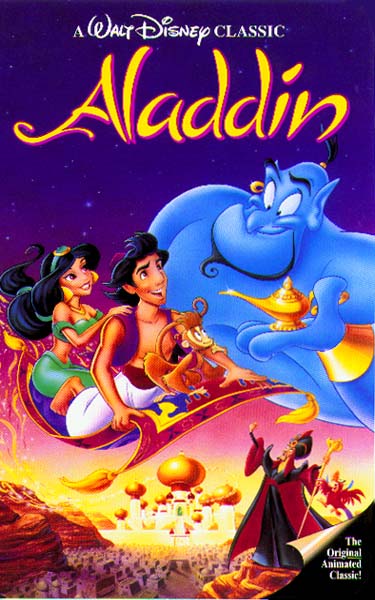
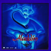
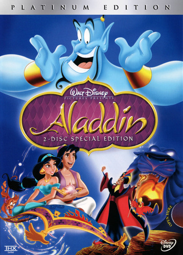
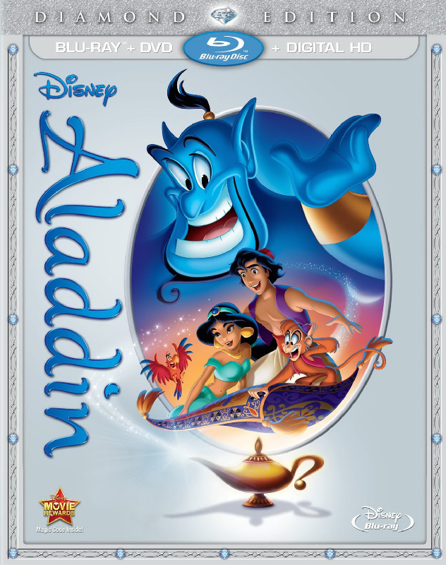
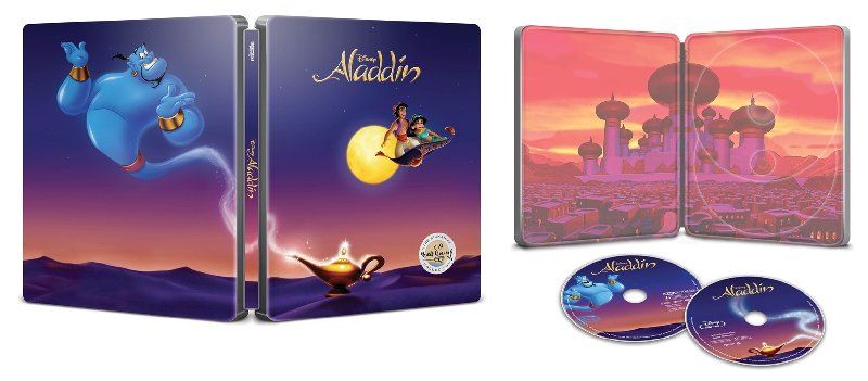
Aladdin:
Classics VHS:
Laserdisc (deluxe Edition):
Platinum Edition DVD:
Platinum Edition Box Set:

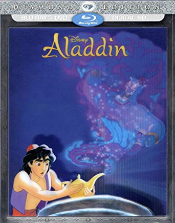
Diamond Edition Blu-ray:
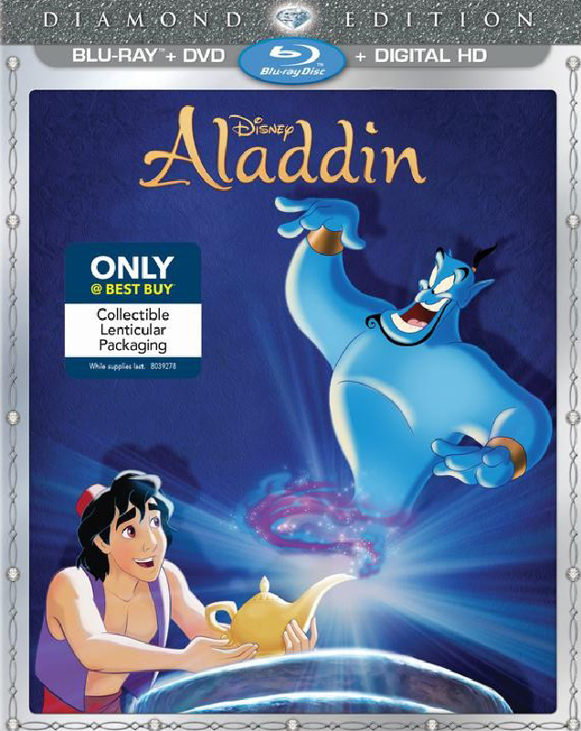
Best Buy Diamond Lenticular Exclusive:
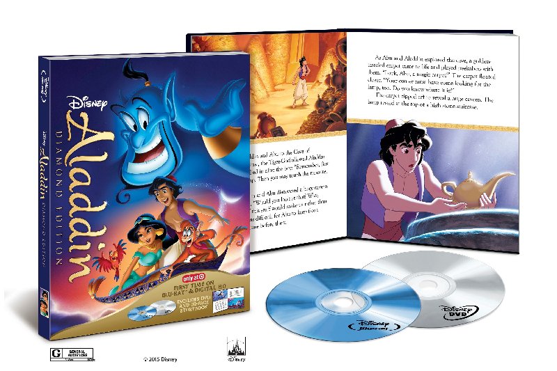
Target Diamond Digibook:
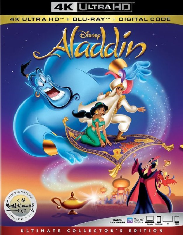
Signature Collection 4K UHD:
Target Signature Digipack:
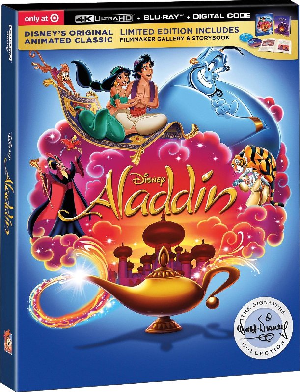
Best Buy Signature Steelbook:
Classics VHS:
Laserdisc (deluxe Edition):
Platinum Edition DVD:
Platinum Edition Box Set:
Diamond Edition Blu-ray:
Best Buy Diamond Lenticular Exclusive:
Target Diamond Digibook:
Signature Collection 4K UHD:
Target Signature Digipack:
Best Buy Signature Steelbook:
Last edited by Farerb on Fri Feb 21, 2020 2:12 am, edited 2 times in total.
Re: Comparing Home Releases Cover Arts
1. Best Buy Signature Steelbook - I really like how Aladdin and Jasmine are drawn here (taken from the Diamond Edition) and I like that they're alone on the front with the moon behind them. It's minimalistic and elegant.
2. Target Diamond Digibook - mainly because I like the way Aladdin and Jasmine are drawn here. The layout seems fine too.
3. Classics VHS - the characters look better than the rest of the covers, but I find the Genie drawn like that weird, like he's missing half of his body.
4. Target Signature Digipack - very creative, very good. Too bad Aladdin and Jasmine don't look quit right.
5. Platinum Edition DVD - better layout than the VHS, but characters look worse.
6. Laserdisc - it's fine for what it is, Genie looks a bit off, but I don't like that Aladdin isn't featured.
7. Signature Collection 4K - Aladdin and Jasmine look off, Jafar is used from the Platinum Edition. Genie looks good. weird perspective. I don't like Aladdin standing on Carpet like that. Aladdin and Jasmine sequence was a romantic one, not an action sequence, so his action pose doesn't make sense.
8. Best Buy Diamond Lenticular Exclusive - Aladdin's left eye ruins it for me. Though I like the concept here.
9. Diamond Edition Blu-ray - I despise that oval. No matter how well drawn the characters are. That oval just ruins everything. I don't understand why they decided to go for it in the latter Diamond covers. It's just awful in my opinion.
Last edited by Farerb on Fri Feb 21, 2020 2:24 am, edited 1 time in total.
-
Disney Duster
- Ultimate Collector's Edition
- Posts: 14163
- Joined: Fri Jun 17, 2005 6:02 am
- Gender: Male
- Location: America
Re: Comparing Home Releases Cover Arts
1. Target Signature Digipack - God, this cover is just amazing! It's so splashy, so fun, so colorful, so...magical! It has like everything you could ever want! Love the composition! The magic lamp spraying the palace and all the major characters out bordered around the title!
2. Signature Collection 4K UHD- This one is also great! I love the composition and the only think I am not keen on is Aladdin as Ali, but whatever, it's not a bad thing!
3. Best Buy Diamond Lenticular Exclusive - Love the simplicity and it's cool!
4. Platinum Edition DVD - Cool composition.
5. Classics VHS - I like the composition and love that Aladdin is looking at his dear friend the Genie.
6. Laserdisc (deluxe Edition) - Kind of weird to have such a comical character in such a serious light, but it's also so nice-looking.
7. Best Buy Signature Steelbook - I really, really like it, it's classy, but...Genie is totally in a clipart pose that looks wrong.
8. Target Diamond Digibook - Eh, whatever, could be worse.
9. Diamond Edition Blu-ray - It's worse.
Re: Comparing Home Releases Cover Arts
They somehow needed to compensate Cogsworth for not appearing on the Platinum Edition. He would not have stood for this.D82 wrote: And if you guys found the cover in which Ariel seemed to be about to eat Flounder ridiculous, take a look at this 3-Movie Collection cover for Beauty and the Beast. They should change the title on it for Beauty and the Clock
Source: https://www.amazon.co.uk/Beauty-Belles- ... ref=sr_1_9
What I like about this cover though is the color combination of the background, which matches Belle and the Beast's outfits.
Re: Comparing Home Releases Cover Arts
Hey Fareb!
There is an Aladdin cover you missed.... the Platinum edition box set... Just saying! I know you like to be thorough!
There is an Aladdin cover you missed.... the Platinum edition box set... Just saying! I know you like to be thorough!
Re: Comparing Home Releases Cover Arts
Thank youMarce82 wrote:Hey Fareb!
There is an Aladdin cover you missed.... the Platinum edition box set... Just saying! I know you like to be thorough!
Re: Comparing Home Releases Cover Arts
Thank you, Fareb...
Don't hate me: just remembered the UK "musical masterpiece"edition... you can google it and add it to your post... if you want.
Don't hate me: just remembered the UK "musical masterpiece"edition... you can google it and add it to your post... if you want.