
I usually don't do international covers but I wanted to do them for Beauty and the Beast. I'm sure I missed a few though.D82 wrote:Wow, what a large and complete list of covers, farerb! It's going to be difficult to pick our favorites.
Comparing Home Releases Cover Arts
Re: Comparing Home Releases Cover Arts

Re: Comparing Home Releases Cover Arts
I'm glad you did. There are several beautiful international covers I hadn't seen before. Thanks for all the work you do each week finding all the releases and posting them in order and with their correct names. You do a great job and it's a lot of fun discussing them.farerb wrote:I usually don't do international covers but I wanted to do them for Beauty and the Beast. I'm sure I missed a few though.
I'll think about my ranking and I'll try to post it earlier this time.
-
DisneyBluLife

- Gold Classic Collection
- Posts: 381
- Joined: Sun Oct 14, 2012 10:36 am
- Location: Sweden
Re: Comparing Home Releases Cover Arts
UK Beauty and the beast "Heroes" cover
https://www.amazon.co.uk/Beauty-Beast-L ... B01F468DJ4
https://www.amazon.co.uk/Beauty-Beast-L ... B01F468DJ4
Re: Comparing Home Releases Cover Arts
Thank you.D82 wrote:I'm glad you did. There are several beautiful international covers I hadn't seen before. Thanks for all the work you do each week finding all the releases and posting them in order and with their correct names. You do a great job and it's a lot of fun discussing them.farerb wrote:I usually don't do international covers but I wanted to do them for Beauty and the Beast. I'm sure I missed a few though.
I'll think about my ranking and I'll try to post it earlier this time.
-
Disney Duster

- Ultimate Collector's Edition
- Posts: 14133
- Joined: Fri Jun 17, 2005 6:02 am
- Gender: Male
- Location: America
Re: Comparing Home Releases Cover Arts
Farerb, I echo D82, you do such a good job rounding up all the covers and putting them in order with their names!
1. Best Buy Steelbook - This cover is freaking beyond gorgeous. It's silver with some pink, purple, and black. It's so elegant, so classy, so shiny! I know you wanted the rose on the back, farerb, and Belle and the Beast on the front, but I would say it could go either way and still be an amazing cover, so as it is, I still love it. The silhouette of them is so lovely and yes, in purple and pink it looks better than the red, which brings me to...
2. Japanese Laserdisc - The original, and best, poster! The silhouette of them is really just gorgeous and while I would rather being able to see them defined a little better, it's near perfect.
3. Diamond Edition DVD - I know what you're all thinking. What? Why?! Well, because I like having a lot of characters and scenes on a cover. It should all be scaled better and drawn better, certainly, but I like the layout and concept, and I love the rose-like title.
4. Deluxe DVD (Germany) - I really love this poster, too, even though it doesn't make sense since this never quite happened in the movie. I guess it sort of did since they sat once in those clothes and there were stained-glass windows... But it's so gorgeous and I do love the concept! It's very romantic.
5. Collector's Edition (UK) - This is a great image of them, and it's nice the Beast is lifting Belle's chin, and it's a rather lovely idea.
6. Classics VHS - It's, well, classic! Great poses for all the characters!
7. Classics VHS (UK) - It's just like the first one but I don't like the UK triangle marring it.
8. Work In Progress Laserdisc - Very nice! The idea of roses on "Beauty" and thorns on "Beast" is genius and I, like farerb, really like the drawings on the white.
9. Signature Collection 4K UHD - Nice! I don't like a Disney Princess clipart being used, but other than that, nice!
10. Platinum Edtion - I hate the layout, but at least it looks nice.
11. Platinum Edtion 3D Limited Edition (Germany) - It's just the rose. Can't go wrong. Pretty nice.
12. Target Digipack - The concept sucks but I like how nice it looks.
13. Diamond Edtion Blu-ray - Eh. If it were drawn better, it may actually look good.
14. Diamond Edtion with a book - I hate the borders around the image with nothing other than the color!
15. Diamond Edition 3D - I hate sideways titles!
16. Diamond Edition 3D (Germany) - Love the original poster, hate this border.
17. Work in Progress VHS - Hate empty borders. Hate 'em.

Re: Comparing Home Releases Cover Arts
Perhaps I should have included this one but I never cared for these. Especially in Beauty and the Beast's case, which is a story about two characters, not just Belle's and IMO it's wrong to drop the Beast from the cover. I also don't like the DP clip art they used, I hate that pose and I hate that she's holding a rose.DisneyBluLife wrote:UK Beauty and the beast "Heroes" cover
https://www.amazon.co.uk/Beauty-Beast-L ... B01F468DJ4
Re: Comparing Home Releases Cover Arts
Thank you.Disney Duster wrote:Farerb, I echo D82, you do such a good job rounding up all the covers and putting them in order with their names!
TBF, they at least altered it so she'd look more like she does in the film.Disney Duster wrote: 9. Signature Collection 4K UHD - Nice! I don't like a Disney Princess clipart being used, but other than that, nice!

Re: Comparing Home Releases Cover Arts
For one of Disney's most cherished films, BatB had a really bad luck with covers.
I don't see what everyone else sees about the steelbook, I find it rather ugly. Colors on each of the sides don't match, the images should be reversed (Belle and the Beast on the front, the rose on the back), the new font is hideous, and most of the inside image gets covered by the disc.
1. German DVD
2. UK/US VHS - slight preference for the UK version for the reasons farerb already mentioned
3. Platinum DVD - I used to love this one. Yes, it's mostly the same as the VHS, but it has some serious issues. I appreciate the added details in clothes, hair and fur, but Belle looks awful. Her lips are thinner and pursed, her chin lacks shading and definition, and it all makes her look like a middle-aged schoolmarm. The Enchanted Christmas DVD cover from 2002 also re-used the same art (only flipped it), but she somehow looks much better there. Her arms have also gone missing/faded into the background. The Beast and the rose look great, so that's why this cover takes spot No. 3.
4. Signature 4K despite the new font
Everything else ranges from meh to beyond awful.
Re: Comparing Home Releases Cover Arts
Darn... I had already written this message, but it didn't post for some reason.
I know the BATB covers have been posted, but there are a few comments from TLM I still want to address:
Fareb: Yes! the israeli cover handles Sebastian MUCH better! He looks like he is part of the scene.
D82: Oh wow... that blue shiny thing in the title makes a huge difference!! It's much better than the American version, and you can see the texture for the seashell better! Very very cool. And I remember that sticker album from when I was kid... it's a great cover.
JeanGreyForever: I wish that was the 4K cover!!! That is freakin gorgeous.
DisneyDuster: the interlocutor figure is ONE character looking at the camera/audience, in order to draw attention and connect with the onlooker. Also applies to Chip in the BATB vhs. Hope it's clear now.
One BATB note: Fareb, that is not the WIP VHS cover, that is the cover for the deluxe box set. The WIP VHS has the same pose as the regular vhs, only drawn in pencil. You can google it... maybe replace it in your posting with all the covers? Thank you!
Re: Comparing Home Releases Cover Arts
Thanks for letting me know. I edited the post.
Re: Comparing Home Releases Cover Arts
Fareb, you are awesome! Thank you!
And thank you for creating this thread and being so dedicated!
And thank you for creating this thread and being so dedicated!
Re: Comparing Home Releases Cover Arts
Thank youMarce82 wrote:Fareb, you are awesome! Thank you!
And thank you for creating this thread and being so dedicated!

Re: Comparing Home Releases Cover Arts
I second that. Such a fun thread.
Re: Comparing Home Releases Cover Arts
Thank you. I'm glad people are enjoying it.rodis wrote:I second that. Such a fun thread.
-
Disney's Divinity

- Ultimate Collector's Edition
- Posts: 16400
- Joined: Thu Mar 17, 2005 9:26 am
- Gender: Male
Re: Comparing Home Releases Cover Arts
1. Best Buy Steelbook ~ It’s simple and elegant. I bumped it up twice the longer I looked at it. While I admit I'm not fond of the original poster, it looks fine as a back cover. You know, I'd love if one day they made a cover that used the final stained glass shot of the film. It would be beautiful.
2. UK VHS ~ I chose to rank this one higher than the other one with the same cover simply because the logo’s nicer. The picture itself is gorgeous on both. My only critique was that Mrs. Potts looks Dumbo-like. Everything else is perfect. Of course now I'm reading your post, farerb, and you've got me looking at Belle too much and I think her arms look a little tiny... Anyway, I think the cover Mrs. Potts looks the best on is surprisingly the Diamond DVD.
3. Classics VHS
4. Diamond Edition Blu-Ray ~ My favorite thing is that the background is the ballroom, that they included the chandelier and the beautiful window-doors opening out onto the balcony* (I just had a thought that I hope they have a cover of the film in the future of Belle and Beast on the balcony), and it's mostly gold. I mean, I like the purples of the Classics VHS, too. And yet these are the colors I most associate with the film. The only thing I don’t really like about this one is the logo box. What a bizarre shape they used. It’s like an alien spaceship. And it’s even more noticeable on the pink cover.
5. WIP Laserdisc
6. Diamond Edition DVD ~ It’s not perfect (Gaston looks the worst of all the characters), still there's something I really like about the arrangement. I find it very appealing visually even if it could be better.
7. Platinum Edition ~ I don't like Belle's face here. Like Mooky, I used to love this one more than I do now. This version of B&tB was the first movie I ever bought actually! I believe I bought it and the Snow White Platinum DVD at the same time. B&tB was also the first film I bought on Blu-ray. It's not even my favorite movie, so it's funny it got the honor both times.
8. Deluxe DVD (UK)
9. Signature Collection
10. Diamond Edition 3D ~ I wish the title was still in a logo box (even if I wish it was better shaped). The cover looks better with it in the center. Plus, I hate that they blotted out some of the ballroom. I also prefer the blue border over this silver one.
11. Diamond Edition Blu-Ray w/ Book (the Pink Cover) ~ The flying saucer logo box draws more attention to itself, plus they threw in that stupid Diamond. That reminds me, I’m not sure if I’ve said it in the past: I hate the borders on the Diamond covers. So ugly.
12. Collector’s Edition (UK) ~ I like that the Beast is holding Belle’s chin here.
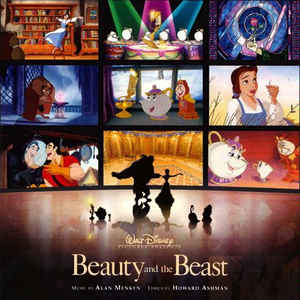
13. Diamond Edition 3D (Germany) ~ I love this artwork; it was an overset cover for the Platinum’s soundtrack release. I’d like it more if they hadn’t added a gold border. Btw, am I the only one who loved the Platinum soundtrack’s cover? The one with a crowd of images from the film in the background with Belle and Beast dancing in shadow and all the servants crowded around?
14. Target Digibook ~ It looks okay, if a little bizarre. For some reason, the cover makes me think of Christmas.
15. Heroes Cover ~ Even though I put this low, I actually don’t mind this clipart of Belle.
16. Japanese Laserdisc ~ This might be Disney blasphemy, but I don’t really like this artwork… I like the artwork used for the Deluxe DVD (UK) cover a little better, but I’m not too crazy about that one either. This artwork looks good as the back cover for the Best Buy Steelbook though.
17. WIP VHS ~ This looks sort of like a sketchbook that you would open and flip the pages.
18. Diamond Edition 3D Limited Edition (Germany) ~ It’s alright. Looks more like a coloring book cover.

 To think that was so long ago now.
Yes, thank you for this thread, farerb! It's been a lot of fun.
EDIT: I forgot to rank the US's Diamond 3D version.
2. UK VHS ~ I chose to rank this one higher than the other one with the same cover simply because the logo’s nicer.
3. Classics VHS
4. Diamond Edition Blu-Ray ~ My favorite thing is that the background is the ballroom, that they included the chandelier and the beautiful window-doors opening out onto the balcony* (I just had a thought that I hope they have a cover of the film in the future of Belle and Beast on the balcony), and it's mostly gold. I mean, I like the purples of the Classics VHS, too. And yet these are the colors I most associate with the film. The only thing I don’t really like about this one is the logo box. What a bizarre shape they used. It’s like an alien spaceship. And it’s even more noticeable on the pink cover.
5. WIP Laserdisc
6. Diamond Edition DVD ~ It’s not perfect (Gaston looks the worst of all the characters), still there's something I really like about the arrangement. I find it very appealing visually even if it could be better.
7. Platinum Edition ~ I don't like Belle's face here. Like Mooky, I used to love this one more than I do now. This version of B&tB was the first movie I ever bought actually! I believe I bought it and the Snow White Platinum DVD at the same time. B&tB was also the first film I bought on Blu-ray. It's not even my favorite movie, so it's funny it got the honor both times.
8. Deluxe DVD (UK)
9. Signature Collection
10. Diamond Edition 3D ~ I wish the title was still in a logo box (even if I wish it was better shaped). The cover looks better with it in the center. Plus, I hate that they blotted out some of the ballroom. I also prefer the blue border over this silver one.
11. Diamond Edition Blu-Ray w/ Book (the Pink Cover) ~ The flying saucer logo box draws more attention to itself, plus they threw in that stupid Diamond. That reminds me, I’m not sure if I’ve said it in the past: I hate the borders on the Diamond covers. So ugly.
12. Collector’s Edition (UK) ~ I like that the Beast is holding Belle’s chin here.
13. Diamond Edition 3D (Germany) ~ I love this artwork; it was an overset cover for the Platinum’s soundtrack release. I’d like it more if they hadn’t added a gold border. Btw, am I the only one who loved the Platinum soundtrack’s cover? The one with a crowd of images from the film in the background with Belle and Beast dancing in shadow and all the servants crowded around?
14. Target Digibook ~ It looks okay, if a little bizarre. For some reason, the cover makes me think of Christmas.
15. Heroes Cover ~ Even though I put this low, I actually don’t mind this clipart of Belle.
16. Japanese Laserdisc ~ This might be Disney blasphemy, but I don’t really like this artwork… I like the artwork used for the Deluxe DVD (UK) cover a little better, but I’m not too crazy about that one either. This artwork looks good as the back cover for the Best Buy Steelbook though.
17. WIP VHS ~ This looks sort of like a sketchbook that you would open and flip the pages.
18. Diamond Edition 3D Limited Edition (Germany) ~ It’s alright. Looks more like a coloring book cover.
That is very pretty. I would've liked that for its 30th Anniversary release. Hopefully it gets released on the physical format again and they do something like that at one point or another. I'm sure there will still be physical releases for a very long time really, although I expect they'll become harder to find--maybe only purchasable through online stores--as the general public moves further and further to digital-only the next 50 years.universALLove wrote:Oh my gosh I so would’ve loved that as the 4k cover.
I believe that, too. I try to use emoji's so often in order to try to get my tone of voice across, but even then sometimes it's lost.D82 wrote:I believe if we were talking face to face, these arguments wouldn't happen so frequently.
I didn't want to take away from B&tB with these TLM-related posts, just wanted to say this is really nice! It looks almost like the cover for a vinyl record. Even without the top portion, it's still a pretty picture of Ariel.D82 wrote: The Panini sticker album did use that poster as a cover, but without Triton, Ursula and the palace, which would also still make for a nice home video cover in my opinion.
https://i.imgur.com/c0CfcRt.jpg
I like the drawing of Ariel in the original poster, but I do think the Classics VHS cover has the nicer picture of Eric though. I love both pictures though. I think Ursula looks a little less psychotic in the VHS version.rodis wrote:1. Classics VHS - I'm being overwhelmed with nostalgia as I look at it. Some of my best childhood memories. I for one think Ariel and Eric look nothing like themselves in the original poster... revised VHS cover is gorgeous.
Yeah, I remember how excited I was to finally own the film on DVD! And I bought it with my own money and everything.rodis wrote:3. Platinum Edition - my god how I've waited for this one to come out!
I suppose she's supposed to be looking at the beautiful ballroom, ceiling paintings, and chandelier.farerb wrote:(In regards to the Diamond covers) And I don't understand why Belle is looking at the ceiling.
Yes, thank you for this thread, farerb! It's been a lot of fun.
EDIT: I forgot to rank the US's Diamond 3D version.
Last edited by Disney's Divinity on Fri Feb 14, 2020 3:46 pm, edited 5 times in total.

Listening to most often lately:
Christina Aguilera ~ "Cruz"
Sombr ~ "homewrecker"
Megan Moroney ~ "Beautiful Things"
Re: Comparing Home Releases Cover Arts
It actually makes sense since it's one of the earliest titles to be released on both formats.Disney's Divinity wrote: This version of B&tB was the first movie I ever bought actually! I believe I bought it and the Snow White Platinum DVD at the same time. B&tB was also the first film I bought on Blu-ray. It's not even my favorite movie, so it's funny it got the honor both times.
I think it's just supposed to be a demonstration of how it will look when the light shines on it like The Lion King's steelbook.Disney's Divinity wrote: 8. Best Buy Steelbook ~ I wish the lines didn’t fade out at the top and bottom. Still, it’s simple and elegant.
I like that as well.Disney's Divinity wrote: Btw, am I the only one who loved the Platinum soundtrack’s cover? The one with a crowd of images from the film in the background with Belle and Beast dancing in shadow and all the servants crowded around?
Thank youDisney's Divinity wrote: Yes, thank you for this thread, farerb! It's been a lot of fun.
-
Disney's Divinity
- Ultimate Collector's Edition
- Posts: 16400
- Joined: Thu Mar 17, 2005 9:26 am
- Gender: Male
Re: Comparing Home Releases Cover Arts
Thank you for posting that picture. I think it looks very classy. I suppose screencaps on a DVD or Blu-ray cover would be a little weird though.
Listening to most often lately:
Christina Aguilera ~ "Cruz"
Sombr ~ "homewrecker"
Megan Moroney ~ "Beautiful Things"
Re: Comparing Home Releases Cover Arts
Better image:
Yes, I think it works better as a soundtrack. I also think its slipcover looks better as a soundtrack than a Blu-ray cover.
Speaking of soundtracks, what do you all think about the Legacy Collection covers:
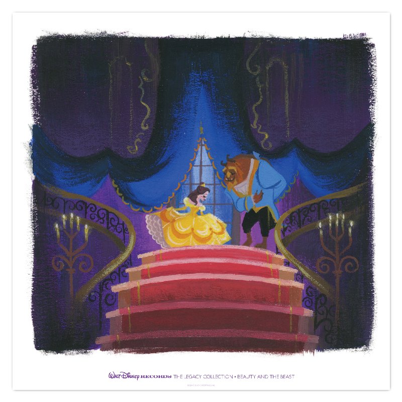
Yes, I think it works better as a soundtrack. I also think its slipcover looks better as a soundtrack than a Blu-ray cover.
Speaking of soundtracks, what do you all think about the Legacy Collection covers:
-
Disney's Divinity
- Ultimate Collector's Edition
- Posts: 16400
- Joined: Thu Mar 17, 2005 9:26 am
- Gender: Male
Re: Comparing Home Releases Cover Arts
Not to hog the conversation: I love the Legacy Collection cover for B&tB, in part because it uses one of the best shots from the film as its basis! You could tell Bove went to pains to make it look as nice as possible. I think the next best LC cover is The Aristocats cover actually, with TLM's in third. Cinderella's is beautiful, too, if only the stairs had looked better.
EDIT:
EDIT:
I didn't quite understand what this meant when I first read it, but re-reading your post again just now, it clicked. Stupid me. I ranked it a little higher now I understand it's supposed to be sort of a flicker.farerb wrote: I think it's just supposed to be a demonstration of how it will look when the light shines on it like The Lion King's steelbook.
Listening to most often lately:
Christina Aguilera ~ "Cruz"
Sombr ~ "homewrecker"
Megan Moroney ~ "Beautiful Things"
-
Disney Duster
- Ultimate Collector's Edition
- Posts: 14133
- Joined: Fri Jun 17, 2005 6:02 am
- Gender: Male
- Location: America
Re: Comparing Home Releases Cover Arts
Farerb, yes, even though it comes from clipart, they did make the Signature Collection one more like Belle and look nice.
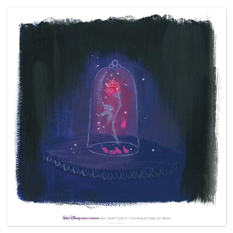
As for the Lorelay Bove covers, The Little Mermaid ones are nice, especially the front cover, and I think she is supposed to be near the top of her grotto in the back one? The Beauty and the Beast ones are gorgeous. I actually would rate the Little Mermaid front cover above the Beauty and the Beast ones though.
Marce82, oh, ok, I get you. But Ariel doesn't look at the camera in the poster.