https://www.thehut.com/blu-ray/the-litt ... 12092.html
Comparing Home Releases Cover Arts
-
DisneyBluLife

- Gold Classic Collection
- Posts: 381
- Joined: Sun Oct 14, 2012 10:36 am
- Location: Sweden
Re: Comparing Home Releases Cover Arts
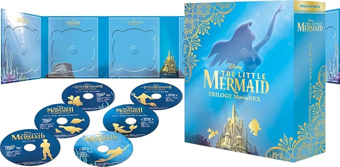
UK Blu-ray The little mermaid trilogy. Ariel almost looks like she is going to eat Flounder at any time . 
https://www.thehut.com/blu-ray/the-litt ... 12092.html
https://www.thehut.com/blu-ray/the-litt ... 12092.html
-
Disney's Divinity

- Ultimate Collector's Edition
- Posts: 16407
- Joined: Thu Mar 17, 2005 9:26 am
- Gender: Male
Re: Comparing Home Releases Cover Arts
They could've used that one for a fishsticks cover.

Listening to most often lately:
Christina Aguilera ~ "Cruz"
Sombr ~ "homewrecker"
Megan Moroney ~ "Beautiful Things"

Re: Comparing Home Releases Cover Arts
They took that clip art from Ariel's Beginning where she holds that music box.DisneyBluLife wrote:UK Blu-ray The little mermaid trilogy. Ariel almost looks like she is going to eat Flounder at any time .
https://www.thehut.com/blu-ray/the-litt ... 12092.html
Re: Comparing Home Releases Cover Arts
Hey Disney Divinity...
About that pose for the classics VHS... it doesn't look like she is touching her throat... it looks like "moi? lil' ol' me?" (in a southern accent).
Seriously, people... look up the original poster. GORGEOUS (not that it should have been the cover)
About that pose for the classics VHS... it doesn't look like she is touching her throat... it looks like "moi? lil' ol' me?" (in a southern accent).
Seriously, people... look up the original poster. GORGEOUS (not that it should have been the cover)
-
Disney's Divinity
- Ultimate Collector's Edition
- Posts: 16407
- Joined: Thu Mar 17, 2005 9:26 am
- Gender: Male
Re: Comparing Home Releases Cover Arts
You have a right to your opinion. Naturally, I disagree.
Yeah, the original poster is nice, but I actually think the VHS cover is better other than Ariel's expression, mostly because it cuts Scuttle, has a better picture of Flounder, and leaves off the busy bottom portion. Eric looks a tad better on the VHS, too, although neither are perfect. Kind of a reverse situation of the Masterpiece VHS for me.
Yeah, the original poster is nice, but I actually think the VHS cover is better other than Ariel's expression, mostly because it cuts Scuttle, has a better picture of Flounder, and leaves off the busy bottom portion. Eric looks a tad better on the VHS, too, although neither are perfect. Kind of a reverse situation of the Masterpiece VHS for me.
Last edited by Disney's Divinity on Mon Feb 10, 2020 10:10 pm, edited 1 time in total.
Listening to most often lately:
Christina Aguilera ~ "Cruz"
Sombr ~ "homewrecker"
Megan Moroney ~ "Beautiful Things"
Re: Comparing Home Releases Cover Arts
These are the posters:
Re: Comparing Home Releases Cover Arts
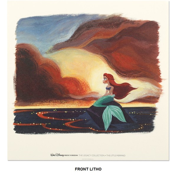
What do you think about Lorelay Bove's art that was used for the Legacy Collection?
-
Disney's Divinity
- Ultimate Collector's Edition
- Posts: 16407
- Joined: Thu Mar 17, 2005 9:26 am
- Gender: Male
Re: Comparing Home Releases Cover Arts
I'm glad The Little Mermaid has at least four great posters, with those two you posted, farerb, along with the one of her swimming to the surface in almost-silhouette and the other one of her sitting on the rock in the moonlight. If I had to rank them, I'd go with:
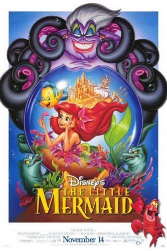
1. Re-release Poster ~ I think I like this because it heavily features Ursula's POV. The castle and Triton being above Ariel's hair--almost as if visually telling us this is what Ursula sees whenever she looks at Ariel. Her teeming mass of tentacles are just so amazingly done. I can't believe they've never utilized her tentacles in the TLM covers very much. The funny thing is I have an alternate version of this that was in one of those Disney Adventure magazines back in the day. Ariel and Sebastian look a little different there, the latter more than the former. Sebastian isn't dancing, he has a more consoling pose/expression.
2. Original Poster ~ I was always confused by the treasure box at the bottom... I know Ariel hunts for treasure, but her treasure is usually human garbage, not gold. That part looks sort of like a videogame advertisement.
3. Silhouette Ariel Poster
4. Ariel in Moonlight Poster ~ I'm glad they used it for the main menu of the Diamond and Signature releases.
I always liked Bove's artwork, but I know she's probably an acquired taste for others. Her TLM cover is one of her best, imo--and such a different kind of mood than you'd expect for a TLM cover. Very melancholy.
1. Re-release Poster ~ I think I like this because it heavily features Ursula's POV. The castle and Triton being above Ariel's hair--almost as if visually telling us this is what Ursula sees whenever she looks at Ariel. Her teeming mass of tentacles are just so amazingly done. I can't believe they've never utilized her tentacles in the TLM covers very much.
2. Original Poster ~ I was always confused by the treasure box at the bottom... I know Ariel hunts for treasure, but her treasure is usually human garbage, not gold.
3. Silhouette Ariel Poster
4. Ariel in Moonlight Poster ~ I'm glad they used it for the main menu of the Diamond and Signature releases.
I always liked Bove's artwork, but I know she's probably an acquired taste for others.
Last edited by Disney's Divinity on Mon Feb 10, 2020 10:34 pm, edited 2 times in total.
Listening to most often lately:
Christina Aguilera ~ "Cruz"
Sombr ~ "homewrecker"
Megan Moroney ~ "Beautiful Things"
Re: Comparing Home Releases Cover Arts
I actually really like Lorelay Bove's artwork. In general, the legacy collection covers are BEAUTIFUL, including TLM's. Extra points because it is based on a shot from the film which is in turn based on the little mermaid statue in Copenhagen. And I love the dramatic morning sky.
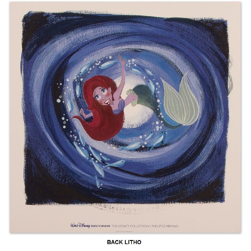
The back cover where she is in the cave... Ariel looks great. But overall it doesn't work for me, cause she doesn't look like she is at the bottom of the cave; she looks like she is at the bottom of some kind of underwater tornado...
Plus, it looks like she tried to mix the shots from "wonderin free..." and the very end of the song, where she is at the very bottom of the cave. Still, Ariel looks great.
PS: I was referring to the original release poster. Thanks for posting it, Fareb!
-
Disney's Divinity
- Ultimate Collector's Edition
- Posts: 16407
- Joined: Thu Mar 17, 2005 9:26 am
- Gender: Male
Re: Comparing Home Releases Cover Arts
So was I... Scuttle and Eric aren't in the other posters? I'm sorry for all the confusion I cause.
Listening to most often lately:
Christina Aguilera ~ "Cruz"
Sombr ~ "homewrecker"
Megan Moroney ~ "Beautiful Things"
-
JeanGreyForever

- Signature Collection
- Posts: 5335
- Joined: Sun Sep 15, 2013 5:29 pm
Re: Comparing Home Releases Cover Arts
Japanese Blu-Ray trilogy sets.

Also some fanedits of the Signature Edition covers.
https://www.instagram.com/p/BrYt6KoHLTD/
https://www.instagram.com/p/Brq2cykH4_8/
Also some fanedits of the Signature Edition covers.
https://www.instagram.com/p/BrYt6KoHLTD/
https://www.instagram.com/p/Brq2cykH4_8/


We’re a dyad in the Force. Two that are one.
"I offered you my hand once. You wanted to take it." - Kylo Ren
"I did want to take your hand. Ben's hand." - Rey
-
JeanGreyForever
- Signature Collection
- Posts: 5335
- Joined: Sun Sep 15, 2013 5:29 pm
Re: Comparing Home Releases Cover Arts
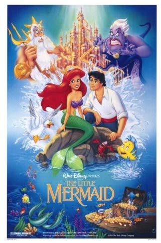
1. Diamond Edition 3D Blu-Ray - Such an iconic image and one of the few times that Disney took their beloved poster art and made it into a cover.
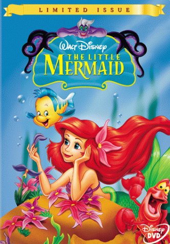
2. Masterpiece VHS/Limited Issue DVD - I grew up with this cover and I absolutely adore it. The VHS has a better composition over the DVD b/c of Sebastian's placement. However I loved this image of Ariel and the way Ursula was looming over the characters.
3. Platinum DVD - Another cover I grew up with. I loved the Platinum Line and was waiting years for TLM to finally get one of its own so this cover is incredibly special to me just based on that alone. What I always loved was that this cover kept Ariel on the rock but still managed to portray the underwater characters beneath her. There's no Eric but I almost prefer how they substituted him with the ship which is a nice addition we don't see too often on TLM covers. And Sebastian's pose was just perfect.
4. Classic VHS - I like this a lot but I prefer the theatrical poster. The characters are way more on-model in the poster, especially Ariel.
5. Japanese Blu-Ray Trilogy - This clipart of Ariel is used in the Japanese VHS cover but I prefer it here. The white seashell background and gold lettering and stencils are just very classy. IMO this would make a very nice cover for the TV series if it was ever released.
6. Japanese Blu-Ray Trilogy (MovieNEX) - I'm a big fan of the MovieNEX trilogy cover art for Disney films. TLM might be my favorite b/c of the light blue coloring and using the iconic Ariel image from the poster. However the original poster is still superior b/c it shows all of Ariel. The gold stencils and side characters are stunning additions though.
7. Zavvi Steelbook - I love Disney's Mondo art and TLM is no exceptin. All the principal charcters are basically on there and I love how they incorporated Ariel's rock, Ursula's tentacles, and Triton's throne, with Flotsam and Jetsam lurking like they do in the movie. There is a lack of Scuttle and Eric although I guess they wouldn't belong in the underwater scenery so it's not a huge deal. The shade of purple used is my main issue b/c it's too bright and not the light lavender we see in the movie.
8. Signature Collection 4K - It's similar to the Diamond Edition cover and while I'm still not a fan of the sideways title, I prefer the composition for this. Not only are the characters better drawn, but Ursula doesn't feel as out of place as King Triton did on the Diamond Cover. My main issue with this is the placement of Ariel's flower and her hair should be longer. I prefer this fanedit by far.
https://www.instagram.com/p/BrYt6KoHLTD/
9. Target Digipack - I do like this cover for the most part even though Ariel and Flounder aren't the best drawn and Sebastian's pose has been overused. But Ursula really doesn't belong on here and the coloring of Ariel's tail is inconsistent and really bothers me. This fanedit is slightly better.
https://www.instagram.com/p/Brq2cykH4_8/
10. Japanese VHS - I like this image but I've seen it so much on clipart that it doesn't have much appeal to me as a cover.
11. Best Buy Steelbook - Anything by Paige O'Hara would be an automatic favorite. However, it's a bit generic for a cover and I have a few issues, mainly how deep purple Ariel's seashells are and the placement of the flower, as well as the fact that it's green.
12. Diamond Edition Blu-Ray Digital - I go in-depth on the artwork below but overall, I prefer the Digital Variant over the Regular Diamond Edition cover b/c the gold border worked really well with the teal coloring.
13. Diamond Edition Blu-Ray - This cover is okay but a bit generic and I don't like how minuscule King Triton is. It's like they found a lit bit of free space and decided to shoehorn him in there. None of the characters are drawn as well as I would like them to be. The overall composition is nice though and I own this so I'm a little more lenient towards it.
14. Spanish DVD - This cover is nice but nothing special. I don't think Ursula, Triton, AND Eric all needed to be up there. And once more, I've seen this used in clipart so often that it doesn't have much appeal as a cover by this point.
15. German Blu-Ray Trilogy - This ranks so low only because I don't like how they used the redesign clipart of Ariel.
16. UK Blu-Ray Trilogy - The clipart comes from Ariel's Beginning which I'm not a fan of at all so I'm automatically biased against it.
17. Diamond Edition DVD - Absolutely worst cover by far. Even worse than that atrocious Dumbo cover where his ears are super exaggerated. Ursula looks pretty bad here too like she's snapping a pic she's posting on Insta.
We’re a dyad in the Force. Two that are one.
"I offered you my hand once. You wanted to take it." - Kylo Ren
"I did want to take your hand. Ben's hand." - Rey
-
Disney Duster

- Ultimate Collector's Edition
- Posts: 14163
- Joined: Fri Jun 17, 2005 6:02 am
- Gender: Male
- Location: America
Re: Comparing Home Releases Cover Arts
Marce82, you are so right that Ariel's expression on the cover is a little strange and, to me, it's weird she and Eric have never been allowed to look directly at one another in either the VHS or the original poster. This may sound strange, but I have always liked the way her tail looks, even though saying it looks like there are thighs in there is a fair statement. She is certainly looking like she is saying, "Who, me?" instead of pointing to her throat to sing, though!
I loved reading about your personal connections to the covers, JeanGreyForever.
I think in the Spanish cover, you do need three characters above Ariel as opposed to two. Even in the Classics cover and poster, it's Triton, Ursula, and the castle. You need three things or it doesn't look right. It's still an ugly ass cover that makes little sense.


Re: Comparing Home Releases Cover Arts
She looks like Nicole Kidman there.farerb wrote:I like the concept, but I don't get why they gave Ariel a face lift and a nose job.DisneyBluLife wrote:German The little mermaid trilogy
https://www.blu-ray.com/movies/The-Litt ... ray/78009/
By the way, the Japanese VHS was also inspired by a poster/banner for the 1997 re-release:

I'll try to post my ranking later.
Re: Comparing Home Releases Cover Arts
.
Last edited by Marce82 on Wed Feb 12, 2020 3:09 am, edited 1 time in total.
Re: Comparing Home Releases Cover Arts
[quote="Disney Duster"][b]Marce82[/b], you are so right that Ariel's expression on the cover is a little strange and, to me, it's weird she and Eric have never been allowed to look directly at one another in either the VHS or the original poster. This may sound strange, but I have always liked the way her tail looks, even though saying it looks like there are thighs in there is a fair statement. She is certainly looking like she is saying, "Who, me?" instead of pointing to her throat to sing, though![/quote]
Disney Duster..... I pretty much agree with what you said.
In the original poster, it makes a little more sense: all characters are looking at Ariel, and expressing something toward her. Eric is DEF into her in that original poster! Ariel, in turn, is looking at the audience. I remember this more an art history class: this is what is called an interlocutor figure. It was often used in the renaissance to draw in the onlooker into the scene (there are often people in old paintings looking at the onlooker) Yay the original poster!
D82.... yes! She kinda does look like Nicole Kidman... when she was at her worst with plastic surgery/fillers... Not a good look!
-
DisneyBluLife
- Gold Classic Collection
- Posts: 381
- Joined: Sun Oct 14, 2012 10:36 am
- Location: Sweden
Re: Comparing Home Releases Cover Arts
Swedish The Little Mermaid 2-movie collection DVD 2008
https://www.discshop.se/filmer/dvd/den_ ... isc/P69325
https://www.discshop.se/filmer/dvd/den_ ... isc/P69325

Re: Comparing Home Releases Cover Arts
That's not a terrible cover. They used an image of Ariel from a previous Disney Princess Stories DVD and the image of Melody from the original TLM2 DVD art. I would've loved it if they used a more suitable image for Ariel though. This one looks nothing like her.

If it's not baroque, don't fix it.
-
Disney's Divinity
- Ultimate Collector's Edition
- Posts: 16407
- Joined: Thu Mar 17, 2005 9:26 am
- Gender: Male
Re: Comparing Home Releases Cover Arts
I've never seen that picture of Ariel before. What is she holding? A music box or a book? Of course Melody is recycled from the TLMII VHS cover.DisneyBluLife wrote:Swedish The Little Mermaid 2-movie collection DVD 2008
https://www.discshop.se/filmer/dvd/den_ ... isc/P69325
This is a good spot to say (since the sequels are likely not going to be discussed here), that I do like that one TLM2 cover that was released around the time of TLM's Platinum. It's the one where Ariel and Melody are swimming on either side of the logo in the center, with Morgana on the bottom left and Triton on the bottom right. I’m not fond of the movie other than you get more of Pat Carroll, Jodi Benson, Samuel Wright, and Kenneth Mars, but I liked that cover. I wasn’t too crazy about the Ariel’s Beginning cover, but it was okay.
Btw, I had another thought yesterday and I'll put it here: one thing I do like better about the original poster v. the Classics VHS version of it is that in the original poster, Triton and Ursula are both so much larger in size than Ariel and Eric. It makes them seem almost like battling gods/titans.
You posted this as I was typing my post. Thanks, I was wondering where that picture of Ariel came from.Sicoe Vlad wrote:That's not a terrible cover. They used an image of Ariel from a previous Disney Princess Stories DVD and the image of Melody from the original TLM2 DVD art. I would've loved it if they used a more suitable image for Ariel though. This one looks nothing like her.
Listening to most often lately:
Christina Aguilera ~ "Cruz"
Sombr ~ "homewrecker"
Megan Moroney ~ "Beautiful Things"
Re: Comparing Home Releases Cover Arts
I'll only rank my top 7 covers:
1. Limited Issue DVD: I didn't have a VHS player until 1992 and at first we just rented the movies, so I never owned the Classics VHS of The Little Mermaid. The first time I was able to get it was with this cover, so that probably influences my decision a bit, but I always loved this artwork. It's quite simple, but Ariel and the others are drawn very well, probably because it's based on a theatrical poster. I don't like the golden frame of the Masterpiece Collection, that's why I chose the Limited Issue. But I prefer the equivalent of this cover for Spain (below right) to both, because Sebastian has a more proportionate size on it and, like Disney's Divinity, I prefer the logo with a white background.

2. Platinum Edition DVD: We never got this cover in Spain, but I own this release too (the UK version), because in Spain they didn't include the disc of extras. I agree about several of the flaws Marce82 and others have mentioned, but I love that they used this iconic pose of Ariel, the ship and the bright colors. I like this one almost as much as my number one.
3. Japanese VHS: I agree with the defects others have pointed out about this one too, but Ariel looks quite accurate and I really like her pose here too. For that alone, I prefer it to the rest of covers left.
4. Diamond Edition 3D Blu-ray: I agree with everybody else that this drawing it's beautiful, but for some reason I don't love it as a cover. Maybe it's because of how it has been cropped. The full poster is much better in my opinion.
5. Signature Collection 4K UHD: I really like the idea. And, despite some minor inaccuracies, the characters are quite on-model too. But I think this cover would be better without Ursula there in the bottom.
6. Classics VHS: As I've said, I've never owned this release, but I remember the cover from the video store and I've never liked it. Mainly because it looked like an inferior version of my favorite poster for the movie and because most of the characters, and especially Ariel, look quite bad here in my opinion. However, the layout is really good, so that's why I don't rank it lower.
7. Target Digipack: I really like the idea for this one, but the execution (especially for the bottom half) is not very good. The final artwork is not much better in my opinion. I wish they had made the top half a separate drawing instead of drilling Ariel's rock to show the other characters and the palace.
And I agree with the majority that the Diamond Edition DVD is the worst one.
1. Limited Issue DVD: I didn't have a VHS player until 1992 and at first we just rented the movies, so I never owned the Classics VHS of The Little Mermaid. The first time I was able to get it was with this cover, so that probably influences my decision a bit, but I always loved this artwork. It's quite simple, but Ariel and the others are drawn very well, probably because it's based on a theatrical poster. I don't like the golden frame of the Masterpiece Collection, that's why I chose the Limited Issue. But I prefer the equivalent of this cover for Spain (below right) to both, because Sebastian has a more proportionate size on it and, like Disney's Divinity, I prefer the logo with a white background.
That's something I never liked about the cover either. I don't know why they drew it like that, it doesn't make sense.Disney's Divinity wrote:Looking more at Ursula at the top, it's funny because her tentacles do a bit of a disappearing act. The tentacle on either side that loops up the highest and then bends down behind the other isn't colored where it should be behind the other tentacle Instead you have gold background where there should be tentacle.
2. Platinum Edition DVD: We never got this cover in Spain, but I own this release too (the UK version), because in Spain they didn't include the disc of extras. I agree about several of the flaws Marce82 and others have mentioned, but I love that they used this iconic pose of Ariel, the ship and the bright colors. I like this one almost as much as my number one.
3. Japanese VHS: I agree with the defects others have pointed out about this one too, but Ariel looks quite accurate and I really like her pose here too. For that alone, I prefer it to the rest of covers left.
4. Diamond Edition 3D Blu-ray: I agree with everybody else that this drawing it's beautiful, but for some reason I don't love it as a cover. Maybe it's because of how it has been cropped. The full poster is much better in my opinion.
5. Signature Collection 4K UHD: I really like the idea. And, despite some minor inaccuracies, the characters are quite on-model too. But I think this cover would be better without Ursula there in the bottom.
6. Classics VHS: As I've said, I've never owned this release, but I remember the cover from the video store and I've never liked it. Mainly because it looked like an inferior version of my favorite poster for the movie and because most of the characters, and especially Ariel, look quite bad here in my opinion. However, the layout is really good, so that's why I don't rank it lower.
I always thought she was being shy there because of Eric and that's why she had her hand in that position, but now I think it's very likely that it's what you said.Disney's Divinity wrote:I wonder if the reason they chose to have her hand up where her neck is was to gesture towards her voice, as if she were about to sing.
7. Target Digipack: I really like the idea for this one, but the execution (especially for the bottom half) is not very good. The final artwork is not much better in my opinion. I wish they had made the top half a separate drawing instead of drilling Ariel's rock to show the other characters and the palace.
And I agree with the majority that the Diamond Edition DVD is the worst one.