LOL! But I haven't seen that documentary yet unfortunately.Marce82 wrote:If you've ever seen the documentary The Sweatbox, you can see the moment where they tell Sting the title change from "Empire of the Sun" to "The emperor's new groove"... he let's out a perfect groan that shows a mix of disappointment and disgust.
Comparing Home Releases Cover Arts
-
Disney Duster

- Ultimate Collector's Edition
- Posts: 14163
- Joined: Fri Jun 17, 2005 6:02 am
- Gender: Male
- Location: America
Re: Comparing Home Releases Cover Arts

Re: Comparing Home Releases Cover Arts
DisneyBluLife: I have to say, I think those Swedish ones are very good adaptations of those two titles, and they fit the movies very well.
I'm not sure about the Israeli ones... again, maybe too colloquial. The problem with colloquial is that it AGES very quickly. During the Disney Renaissance, they tried to hold on to a sense of timelessness and they wanted the films to fit on the shelf with the Walt-era classics. Oh well.
D82: I actually like "Vacas Vaqueras" better than the title in Spain (no offense). Can't get past the word "zafarrancho"...
The title for Emperor in Latin America is "Las Locuras del Emperador"... which has pretty much the same meaning as the one used in Spain, maybe a little more streamlined? I actually like both Latin and Spaniard titles better for the movie than the original English one. Can't get past "groove".
I was aware of the play on the original title of this movie. I actually knew "The Emperor's new clothes" as a child (which I knew as "Las nuevas ropas del emperador", which is a literal translation). I'm ok with them not trying to adapt the title and shoehorn the H.C. Andersen reference into it in Spanish.
Disney Duster: I have sent you a private message.

Re: Comparing Home Releases Cover Arts
Yeah, that's true.Marce82 wrote:The problem with colloquial is that it AGES very quickly.
It's very similar to the title for Spain. Personally I prefer the English one, but both of these are fine too.Marce82 wrote:The title for Emperor in Latin America is "Las Locuras del Emperador"... which has pretty much the same meaning as the one used in Spain, maybe a little more streamlined? I actually like both Latin and Spaniard titles better for the movie than the original English one. Can't get past "groove".
I also knew about the fairy tale. My mother used to tell me that story when I was a child. I never read it though, but I had a storybook with several Andersen stories and in the back other volumes were advertised and this tale was included in one of them. Its title in Spain is similar to the one you mentioned: "El traje nuevo del emperador".Marce82 wrote:I was aware of the play on the original title of this movie. I actually knew "The Emperor's new clothes" as a child (which I knew as "Las nuevas ropas del emperador", which is a literal translation). I'm ok with them not trying to adapt the title and shoehorn the H.C. Andersen reference into it in Spanish.

Re: Comparing Home Releases Cover Arts
The moment we've all been waiting for will soon arrive.
Re: Comparing Home Releases Cover Arts
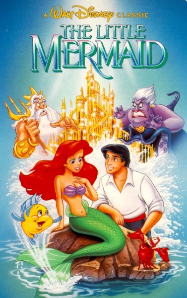
The Little Mermaid:
Classics VHS:
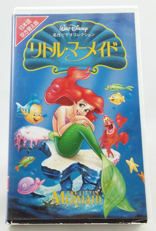
Japanese VHS:
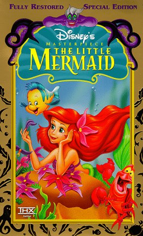
Masterpiece VHS:
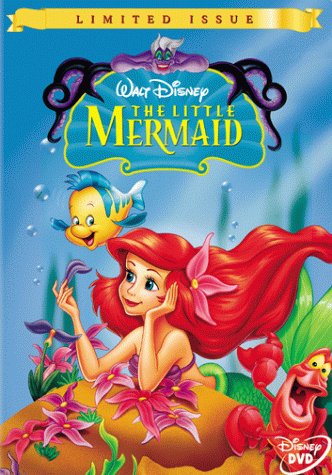
Limited Issue DVD:
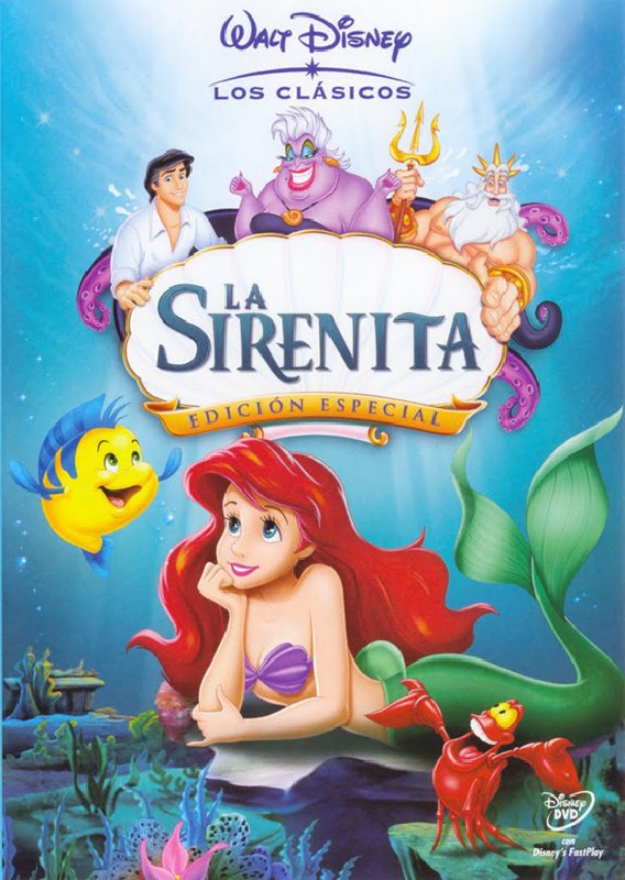
Spanish DVD:
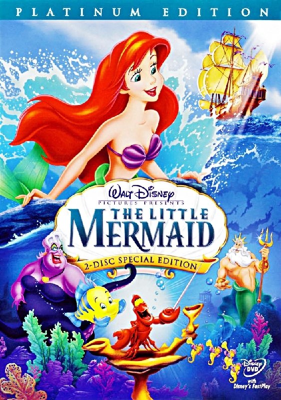
Platinum Edition DVD:
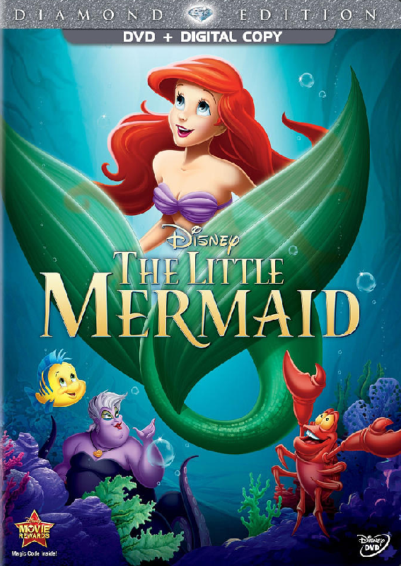
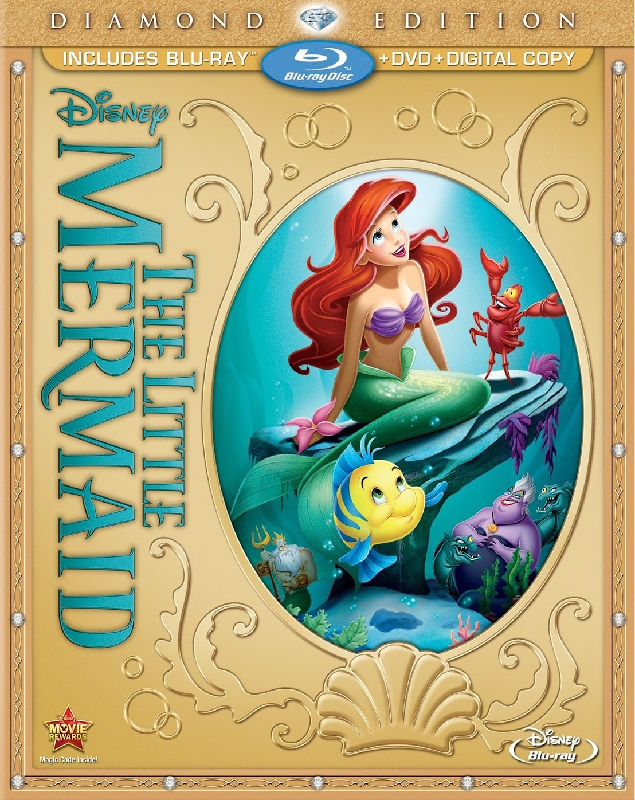
Diamond Edition DVD:
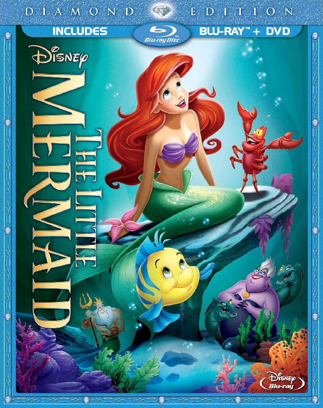
Diamond Edition Blu-ray:
Diamond Edition Blu-ray (Ellipse):
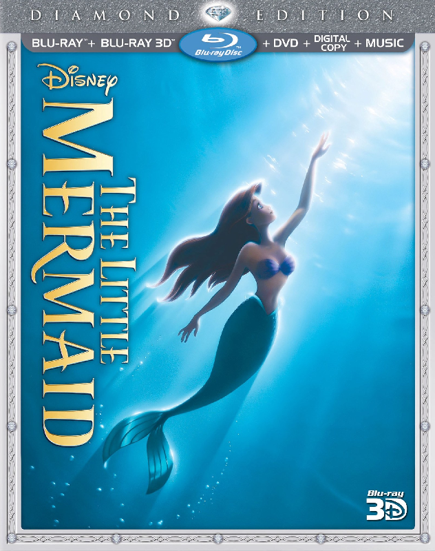
Diamond Edition 3D Blu-ray:
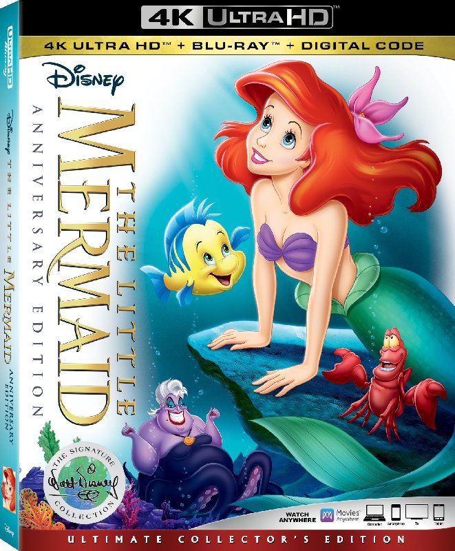
Signature Collection 4K UHD:
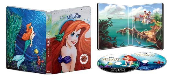
Best Buy Steelbook:
Target Digipack:
Classics VHS:
Japanese VHS:
Masterpiece VHS:
Limited Issue DVD:
Spanish DVD:
Platinum Edition DVD:
Diamond Edition DVD:
Diamond Edition Blu-ray:
Diamond Edition Blu-ray (Ellipse):
Diamond Edition 3D Blu-ray:
Signature Collection 4K UHD:
Best Buy Steelbook:
Target Digipack:
Re: Comparing Home Releases Cover Arts
1. Diamond Edition 3D - This is also the 1997 theatrical rerelease poster. I always loved it ever since I saw it in the newspaper. There's something really poetic about it.
2. Limited Issue/Masterpiece VHS - I like the design and the way the characters are drawn, and Ursula at the top. It's simple, elegant and beautiful.
3. Platinum Edition - The Platinum Editions always had some of my favorite covers. This one is very colorful and very representative of the film.
4. Best Buy Steelbook - At first I didn't really like it, but it has grown on me ever since. I like Paige O'Hara and I like that they actually put effort in this one than using an old clip art or an off model Ariel.
5. Target Digipack - Another one that's good, though for some reason I find it to be really wierd. I guess the way they placed the characters.
6. Diamond Edition - I like the concept, but Ariel could have been drawn a bit better. I don't like the curls coming out of her hair.
7. Spanish VHS - Ariel is a little weird here and I don't really like that there are three characters at the top.
8. Classics VHS - In my opinion the characters are not drawn really well and I don't get why Atlantica is above water.
9. Signature Collection - It could have placed higher had Ariel not had a short hair. I also don't like the semi colored background.
10. Japanese VHS - It's just weird. Seems more like it's one of her TV episodes than the film.
11. Diamond Edition (ellipse) - I just really despise that ellipse.
12. Diamond Edition DVD - I get that she's a Mermaid. Did we really need her fins to take up like a third of the cover as if they were the Genie? They are also disproportionate to the rest of her body.
-
Disney's Divinity

- Ultimate Collector's Edition
- Posts: 16407
- Joined: Thu Mar 17, 2005 9:26 am
- Gender: Male
Re: Comparing Home Releases Cover Arts
1. Classics VHS ~ I’m not crazy about Ariel’s face, but I love everything else about this. Ursula, Triton, the sparkling palace, Flounder, Sebastian. I love the placement of everything with Ursula and Triton faced in the direction of Ariel and Eric respectively--Ursula trying to use Ariel, Triton trying to stop her love of humans--the castle between the two representing the fight over property essentially (Ariel, Atlantica, and the trident are all commodities leveraged back-and-forth between them). The dynamic between Triton and Ursula plays a big role in why I love the film, too, and I've always liked the way this picture gets the story across so well, with the older generation playing a different game and on another level than the other characters with both of them attempting to control Ariel, who is a force unto herself. Ariel has always looked a bit too Barbie bimbo for me here, but it's not horrible--and definitely better than how she looks on many of the other covers. I wonder if the reason they chose to have her hand up where her neck is was to gesture towards her voice, as if she were about to sing.
2. Diamond Edition 3D Blu-ray ~ Of course everyone loves this re-used poster. This is also the only Diamond cover for TLM I don’t hate. It's a gorgeous image, but my ideal cover would always include Ursula, Triton, and Sebastian. *shrug*
3. Target Digipak ~ I love this one. I know it re-uses a great deal and Ariel doesn’t look perfect, but I love how everything’s placed. Ariel’s tail, Flounder, and the grotto are beautiful. I love seeing the palace in the distance. And they may have used slightly altered clipart for Ursula, but at least it’s not an ugly picture of her like every other cover she appears on that I ranked below the Signature Collection.
4. Signature Collection ~ Imperfect, but eh. I like the colors for everything--the ONLY time Ursula's colors are completely right for her earrings and makeup without forgetting the beauty mark either. Sebastian is perfect. Ariel and Ursula aren't so bad they ruin it for me.
5. Platinum ~ I liked that Triton clipart, and that they tried to re-create the moment on the rock. Also that they incorporated a ship into it, too. I know Ursula is ugly and all, but she's a little too repulsive on this one... It doesn't look like her. Random thought, but I always thought Ariel's right eye was a little too far to the left.
6. Spanish DVD ~ I like the pictures for Eric and Triton. The Ursula clipart and the re-used Sebastian from the Classics cover are fine, too. Ariel's face doesn't look quite like her to me. Still, it's not too bad.
7. Japanese VHS ~ I like Ariel's pose and that they show the scales just like on the Classics VHS and the lithograph used for the Masterpiece VHS and Limited Issue DVD. I also like that they used the rock from the love me-love me not scene and "Under the Sea." Still, the characters are way out of proportion next to one another. It would be a good idea if they'd really executed it, but it seems sort of lazy and slapdash.
8. Best Buy Steelbook ~ The back is okay--not perfect, but okay. Hate the front.
9. Diamond Edition Blu-ray (Ellipse) ~ Triton is probably the only character that I don’t think looks bad on this cover. Well, F&J are alright. The pose for Flounder is really dumb. My least favorite part about all the original Diamond covers is the poor attempt at scales. The light / sheen on the tail and Ariel's hair on all these original Diamond covers is ugly for me. I don't like the Diamond line's covers in general though. I like the logo on the ellipse cover best because it's a blue-green color.
10. Diamond Edition Blu-ray
11. Limited Issue DVD
12. Masterpiece VHS ~ I love the lithograph / poster this and the Limited Issue DVD cover are taken from (always loved the dancing Sebastian clipart), but I hate these covers. Ursula looks horrible; it's a nice concept to have her at the top with her tentacles (a poor imitation of the lithograph), but her face, hands, and the ugly green eyeshadow are just horrible. I don’t know how they took such a beautiful picture and cut it down to something as ugly as these two covers. The white shell on the Platinum and Digipak work better than blue, in part because the logo is dark blue on the white shell. Something about the blue shell and the almost neon green logo on top of it looks really cheap to me. EDIT: Looking more at Ursula at the top, it's funny because her tentacles do a bit of a disappearing act. The tentacle on either side that loops up the highest and then bends down behind the other isn't colored where it should be behind the other tentacle Instead you have gold background where there should be tentacle. The left side is the worst one, because you probably shouldn't be seeing any gold at all right there. I do think the tentacles are at least better drawn than her face/arms aside from that screwup.
13. Diamond Edition DVD ~ Awful.
The top 6 are the only ones I think are good, and I'd say I only really like the top 4. EDIT: I was just looking at them again and the funny thing is, I'd say Triton is the only character that (even though he isn't on every cover) doesn't look ugly or off on any of the covers--although his eyes are a little eye-poppy on the Spanish cover. I almost think that picture of him must've used his appearance on the lithograph that the Limited Issue DVD and Masterpiece VHS covers lift from as reference, with the trident switched to the opposite side.
2. Diamond Edition 3D Blu-ray ~ Of course everyone loves this re-used poster. This is also the only Diamond cover for TLM I don’t hate. It's a gorgeous image, but my ideal cover would always include Ursula, Triton, and Sebastian. *shrug*
3. Target Digipak ~ I love this one. I know it re-uses a great deal and Ariel doesn’t look perfect, but I love how everything’s placed. Ariel’s tail, Flounder, and the grotto are beautiful. I love seeing the palace in the distance. And they may have used slightly altered clipart for Ursula, but at least it’s not an ugly picture of her like every other cover she appears on that I ranked below the Signature Collection.
4. Signature Collection ~ Imperfect, but eh. I like the colors for everything--the ONLY time Ursula's colors are completely right for her earrings and makeup without forgetting the beauty mark either. Sebastian is perfect. Ariel and Ursula aren't so bad they ruin it for me.
5. Platinum ~ I liked that Triton clipart, and that they tried to re-create the moment on the rock. Also that they incorporated a ship into it, too. I know Ursula is ugly and all, but she's a little too repulsive on this one... It doesn't look like her. Random thought, but I always thought Ariel's right eye was a little too far to the left.
6. Spanish DVD ~ I like the pictures for Eric and Triton. The Ursula clipart and the re-used Sebastian from the Classics cover are fine, too. Ariel's face doesn't look quite like her to me. Still, it's not too bad.
7. Japanese VHS ~ I like Ariel's pose and that they show the scales just like on the Classics VHS and the lithograph used for the Masterpiece VHS and Limited Issue DVD. I also like that they used the rock from the love me-love me not scene and "Under the Sea." Still, the characters are way out of proportion next to one another. It would be a good idea if they'd really executed it, but it seems sort of lazy and slapdash.
8. Best Buy Steelbook ~ The back is okay--not perfect, but okay. Hate the front.
9. Diamond Edition Blu-ray (Ellipse) ~ Triton is probably the only character that I don’t think looks bad on this cover. Well, F&J are alright. The pose for Flounder is really dumb. My least favorite part about all the original Diamond covers is the poor attempt at scales. The light / sheen on the tail and Ariel's hair on all these original Diamond covers is ugly for me. I don't like the Diamond line's covers in general though. I like the logo on the ellipse cover best because it's a blue-green color.
10. Diamond Edition Blu-ray
11. Limited Issue DVD
12. Masterpiece VHS ~ I love the lithograph / poster this and the Limited Issue DVD cover are taken from (always loved the dancing Sebastian clipart), but I hate these covers. Ursula looks horrible; it's a nice concept to have her at the top with her tentacles (a poor imitation of the lithograph), but her face, hands, and the ugly green eyeshadow are just horrible. I don’t know how they took such a beautiful picture and cut it down to something as ugly as these two covers. The white shell on the Platinum and Digipak work better than blue, in part because the logo is dark blue on the white shell. Something about the blue shell and the almost neon green logo on top of it looks really cheap to me. EDIT: Looking more at Ursula at the top, it's funny because her tentacles do a bit of a disappearing act. The tentacle on either side that loops up the highest and then bends down behind the other isn't colored where it should be behind the other tentacle Instead you have gold background where there should be tentacle.
13. Diamond Edition DVD ~ Awful.
The top 6 are the only ones I think are good, and I'd say I only really like the top 4. EDIT: I was just looking at them again and the funny thing is, I'd say Triton is the only character that (even though he isn't on every cover) doesn't look ugly or off on any of the covers--although his eyes are a little eye-poppy on the Spanish cover.
Last edited by Disney's Divinity on Fri Feb 07, 2020 2:55 pm, edited 12 times in total.

Listening to most often lately:
Christina Aguilera ~ "Cruz"
Sombr ~ "homewrecker"
Megan Moroney ~ "Beautiful Things"
-
Disney Duster
- Ultimate Collector's Edition
- Posts: 14163
- Joined: Fri Jun 17, 2005 6:02 am
- Gender: Male
- Location: America
Re: Comparing Home Releases Cover Arts
1. Masterpiece VHS - What can I say, I love the choice of poses, the placement, Ursula at the top, and a very nice border. If only the colors and shading weren't kind of ugly.
2. Limited Issue DVD - Well, it's just a less good version of the Masterpiece.
3. Diamond Edition 3D - What a great, beautiful image. Yes, it is poetic farerb! I just hate the sideways title.
4. Platinum Edition - I love everything about this one except that Ariel is too far to the left, I'd rather have her in the middle and Eric's ship on her left and Eric's castle on her right.
5. Classics VHS - Well, it's the Classics one and it's very classic! I love how it has the drama with all the characters placement's.
6. Diamond Edition Blu-ray - Really like it except for the drawing and sideways title.
7. Diamond Edtion Blu-ray with digital copy - It's like the one above except has an ok elipse.
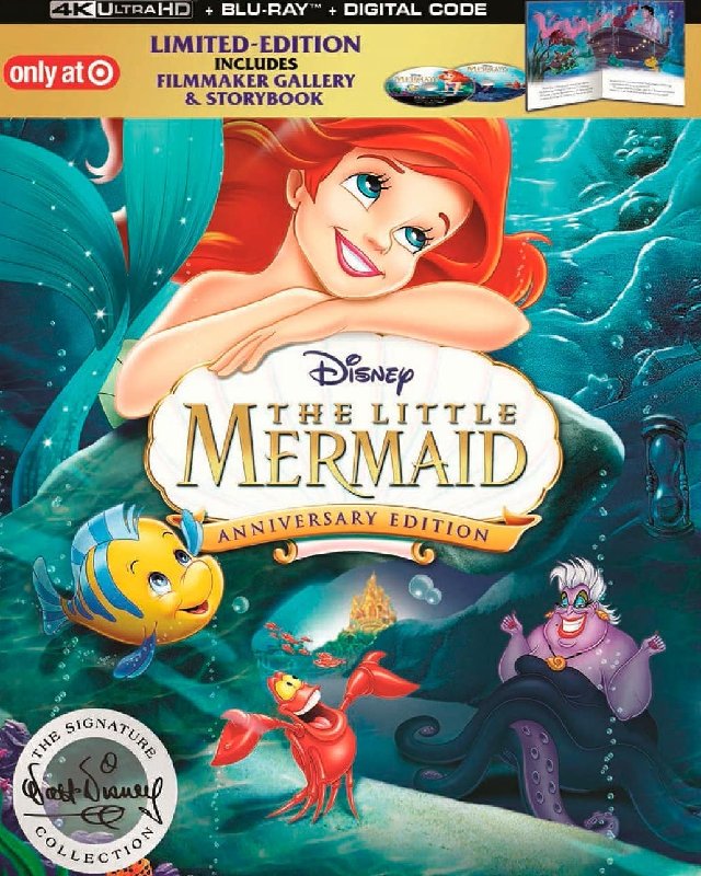
8. Signature Edition 4K UHD - Pretty good except the bad, incorrect, disproportionate drawing of Ariel.
9. Target Digipack - Meh. KInda weird with the grotto and Ariel at the top.
10. Spanish DVD - Meh.
11. Japanese DVD - Boring unimaginative re-use of clipart.
12. Diamond Edition DVD - Ew. So bad with the fins being so huge.
13. Best Buy Steelbook - I'm sorry but it's the worst one. I swear I have seen clipart that is what Paige based her painting on, farerb.
2. Limited Issue DVD - Well, it's just a less good version of the Masterpiece.
3. Diamond Edition 3D - What a great, beautiful image. Yes, it is poetic farerb! I just hate the sideways title.
4. Platinum Edition - I love everything about this one except that Ariel is too far to the left, I'd rather have her in the middle and Eric's ship on her left and Eric's castle on her right.
5. Classics VHS - Well, it's the Classics one and it's very classic! I love how it has the drama with all the characters placement's.
6. Diamond Edition Blu-ray - Really like it except for the drawing and sideways title.
7. Diamond Edtion Blu-ray with digital copy - It's like the one above except has an ok elipse.
8. Signature Edition 4K UHD - Pretty good except the bad, incorrect, disproportionate drawing of Ariel.
9. Target Digipack - Meh. KInda weird with the grotto and Ariel at the top.
10. Spanish DVD - Meh.
11. Japanese DVD - Boring unimaginative re-use of clipart.
12. Diamond Edition DVD - Ew. So bad with the fins being so huge.
13. Best Buy Steelbook - I'm sorry but it's the worst one. I swear I have seen clipart that is what Paige based her painting on, farerb.

Re: Comparing Home Releases Cover Arts
1. 3D Diamond Edition - it's simple, beautiful, elegant
2. Classics VHS - The characters are beautifully drawn, plus I love that Triton and Ursula have the palace between them
3. Platinum Edition - Again, the characters are beautifully drawn, and I love that they used the most iconic moment in the film for Ariel
4. Masterpiece VHS / Limited Issue DVD - Ursula is super weird, they could have used the image of her from the theatrical poster, using the same imagery . But other than that, it's gorgeous
5. Signature Edition Target Exclusive - In the final product, Ariel is drawn a lot better, as are the other characters as well, but I love that she has her hands on the logo
6. Signature Edition - If Ariel's hair had been longer and the background fully colored, it would have been perfect.
7. Signature Edition Best Buy Exclusive - it's a unique design, that's for sure, but quite beautiful
8. Diamond Edition - Ariel is beautifully drawn, but her ears are quite large for some reason
9. Spanish DVD - I would have loved it if the Eric, Ursula and Triton weren't on it
9. Japanese VHS - Beautiful clipart of Ariel, but I don't know, I'm not that big a fan of the cover
11. Diamond Edition DVD - She is beautiful, but those tail flippers are disturbingly huge. Also, not a big fan of Ursula.

If it's not baroque, don't fix it.
-
blackcauldron85

- Ultimate Collector's Edition
- Posts: 16717
- Joined: Sat Jun 17, 2006 7:54 am
- Gender: Female
- Contact:
Re: Comparing Home Releases Cover Arts
1. Classics VHS
2. Best Buy Steelbook
3. Diamond Edition 3D Blu-ray
4. Spanish DVD
I don't dislike any of them, but these are my Top 4.
2. Best Buy Steelbook
3. Diamond Edition 3D Blu-ray
4. Spanish DVD
I don't dislike any of them, but these are my Top 4.

Re: Comparing Home Releases Cover Arts
This is the final design of the Target digipack. The characters are drawn better in this. I still find it a little weird, I think it would have been better if it was only Ariel there looking at all her stuff, but all the characters there and they don't really fit and have no connection to one another, like someone copy pasted them and the castle.
-
Disney's Divinity
- Ultimate Collector's Edition
- Posts: 16407
- Joined: Thu Mar 17, 2005 9:26 am
- Gender: Male
Re: Comparing Home Releases Cover Arts
I really wish they'd kept the Flounder from the WIP version of that cover; the palace looked better in the mock-up, too. Looking at the two versions close together, I see they cut out the cave behind Ursula that's supposed to show where the grotto ends. Most of the other changes are improvements. I like that the final cover wasn't as green-tinged as the WIP cover.
Listening to most often lately:
Christina Aguilera ~ "Cruz"
Sombr ~ "homewrecker"
Megan Moroney ~ "Beautiful Things"
Re: Comparing Home Releases Cover Arts
I thought everyone waited to finally discuss The Little Mermaid... 
-
JeanGreyForever

- Signature Collection
- Posts: 5335
- Joined: Sun Sep 15, 2013 5:29 pm
Re: Comparing Home Releases Cover Arts
I've been busy the past few days but I'll post about TLM covers tomorrow. I've been waiting for some of our international friends to post the non-American covers as well.


We’re a dyad in the Force. Two that are one.
"I offered you my hand once. You wanted to take it." - Kylo Ren
"I did want to take your hand. Ben's hand." - Rey
Re: Comparing Home Releases Cover Arts
Ok, so we are moving on to the Renaissance! These coming weeks will be a mixed bag when it comes to the covers...
About Little Mermaid: I absolutely LOVE this movie. Kinda sad to see that the covers it has had over the years range from mediocre to... kinda bad. So here we go with my ranking!
1) Classics VHS: this is probably the one with the best layout. A lot of it is recycled from the (much superior) movie poster. Sebastian, Triton and Ursula look perfect. Castle looks perfect. Flounder , Ariel and Eric look meh. Eric's expression is very bland (specially compared to the poster) and Ariel's anatomy is a little off: why does it look like there are thighs trapped under the upper part of her fish tail?? Makes her look like her body is twisting in a weird way. I'm not sure what she is looking at that would warrant her downward gaze and half closed eyes...Overall, a pretty good cover. I really enjoyed your analysis of this one, DisneyDivinity!
2) Masterpiece VHS/Limited dvd: I'm lumping these together cause... c'mon, they are the same. I like how colorful it is, I like the perspective and overall layout. They picked a very key scene from the film to depict: Ariel daydreaming of Eric and her rise to the surface. Anatomy is pretty good, and Ariel is... ALMOST on model. Flounder's eyes are too small, but he is almost right.
3) Diamond Edition 3D: this one is beautiful, but it's a little too solemn for a film this colorful and fun. The light is beautiful, her body looks good. Minus points for her right hand (looks stiff) and her wide open eye. Looks mesmerized.
4) Target Digipac: first off, THANK GOD they re-drew this for the official release. That mockup looks TERRIBLE: Off model, horrible anatomy... So on to the real one: Ariel looks almost right, extra points for the red (not pink) lips and the crystal blue eyes. Perspective and anatomy are good on her, and I like her dreamy expression. The bottom part is a bit of a senseless collage... recycled Sebastian looks great (why yellow eyes dammit!?!?!?), Ursula could use some work. Sadly, Flounder looked better in the mockup. Oh well. Can't win them all.
5) Signature 4K: wasn't sure where to place this one. Her face looks pretty good... her hair needs more volume. Her ribcage is too big, and her tail position looks weird in relation to her upper torso. Sebastian looks perfect (save for the yellow eyes). Ursula looks passable. Why does she have huge teeth?? She never smiles like that in the movie. Perspective is off: camera looks down at Ariel, but straight on at Ursula.
6) Japanese VHS: the layout is GOD awful. The scales (sizes, not fish-scales) are off, there are random fish placed awkwardly in the background... the rock looks blurry... BUT: I am giving this one major props because it has an Ariel that is the most on model of all the covers. Her face looks great, anatomy is good... wish her hips were a little wider.
7) Spanish dvd: I like the concept, but not the execution here. Ariel's face and hair are off... the pose is a little awkward (that bent fin is STRANGE). But I do like the characters above the title and Sebastian looks good (but recycled from the classics cover.... why the yellow eyes??)
 Platinum dvd: Layout is sloppy... Ariel is slightly off center, and the top half looks like a collage of random iconography. Anatomical logic for Ariel and Ursula have left the building: please follow the line that defines Ariel's forehead and imagine how that line continues to the back of her head. That ain't no skull! Plus, it doesn't look like she is supporting her weight on her hands (like she does in the movie in a similar pose). And why does Sebastian look like he is about to cry while looking up at the heavens? Triton and Flounder look ok... but not perfect. This cover isn't dreadful, but I expect better from Disney.
9) Diamond blu: awful layout and perspective. Ursula and Triton don't look far away... they look just small in relation to Ariel. Ariel's hair is off (what is it with those loose, awkward strands of hair... there is a logic to Ariel's hair), her body looks terrible... her tail looks like it is filled with gel, like there is no bones inside. Her face is ALMOST right... wish they had defined the bottom of her eyes. And clearly, the artist didn't want to bother drawing her hands. Ursula looks passable, but her pose is awkward (we tent our fingertips, not our fingernails). I like this one only slightly better than the diamond dvd version. This one could have been ok if drawn well.
10) Diamond DVD: I have no words. Terrible layout. Ariel's pose is super stiff; the extreme perspective on her fins looks awful, her hair is incorrect, the bottom of her eyes have no definition... Ursula looks off, her anatomy is way off... Sebastian looks like he is high. SHOCKING: Flounder looks GREAT!!!
11) Diamond ellipse: same as the regular diamond blu, but that ellipse makes me want to barf.
12) Best Buy Steelbook: Sorry, Paige. Great voice (back in '91). I don't like her art. I will leave it at that.
Man, that was A LOT to get off my chest!
About Little Mermaid: I absolutely LOVE this movie. Kinda sad to see that the covers it has had over the years range from mediocre to... kinda bad. So here we go with my ranking!
1) Classics VHS: this is probably the one with the best layout. A lot of it is recycled from the (much superior) movie poster. Sebastian, Triton and Ursula look perfect. Castle looks perfect. Flounder , Ariel and Eric look meh. Eric's expression is very bland (specially compared to the poster) and Ariel's anatomy is a little off: why does it look like there are thighs trapped under the upper part of her fish tail?? Makes her look like her body is twisting in a weird way. I'm not sure what she is looking at that would warrant her downward gaze and half closed eyes...Overall, a pretty good cover. I really enjoyed your analysis of this one, DisneyDivinity!
2) Masterpiece VHS/Limited dvd: I'm lumping these together cause... c'mon, they are the same. I like how colorful it is, I like the perspective and overall layout. They picked a very key scene from the film to depict: Ariel daydreaming of Eric and her rise to the surface. Anatomy is pretty good, and Ariel is... ALMOST on model. Flounder's eyes are too small, but he is almost right.
3) Diamond Edition 3D: this one is beautiful, but it's a little too solemn for a film this colorful and fun. The light is beautiful, her body looks good. Minus points for her right hand (looks stiff) and her wide open eye. Looks mesmerized.
4) Target Digipac: first off, THANK GOD they re-drew this for the official release. That mockup looks TERRIBLE: Off model, horrible anatomy... So on to the real one: Ariel looks almost right, extra points for the red (not pink) lips and the crystal blue eyes. Perspective and anatomy are good on her, and I like her dreamy expression. The bottom part is a bit of a senseless collage... recycled Sebastian looks great (why yellow eyes dammit!?!?!?), Ursula could use some work. Sadly, Flounder looked better in the mockup. Oh well. Can't win them all.
5) Signature 4K: wasn't sure where to place this one. Her face looks pretty good... her hair needs more volume. Her ribcage is too big, and her tail position looks weird in relation to her upper torso. Sebastian looks perfect (save for the yellow eyes). Ursula looks passable. Why does she have huge teeth?? She never smiles like that in the movie. Perspective is off: camera looks down at Ariel, but straight on at Ursula.
6) Japanese VHS: the layout is GOD awful. The scales (sizes, not fish-scales) are off, there are random fish placed awkwardly in the background... the rock looks blurry... BUT: I am giving this one major props because it has an Ariel that is the most on model of all the covers. Her face looks great, anatomy is good... wish her hips were a little wider.
7) Spanish dvd: I like the concept, but not the execution here. Ariel's face and hair are off... the pose is a little awkward (that bent fin is STRANGE). But I do like the characters above the title and Sebastian looks good (but recycled from the classics cover.... why the yellow eyes??)
9) Diamond blu: awful layout and perspective. Ursula and Triton don't look far away... they look just small in relation to Ariel. Ariel's hair is off (what is it with those loose, awkward strands of hair... there is a logic to Ariel's hair), her body looks terrible... her tail looks like it is filled with gel, like there is no bones inside. Her face is ALMOST right... wish they had defined the bottom of her eyes. And clearly, the artist didn't want to bother drawing her hands. Ursula looks passable, but her pose is awkward (we tent our fingertips, not our fingernails). I like this one only slightly better than the diamond dvd version. This one could have been ok if drawn well.
10) Diamond DVD: I have no words. Terrible layout. Ariel's pose is super stiff; the extreme perspective on her fins looks awful, her hair is incorrect, the bottom of her eyes have no definition... Ursula looks off, her anatomy is way off... Sebastian looks like he is high. SHOCKING: Flounder looks GREAT!!!
11) Diamond ellipse: same as the regular diamond blu, but that ellipse makes me want to barf.
12) Best Buy Steelbook: Sorry, Paige. Great voice (back in '91). I don't like her art. I will leave it at that.
Man, that was A LOT to get off my chest!
Re: Comparing Home Releases Cover Arts
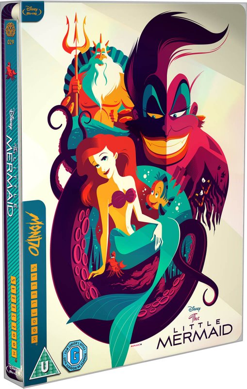
Zavvi steelbook:
Re: Comparing Home Releases Cover Arts
I never noticed Sebastian's eye color. I don't get why they made them yellow in all of them.
-
Disney's Divinity
- Ultimate Collector's Edition
- Posts: 16407
- Joined: Thu Mar 17, 2005 9:26 am
- Gender: Male
Re: Comparing Home Releases Cover Arts
You're right about Sebastian's eyes, farerb! I've never noticed that. They’re white in the Classics VHS cover, actually, but whenever that piece of art of him is used in the other covers, they made the eyes yellow anyway. I wonder what the decision-making behind that was? I can kind of understand Ursula’s earrings and makeup occasionally changing, to make her more colorful on the cover (the gold earrings on the Classics VHS are a nice accent next to the gold palace and the trident), but how does Sebastian’s eyes being yellow add anything?
I'd love that Zavvi poster if Triton's and especially Ariel's face looked better. Still, it's a very nice concept; I especially like Flotsam's and Jetsam's eyes lurking underneath Ursula's hand. I always loved that clipart of Sebastian they used where he looks all prissy with the upper lip. It reminds me of how the character was originally going to be a British butler type.
About the Signature, I remember saying back when it was released that Ursula's mouth looks like they were going to have the bottom half open as if she's laughing, but then I suppose somebody didn't want to have to draw the tongue/tonsils and filled it in with white. Of course, it's a close imitation of the well-known clip art pose used in the mock-up for the Digipak, so perhaps the person drawing was just bad at this and put the line between the bottom half of her teeth and the lower a little too high.
I'd love that Zavvi poster if Triton's and especially Ariel's face looked better. Still, it's a very nice concept; I especially like Flotsam's and Jetsam's eyes lurking underneath Ursula's hand. I always loved that clipart of Sebastian they used where he looks all prissy with the upper lip. It reminds me of how the character was originally going to be a British butler type.
If the hand gesture was intended to emphasize her voice, perhaps she's supposed to be looking at Sebastian, who is telling her to sing.Marce82 wrote:1) Classics VHS: this is probably the one with the best layout. A lot of it is recycled from the (much superior) movie poster. Sebastian, Triton and Ursula look perfect. Castle looks perfect. Flounder , Ariel and Eric look meh. Eric's expression is very bland (specially compared to the poster) and Ariel's anatomy is a little off: why does it look like there are thighs trapped under the upper part of her fish tail?? Makes her look like her body is twisting in a weird way. I'm not sure what she is looking at that would warrant her downward gaze and half closed eyes...Overall, a pretty good cover.
I agree. That's why, even thought the image is absolutely gorgeous, I would never say it was my favorite cover for the film.3) Diamond Edition 3D: this one is beautiful, but it's a little too solemn for a film this colorful and fun.
About the Signature, I remember saying back when it was released that Ursula's mouth looks like they were going to have the bottom half open as if she's laughing, but then I suppose somebody didn't want to have to draw the tongue/tonsils and filled it in with white. Of course, it's a close imitation of the well-known clip art pose used in the mock-up for the Digipak, so perhaps the person drawing was just bad at this and put the line between the bottom half of her teeth and the lower a little too high.
Listening to most often lately:
Christina Aguilera ~ "Cruz"
Sombr ~ "homewrecker"
Megan Moroney ~ "Beautiful Things"
-
DisneyBluLife

- Gold Classic Collection
- Posts: 381
- Joined: Sun Oct 14, 2012 10:36 am
- Location: Sweden
Re: Comparing Home Releases Cover Arts
German The little mermaid trilogy
https://www.blu-ray.com/movies/The-Litt ... ray/78009/
https://www.blu-ray.com/movies/The-Litt ... ray/78009/
Re: Comparing Home Releases Cover Arts
I like the concept, but I don't get why they gave Ariel a face lift and a nose job.DisneyBluLife wrote:German The little mermaid trilogy
https://www.blu-ray.com/movies/The-Litt ... ray/78009/