DisneyBluLife wrote:Of course there is fire in the forest. Amor Slade used fire to capture Tod.
Yes, that's true. But that was a small fire, I meant a big one. In this movie there's not a big forest fire like in Bambi, for example. I guess the background of that cover is probably just meant to represent the colors of the fall, but to me the trees look like they were burning.
DisneyBluLife wrote:Fox and the hound is called "Micke och Molle" in Sweden. Translates to "Micke and Molle", "Micke" a typical nickname you give to foxes in Sweden.
Interesting. Are those the names of the characters too or are they called that way just in the title?
Micke is ironic considering Mickey Rooney played Tod.
We’re a dyad in the Force. Two that are one. "I offered you my hand once. You wanted to take it." - Kylo Ren "I did want to take your hand. Ben's hand." - Rey
Like The Rescuers Steelbook is similar to the Masterpiece VHS and UK DVD cover, this Steelbook is again the same composition as the US Blu-Ray however there’s no Fox and the Hound 2, the font is closer to the gold collection and 25th Anniversary edition and the image is less cropped (more of the edges can be seen) and the colours are deeper as suppose to the brighter greens.
DisneyBluLife wrote:Fox and the hound is called "Micke och Molle" in Sweden. Translates to "Micke and Molle", "Micke" a typical nickname you give to foxes in Sweden.
Interesting. Are those the names of the characters too or are they called that way just in the title?[/quote]
Yes, it is the names of the characters too in the Swedish dub.
I like all the covers for Fox and the hound. And I thought Disney would never do a cover with them as adults, but I was so suprised when it happened. I wonder if Bambi can get one too someday?
I like the Steelbook cover better too since it takes out the 2-Movie Collection text.
Those Japanese posters are amazing!
We’re a dyad in the Force. Two that are one. "I offered you my hand once. You wanted to take it." - Kylo Ren "I did want to take your hand. Ben's hand." - Rey
It's very different indeed. If a poster like that one was used in America or Europe, I bet parents wouldn't take their kids to see the movie thinking it's too violent.
universALLove wrote:Like The Rescuers Steelbook is similar to the Masterpiece VHS and UK DVD cover, this Steelbook is again the same composition as the US Blu-Ray however there’s no Fox and the Hound 2, the font is closer to the gold collection and 25th Anniversary edition and the image is less cropped (more of the edges can be seen) and the colours are deeper as suppose to the brighter greens.
That steelbook is definitely an improvement over the US Blu-ray. I really like it.
Hmmmm... I don't know if it's my subjectivity, but it seems that the lesser known films seem to get better covers. Or maybe it's because animals are easier to draw than humans? Or that I don't spot them being off-model because I don't know those movies as well? Either way... seems TFATH has gotten some nice covers, so here we go:
1) VHS: this one is almost a tie with my #2. I like the overall composition, the character poses... even the anatomy is good. My one gripe is the stupid bear... it looks like Tod has a ghost bear standing on his head. And you can tell adding the bear was an afterthought... the floor-plane doesn't match the foreground. Would have been so much better if it was just a forest background. Oh well...
2) UK VHS: Very nice cover; nice rendering and layout. I didn't give it the top spot because Copper looks a little off... and it looks like he is looking off camera, not at Tod. Also don't like the way they rendered the guy in the background... they are trying to do some hazy far-away look.... it works on the tree. Not on the guy.
3) UK Steelbook: this one isnt perfect, but I like that it is like a zoomed out version of the American blu ray. Feels less claustrophobic. Has the same issues as the blu-ray (see below), but I like the colors and rendering a little better. And the font is WAY better.
4) First Blu Ray: I like the overall layout, and the sort of ying-yang composition for the characters. I find the lighting a little odd... they are sort of being lit by a "light beam from heaven"... and that doesn't match the tone of the film. As far as Tod's anatomy... D82, yes and no: they have messed up the anatomy of his front right leg (the shoulder should be popping on his back). So if the anatomy was correct, his right shoulder would be different AND we WOULD see the left one. But since they changed it, then the left one can match this one... so we dont see it. But we should be seeing his left-hind leg.... and we dont!
5) Gold Collection: ooooh... don't like this one. Bland poses. They don't look playful. Tod's eyes are off, and would Copper's ear stretch like that? I do like the forest in the background.
6) 25th Anniversary: Nice idea, poor execution. ARE they supposed to be adults? Their body proportions looks like somewhere between kid and adult. Perspective on Tod's face is off. Actually, his whole face is off model. The overall color choices are interesting, and I LOVE the rendering on the rock. Very painterly. The bear and the man look like last-minute additions...
7) DMC Exclusive: this one is just.... strange. Tod looks like a fat woman on speed: way too excited, with very arched eyebrows and a major wattle. The latter is from the poor rendering and lack of a chin to define his neck. They also look like they are standing in front of a wall... of rock? And they added some last minute leaves to suggest it's a forest. The scale of that owl is way off. Copper looks good!
8 ) Second Blu ray: A worse version of 25th... similar issues. Copper now seems to be mid-movement (awkward!), Tod is off model and.... has weirdly thick hind legs. The background looks bland. A lot of repeated shapes. Just a bland cover overall. Nothing going on.
Note: no nostalgia for any of these.... I have never owned this movie.
Last edited by Marce82 on Wed Jan 15, 2020 10:21 pm, edited 1 time in total.
I like all the covers. I'm partial to the Gold Collection DVD- I actually have that picture tatooed on my shoulder. I love the original US VHS; that's what I grew up with. I also absolutely love the DMC exclusive Blu- I own that, and I wish we had more anything with them as adults!!
Marce82 wrote:As far as Tod's anatomy... D82, yes and no: they have messed up the anatomy of his front right leg (the shoulder should be popping on his back). So if the anatomy was correct, his right shoulder would be different AND we WOULD see the left one. But since they changed it, then the left one can match this one... so we dont see it. But we should be seeing his left-hind leg.... and we dont!
Thanks for answering my doubt, Marce82. I knew something was wrong with Tod in that cover, but I didn't know exactly what it was. What you said makes perfect sense. It's always interesting to read your opinions, you always notice things the rest of us don't.
By the way, I forgot to comment something about the logo of the DMC Exclusive Blu-ray. It's a minor issue, but I don't like that they've put the words "and" and the second "the" of the title inside the two O's. It's a bit confusing. For someone who didn't know anything about the movie, it could be difficult to know in which order the words should be read.
Marce82 wrote:As far as Tod's anatomy... D82, yes and no: they have messed up the anatomy of his front right leg (the shoulder should be popping on his back). So if the anatomy was correct, his right shoulder would be different AND we WOULD see the left one. But since they changed it, then the left one can match this one... so we dont see it. But we should be seeing his left-hind leg.... and we dont!
By the way, I forgot to comment something about the logo of the DMC Exclusive Blu-ray. It's a minor issue, but I don't like that they've put the words "and" and the second "the" of the title inside the two O's. It's a bit confusing. For someone who didn't know anything about the movie, it could be difficult to know in which order the words should be read.
But something I like about that logo is that Tod's tail is a part of the letter "X" and Copper's tail is a part of the "D".
Nice details.
I know this is sooo random. I was looking at the DMC exclusive cover again because of what you pointed out, DisneyBluLife. I already said I thought Tod’s face looked a little odd on that cover anyway, but for some reason I had the thought that he looked sort of like Bea Arthur as Maude in that show's opening theme song when she gives a surprised smile to the camera and now I can never un-see that.
Listening to most often lately:
Christina Aguilera ~ "Cruz"
Sombr ~ "homewrecker"
Megan Moroney ~ "Beautiful Things"
Marce82 wrote:
Hmmmm... I don't know if it's my subjectivity, but it seems that the lesser known films seem to get better covers. Or maybe it's because animals are easier to draw than humans? Or that I don't spot them being off-model because I don't know those movies as well? Either way... seems TFATH has gotten some nice covers, so here we go:
I think that's also in part because the big titles were part of the Platinum/Diamond/Signature Edition lines and they all repackage the films with endless variants of the same covers that are cheaply churned out so they use off-model designs. The 70s/80s Dark Age films aren't released as often so they probably invest more time in the few times they have to make cover art for the films.
blackcauldron85 wrote:I like all the covers. I'm partial to the Gold Collection DVD- I actually have that picture tatooed on my shoulder. I love the original US VHS; that's what I grew up with. I also absolutely love the DMC exclusive Blu- I own that, and I wish we had more anything with them as adults!!
Wow, you have that as a tattoo? I grew up with that cover and it's so nostalgic! Is The Fox and the Hound one of your favorite films?
DisneyBluLife wrote:
But something I like about that logo is that Tod's tail is a part of the letter "X" and Copper's tail is a part of the "D".
Nice details.
Never noticed that either. Really cool catch.
We’re a dyad in the Force. Two that are one. "I offered you my hand once. You wanted to take it." - Kylo Ren "I did want to take your hand. Ben's hand." - Rey
DisneyBluLife wrote:But something I like about that logo is that Tod's tail is a part of the letter "X" and Copper's tail is a part of the "D".
Nice details.
Good catch! I had noticed the tail in the letter "D", but not the other one, and I wasn't sure if it was really a tail or just part of that typography. It's indeed a cool detail. Now I like the logo more.
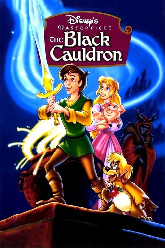
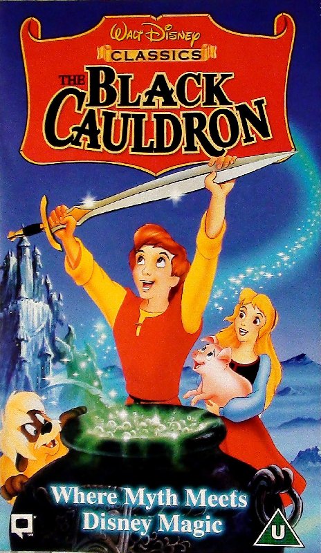
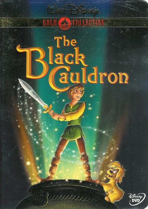
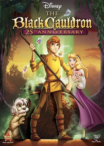
The Gold Collection DVD is the best of these, but I like the 25th Anniversary DVD in spite of most of the characters being off-model. Those two feel the most "epic" of the four. Poor Fflewdur is the forgotten member of the group.
Listening to most often lately:
Christina Aguilera ~ "Cruz"
Sombr ~ "homewrecker"
Megan Moroney ~ "Beautiful Things"