Comparing Home Releases Cover Arts
- DisneyBluLife
- Gold Classic Collection
- Posts: 381
- Joined: Sun Oct 14, 2012 10:36 am
- Location: Sweden
Re: Comparing Home Releases Cover Arts
These covers are from the UK "Heroes slipcover" collection.
The Rescuers
German Blu-ray 2018 edition
https://www.blu-ray.com/movies/The-Resc ... ay/193092/
The Rescuers down under
German Blu-ray 2018 edition
https://www.blu-ray.com/movies/The-Resc ... ay/193091/
The Rescuers
German Blu-ray 2018 edition
https://www.blu-ray.com/movies/The-Resc ... ay/193092/
The Rescuers down under
German Blu-ray 2018 edition
https://www.blu-ray.com/movies/The-Resc ... ay/193091/
Re: Comparing Home Releases Cover Arts
Hi universALLove,
True, I didn't do the steelbooks... it's mostly recycled artwork. But here we go:
Rescuers: the front is recycled from an American release... and they added those stars, which don't fit at all. This aint "A whole new world". The back is pretty terrible... the rendering is bad, that cave has zero depth (it actually reminds me of the tunnel in the movie Coraline), all the relational scale is off...(as in, if you consider perspective, all the sizes of the characters make no sense in relation to one another). Plus, the whole thing doesn't even make sense: Penny was lowered down into the cave... so are the characters now standing on the walls? I do like the drawing and rendering of the mice.
Resc. D.U.: the front looks super cheesy. Like a poorly rendered $2 book. Nothing interesting about the layout or poses. The back is just a section of the original VHS cover. Meh.
- Disney's Divinity
- Ultimate Collector's Edition
- Posts: 16384
- Joined: Thu Mar 17, 2005 9:26 am
- Gender: Male
Re: Comparing Home Releases Cover Arts
I like the picture better with a blue background as compared to the solid yellow one someone else posted.DisneyBluLife wrote: German Blu-ray 2018 edition
https://www.blu-ray.com/movies/The-Resc ... ay/193091/

Listening to most often lately:
Christina Aguilera ~ "Cruz"
Sombr ~ "homewrecker"
Megan Moroney ~ "Beautiful Things"
- DisneyBluLife
- Gold Classic Collection
- Posts: 381
- Joined: Sun Oct 14, 2012 10:36 am
- Location: Sweden
Re: Comparing Home Releases Cover Arts
I think it was me too.Disney's Divinity wrote:I like the picture better with a blue background as compared to the solid yellow one someone else posted.DisneyBluLife wrote: German Blu-ray 2018 edition
https://www.blu-ray.com/movies/The-Resc ... ay/193091/
- Disney's Divinity
- Ultimate Collector's Edition
- Posts: 16384
- Joined: Thu Mar 17, 2005 9:26 am
- Gender: Male
Re: Comparing Home Releases Cover Arts
Oh, yeah, my bad.  For some reason, I thought D82 or universALLove might've posted some links and was too lazy to go back through links to look for which one it was.

Listening to most often lately:
Christina Aguilera ~ "Cruz"
Sombr ~ "homewrecker"
Megan Moroney ~ "Beautiful Things"
Re: Comparing Home Releases Cover Arts
It is soooo time for Fox and the Hound...
Re: Comparing Home Releases Cover Arts
Sorry for posting this so late in the week devoted to the Rescuers films, but I've noticed the Spanish cover for The Rescuers Down Under (below on the right) is not the same as the US one either:


I also found this edition with sleeve from the UK:

I'll post my top 5 covers for each film separately:
The Rescuers
1. Classics VHS (UK version): I like the composition and how they've managed to give prominence to the tiny protagonists thanks to the clever use of perspective. Penny and Medusa could look better, but Bernard and Bianca are quite on-model.
2. Masterpiece VHS: They've done something similar with the perspective here, and this cover is quite well drawn too, in my opinion. What I don't like about this and the Classics VHS, though, is that the mice and the can they're on are much bigger compared to Orville than in the movie. But I partially forgive it, because I guess it must be difficult to make the main characters stand out on the covers due to their small size.
3. Classics VHS: This one is quite cool too. I actually like these first three more or less the same.
4. Blu-ray combo: Bernard and Bianca look quite good and I like that some of the other characters have more prominence here.
5. UK Steelbook: It's the same drawing of the main characters from the Masterpiece VHS, but it's simple and elegant, and personally I find it better than the rest of the covers.
The Rescuers Down Under
1. Classics VHS (Spanish version): I really like the idea for this cover. This version is very similar to the US one, but I think the characters are more accurate here (except for Marahute, who looks worse).
2. Classics VHS: I actually prefer the composition of this version, but Bernard and Cody look especially bad on this one.
3. Gold Collection DVD: I quite like this cover too, though Marahute is poorly drawn here and should be much bigger.
4. Blu-ray combo.
5. UK VHS: I hadn't noticed the rope was coming from nowhere until you pointed it out, Marce82. I don't like that. The original version with Cody and Marahute is much better.


I also found this edition with sleeve from the UK:

I'll post my top 5 covers for each film separately:
The Rescuers
1. Classics VHS (UK version): I like the composition and how they've managed to give prominence to the tiny protagonists thanks to the clever use of perspective. Penny and Medusa could look better, but Bernard and Bianca are quite on-model.
2. Masterpiece VHS: They've done something similar with the perspective here, and this cover is quite well drawn too, in my opinion. What I don't like about this and the Classics VHS, though, is that the mice and the can they're on are much bigger compared to Orville than in the movie. But I partially forgive it, because I guess it must be difficult to make the main characters stand out on the covers due to their small size.
3. Classics VHS: This one is quite cool too. I actually like these first three more or less the same.
4. Blu-ray combo: Bernard and Bianca look quite good and I like that some of the other characters have more prominence here.
5. UK Steelbook: It's the same drawing of the main characters from the Masterpiece VHS, but it's simple and elegant, and personally I find it better than the rest of the covers.
The Rescuers Down Under
1. Classics VHS (Spanish version): I really like the idea for this cover. This version is very similar to the US one, but I think the characters are more accurate here (except for Marahute, who looks worse).
2. Classics VHS: I actually prefer the composition of this version, but Bernard and Cody look especially bad on this one.
3. Gold Collection DVD: I quite like this cover too, though Marahute is poorly drawn here and should be much bigger.
4. Blu-ray combo.
5. UK VHS: I hadn't noticed the rope was coming from nowhere until you pointed it out, Marce82. I don't like that. The original version with Cody and Marahute is much better.
Last edited by D82 on Thu Jan 09, 2020 11:27 pm, edited 2 times in total.
- Disney's Divinity
- Ultimate Collector's Edition
- Posts: 16384
- Joined: Thu Mar 17, 2005 9:26 am
- Gender: Male
Re: Comparing Home Releases Cover Arts
Maybe they re-drew Marahute for the Spanish cover because they were afraid some children may not have realized the thing at the top of the U.S. cover is a bird if the wing wasn't stretched perfectly straight out....  Only thing I can think of, because the bird on the U.S. cover looks much more realistic (although neither look like the bird from the film...).
I guess that's assuming that the Spanish cover is the one that came second rather than the other way around. The bird for the Spanish cover suits the rest of the drawings on the cover--which are pretty poor--so perhaps the U.S. cover's bird is the one that was newly drawn for the U.S.? That could be because the eagle is an American symbol.
EDIT: No, I was just on the TRDU Wikipedia page, and it looks like the eagle from the U.S. cover is lifted from a poster for the film? Besides, Marahute is a golden eagle, not a bald eagle, my mistake. It's too bad the U.S. cover didn't copy Cody from the poster, too, because he looks much better there. I see tiny differences between the two covers now I'm looking more closely, too; perhaps the artist for the Spanish cover was tracing the U.S. cover to some degree and realized they couldn't do that very well for the Marahute drawing and drew something very simplistic in its place.

Listening to most often lately:
Christina Aguilera ~ "Cruz"
Sombr ~ "homewrecker"
Megan Moroney ~ "Beautiful Things"
Re: Comparing Home Releases Cover Arts
Yes, I think the VHS covers are based on this poster by John Alvin:Disney's Divinity wrote:No, I was just on the TRDU Wikipedia page, and it looks like the eagle from the U.S. cover is lifted from a poster for the film?

You're right, there are several differences between the Spanish and the US covers. I think the characters are better drawn on the Spanish cover (except for Marahute), but I prefer the composition of the US one.
Re: Comparing Home Releases Cover Arts
It seems like whatever his name is the main character in that poster.
- JeanGreyForever
- Signature Collection
- Posts: 5335
- Joined: Sun Sep 15, 2013 5:29 pm
Re: Comparing Home Releases Cover Arts
Lol the Australian mouse? I think his name was Jake but I honestly don't even remember.


We’re a dyad in the Force. Two that are one.
"I offered you my hand once. You wanted to take it." - Kylo Ren
"I did want to take your hand. Ben's hand." - Rey
Re: Comparing Home Releases Cover Arts
Yes, he's called Jake. You're right, farerb, It looks like he's the protagonist in that poster. I guess that's why they traded his place on the cover with Bernard and Bianca's for the home video release.
Last edited by D82 on Thu Jan 09, 2020 9:59 pm, edited 1 time in total.
Re: Comparing Home Releases Cover Arts
The Fox and the Hound:
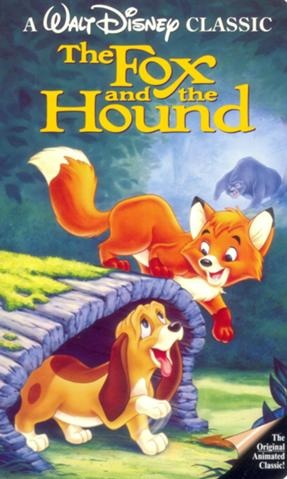
VHS:
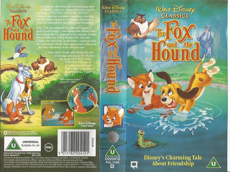
VHS (UK):
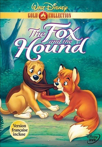
Gold Collection DVD:
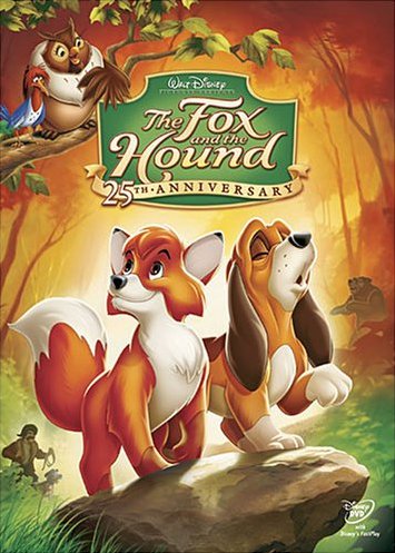
25th Anniversary DVD:
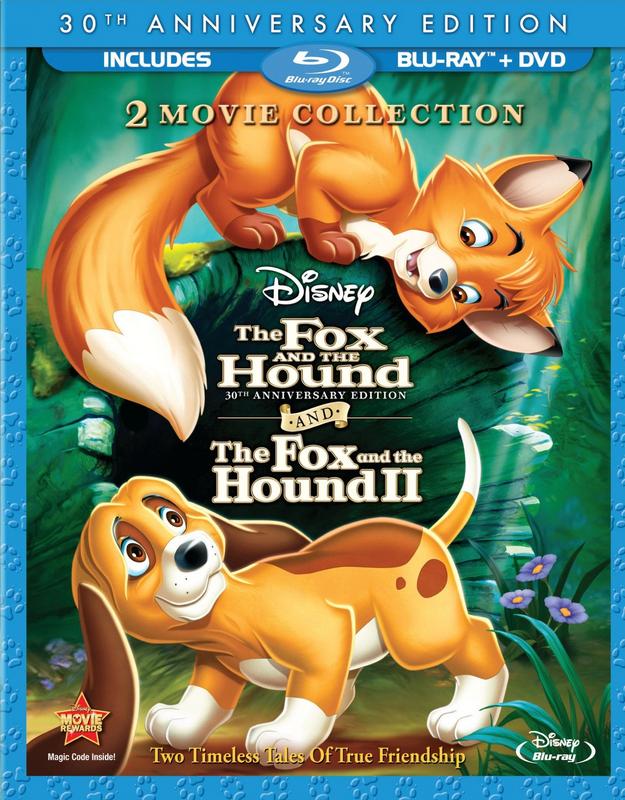
First Blu-ray:
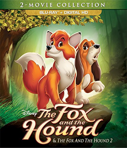
Second Blu-ray:
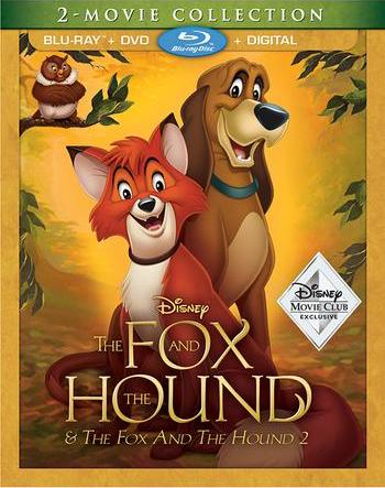
DMC Exclusive Blu-ray:
VHS:

VHS (UK):

Gold Collection DVD:

25th Anniversary DVD:

First Blu-ray:

Second Blu-ray:

DMC Exclusive Blu-ray:

- Disney Duster
- Ultimate Collector's Edition
- Posts: 14120
- Joined: Fri Jun 17, 2005 6:02 am
- Gender: Male
- Location: America
Re: Comparing Home Releases Cover Arts
I like the 25th Anniversary DVD. Great composition, great view of the characters, fits in a lot, and I love the colors. Next, I like the DMC Exclusive Blu-ray. I like seeing them grown up and I like the composition. Next, I like the Gold Collection DVD. Nice, simple compositon. Then I like the first VHS. Then the first Blu-ray. None of these are really bad though except the second Blu-ray. That drawing is a disaster.

- JeanGreyForever
- Signature Collection
- Posts: 5335
- Joined: Sun Sep 15, 2013 5:29 pm
Re: Comparing Home Releases Cover Arts
My favorite is the Second Blu-ray. I think it's an improvement over the 25th Anniversary DVD because I prefer the green background and Copper's pose.
I also like the US VHS and Gold Collection DVD covers although I could do without the bear's presence on the former. Feels a bit shoehorned in.
The First Blu-Ray cover is really nice as well if it wasn't for the 2-Movie Collection logo.
I also like the US VHS and Gold Collection DVD covers although I could do without the bear's presence on the former. Feels a bit shoehorned in.
The First Blu-Ray cover is really nice as well if it wasn't for the 2-Movie Collection logo.


We’re a dyad in the Force. Two that are one.
"I offered you my hand once. You wanted to take it." - Kylo Ren
"I did want to take your hand. Ben's hand." - Rey
Re: Comparing Home Releases Cover Arts
I like the two VHS and the Gold Collection DVD. The rest look weird in my opinion.
- Disney's Divinity
- Ultimate Collector's Edition
- Posts: 16384
- Joined: Thu Mar 17, 2005 9:26 am
- Gender: Male
Re: Comparing Home Releases Cover Arts
I grew up with the first VHS. The only versions I've bought myself are the 25th Anniversary DVD and the DMC exclusive Blu-ray, which, luckily, are my favorite covers. I didn't have to buy the DMC version to get the Blu-ray, but it has the best cover and I might never buy the film again, so...  Tod's face looks a touch odd, but otherwise I love the colors and the fact that they're adults rather than children. The Gold Collection DVD cover is cute.
I only wish one of the covers had used Widow Tweed. Maybe have Amos in the distance on one side and Tweed in the distance on the other; similar to how Triton and Ursula are both looking at Ariel in TLM covers / posters, only less prominent.
I only wish one of the covers had used Widow Tweed. Maybe have Amos in the distance on one side and Tweed in the distance on the other; similar to how Triton and Ursula are both looking at Ariel in TLM covers / posters, only less prominent.

Listening to most often lately:
Christina Aguilera ~ "Cruz"
Sombr ~ "homewrecker"
Megan Moroney ~ "Beautiful Things"
Re: Comparing Home Releases Cover Arts
I've updated my first post on this page adding my opinion of the Rescuers covers. And here's my ranking of the covers for The Fox and the Hound:
1. VHS: I love this cover. It's simple and beautiful, and the two protagonists look good here. Like JeanGreyForever, I'd rather the bear wasn't on it, but at least it's well drawn too.
2. First Blu-ray: I love the idea and how Tod and Copper form a circle with their bodies and tails. I'm not sure if Tod's pose is possible, though. Where's his other front leg? I'd be interested to know your opinion on that, Marce82.
3. VHS (UK): I grew up with the Spanish version of this cover. I find the composition quite good, but the main couple could be drawn a bit better.
4. Gold Collection DVD: Tod is slightly off-model here in my opinion, but this is also a really nice cover.
5. DMC Exclusive Blu-ray: I like that it features Tod and Copper as adults for a change, as well as the colors of the background and frame. But it's maybe too simple and the characters aren't doing anything interesting.
6. 25th Anniversary DVD: I have this cover too, but I've never liked it much. Mainly because, from what I remember, Tod and Copper are never on a rock in the movie. It reminds me more of The Lion King or Bambi. Also, the colors of the background make it seem there's a fire in the forest, which doesn't happen in the film either, and the bear looks like a zombie. To say something positive, the composition is not bad.
7. Second Blu-ray: It's the same drawing of the main characters from the previous cover, but I think the modifications make it worse. Plus there's some horrible Photoshop work in the background.
I think this film has several good covers. I didn't expect I would like so many of them. By the way, just a curiosity, it's strange for me to call Tod's best friend Copper. For some reason his name is Toby in the Spanish dubbing and I'm used to know him as such. The film is even titled Tod y Toby (Tod and Toby) here instead of The Fox and the Hound.
- DisneyBluLife
- Gold Classic Collection
- Posts: 381
- Joined: Sun Oct 14, 2012 10:36 am
- Location: Sweden
Re: Comparing Home Releases Cover Arts
Of course there is fire in the forest. Amor Slade used fire to capture Tod.
- DisneyBluLife
- Gold Classic Collection
- Posts: 381
- Joined: Sun Oct 14, 2012 10:36 am
- Location: Sweden
Re: Comparing Home Releases Cover Arts
Fox and the hound is called "Micke och Molle" in Sweden. Translates to "Micke and Molle", "Micke" a typical nickname you give to foxes in Sweden.