Ok, sorry I'm a little late.... you know, the holidays. Plus, Winnie the pooh is not the most fascinating of home-video-covers topic.
So I will only address the American releases, cause the international ones are too numerous to examine, plus I wouldn't know how to refer to them. Actually, I think WTP has had pretty decent covers... at times good concepts but not great execution. So here we go:
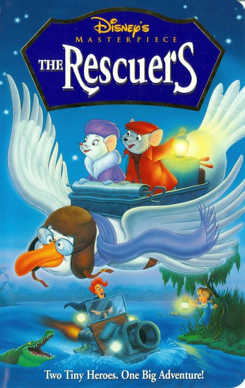
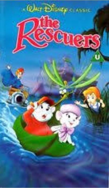
1) Masterpiece VHS: love the simplicity, and like others have mentioned, it really echos the concept of a storybook, which is such a part of WTP. Though it's low res, I cant tell poor Winnie isn't super on model. Still, very nice overall design.
2) 25th Anniversary: Again, I like the storybook look. Love the watercolor texture of the background and pot of honey. Winnie's face isn't perfect... I do like that kinda conveys that this isn't a single narrative, but different shorts put together.
3) Blu ray: I kinda like the overall image, but the scale seems a bit strange... like the characters are too big in the frame. Plus, it looks like Winnie has pooped out a tiny Eyeore. The perspective there is not good... I do really like that they kept the black outlines of the characters to match the film, and the same visual style for the background.
4) Friendship edition: Very nice overall, and again, it conveys three separate scenes, communicating the different segments. Minus points for the awkward head tilts on Winnie and Tigger looking at each other and yet having their heads turned away...
5) Classics VHS: "why, let's just take a screencap from the movie and make that the cover!". Nice image, really conveys Tigger's personality... but it's now original artwork. Same applies to...
6) BETA release! Woah... a beta cover. Retro! And yes, same applies here. Screencap. But why THAT image?? Winnie sleeping??
7) Special commemorative Edition: I kinda hate this one. It looks like poor artwork, done by someone who doesn't fully understand how these characters are built. Almost all are off model. It really looks like a bootleg vhs. Boooo!
I cant believe TMAOWTP has had so many releases!!!
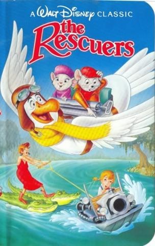
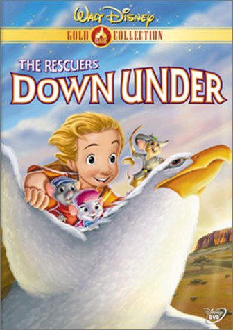
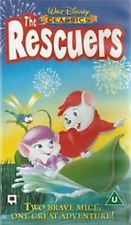
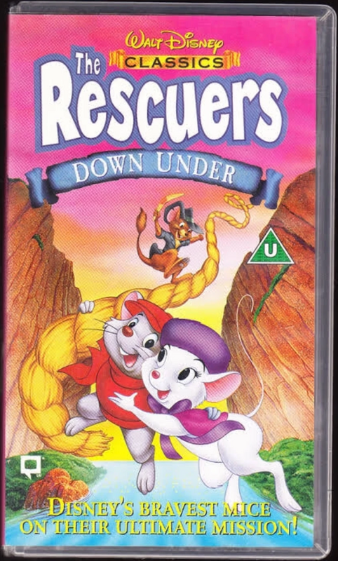
I like the Classics VHS for The Rescuers. Something about Medusa on the alligators really gives me joy. I like the Gold Collection for The Rescuers Down Under because of the colors and the way the lighting makes it look kind of glorious.
And Im not commenting on Rescuers until the international covers are up! I recall one where Bernard and Bianca are riding a leaf on the water... someone post it!
The DVD for The Rescuers was also reissued with this limited edition sleeve:
Here are also some international covers that are not completely new, but are variants of other covers. I'll put the originals on the left so you can compare them:
This Spanish VHS is like the UK one, but they changed the scene to daytime.
The background of this other Spanish VHS is different than the UK one and more characters appear on it.
The layout for this Latin American cover is very similar to the Masterpiece VHS, but it's a different drawing.
This Latin American version of the UK VHS for The Rescuers Down Under includes Wilbur over the title.
And they used an earlier draft of the US Blu-ray combo as the cover for the UK version.
I grew up on the Classics VHS covers, but the Masterpiece VHS and Gold Collection DVD covers are much better for the respective films. I love the sleeve D82 posted, too. The first UK cover is cute. I have the U.S. Blu-ray and, while it has a nice concept, it's a real eyesore in execution. Nearly all the characters look bad. Medusa is a real monstrosity.
I like that the UK and Spanish covers for The Rescuers included Evinrude, he always made me laugh. The Zavvi cover for The Rescuers is neat and simplistic, re-using the top of the Masterpiece VHS. It's nice they tried to re-create the part of the film--one of the best parts--when Penny's forced to look for the diamond onto the back cover*, although it didn't turn out very well. They should've been as simplistic as the front and just had a skull with the diamond glittering from inside its eye on the back. I don't like the TRDU Zavvi cover at all. Any cover for that film should feature Marahute.
Medusa looks best on the Masterpiece VHS (and the DVD sleeve that re-used that picture of her). I wonder why the Spanish VHS changed her to a yellow coat--and the Latin American cover to red?
* I'm also surprised that the second UK cover (and the second Spanish VHS cover you posted, D82, that imitates it) is the only one time they've thought to use the fireworks as part of the cover. They would make everything seem more exciting--just like the Devil's Eye--considering there's mostly drab colors and they usually want animated films to look bright and colorful on the shelf.
Listening to most often lately:
Christina Aguilera ~ "Cruz"
Sombr ~ "homewrecker"
Megan Moroney ~ "Beautiful Things"
Ok ok... Im gonna give my ranking early on this one. Who knew there were so many covers!!!
So here we go:
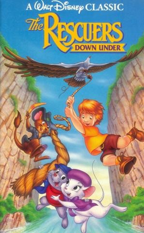
1) Rescuers Down Under Classic VHS: this one is tied for 1st or 2nd place... I REALLY like the layout, the sense of depth, the unusual perspective.... beautifully executed. This is a great example of how to cram a lot of characters into the space without it feeling crammed. Characters are fairly on model, except for the kid (I don't remember his name).
2) Classic VHS Uk/Spain: (the one on the leaf). Tied for 1st place. Again, very nice layout, a lot of characters and all size relations work. And look at the lovely rendering of the water! Characters mostly on model (not sure about Medusa)... my main complaint is that Penny looks like she doesn't have a body behind those grasses... like she disappears. They should have showed a little more of her.
3) Rescuers Classic VHS: Overall a fun concept, good perspective... I find Bernard's pose and expression super awkward, and Medusa is off model. But nice overall artwork.
4) Masterpiece VHS: I like the lighting choices with the lanterns and such... fairly good layout, though Medusa's head is dangerously close to Evinrude's cap-strap. Bianca is super off model, but this is probably the most on-model Medusa.
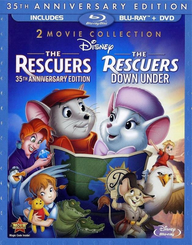
5) Blu ray (American): I actually like the layout, considering they are cramming two films into one. Characters aren't always on model... and why is Bianca's head so much bigger than Bernard's? they are supposed to be standing next to one another. Shame about Medusa: seems like a pose taken straight from the film, but they messed it up a bit with the shading... makes her look fat. I really like the hands and diamond.
6) Rescuers limited edition sleeve: LOVE the upper portion: Medusa, Penny, the crock, the car, the water.... hate the foreground. Looks slapped on, and it doesn't match. Bernard is super off model... like bad fan art.
7) Latin and UK Rescuers Down Under Covers: very similar to the Classic VHS version, but where is Marahute??? Looks like the rope is coming from.... nowhere. It's just an inferior version. And Wilbur (?) is just slapped on by the title (which is super tacky font).
8 ) Resc. down under Gold Collection: this one feels weird. I actually don't like the lighting... what is the source? If they are flying, the light wouldn't be coming from underneath. It also gives the mice some very strange shadows in their faces. The layout feels a little crammed. The kid looks pretty on model, even if his eyes are uneven.
9) Spanish daytime cover: I actually think this isn't the same artwork as the other release... so everything is a little off. And I hate that it's daytime and Medusa's yellow coat... it totally betrays the film's color palette. This film ain't colorful!
10) Latin Cover (similar to the Masterpiece): Nice layout, and an improved Bianca, but the rendering is just terrible. Why does everything have a weird glow to it? A lot of the linework is lost with the airbrushing...
11) Both Spanish/UK VHS releases: Oh dear GOD. These look beyond awful. No character is on model, bad perspective, bad anatomy.... bad coloring. And again, what is it with the European covers and those hideous multi color skies?!?!!? These two are the bottom of the barrel.
I know I didn't address all of them, but I think I got to the important ones.
A note for the people posting the pictures of the covers: please make sure you give each a "name"so we can refer to them easily.
What did you think of the steelbooks Marcel82 those were the only two you missed and I like hearing your point of view as you sometimes point out things I might overlook?
For The Rescuers, I always liked the two VHS covers although Penny isn't supposed to be blonde like she is in the second one. The first UK one/Spanish one is nice as well. Penny and Medusa look awful but I prefer Evinrude to Orvile.
The limited edition sleeve DVD is a little too off-model for my taste.
For The Rescuers Down Under, I only like the Gold Collection cover.
This one I think is a very neat variant on the classic cover. I've never seen it before so I'm glad it was posted here!
farerb wrote:I hate any cover that changes Wendy's gown from blue to pink.
Same. Also when Michael is in any color but pink.
We’re a dyad in the Force. Two that are one. "I offered you my hand once. You wanted to take it." - Kylo Ren "I did want to take your hand. Ben's hand." - Rey
We’re a dyad in the Force. Two that are one. "I offered you my hand once. You wanted to take it." - Kylo Ren "I did want to take your hand. Ben's hand." - Rey