Hey Disney Duster,
The Best Buy exclusive... I like it, but it's a little bland. I do like that the front cover shows a bit of London and the "second star to the right"... but for a film this whimsical... it's just a character standing.
The idea of having the back be the actual backview is a nice touch, but there is nothing clever about it. It's just... the back view.
And again, Tink's size is way off. Watch the film... the is pretty much a dot of light when we see Peter full size. She is supposed to be tiny!
I'm sticking with the classics VHS cover (which btw, had a beautiful back cover, of Peter and Hook fighting on the ship, with Wendy tied up in the background)
Comparing Home Releases Cover Arts
-
Disney's Divinity

- Ultimate Collector's Edition
- Posts: 16430
- Joined: Thu Mar 17, 2005 9:26 am
- Gender: Male
Re: Comparing Home Releases Cover Arts
I was never in love as much as others with the Signature BestBuy cover either, although I do like it. I suppose the most UO I have about the PP covers is I don’t like the Diamond + Digital Copy cover. Peter’s shadow is huge and the pose is so random.

Listening to most often lately:
Ariana Grande ~ "hate that I made you love me"
Sombr ~ "My Body Isn't Ready"
Kelly Clarkson ~ "I'd Be Lyin'"
Re: Comparing Home Releases Cover Arts
Oh, Disney Divinity, GOOD POINT!
I hadn't considered the scale of the shadow! I think the pose it lifted from when peter first flies AFTER sprinkling the kids w the dust... doing silhouettes is tough... you can't get very complex, because at a certain point, they just look like they are missing a limb.
I still like the concept for it.
Re: Comparing Home Releases Cover Arts
Ok, this is a little OCD of me, but I couldn't let go, so here are my thoughts on Alice.
From best to worst:
Best:
Classics VHS. I admit it, there is a bit of nostalgia here, but I do think it's a beautiful painting. Perspective is great, rendering and colors work are very well executed and creative (check out the blue woods in the back!)... Alice isnt super on model, but its a really good drawing. All other characters are perfect. One thing I remember about this one, is that it extended to the left to wrap around the vhs case... the table continued, and it showed the white rabbit and the Cheshire cat.
Gold Collection: probably the most on model. Beautiful drawing.... check out the rendering of her petticoats! It is also a scene rarely depicted. My main complaint is that all characters seem to be floating in a vacumm. No background at all. Which seems to be a theme for the Alice covers...
Masterpiece VHS: similar to the Classics, but her face and hair are off, the March Hare looks like they are on cocaine. The mad hatter is ok... scale of the dorm mouse is way off. The shading is a little sloppy. The background looks like a less interesting version of the classics vhs.
Masterpiece dvd: yes, Alice is based on a Milt Kahl drawing... it was just re-drawn by someone who doesn't understand the structure of a head (that is one loooong skull!... toward the back of her head). And her hands look terrible. But I give them points for the cool semi-appearing C. Cat and the attempt at a background, including leaves with the patterns from the film. Minus points for that random inclusion of the rabbit in a scale that makes zero sense.
60th blu ray: They are all floating in a vacumm again! All mildly off model... and the queen is missing an eyebrow!
Un-anniversary: this is just a cluster of stuff... zero composition. Character look ok, but bland poses.
65th blu ray: They just recycled almost all of it and repositioned the characters. I can't see Alice very well... but I would say semi-on-model.
First VHS: this is an interesting one... cause it is clear the characters have been traced/cleaned-up from REALLY good drawings... but by a poor clean up artist. And using black outline, which hardens the characters. The background is a pretty crude painting. Oh well... first attempt.
Now... I mentioned earlier that Cinderella is possibly the most difficult to draw of all the disney heroines, and someone said Alice must be too, since she is often off-model. ALL the Disney leading ladies are tough to draw... it's just that Cinderella has the least defined facial features. Its all about proportions with her... tough cookie!
Last edited by Marce82 on Wed Nov 13, 2019 7:42 pm, edited 1 time in total.
-
Disney's Divinity
- Ultimate Collector's Edition
- Posts: 16430
- Joined: Thu Mar 17, 2005 9:26 am
- Gender: Male
Re: Comparing Home Releases Cover Arts
Yes, I do love the clocktower.Marce82 wrote: I still like the concept for it.
Out of curiosity, does anyone perhaps have a link to the picture by Milt Kahl? Several others mentioned it, too. I never knew the Masterpiece DVD took from a previous drawing.Marce82 wrote:
Masterpiece dvd: yes, Alice is based on a Milt Kahl drawing... it was just re-drawn by someone who doesn't understand the structure of a head (that is one loooong skull!... toward the back of her head). And her hands look terrible. But I give them points for the cool semi-appearing C. Cat and the attempt at a background, including leaves with the patterns from the film. Minus points for that random inclusion of the rabbit in a scale that makes zero sense.
Listening to most often lately:
Ariana Grande ~ "hate that I made you love me"
Sombr ~ "My Body Isn't Ready"
Kelly Clarkson ~ "I'd Be Lyin'"
-
DisneyBluLife

- Gold Classic Collection
- Posts: 381
- Joined: Sun Oct 14, 2012 10:36 am
- Location: Sweden
Re: Comparing Home Releases Cover Arts
What do you think about the VHS cover from UK & Europe on page 8?Marce82 wrote:Ok, this is a little OCD of me, but I couldn't let go, so here are my thoughts on Alice.
From best to worst:
Best:
Classics VHS. I admit it, there is a bit of nostalgia here, but I do think it's a beautiful painting. Perspective is great, rendering and colors work beautiful and creative (check out the blue woods in the back!)... Alice isnt super on model, but its a really good drawing. All other characters are perfect. One thing I remember about this one, is that it extended to the left to wrap around the vhs case... the table continued, and it showed the white rabbit and the Cheshire cat.
Gold Collection: probably the most on model. Beautiful drawing.... check out the rendering of her petticoats! It is also a scene rarely depicted. My main complaint is that all characters seem to be floating in a vacumm. No background at all. Which seems to be a theme for the Alice covers...
Masterpiece VHS: similar to the Classics, but her face and hair are off, the March Hare looks like they are on cocaine. The mad hatter is ok... scale of the dorm mouse is way off. The shading is a little sloppy. The background looks like a less interesting version of the classics vhs.
Masterpiece dvd: yes, Alice is based on a Milt Kahl drawing... it was just re-drawn by someone who doesn't understand the structure of a head (that is one loooong skull!... toward the back of her head). And her hands look terrible. But I give them points for the cool semi-appearing C. Cat and the attempt at a background, including leaves with the patterns from the film. Minus points for that random inclusion of the rabbit in a scale that makes zero sense.
60th blu ray: They are all floating in a vacumm again! All mildly off model... and the queen is missing an eyebrow!
Un-anniversary: this is just a cluster of stuff... zero composition. Character look ok, but bland poses.
65th blu ray: They just recycled almost all of it and repositioned the characters. I can't see Alice very well... but I would say semi-on-model.
First VHS: this is an interesting one... cause it is clear the characters have been traced/cleaned-up from REALLY good drawings... but by a poor clean up artist. And using black outline, which hardens the characters. The background is a pretty crude painting. Oh well... first attempt.
Now... I mentioned earlier that Cinderella is possibly the most difficult to draw of all the disney heroines, and someone said Alice must be too, since she is often off-model. ALL the Disney leading ladies are tough to draw... it's just that Cinderella has the least defined facial features. Its all about proportions with her... tough cookie!
The cover where Alice is sitting and all of the characters are behind her, except for the Chesire cat.
Re: Comparing Home Releases Cover Arts
Hey DisneyBluLife:
Actually, the European cover is pretty ok. I think Alice is too big on the frame (specially considering how tiny the other characters have to be to fit in the frame... a less exaggerated perspective would have been better)... and she is kinda poorly drawn, from a cartoon-anatomy standpoint. Her head is too big, her feet are turned towards camera but her legs are not... and PLEASE look at her right hand. That hand is too tiny, badly drawn and the pose is awkward. Both hands are bad... but the right one... ugh.
That said, I like the concept... the Mad Hatter and Chesire Cat are VERY on-model. So it's mixed bag.
Hey DisneyDivinity:
I was looking for the drawing you requested... and it may actually be a Marc Davis Drawing. Since she is in so much of the film, several directing animators handled Alice. I found a publicity still of Kathryn Beaumont with Marc Davis (see below) and if you look at his animation desk, it looks like he is working on this same shot (earlier drawing). But again... this was a posed publicity still. So who knows. If you asked me, it looks more Marc Davis than Milt Kahl ...
So here they are:
https://ibb.co/5RqBkxc
https://ibb.co/zmzM2kB
Sorry... I still dont know how to post images on here directly!
-
Disney's Divinity
- Ultimate Collector's Edition
- Posts: 16430
- Joined: Thu Mar 17, 2005 9:26 am
- Gender: Male
Re: Comparing Home Releases Cover Arts
Thank you very much, Marce82!
Listening to most often lately:
Ariana Grande ~ "hate that I made you love me"
Sombr ~ "My Body Isn't Ready"
Kelly Clarkson ~ "I'd Be Lyin'"

Re: Comparing Home Releases Cover Arts
How timely that this week's movie was Lady and the Tramp, the same week than the release of the live-action remake!
My favorite cover for Lady and the Tramp is the Limited Issue DVD, followed by the Classics VHS and the Masterpiece VHS. There isn't any cover that is really bad, but the ones I like the least are the Diamond Edition Blu-ray (the background feels quite empty with only Tony there) and the Signature Collection DVD (Tony and Joe seem to be singing to nobody in the background).
My favorite cover for Lady and the Tramp is the Limited Issue DVD, followed by the Classics VHS and the Masterpiece VHS. There isn't any cover that is really bad, but the ones I like the least are the Diamond Edition Blu-ray (the background feels quite empty with only Tony there) and the Signature Collection DVD (Tony and Joe seem to be singing to nobody in the background).
Me too, I knew most of them featured the famous spaghetti scene, but I hadn't noticed that many recycled the same artwork. The Platinum Edition DVD and the Diamond Edition Blu-ray covers use the drawing of Lady and Tramp from the Masterpiece VHS; and the Signature Collection Blu-ray, the Best Buy Exclusive and the Target Exclusive use their poses from the Limited Issue DVD. I hadn't noticed it either that they always use the same drawing of the spaghetti! Yes, good catch, DisneyBluLife!Marce82 wrote:Im surprised to see how much they have recycled the artwork for this one... and yes, almost always depicting the same spaghetti-eating scene. And yes, always the same plate... good catch!
I agree, I don't like that either.farerb wrote:I don't like the covers where they look at each while eating the Spaghetti cause that's not what happened in the scene. It's either looking at each other or eating the Spaghetti nonchalantly not knowing what's gonna happen.
I wonder when the Siamese cats began to be seen as offensive, because as that cover proves, as recent as 2006 they were still used to promote the film. Actually, that cover is quite funny too; it looks as if Tony and Joe were singing to the Siamese cats instead to Lady and Tramp in it.DisneyBluLife wrote:Lady and the tramp UK 2006 DVD edition cover art
https://www.ebay.co.uk/p/Lady-And-The-T ... 3394010961
Re: Comparing Home Releases Cover Arts
It was me who said that about Alice. OK, I see. I think I've seen Cinderella drawn off-model more times than Alice in general in merchandise, storybooks and things like that, so I guess you must be right about that. By the way, I really enjoyed reading your comments about the latest movies. There were many details about the covers (the drawings, the perspectives, etc.) that I hadn't noticed before, and I agree with many of the things you said.Marce82 wrote:Now... I mentioned earlier that Cinderella is possibly the most difficult to draw of all the disney heroines, and someone said Alice must be too, since she is often off-model. ALL the Disney leading ladies are tough to draw... it's just that Cinderella has the least defined facial features. Its all about proportions with her... tough cookie!
Judging by this poster for that release, it seems he's flying. But I agree, that cover is quite bad in my opinion too.Marce82 wrote:Special Edition: strange concept and composition. Is Peter flying? standing... on water?

It's true, the shadow is huge. And also, the clock is lit from the inside, right? So, Peter (or his shadow) should be inside the tower to cast it, don't you think? It doesn't make much sense to me. I'd rather they had used a different background for that cover.Disney's Divinity wrote:I suppose the most UO I have about the PP covers is I don’t like the Diamond + Digital Copy cover. Peter’s shadow is huge and the pose is so random.
Re: Comparing Home Releases Cover Arts
Hey D82,
I didn't mean any disrespect when I said "someone" had mentioned the thing about Alice being hard to draw too. I just didn't want to scroll back and re-read all those posts! Again, no disrespect. And I'm glad you are enjoying my comments!
And yes, I have seen some merchandise of Alice where she IS on model. Cinderella almost never is... the one instance I recall is a french re-release poster from 2005. It's just her, with some birds in front of a big clock. The drawing isn't perfect... but her face is VERY on model... and her hair is orange-ish!
That Peter Pan poster you just posted is very interesting. I agree with your comments wholeheartedly. But there interesting part is how Disney uses the same elements to create different artwork. This poster uses the same art as the VHS cover... but the placement and sizes are different: tinkerbell is placed slightly differently... and peter is farther away from the ship. Notice how in this one the ship's bowsprit IS NOT about to "poke" the side of his head like the VHS...
As for the "shadow" blu ray cover.... the scale is off no matter how you look at it. There are two options: if this is the actual Big Ben, then Peter is WAY smaller.... remember the movie, they land on the minute handle of the clock... you can see the scale there.
The other option is that this is the Big Ben replica in the Darling's foyer (we see it when the parents return at the end of the movie)... for which Peter would be way bigger.
So I dont think we are to take that cover literally... its just three separate movie elements in a pleasant (?) composition.
Re: Comparing Home Releases Cover Arts
I know, don't worry, I didn't think you were disrespectful at all.Marce82 wrote: I didn't mean any disrespect when I said "someone" had mentioned the thing about Alice being hard to draw too. I just didn't want to scroll back and re-read all those posts! Again, no disrespect..
Yes, it's interesting. I much prefer the way the elements are arranged in the poster.Marce82 wrote:That Peter Pan poster you just posted is very interesting. I agree with your comments wholeheartedly. But there interesting part is how Disney uses the same elements to create different artwork. This poster uses the same art as the VHS cover... but the placement and sizes are different: tinkerbell is placed slightly differently... and peter is farther away from the ship. Notice how in this one the ship's bowsprit IS NOT about to "poke" the side of his head like the VHS...
I didn't think of the possibility that it could be the Big Ben replica in the Darling's home. But, yes, even if it was that Big Ben, the scale would be off too.Marce82 wrote:As for the "shadow" blu ray cover.... the scale is off no matter how you look at it. There are two options: if this is the actual Big Ben, then Peter is WAY smaller.... remember the movie, they land on the minute handle of the clock... you can see the scale there.
The other option is that this is the Big Ben replica in the Darling's foyer (we see it when the parents return at the end of the movie)... for which Peter would be way bigger.
Yeah, I know, but I can't help but think of the illogicality of it when I look at the cover. However, I appreciate that they tried something new and unconventional for it.Marce82 wrote:So I dont think we are to take that cover literally... its just three separate movie elements in a pleasant (?) composition.
Re: Comparing Home Releases Cover Arts
Hey D82:
I agree with everything you just said!
Looking forward to Sleeping Beauty....
I agree with everything you just said!
Looking forward to Sleeping Beauty....
Re: Comparing Home Releases Cover Arts
Me too!Marce82 wrote:Looking forward to Sleeping Beauty....
-
Disney Duster

- Ultimate Collector's Edition
- Posts: 14174
- Joined: Fri Jun 17, 2005 6:02 am
- Gender: Male
- Location: America
Re: Comparing Home Releases Cover Arts
I can't freaking wait for Sleeping Beauty.
But about the Peter Pan Diamond with digital copy, I always thought it was that something was making Peter Pan's shadow as big as it is in the same way our shadows can get huge and cover large walls and such depending on where we are and where the light is coming from, and Tinker Bell is just very far away in front of the clock, very far in the foreground.
But about the Peter Pan Diamond with digital copy, I always thought it was that something was making Peter Pan's shadow as big as it is in the same way our shadows can get huge and cover large walls and such depending on where we are and where the light is coming from, and Tinker Bell is just very far away in front of the clock, very far in the foreground.


Re: Comparing Home Releases Cover Arts
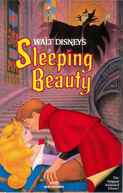
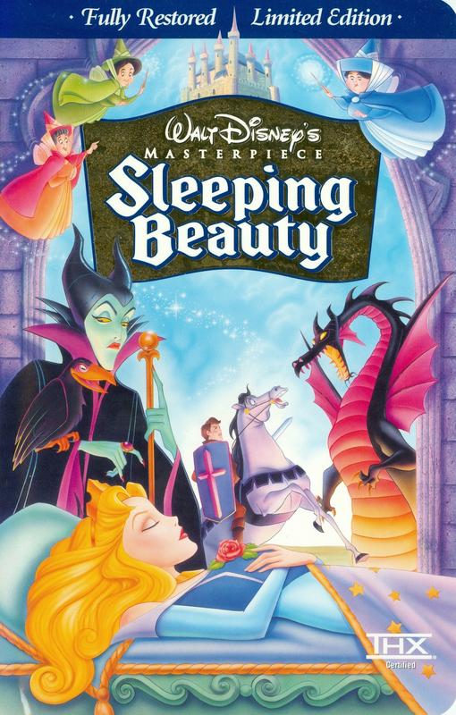
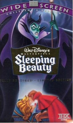
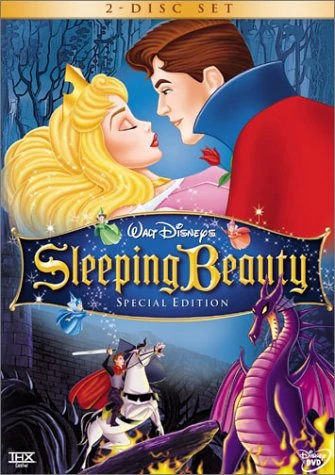
Sleeping Beauty:
Classics VHS:
Masterpiece VHS:
Widescreen Edition:
Special Edition DVD:
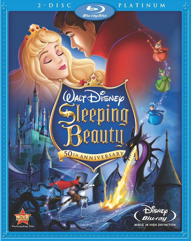
Platinum Edition Blu-ray:
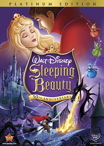
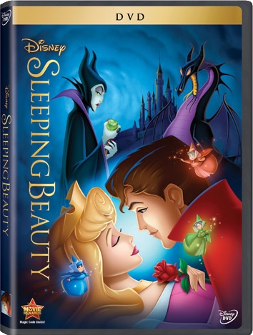
Platinum Edition DVD:
Best Buy Exclusive:
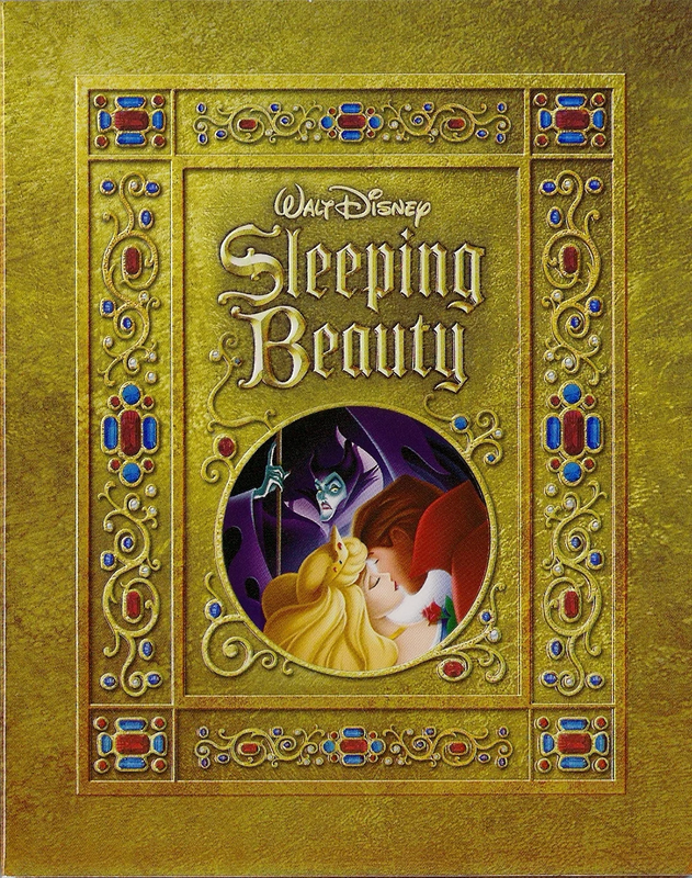
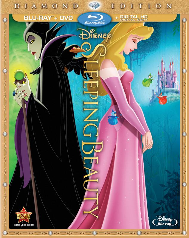
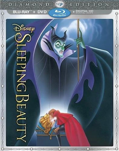
Diamond Edition Blu-ray:
Diamond Edition DVD:
Best Buy Exclusive:
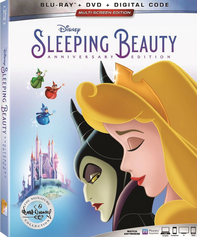
Signature Collection Blu-ray:
Best Buy Exclusive:
Target Exclusive:
Classics VHS:
Masterpiece VHS:
Widescreen Edition:
Special Edition DVD:
Platinum Edition Blu-ray:
Platinum Edition DVD:
Best Buy Exclusive:
Diamond Edition Blu-ray:
Diamond Edition DVD:
Best Buy Exclusive:
Signature Collection Blu-ray:
Best Buy Exclusive:
Target Exclusive:
-
universALLove

- Collector's Edition
- Posts: 2401
- Joined: Fri Jul 08, 2005 8:21 am
Re: Comparing Home Releases Cover Arts
Apart from the Diamond and Platinum, I don’t really like many of the North American covers. I’ve much preferred the ones we received in the UK (which makes a change). My favourites are the UK VHS and the 2003 Collector’s Edition DVD. I really like the classiness, simplicity and lighting of the 2003 edition. Just Aurora and Phillip with Maleficent eerily above. Just beautiful. I have a lot of nostalgia for the VHS one and I like the composition, the fact that it’s so colourful and nice to look at and that it’s the ballroom scene for a change as suppose to the sleeping scene and in spite of all the characters pretty much included it doesn’t look overcrowded like some Disney covers do when they stick all the characters on.... Oh, and I like that Aurora’s in blue  (unlike the North American where she’s primarily in pink)
- Attachments
-
- 74413205-AAF9-4532-BBFA-9A7CB732ED17.jpeg (45.9 KiB) Viewed 5648 times
-
- D8A6A8DC-DB04-4B93-A73B-3B81AD4328B5.jpeg (110.51 KiB) Viewed 5648 times
Last edited by universALLove on Fri Nov 15, 2019 1:55 am, edited 1 time in total.

-
universALLove
- Collector's Edition
- Posts: 2401
- Joined: Fri Jul 08, 2005 8:21 am
Re: Comparing Home Releases Cover Arts
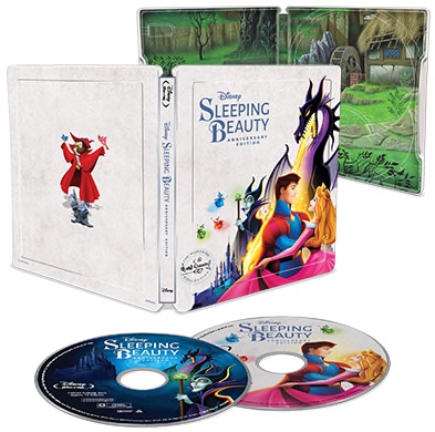
Side note - The UK had an alternate cover to the Diamond in her Briar Rose outfit as suppose to her pink princess dress and we received an epic Zavvi exclusive Mondo Steelbook (far better than the clip arty Best Buy in my opinion).
I’ll upload the picture of the Steelbook later as I’ve reached my attachment upload limit apparently.
I’ll upload the picture of the Steelbook later as I’ve reached my attachment upload limit apparently.
- Attachments
-
- 24A47EFC-D20F-4F9C-AC64-7707B85DC409.jpeg (54.4 KiB) Viewed 5648 times
-
DisneyBluLife
- Gold Classic Collection
- Posts: 381
- Joined: Sun Oct 14, 2012 10:36 am
- Location: Sweden
Re: Comparing Home Releases Cover Arts
UK DVD of Sleeping Beauty
https://www.amazon.co.uk/Sleeping-Beaut ... B00005U1X9
https://www.amazon.co.uk/Sleeping-Beaut ... B00005U1X9
-
lord-of-sith

- Collector's Edition
- Posts: 2288
- Joined: Wed Jul 14, 2004 7:03 pm
- Gender: Male (He/Him/His)
Re: Comparing Home Releases Cover Arts
Sleeping Beauty is really the only film I've kept track of covers for, as it has always been my favorite! I'd rank them as follows:
1. Widescreen Edition VHS/Best Buy Exclusive Diamond Edition - I put these together because they are the same image. As a big Maleficent fan, obviously I'm predisposed to this because she's the focus of the cover. Aside from that, I appreciate how epic the image is, how small Phillip and Aurora are in contract to the towering Maleficent. It's beautifully drawn and dramatically colored. Nothing has topped this for me so far.
2. UK 2003 Collectors Edition - Easily the most beautiful and simplistic cover. The drama it brings! I appreciate how they held back from cluttering it up, and really let the beauty of the artwork shine.
3. US Classic (Black Diamond) VHS - Again I appreciate the simplicity. I also recall this VHS from my youth as one I'd see at the library or at friend's houses, and I always thought Maleficent looked so cool at the top of the stairs. I think it's an effective composition. Downside is that Phillip's face is weirdly proportioned.
4. Masterpiece VHS - This one is straight up nostalgia for me. It was the first time I was able to own the movie as a kid. I remember spending hours watching it again and again. It also brings to mind the behind-the-scenes feature after the film, which I had completely memorized... as a kindergartner.... I also feel like it's a unique composition that is dissimilar to any other cover for the film. It includes many characters without any of them floating from nowhere.
5. Best Buy Exclusive Platinum Edition - Pretty basic, but at least the majority of the cover is referencing the way the story book looks in the film, and the small circle includes the artwork from my favorite cover. No points for effort or creativity, but at least they picked good artwork to re-use.
6. Best Buy Exclusive Signature Edition - I haven't seen this in person, but from the photo I think it looks good! Again it's not over-complicated, and the characters look good with each other. If I saw this on sale, I'd be pretty tempted to get it.
7. UK Classic VHS - Pretty good composition! Different than other covers, which is a plus. My main complaint with it, is that it doesn't really represent the film stylistically from a visual standpoint. Sure the characters are present, but the way it's drawn and colored makes look more like a cheaper 80s move (a la Swan Princess or Happily Ever After) than the visual masterpiece it represents.
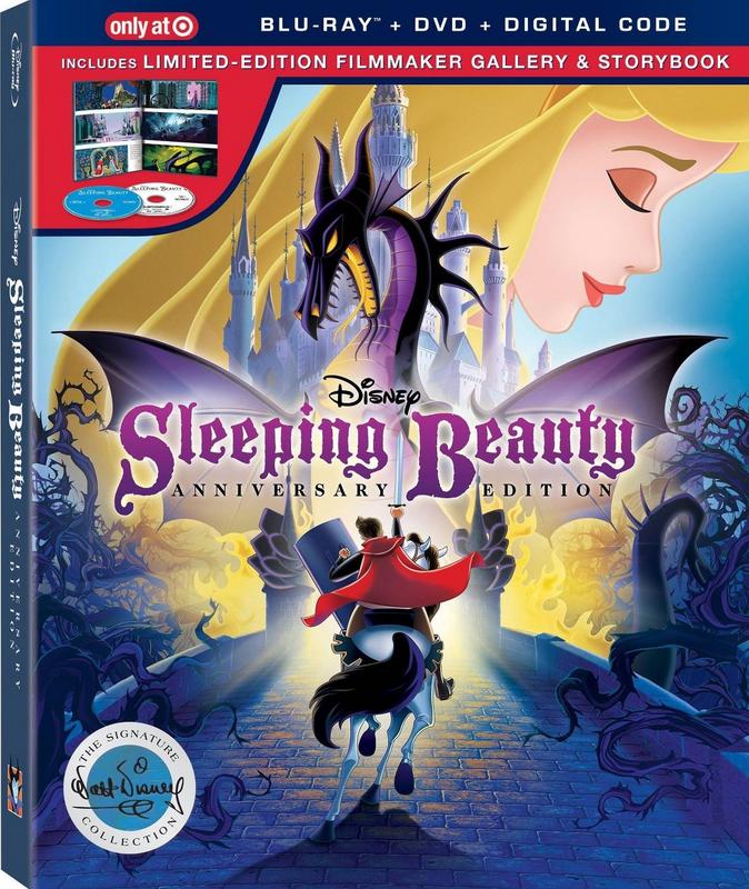
8. Taget Exclusive Signature Edition - I will say I appreciate the concept of this. So incredibly different than any of the others, and they actually used new art for Phillip! It does kind of trip up in its execution though. The use of Aurora really brings the whole thing down, though I understand why they did it.
9. Diamond Edition Blu Ray - Does not represent the film very much (makes it look much more like an animated version of Maleficent) but it is a unique concept. Plus it uses Marc Davis illustrations, so points for that! I do prefer the alternate version with the Briar Rose outfit though. I don't really like the trend of putting Aurora in pink when she's in blue for a majority (like 98%) of the time.
10. Platinum Edition Blu Ray/DVD - I put these together because its the same image with a slightly different color scheme. It's fairly basic and unexciting, but it's at least an improvement from the Special Edition DVD (which I'll get to). Considering that it is the same concept but upgraded, I can't be too mad at it.
11. Diamond Edition DVD - Clunkily put together and most of the characters are off model. The arrangement of the characters is awkward. Upside is I like the color scheme (minus Aurora's pink dress) and the Maleficent artwork they used. Odd having fairy and dragon Maleficent the same size.
12. Special Edition DVD - I get what they were going for, but boy is this underwhelming. Aurora and Phillip look ugly (her hair is SO yellow), and the proportion of Phillip and Dragon Maleficent at the bottom is way off. Overall they've done so much better than this.
13. Signature Collection Blu Ray - The epitome of laziness. A film full of beautiful images and iconic moments, and THAT is the best you can come up with?? Yikes. As someone who has purchased the film every time it has been released, this cover alone has made me completely disinterested in seeking it out. While I praised simplicity in my higher-ranked covers, this one is simplicity done wrong. I honestly can't imagine this took more than an hour to create.
1. Widescreen Edition VHS/Best Buy Exclusive Diamond Edition - I put these together because they are the same image. As a big Maleficent fan, obviously I'm predisposed to this because she's the focus of the cover. Aside from that, I appreciate how epic the image is, how small Phillip and Aurora are in contract to the towering Maleficent. It's beautifully drawn and dramatically colored. Nothing has topped this for me so far.
2. UK 2003 Collectors Edition - Easily the most beautiful and simplistic cover. The drama it brings! I appreciate how they held back from cluttering it up, and really let the beauty of the artwork shine.
3. US Classic (Black Diamond) VHS - Again I appreciate the simplicity. I also recall this VHS from my youth as one I'd see at the library or at friend's houses, and I always thought Maleficent looked so cool at the top of the stairs. I think it's an effective composition. Downside is that Phillip's face is weirdly proportioned.
4. Masterpiece VHS - This one is straight up nostalgia for me. It was the first time I was able to own the movie as a kid. I remember spending hours watching it again and again. It also brings to mind the behind-the-scenes feature after the film, which I had completely memorized... as a kindergartner.... I also feel like it's a unique composition that is dissimilar to any other cover for the film. It includes many characters without any of them floating from nowhere.
5. Best Buy Exclusive Platinum Edition - Pretty basic, but at least the majority of the cover is referencing the way the story book looks in the film, and the small circle includes the artwork from my favorite cover. No points for effort or creativity, but at least they picked good artwork to re-use.
6. Best Buy Exclusive Signature Edition - I haven't seen this in person, but from the photo I think it looks good! Again it's not over-complicated, and the characters look good with each other. If I saw this on sale, I'd be pretty tempted to get it.
7. UK Classic VHS - Pretty good composition! Different than other covers, which is a plus. My main complaint with it, is that it doesn't really represent the film stylistically from a visual standpoint. Sure the characters are present, but the way it's drawn and colored makes look more like a cheaper 80s move (a la Swan Princess or Happily Ever After) than the visual masterpiece it represents.
8. Taget Exclusive Signature Edition - I will say I appreciate the concept of this. So incredibly different than any of the others, and they actually used new art for Phillip! It does kind of trip up in its execution though. The use of Aurora really brings the whole thing down, though I understand why they did it.
9. Diamond Edition Blu Ray - Does not represent the film very much (makes it look much more like an animated version of Maleficent) but it is a unique concept. Plus it uses Marc Davis illustrations, so points for that! I do prefer the alternate version with the Briar Rose outfit though. I don't really like the trend of putting Aurora in pink when she's in blue for a majority (like 98%) of the time.
10. Platinum Edition Blu Ray/DVD - I put these together because its the same image with a slightly different color scheme. It's fairly basic and unexciting, but it's at least an improvement from the Special Edition DVD (which I'll get to). Considering that it is the same concept but upgraded, I can't be too mad at it.
11. Diamond Edition DVD - Clunkily put together and most of the characters are off model. The arrangement of the characters is awkward. Upside is I like the color scheme (minus Aurora's pink dress) and the Maleficent artwork they used. Odd having fairy and dragon Maleficent the same size.
12. Special Edition DVD - I get what they were going for, but boy is this underwhelming. Aurora and Phillip look ugly (her hair is SO yellow), and the proportion of Phillip and Dragon Maleficent at the bottom is way off. Overall they've done so much better than this.
13. Signature Collection Blu Ray - The epitome of laziness. A film full of beautiful images and iconic moments, and THAT is the best you can come up with?? Yikes. As someone who has purchased the film every time it has been released, this cover alone has made me completely disinterested in seeking it out. While I praised simplicity in my higher-ranked covers, this one is simplicity done wrong. I honestly can't imagine this took more than an hour to create.