The Lion King: Diamond Edition
-
Prince Edward

- Anniversary Edition
- Posts: 1184
- Joined: Fri Jun 27, 2008 9:23 pm
- Location: Trondheim, Norway
- Contact:
-
disneyboy20022
- Signature Collection
- Posts: 6868
- Joined: Tue Aug 23, 2005 2:17 pm

......

THIS BY FAR THE WORST COVER ART I'VE EVER SEEN IN MY LIFE!!! AND THE LION KING IS MY FAVORITE DAC AND TO SEE THIS DISGUSTING ARTWORK ON IT IS JUST EVIL
THIS BETTER JUST BE SOME PLACE ART AND THERE BETTER BE A BETTER COVER MADE FOR THIS OR SIMBA WILL ROAR UNTIL THERE IS JUSTICE

Random Video from the Animaniac's The Tiger King
<object width="480" height="385"><param name="movie" value="http://www.youtube.com/v/ZSPFWzHniTY?fs ... ram><param name="allowFullScreen" value="true"></param><param name="allowscriptaccess" value="always"></param><embed src="http://www.youtube.com/v/ZSPFWzHniTY?fs=1&hl=en_US" type="application/x-shockwave-flash" allowscriptaccess="always" allowfullscreen="true" width="480" height="385"></embed></object>
Want to Hear How I met Roy E. Disney in 2003? Click the link Below
http://fromscreentotheme.com/ThursdayTr ... isney.aspx
http://fromscreentotheme.com/ThursdayTr ... isney.aspx
-
VagueSimplicity
- Limited Issue
- Posts: 90
- Joined: Tue Feb 02, 2010 12:03 am
Ugh! This takes the prize for "Worst Disney Cover Art" by far. I didn't mind this style so much on Bambi, but this just ruins the entire atmosphere of The Lion King. Simba and Nala are way off model and that measly boulder in the corner supporting the supporting cast lacks any majesty or pride the true Pride Rock has. Also, where is the beautiful African landscape? Are the characters all just seamlessly floating in the sky? Disney was doing decently recently with their DAC cover art, but this is unforgivable, deplorable work.
But oh well, I guess; it's the movie that counts. None of our opinions matter. Just water under a bridge to Disney. Too bad they don't have more devoted artists like Lorddh working in the home entertainment department.
But oh well, I guess; it's the movie that counts. None of our opinions matter. Just water under a bridge to Disney. Too bad they don't have more devoted artists like Lorddh working in the home entertainment department.

I'm sure you could justify dislike of the cover are as mere personal opinion, but when 9 out of 10 people extremely dislike something, doesn't that stand out? Does Disney keep an eye out for early public opinion? Surely, with a release date about 10 months away, the cover cannot be completely finalized yet. Hopefully someone over there has an eye on us overly-eager fans, as we are almost like a "test group" for these re-releases as details emerge. However, I am well aware of the fact that most consumers would just grab this title off the shelf without ever really looking at the cover...
Bambi's sideways title was surprising at first, but I think it's grown on most of us. I know others didn't like the "huge head" either, but one thing at a time.
I am hopeful and agree with the previous poster that this is extremely early, preliminary art and that even if the characters stay in these positions, that they at least will be cleaned up and drawn better. I remember seeing an early Pinocchio cover for the Platinum release that was really off model, but was eventually fixed before release.
Now, as for the title, I am having a hard time believing that anyone over at Disney got a pat-on-the-back for the idea of putting "The" in the "O." The sideways title is one thing, but that little trick seems really amatuer design-wise to me. In college I had Typography classes, and I could imagine had I hung that title design on the wall, the first comment would be that it was too easily expected, unoriginal, and cliche.
-
BellesPrince
-
PatrickvD
- Signature Collection
- Posts: 5207
- Joined: Fri Sep 19, 2003 11:34 am
- Location: The Netherlands
It doesn't even make any sense... Is Nala a midget lion now? And why is the 'the' in the 'O' in the title? Hell, why is the title vertical? The whole thing is like a major graphic design no-no. Like a lesson on how not to design a cover.
Seriously. This is beyond hideous. I could stomach Bambi's cover, but this is the ugliest thing I've ever seen. They have SO many talented animators who could design something a million times better in their sleep, but this shitfest they call a marketing department continues to get away with this.
Sickening.
Exactly! It's almost as if they were trying to make it as ugly as possible. Are they letting first year graphic design students design these covers? And who is the art director that is stamping this stuff with their approval?PatrickvD wrote:The whole thing is like a major graphic design no-no.
I liked the Snow White and Beauty and the Beast covers, even if a little crowded. I thought they looked very regal and the I liked the type treatment they both received. Bambi still looks classy, and I can deal with the sideways title, but I hope this isn't the new standard for Diamonds.
I know a package is just a package, but I am a graphic designer myself and I have a strange love for package design. I know some people are probably rolling their eyes that we are even concerned with nice packaging (maybe even Disney themselves), but to each their own.
I just hope Disney values the public opinion even just a little bit. I'm sure all of this complaining on the board doesn't amount to a hill of beans to Disney, but we can hope.
-
BellesPrince
I'm not at all sure about the vertical logo, didn't like it on Bambi (much preferred the early promotional art they had for Bambi).
I think if the background colour had the deep red and yellow hues that we tend to associate more with The Lion King, and they lost the mini Nala and the vertical logo, then it's not so bad.
The danger, as always, with these things, is that they become too cluttered, and that's the major problem with this at the moment.
The mane breaking out from the side of the box makes it look even more awkward too.

-
Elladorine

- Diamond Edition
- Posts: 4372
- Joined: Wed Jan 25, 2006 1:02 pm
- Location: SouthernCaliforniaLiscious SunnyWingadocious
- Contact:
-
Elladorine
- Diamond Edition
- Posts: 4372
- Joined: Wed Jan 25, 2006 1:02 pm
- Location: SouthernCaliforniaLiscious SunnyWingadocious
- Contact:
MJW wrote:Yes, because right-reading text is B-O-R-I-N-G and so 2010!enigmawing wrote:I especially love the upside-down Walt Disney logo on Lady and the Tramp!
And now for the heck of it, I'm going with the typical overly-blue theme with the Broadway logo.
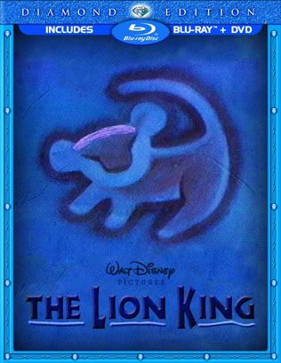

At worst, if we don't get the characters redrawn to be more on-model, they at least need to reposition them as when the typical border is restored (minus the "3D" effect of the character extending outside the frame), Pumba is cut off:

It's almost as if Rafiki, Timon, and Pumba need to be "flipped" so they are all facing left, towards the giant heads.
It's almost as if Rafiki, Timon, and Pumba need to be "flipped" so they are all facing left, towards the giant heads.

-
Elladorine
- Diamond Edition
- Posts: 4372
- Joined: Wed Jan 25, 2006 1:02 pm
- Location: SouthernCaliforniaLiscious SunnyWingadocious
- Contact: