
Disney Custom Cover Sets

-
milojthatch

- Collector's Edition
- Posts: 2646
- Joined: Fri Jan 02, 2009 1:34 am
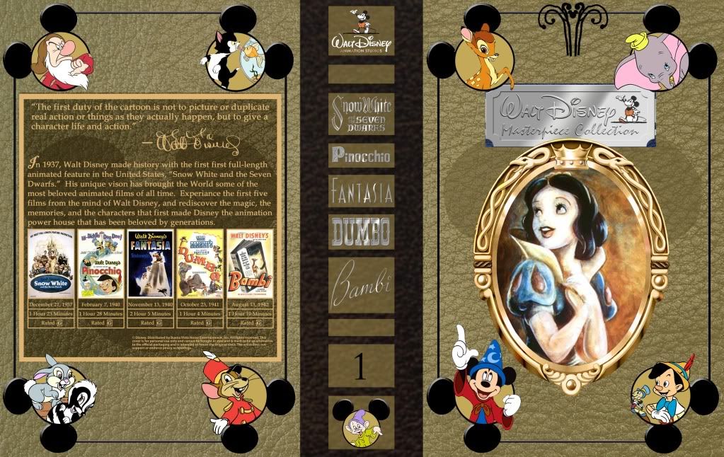
My newest update is done. What are thoughts for how the back is starting to shape up? I want to make a "one size fits all" kind of cover, so that it can be used for DVD or Blu Ray, any region, and any release. Is the back working so far for that? Anyone like the quote I am using for this first cover, or is there a better one to represent these films?
I love all the other covers by the way, I hope to see more! Thanks!
I love all the other covers by the way, I hope to see more! Thanks!
____________________________________________________________
All the adversity I've had in my life, all my troubles and obstacles, have strengthened me... You may not realize it when it happens, but a kick in the teeth may be the best thing in the world for you.
-Walt Disney
All the adversity I've had in my life, all my troubles and obstacles, have strengthened me... You may not realize it when it happens, but a kick in the teeth may be the best thing in the world for you.
-Walt Disney
-
Scarred4life

- Anniversary Edition
- Posts: 1410
- Joined: Sat Dec 26, 2009 12:18 pm
-
milojthatch
- Collector's Edition
- Posts: 2646
- Joined: Fri Jan 02, 2009 1:34 am
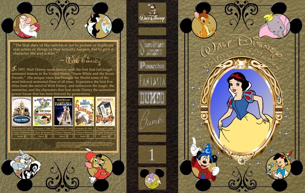
Here is my most recent update on my cover. Thoughts?
____________________________________________________________
All the adversity I've had in my life, all my troubles and obstacles, have strengthened me... You may not realize it when it happens, but a kick in the teeth may be the best thing in the world for you.
-Walt Disney
All the adversity I've had in my life, all my troubles and obstacles, have strengthened me... You may not realize it when it happens, but a kick in the teeth may be the best thing in the world for you.
-Walt Disney

-
Dragonlion
- Gold Classic Collection
- Posts: 202
- Joined: Mon Jul 20, 2009 6:19 pm
-
milojthatch
- Collector's Edition
- Posts: 2646
- Joined: Fri Jan 02, 2009 1:34 am
I changed the picture of Snow White on the suggestion of the guy I'm working with. He felt it didn't match the rest of the pictures. That said, after walking away from it for a day and looking at it again, I'm not so sure I like that picture. I agree, it looks to "clip-artish" and makes it look amateurish. I think I want to change the picture, I'm just not sure to what yet. I'm willing to take suggestions.eralkfang wrote:I personally prefer the sketch of Snow White to the… well, it reminds me of clip art, quite frankly, on your update. And the new "Walt Disney Masterpiece Collection" is a bit hard to read on that background. But otherwise, looks great.
A for the title on the front, I agree, it is hard to read. My partner suggest that I put a shadow behind it. I hope to try this soon, and hope it works. Thanks for the suggestions!
What color would you suggest? Keep in mind that I want different colors for the various sets I wish to make. Right now, my thought is to have the current colors for the current sets:Dragonlion wrote:I don't really like the painting of Snow White in this because it doesn't match the rest of the art. Also I think a different color for the case wouldn't be a bad idea.
Disney Masterpiece Collection (DAC) - Gold
Pixar - Blue
Disney Showcase (Animation not DAC) - Orange
Disney Shorts - Red
Disney Nature - Green
Disney Afternoon/ tv animation - Purple
Live action films/ Disney Treasures - Silver
If you have a suggestion though, I'm interested it hearing it. Maybe a different shad of gold may work?
____________________________________________________________
All the adversity I've had in my life, all my troubles and obstacles, have strengthened me... You may not realize it when it happens, but a kick in the teeth may be the best thing in the world for you.
-Walt Disney
All the adversity I've had in my life, all my troubles and obstacles, have strengthened me... You may not realize it when it happens, but a kick in the teeth may be the best thing in the world for you.
-Walt Disney
-
Dragonlion
- Gold Classic Collection
- Posts: 202
- Joined: Mon Jul 20, 2009 6:19 pm
Well, looking at your ideas for the colors, they seem OK to me. It was just that the box seemed a bit dull in color, to me, more brown than gold. Maybe a color that's brighter? Just a suggestion and it might not look too good with the look you seem to be going for either.milojthatch wrote:What color would you suggest? Keep in mind that I want different colors for the various sets I wish to make. Right now, my thought is to have the current colors for the current sets:Dragonlion wrote:I don't really like the painting of Snow White in this because it doesn't match the rest of the art. Also I think a different color for the case wouldn't be a bad idea.
Disney Masterpiece Collection (DAC) - Gold
Pixar - Blue
Disney Showcase (Animation not DAC) - Orange
Disney Shorts - Red
Disney Nature - Green
Disney Afternoon/ tv animation - Purple
Live action films/ Disney Treasures - Silver
If you have a suggestion though, I'm interested it hearing it. Maybe a different shad of gold may work?
-
milojthatch
- Collector's Edition
- Posts: 2646
- Joined: Fri Jan 02, 2009 1:34 am

Maybe something lighter? Like that? I'm not so sure I like it, but what do other's think? Don't worry about the text on the front or back, this was just to get an idea about what it would look like if lighter. Or this is this one:

Again, don't worry about the text, it can be changed. This is just to show the basic idea. Thoughts?
____________________________________________________________
All the adversity I've had in my life, all my troubles and obstacles, have strengthened me... You may not realize it when it happens, but a kick in the teeth may be the best thing in the world for you.
-Walt Disney
All the adversity I've had in my life, all my troubles and obstacles, have strengthened me... You may not realize it when it happens, but a kick in the teeth may be the best thing in the world for you.
-Walt Disney
-
DancingCrab
- Anniversary Edition
- Posts: 1030
- Joined: Mon Aug 23, 2010 3:20 pm
-
Dragonlion
- Gold Classic Collection
- Posts: 202
- Joined: Mon Jul 20, 2009 6:19 pm
-
milojthatch
- Collector's Edition
- Posts: 2646
- Joined: Fri Jan 02, 2009 1:34 am
My latest go at it. I think I'm almost done. The main thing I want to do still is maybe add gold titles to the spine, but past that, I'm liking it.
____________________________________________________________
All the adversity I've had in my life, all my troubles and obstacles, have strengthened me... You may not realize it when it happens, but a kick in the teeth may be the best thing in the world for you.
-Walt Disney
All the adversity I've had in my life, all my troubles and obstacles, have strengthened me... You may not realize it when it happens, but a kick in the teeth may be the best thing in the world for you.
-Walt Disney
-
Elladorine

- Diamond Edition
- Posts: 4372
- Joined: Wed Jan 25, 2006 1:02 pm
- Location: SouthernCaliforniaLiscious SunnyWingadocious
- Contact:
I think doing gold text on the spine will tie it together better. And since you seem to be looking for suggestions, I hope you don't mind if I make a few.milojthatch wrote:My latest go at it. I think I'm almost done. The main thing I want to do still is maybe add gold titles to the spine, but past that, I'm liking it.
Are you using the bevel and emboss effects on the front text for the layer style in photoshop? If so, might I suggest experimenting with the contour (try out the "Chisel Hard"). You might be able to get a shiner, more appealing look to the text with it.
I'm thinking the white, slightly transparent areas on the front and back of the cover might look better as black, like the spine appears to be (although I'm having a hard time judging that without seeing it done). I'm afraid I'm not too fond of the overall background texture; if I were working on this I'd try out several different leather-based textures as a subtle overlay and maybe a deeper, more saturated color.
Also, I think the Mickey-shaped holes the characters are popping out of might look better with a darker background instead of the flat gold.
The layout itself looks fine to me, something I tend to struggle a lot with myself.


-
milojthatch
- Collector's Edition
- Posts: 2646
- Joined: Fri Jan 02, 2009 1:34 am
Thanks for all the ideas. A few things before I get into much else. First, I've never take a class in Photoshop and only know as much as I've found out on my own. This project in particular has pushed my knowledge of Photoshop more then I expected it to.enigmawing wrote:I think doing gold text on the spine will tie it together better. And since you seem to be looking for suggestions, I hope you don't mind if I make a few.milojthatch wrote:My latest go at it. I think I'm almost done. The main thing I want to do still is maybe add gold titles to the spine, but past that, I'm liking it.
Are you using the bevel and emboss effects on the front text for the layer style in photoshop? If so, might I suggest experimenting with the contour (try out the "Chisel Hard"). You might be able to get a shiner, more appealing look to the text with it.
I'm thinking the white, slightly transparent areas on the front and back of the cover might look better as black, like the spine appears to be (although I'm having a hard time judging that without seeing it done). I'm afraid I'm not too fond of the overall background texture; if I were working on this I'd try out several different leather-based textures as a subtle overlay and maybe a deeper, more saturated color.
Also, I think the Mickey-shaped holes the characters are popping out of might look better with a darker background instead of the flat gold.
The layout itself looks fine to me, something I tend to struggle a lot with myself.Good luck with finishing your project! I've been vowing to make my own covers and print them up for a few years now.
Second thing, as I have stated in this post, I'm getting some help. Specifically, he did all the gold lettering for the front and spine, the Mickey Heads I put the characters in on the front and back and he also made the Magic Mirror golden. Everything else is all me. So, I'm not sure how he did the lettering to be honest and I have yet to figure that feature out. As he has time, he was going to make them gold, that is the hang up on that.
Now then, with all of that understood, on to your suggestions. First, thanks, I think it keeps getting better each time I post it. You should have seen my very first attempt at this four years ago. I have come a long way.
So far as it being black instead of the white, this is what that looks like:

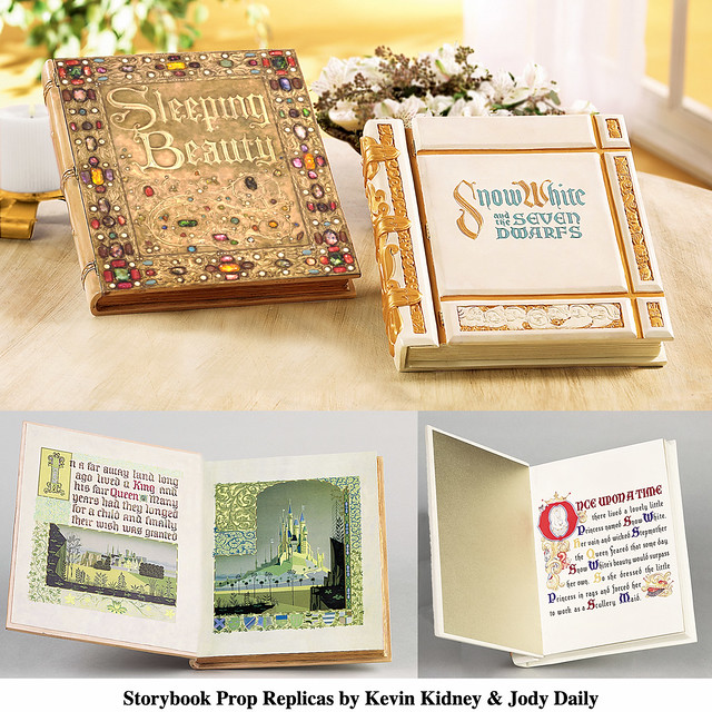
I'm not liking it like that so much. The white idea actually came from the original Snow White book in the film, which was white and gold.
http://farm3.static.flickr.com/2173/216 ... z.jpg?zz=1
I tried to make the spine white, but it wasn't working too well, but maybe with different leather textures, that can be fixed? I'll try a few out. You have any in mind possibly that you think may work? I want to keep the story book feel to these covers.
As for the holes behind the characters in the Mickey Heads, what color did you have in mind, I can try it. For the cover series, I'm trying to hold on to gold for the DAC as other colors are assigned for now with other sets. I posted all of that just above. With that in mind, maybe a darker gold, maybe a black? If it looks good, I'm willing to do it and we can try.
____________________________________________________________
All the adversity I've had in my life, all my troubles and obstacles, have strengthened me... You may not realize it when it happens, but a kick in the teeth may be the best thing in the world for you.
-Walt Disney
All the adversity I've had in my life, all my troubles and obstacles, have strengthened me... You may not realize it when it happens, but a kick in the teeth may be the best thing in the world for you.
-Walt Disney
-
Scarred4life
- Anniversary Edition
- Posts: 1410
- Joined: Sat Dec 26, 2009 12:18 pm
-
milojthatch
- Collector's Edition
- Posts: 2646
- Joined: Fri Jan 02, 2009 1:34 am
You like the black? Really? Why if you don't mind me asking?Scarred4life wrote:Ooh! That new background is by far my favourite!
____________________________________________________________
All the adversity I've had in my life, all my troubles and obstacles, have strengthened me... You may not realize it when it happens, but a kick in the teeth may be the best thing in the world for you.
-Walt Disney
All the adversity I've had in my life, all my troubles and obstacles, have strengthened me... You may not realize it when it happens, but a kick in the teeth may be the best thing in the world for you.
-Walt Disney
-
Scarred4life
- Anniversary Edition
- Posts: 1410
- Joined: Sat Dec 26, 2009 12:18 pm