Julian Carter wrote:No. You misunderstand.

I know perfectly well the significance of Milk Buds in the world of UD. However, the pictures you posted answer my question. Apparently Milk Duds (and Buds, as I was mistakenly referring to them) are "Milk Chocolate Covered Caramels".
They sound delicious. I can't taste them though ... they're not sold here.

I . . . I . . . I have a confession to make.

I prefer Junior Mints over Milk Duds.

Milk Duds are rather chewy, while Junior Mints are really soft.

Goliath wrote:@ all: I can understand how discussions like that can be become tiresome, but I still don't see why a *serious* post couldn't be taken seriously. I don't pretend to know better than Don Hahn.
I hope you realize I never tried to direct any negativity at you, only offer a reply.

As I tried to say, I'm cool with opinions and rational discussions. I also never thought you were trying to say you knew better than Mr. Hahn (although I may not be able to say the same for everyone at UD, lol).
Goliath wrote:BUT! I'm also not saying Don Hahn automatically knows better because he works for Disney and even produced the film.
Believe it or not, I'm not either. But coupled with everything else I've seen and heard his explanation definitely makes the most sense. I tried to offer a basic explanation a few pages back so here's a quote:
enigmawing wrote:Once again, does anyone know how extremely difficult it is to print out digitally-generated images onto physical media and match the colors correctly? Any experts wanna raise their hands? Most likely the difficulties behind the original colors with the film was due to the differences between RGB (additive) and CMYK (subtractive) colors.
Computer monitors emit light, while printed media absorbs and reflects light. RGB and CMYK both have their limits in the visual spectrum, but their ranges are not the same. Artwork produced on a monitor is RGB and must be converted to CMYK at the printing stage, and will most likely not match in color due to their differing limitations.
The original theatrical release of Beauty and the Beast had to be transferred to physical media on a relatively new system with little time to spare. And once it was printed on film, subsequent transfers relied on that physical media with the different set of limitations than seen on the original monitors. The current stance is that now they are able to go back to the CAPS files and recreate the colors as originally seen on their monitors, before they became filtered and compromised by a rushed film transfer.
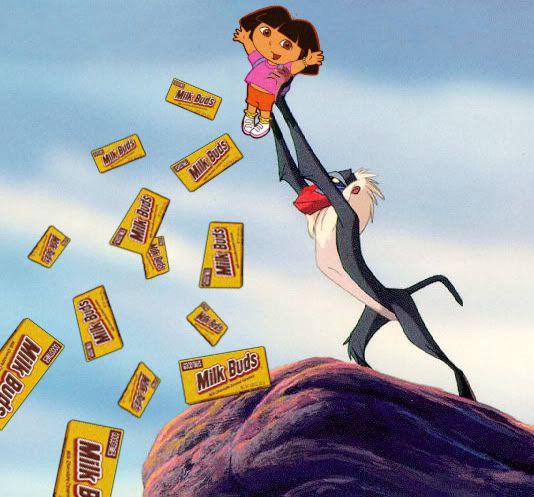
People can argue all they like over which version they prefer, I really have no beef with that. But I think it's disrespectful to claim there's some kind of conspiracy going on. If that were the case, Disney would be finding excuses to alter all their films into the so-called Dora the Explorer colors, from Snow White to Peter Pan to The Little Mermaid. The negativity over the colors here is ruining this thread to the point that I don't even want to click on it anymore.
I'm not sure how much sense I'm making, but I constantly work with digital colors as well as traditional ones, and have experienced the limits in the visual spectrum first-hand and know how frustrating it can be to match things up (or fail to be able to do so) when trying to share work.
Goliath wrote:Generally, I see that the UD community is always, on every topic, very eager to accept the 'official' version of the Disney Company (especially when it comes to "Walt always said..."). It seems many don't realize it's all marketing.
Perhaps some are, but I'm afraid I'm much too cynical for to blindly swallow "facts" from a corporation as big, old, and complex as Disney . . . especially since they're out for money (and who isn't?)

* * *
Who knows, maybe Disney will see this thread and think the whole Dora colors idea has potential beyond just the colors . . .
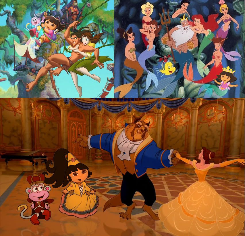
Or maybe I shouldn't be giving them any ideas.


