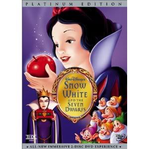
Snow White:
The Diamond cover would be better, if they hadn't gone and insisted on putting in the Witch. The mock-up cover wasn't too bad (aside from a particularly poorly done, zombie-like Queen), but once they threw in the Witch (and relegated Snow White to the bottom of the cover), then it got far too cluttered. The Platinum was the first of floating heads and randomly placed characters, a trend still bugging WDHE, but the characters, and moreover the Queen, were at the very least well replicated. The regular DVD edition looked like it was designed by somebody with bad Photoshop skills, I have to say.
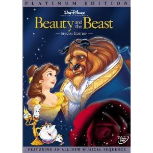
Beauty and the Beast:
The Platinum cover was okay but just a bit generic. The Blu-Ray cover probably would be better had they placed the title at the top and not in the middle; is Disney censoring the clothed waist/thigh areas of the respective characters so as to not spark questions about the capabilities of a couple in love. For some reason, I prefer the regular DVD cover art, even if it makes Belle appear the main character and not part of a duo (though the Disney Princess franchise does that regularly, even to
Aladdin where the princess is a supporting character in somebody else's film). The DVD cover captures some of the thrills of the original film (Gaston, the castle at night, Maurice lost in the wood). It would be nice, as atlantica said, for something other than the ballroom scene, and the DVD cover at least strayed from it the most (even if Belle isn't wearing her village dress; for some reason I've always preferred the heroines in their casual wear).
Bambi:
The Platinum looks a bit
Lion King-ish, and essentially replicates that film's Platinum cover. The Diamond cover is awful, mainly due to the sideways lettering, and the regular DVD is fine but maybe a bit too cute. My favourite cover would probably be the cover for the international Platinum:

Basically, I agree with those that say the older VHS covers were probably better than any of the Platinum covers, bar
The Lion King and possibly
Peter Pan. The Platinum covers weren't awful, and they're not that important ultimately, but their whole design pattern (floating heads, vague backgrounds) just don't seem to speak to me that much. Maybe part of my bias derives from childhood nostalgia; the original VHS covers were undeniably the faces of the animated classics for me growing up.