Hmm... Do I like it, or do I not like it...?
I'm really not sure. I don't think it's a total eyesore, anyway.
At least they're trying to be more creative with the placement of the title on the cover.
Bambi: Diamond Edition Discussion - March 1, 2011
-
UmbrellaFish

- Signature Collection
- Posts: 5762
- Joined: Sun Jan 28, 2007 3:09 pm
- Gender: Male (He/Him)

-
TheSequelOfDisney
- Signature Collection
- Posts: 5263
- Joined: Wed Nov 09, 2005 3:30 pm
- Location: Ohio, United States of America
That certainly is a unique cover, but I'm not digging it. It's just kind of really off.
The Divulgations of One Desmond Leica: http://desmondleica.wordpress.com/
-
zackisthewalrus

- Anniversary Edition
- Posts: 1229
- Joined: Wed Jan 28, 2009 10:00 am
- Location: Everywhere
- Contact:
Oh goodness. That lettering is very....... unique? The image looks fine to me.jrboy wrote:


"No day but today."
My YouTube Channel
My YouTube Channel

-
RIPJoeRanft
- Gold Classic Collection
- Posts: 172
- Joined: Mon Nov 01, 2010 8:33 pm
-
singerguy04
- Collector's Edition
- Posts: 2591
- Joined: Wed Feb 09, 2005 4:40 pm
- Location: The Land of Lincoln
-
zackisthewalrus
- Anniversary Edition
- Posts: 1229
- Joined: Wed Jan 28, 2009 10:00 am
- Location: Everywhere
- Contact:
Just searched "bambi diamond edition" on Amazon. It looks like Bambi: Diamond Edition will be released....
March 1, 2011
March 1, 2011
"No day but today."
My YouTube Channel
My YouTube Channel

Ugh, Bamzilla much? I'm not digging that cover much at all. What's wrong with using this?
http://cdn.stitchkingdom.com/wp-content ... sShelt.jpg
I figured the art in the above ad was too good to just be for that PSA, and it matches the group shot type of artwork Disney's been doing for titles like Beauty and the Beast and Alice in Wonderland. Hmmm....
http://cdn.stitchkingdom.com/wp-content ... sShelt.jpg
I figured the art in the above ad was too good to just be for that PSA, and it matches the group shot type of artwork Disney's been doing for titles like Beauty and the Beast and Alice in Wonderland. Hmmm....
-
PixarFan2006
- Signature Collection
- Posts: 6166
- Joined: Fri Jun 16, 2006 8:44 am
- Location: Michigan
-
zackisthewalrus
- Anniversary Edition
- Posts: 1229
- Joined: Wed Jan 28, 2009 10:00 am
- Location: Everywhere
- Contact:
Here's the cover for the 2-Disc DVD due in stores April 19, 2011:

Personally, I think it looks a lot better than the Blu-ray.
Personally, I think it looks a lot better than the Blu-ray.
"No day but today."
My YouTube Channel
My YouTube Channel
-
SpringHeelJack

- Platinum Edition
- Posts: 3673
- Joined: Fri Nov 10, 2006 3:20 pm
- Location: Boston, MA
- Contact:
It sucks when the DVD gets better cover art. The DVD looked nicer than the cluttered "Snow White" Blu-ray and it looks like the same here. But I guess on some level I'm just glad to see "Wu3-o-." coming out on Blu-ray.
...wait, that's supposed to say "Bambi"? Cripes.
...wait, that's supposed to say "Bambi"? Cripes.
"Ta ta ta taaaa! Look at me... I'm a snowman! I'm gonna go stand on someone's lawn if I don't get something to do around here pretty soon!"
-
Disney's Divinity

- Ultimate Collector's Edition
- Posts: 16407
- Joined: Thu Mar 17, 2005 9:26 am
- Gender: Male
Is it just me, or are these covers (this, B&tB, Snow White) really sucking in comparison to the Platinum Line's covers? The artwork is generally worse and the colors are hi-bright and kiddified.
I thought this was the Diamond Line, not the 50 Cent Glitter Line. Seriously.
I thought this was the Diamond Line, not the 50 Cent Glitter Line. Seriously.

Listening to most often lately:
Christina Aguilera ~ "Cruz"
Sombr ~ "homewrecker"
Megan Moroney ~ "Beautiful Things"
-
disneyboy20022

- Signature Collection
- Posts: 6868
- Joined: Tue Aug 23, 2005 2:17 pm
Looks like more of a postage stamp or a sorta collector's cover of the Blu ray. or perhaps a Poster at wal-mart for $5...zackisthewalrus wrote:Oh goodness. That lettering is very....... unique? The image looks fine to me.jrboy wrote:
Though It beats floating heads and characters off model on the Disney cover for a change. Very Unique....I like it sorta...kinda a unexpected cover, but yet there's something about it that I like...perhaps the unique ness is growing on me liking it..
Want to Hear How I met Roy E. Disney in 2003? Click the link Below
http://fromscreentotheme.com/ThursdayTr ... isney.aspx
http://fromscreentotheme.com/ThursdayTr ... isney.aspx
-
Alphapanchito
- Gold Classic Collection
- Posts: 215
- Joined: Sun Sep 05, 2010 1:12 pm
I like that it says "Walt Disney" instead of the annoying "Disney" above the title of the film. Although I would prefer Walt Disney's or Walt Disney presents, I really do like the inclusion of Walt here, if it is the actual cover art. I like the art used, and as for the sideways writting.. there is something I really like about it. It seems 90s nostalgic, though I have no idea why.
-
Wonderlicious
- Diamond Edition
- Posts: 4661
- Joined: Wed Jun 23, 2004 9:47 am
- Location: UK
- Contact:
Perhaps Bambi is trying to avoid past accidents.Disneykid wrote:Ugh, Bamzilla much?
<object width="480" height="385"><param name="movie" value="http://www.youtube.com/v/csD5WBt-fUw?fs ... ram><param name="allowFullScreen" value="true"></param><param name="allowscriptaccess" value="always"></param><embed src="http://www.youtube.com/v/csD5WBt-fUw?fs ... 2=0x4e9e00" type="application/x-shockwave-flash" allowscriptaccess="always" allowfullscreen="true" width="480" height="385"></embed></object>
Personally, I'm not quite a fan of both covers. They're not particularly bad, rather they're just flawed. The Blu-ray one stumbles mainly due to the composition, and of course the sideways lettering (it has obviously always worked on spines, but not really that much on front covers!). If they shrunk Bambi and moved him to the left, did the same for Thumper and Flower, moved the Great Prince further into the background (possibly placing him atop the cliff), and then put the title in the top right-hand corner, then we'd at the very least get a cover similar to the acceptable one Pinocchio got. The DVD cover is much better (they used a single scene as opposed to floating heads, and one somewhat akin to the art of the film!), but the characters look so ridiculously saccharine and cute that I'm closing my mouth right now should my teeth start to decay in their presence. What I would do would be to simply make the characters look less sickly sweet; at the moment the characters, especially Thumper, look a bit exaggerated in their expressions.

haha what a bunch of weird covers(the lettering looks so fake), but hey you never know with disney(they managed to pull out a horrible cover for beauty and the beast as well, I'm sure people wouldn't even recognize it as disney,cause belle looks so weird.. )
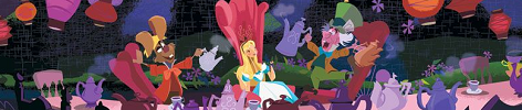
weird also that the covers go from really good(alice in wonderland 60th anniversary blu-ray looks truly great) to horrible(Snowwhite and batb)
weird also that the covers go from really good(alice in wonderland 60th anniversary blu-ray looks truly great) to horrible(Snowwhite and batb)
-
stitchje1981
- Gold Classic Collection
- Posts: 170
- Joined: Thu Feb 11, 2010 8:59 am
totally agree, the lettering is so fake...
The photo's aren't that bad from both versions on this topic
I think the Fantasia + Fantasia 2000 Blu cover is a great one as well
BATB is cliché: always the same ballroom scène with Lumiere, Cogsworth, Chip and Mrs. Potts on the cover!
Snow White wasn't that bad, I loved the Evil Queen as the hag with the apple in the middle

-
UmbrellaFish
- Signature Collection
- Posts: 5762
- Joined: Sun Jan 28, 2007 3:09 pm
- Gender: Male (He/Him)