Thank god, I was running out!Sunny Wing wrote:Milk Buds, anyone?
Sunny, where's the one where we invade the picture?
albert

DisneyJedi wrote:All everyone is doing is whining about how neither the Platinum or Diamond Editions look anything like the "theatrical colors" and frankly, I'm fed up with everyone complaining about it.Scamander wrote:I'm really not on any side in this discussion, but who are you to tell other users about what they may discuss? It isn't even off topic and if you are pissed off than you should simply STOP READING the posts!!!

Excuse me, but how in the name of fudge is that shot "revised"?DisneyChris wrote:Um, a little bad news to report... there's one shot in the "Original Theatrical Version" on this new Diamond Edition that's actually a revised shot from the "Special Edition".
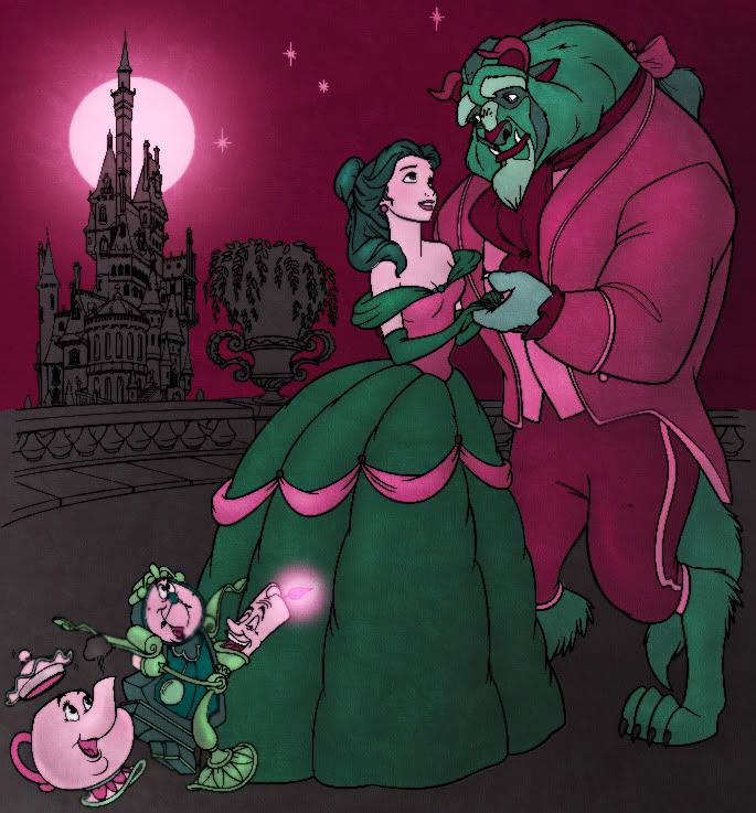
It's the shot at the very end of the "Something There" sequence where Mrs. Potts says to Chip, "I'll tell you when you're older." In the original version, Belle and Beast were behind the enchanted objects, but the Special Edition changed the camera angle, with the hallway in the background, as shown below:
Ironically the "Original Theatrical Version" on the Platinum Edition DVD retained the original shot...

Happy anniversary, I guessScamander wrote:PS. Funny that this pic was posted the first time exactly one year ago.^^


. Hahaha, oh please. If they loved the film they wouldn't be whining for insignificant things. The film is still amazing and the make over looks superb and modern. Praise the film instead!!!!!rodis wrote:People are doing it out of love for the film. Otherwise, they couldn't have cared less about the colors.DisneyJedi wrote: All everyone is doing is whining about how neither the Platinum or Diamond Editions look anything like the "theatrical colors" and frankly, I'm fed up with everyone complaining about it.
Am I a bad Disney fan if I like image B more?jpanimation wrote:Happy anniversary, I guessScamander wrote:PS. Funny that this pic was posted the first time exactly one year ago.^^
Here's my first whack at it, but I can't decide which is better...
Image A
or
Image B

DisneyJedi wrote:Excuse me, but how in the name of fudge is that shot "revised"?
You know, after getting used to watching the Special Edition, the transition from the end of "Something There" to Beast being bathed seems more like a jump cut in the original version.DisneyChris wrote:DisneyJedi wrote:Excuse me, but how in the name of fudge is that shot "revised"?Excuse me, but that's a shot that only appears in the Special Edition. I don't mind repeating again: it's the shot at the very end of the "Something There" sequence where Mrs. Potts says to Chip, "I'll tell you when you're older." In the name of fudge, please either look at the "Original Theatrical Version" on the Platinum Edition DVD or the original VHS/LD. You'll see Belle and Beast in the background instead of the hallway. I know it's a rather minor issue but it's still distracting cos you can see Lumiere and Featherduster closing the door when it suddenly cuts to Beast taking a bath.


DisneyChris wrote:there's one shot in the "Original Theatrical Version" on this new Diamond Edition that's actually a revised shot from the "Special Edition".
Ironically the "Original Theatrical Version" on the Platinum Edition DVD retained the original shot...
Hi DisneyChris, aren't those statements quite contradicting?DisneyChris wrote:Excuse me, but that's a shot that only appears in the Special Edition.
That sucks then, i was so happy with the restored Cogsworth animation in the Theatrical Edition...Scamander wrote:DisneyChris meant, that this shot belongs in the Special Edition, but is part of both versions in this new Diamond Edition.

I meant to comment earlier that I thought that was all kinds of awesome!Sky Syndrome wrote:I made a black velvet poster!
I saw this movie in the theater three times way back when I was 15. I won't get into the whole color debate but Image A definitely takes me back to that.jpanimation wrote:Here's my first whack at it, but I can't decide which is better...
Image A
or
Image B
Be careful what you wish for.zackisthewalrus wrote:I think the movie is pretty good no matter what the colors look like. They could be green and pink for all I care.

I hope this will qualify as a "thoughtful post."jpanimation wrote:Also, I can't believe how rude some people are being on here. Telling people to shut up because you disagree with them or quoting them with blah blah blah isn't contributing to the discussion (I think thoughtful posts is somewhere in the posting guidelines). I get it, you don't like hearing facts and quite frankly, I get tired of repeating these facts only to have them ignored as inaccurate information pertaining to the accuracy of the colors is repeatedly spewed afterwords. You can argue all you want as to whether you personally like the color alterations or whether you feel it affects the film positively/negatively or even if you think it was the director's intent but there really isn't any argument as to whether these are the original colors.
I still haven't heard any smart explanation for the following supporting the format theory:
jpanimation wrote:<b>None of this format argument explains why the original press images and trailers for the Human Again sequence would reflect the VHS colors if they weren't the original ones. </b> It also doesn't explain why the Inter-Stitch-Al, which had to dive back into the CAPS files for new animated section (as the Special Edition did for the Human Again sequence), would remain rather close to the original colors. Both new animated bits [Inter-Stitch-Al and Human Again) featured colors very close to the VHS.
...what viewers saw -- and still see in all of the regular [NTSC analog] sets in use even today -- is a picture in which colors change as the image gets brighter or darker. What's more, the brightness of a scene changes along with the color.
When RCA began commercial TV broadcasting in 1941, TV was strictly a black-and-white affair. Almost immediately, RCA, CBS, and others began working on ways to broadcast in color. The best way would have been to scrap the existing system and start over, but nobody wanted to tell the thousands of TV owners that their sets were suddenly obsolete. The result was a compromise: in 1953, the National Television Standards Committee proposed a standard by which color information could be added to the existing black-and-white broadcast signal. The advantage was that programs broadcast in color could still be seen on black-and-white TVs; the disadvantage was that the images on color TVs would be somewhat muddy and difficult to control. (A joke sprang up among broadcast engineers that NTSC stands for "Never Twice the Same Color.")
Today, we still live with that legacy. Many Director users are horrified to see their sharp, brilliant colors (left, top) reduced to unpleasant, fuzzy blobs when their movie goes through the scan converter (left, bottom). Get used to it: no matter how expensive your hardware, your movies will never look as good on the TV screen as they do on the computer screen. Once you've accepted that fact, you can do what's necessary to optimize your graphics for NTSC output -- even if this requires altering your artistic vision.