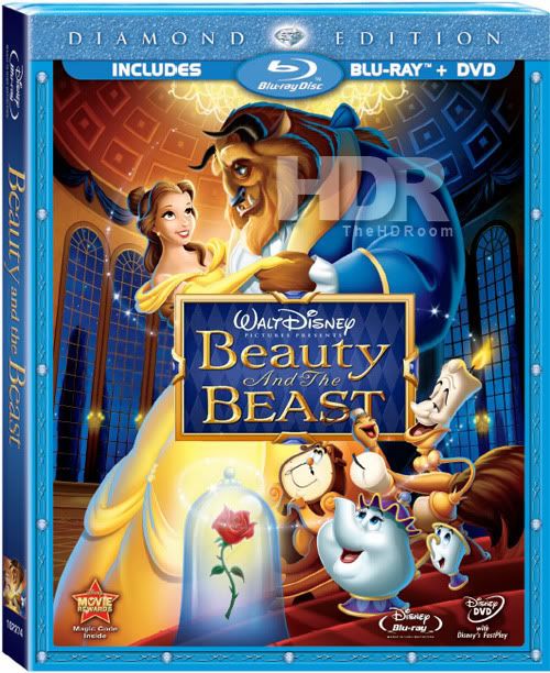
OK, I'm not a fan of the cover but it doesn't bother me as much as the cluttered Snow White one (especially once they added the hag to the cover). So why did they get rid of the fancy boxing around the title for Snow White and Dumbo, only to bring it back for Beauty and the Beast? Not that I'm complaining, I like the boxing around the titles, but I'd also like it if there was some consistency (Snow White and Dumbo's included DVDs have the box around the titles).
As with the Dumbo Blu-ray release, I hate that it only says Disney above the title. It should say Walt Disney, or preferably, Walt Disney Pictures presents. Just Disney is cheap looking.
If they were to change the colors for this release to more accurately depict the theatrical version, then I could care less what is on the cover.
Beauty And The Beast: Diamond Edition Discussion Oct. 5th!
-
DisneyJedi

- Platinum Edition
- Posts: 3754
- Joined: Fri Oct 17, 2008 2:53 pm
- Gender: Male

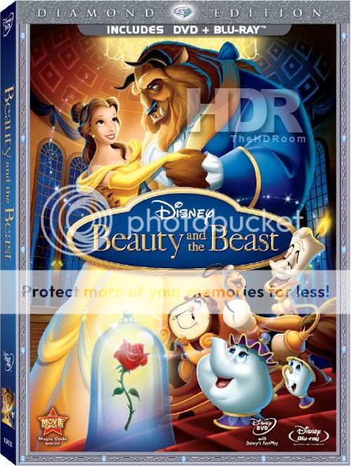

I, personally, think it's gorgeous. I never really liked the Platinum Edition cover, so this to me is a huge step up. The Beast doesn't look that off-model to me. His face seems spot-on, it's just the shape of the fur around it is a little off. Belle may not be 100% correct, but consider that: a) she was hideously off on the PE, and b) Belle herself had, like, three different faces throughout the film. I think both she and the cover as a whole are lovely.
I will say that the logo does need to change to match the film's. The one they keep using on merchandise is so plain.
Still, this beats Snow White's (and thank you, Disney, for not putting the villain smack dab in the middle of the BD cover this time). I think I'll go as far to say it's better than any of the covers in the Platinum collection.
-
ajmrowland

- Signature Collection
- Posts: 8177
- Joined: Fri Jan 16, 2009 10:19 pm
- Location: Appleton, WI

-
disneyboy20022

- Signature Collection
- Posts: 6868
- Joined: Tue Aug 23, 2005 2:17 pm
The Cover reminds me more of this one thats coming out that in April...though only to DVD
Anyway I like it....its a differ style....but it looks like a lithograph or I think there's something's there that wasn't there before and its good
Anyway I like it....its a differ style....but it looks like a lithograph or I think there's something's there that wasn't there before
Want to Hear How I met Roy E. Disney in 2003? Click the link Below
http://fromscreentotheme.com/ThursdayTr ... isney.aspx
http://fromscreentotheme.com/ThursdayTr ... isney.aspx

Kinda haveta agrfee with you there. I dont like the pumpkin-looking shaped boxing around the title.jpanimation wrote:OK, I'm not a fan of the cover but it doesn't bother me as much as the cluttered Snow White one (especially once they added the hag to the cover). So why did they get rid of the fancy boxing around the title for Snow White and Dumbo, only to bring it back for Beauty and the Beast? Not that I'm complaining, I like the boxing around the titles, but I'd also like it if there was some consistency (Snow White and Dumbo's included DVDs have the box around the titles).
As with the Dumbo Blu-ray release, I hate that it only says Disney above the title. It should say Walt Disney, or preferably, Walt Disney Pictures presents. Just Disney is cheap looking.
If they were to change the colors for this release to more accurately depict the theatrical version, then I could care less what is on the cover.
What happened to the box look in the preview?
-
SpringHeelJack

- Platinum Edition
- Posts: 3673
- Joined: Fri Nov 10, 2006 3:20 pm
- Location: Boston, MA
- Contact:
-
ajmrowland
- Signature Collection
- Posts: 8177
- Joined: Fri Jan 16, 2009 10:19 pm
- Location: Appleton, WI
I dont like the cover at all! It looks like a knock off of the first VHS release lol. Belle is more off model then the Beast. I think this is the official cover though. 
I hope this release is gonna be good! I have a feeling they are gonna cut a lot of the bonus features out.
I cannot wait to get my hands on this release though! My old DVD looks like crap on my new LED HD TV!
I hope this release is gonna be good! I have a feeling they are gonna cut a lot of the bonus features out.
I cannot wait to get my hands on this release though! My old DVD looks like crap on my new LED HD TV!
-
ajmrowland
- Signature Collection
- Posts: 8177
- Joined: Fri Jan 16, 2009 10:19 pm
- Location: Appleton, WI
I kind of wish they could lose the blue borders/banners on Blu-rays now. I understand them, but I feel like now that BLU-ray has been established as the new format, I wish we could just have regular covers, just smaller. I just think the blue takes away from the color schemes of most of the covers. That's why I love the steelbook releases so much! I hope to God they have one for BatB.
Ohhhhhhhhhhhhhhhhhhhhhh Lord, don't get em started.Aqua wrote:I hope the video quality/colors look a lot better on Blue Ray. The PE edition has 3 versions of the movie crammed into one single disc thus causing a decline the video department and the bright colors really took away from what was originally a moody film, but that is my opinion.
-
jpanimation

- Anniversary Edition
- Posts: 1841
- Joined: Mon Sep 07, 2009 12:00 am
You mean from the trailer? Here is what it would look like:toonaspie wrote:What happened to the box look in the preview?

I agree and wish they would. Here's a quick mockup of what it could look like:Disneykid wrote:I will say that the logo does need to change to match the film's. The one they keep using on merchandise is so plain.

I got lazy and didn't want to cut out the logo, so I just took a frame right out of the movie and pasted it there. Then changed the border to try and get a harmony with the logo. I know the UK's original VHS had this logo completely horizontal, so someone could try it with the official round title-box if they wanted.

-
Elladorine

- Diamond Edition
- Posts: 4372
- Joined: Wed Jan 25, 2006 1:02 pm
- Location: SouthernCaliforniaLiscious SunnyWingadocious
- Contact:
jpanimation: Cool, I definitely like seeing the trailer logo added in (and I'm willing to bet the actual movie logo would look even better with some tweaking that I'm also too lazy to do). 
I tried playing with the Beast's face a little (and Belle's as well) but had to attempt it without my tablet (it died on me ) . . . I think what's bothering me about him in the original is his expression. He looks all . . . I dunno, determined or something. Not elated like I feel he should be.
Don't know if I captured that but I kinda like it better.
I tried playing with the Beast's face a little (and Belle's as well) but had to attempt it without my tablet (it died on me
Don't know if I captured that but I kinda like it better.

-
drnilescrane
- Gold Classic Collection
- Posts: 268
- Joined: Wed Jun 30, 2004 5:48 am
and I had such high hopes of no box/shield/whatever after Snow White and Dumbo... God it looks so dumb.
I don't know what hell was going on in the marketing dept in 1991 letting them use that (I understand the creative decision - it ties in with the stained glass) but they have made the right choice by using the film's real logo on this release.
There is a reason why that logo is next to never seen outside the title card - it's hard to reproduce and even harder to read - especially when small. It also lacks any flexibility for a designer to use in other applications (posters, CDs, etc.) - you are stuck with a notoriously poor colour scheme that just about overpowers everything else and you can't change the lockup without seriously modifying it.jpanimation wrote:
I don't know what hell was going on in the marketing dept in 1991 letting them use that (I understand the creative decision - it ties in with the stained glass) but they have made the right choice by using the film's real logo on this release.