i agree, i guess it would have been more surprising if he had said something negative, but on the bright side, he could have said it's one of his best work and not necessarily the best. Anyway, i'm really looking forward to see a more classic story and in 2D again.Kyle wrote:
yeah, we should keep in mind that artists usually say their most recent or current work is their best or fav. usually its because its the most fresh in their mind. Im glad they feel proud, but lets wait til we can judge ourselves.
Frog Princess found & renamed!
-
kurtadisneyite
- Gold Classic Collection
- Posts: 241
- Joined: Tue Jan 16, 2007 8:14 pm
- Location: los angeles, ca
various thoughts
Well, one of the cream of the crop artists is _not_ on PATF (possibly because he was considered too old - many (but not all) animation companies simply won't hire people over 35 these days).
Still, nice to see Disney giving 2D another shot before 3D possibly steamrollers the whole niche (FYI there is a ton of activity from a number of software vendors trying to convert Live Action into 2D ("Through a Scanner Darkly" and others)).
Remember, there is still no foolproof way to get 2D to 3D without it looking like a giant viewmaster, though Disney and its contractors may come up with a solution.
Also, some of the news services recently pounced on an apparent PATF plot point where the intrepid princess ends up marrying a prince who is _not_ black.
I really hope Disney just forges ahead, makes the product the way they want and with care and love, and see how it fares. They make enough money to experiment.
2D isn't Ded yet!
-
supertalies
- Special Edition
- Posts: 931
- Joined: Mon Jan 01, 2007 6:11 am
- Location: The Netherlands

-
DisneyJedi
- Platinum Edition
- Posts: 3754
- Joined: Fri Oct 17, 2008 2:53 pm
- Gender: Male
-
totallyminnie86

- Gold Classic Collection
- Posts: 403
- Joined: Thu Feb 16, 2006 5:15 pm
- Contact:


-
Sotiris

- Ultimate Collector's Edition
- Posts: 21477
- Joined: Sat Sep 23, 2006 3:06 am
- Gender: Male
- Location: Fantasyland
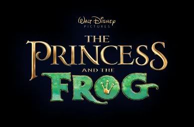
The problem with the logo is that they try to create the same effect that the logo of Beauty and the Beast had but for this movie i don't think that works well. I don't mind the gold so much, i think though they should add some purple in it to be more purplish-gold rather than this icy gold they have. I really dislike the font of the frog part of the logo and especially the golden outline it has and the fact that the little crown is on a concrete "o" than an open one like before.


-
kbehm29

- Anniversary Edition
- Posts: 1184
- Joined: Wed Jan 18, 2006 7:49 am
- Location: Too Far Away from Disney
- Contact:
I feel much better about this one. At least the font isn't so childish and it's got some flair to it.
Disneyland Trips: 1983, 1992, 1995, 2001, 2002, 2004, 2008, 2009, 2011, 2013, 2014, 2016, Aug 2018
Walt Disney World Trips: 1999, 2007, 2011, 2014, 2016, ~Dec 2018~, ~Apr 2019~
Favorite Disney Movies: Peter Pan, 101 Dalmatians, Tangled, The Princess and the Frog, Enchanted, FROZEN
Walt Disney World Trips: 1999, 2007, 2011, 2014, 2016, ~Dec 2018~, ~Apr 2019~
Favorite Disney Movies: Peter Pan, 101 Dalmatians, Tangled, The Princess and the Frog, Enchanted, FROZEN
-
totallyminnie86
- Gold Classic Collection
- Posts: 403
- Joined: Thu Feb 16, 2006 5:15 pm
- Contact:
-
Disney Duster

- Ultimate Collector's Edition
- Posts: 14163
- Joined: Fri Jun 17, 2005 6:02 am
- Gender: Male
- Location: America
The Princess and the Frog
I think the crown is supposed to fill in as the hole in the "o". Techically the old "o" was just skinnier, not inconcrete.sotiris2006 wrote:I really dislike the font of the frog part of the logo and especially the golden outline it has and the fact that the little crown is on a concrete "o" than an open one like before.
Hey, I actually like the logo. Really, the only thing I might like more is the frog part slightly less fat, because the frogs in the film are not that fat, and maybe make the crown a little more round to be more like a hole.


-
xxhplinkxx
- Collector's Edition
- Posts: 2769
- Joined: Wed Feb 15, 2006 7:34 am
- Location: Your mind.


-
Dottie
- Collector's Edition
- Posts: 2576
- Joined: Wed Aug 23, 2006 1:51 pm
- Location: The Pie-Hole
- Contact:
That's because most people have certain connotations with that kind of font style. One of them being "princessy". A lot of movies that have to do with princesses use that style and so people have started to connect the image of the font style with idea of a princess. The idea of specific connotations that people have in their heads is one of the basic principles of typography and especially designing logos is a very hard task, because you have to represent the feel and message of a movie with just a few letters.
I actually like the logo, although the "frog", I think, is a little bit too cartoonish for my taste, but it looks nice on the book cover.
I actually like the logo, although the "frog", I think, is a little bit too cartoonish for my taste, but it looks nice on the book cover.