Snow White Re-release Platinum Discussion & Cover Art Th
-
SleepingBeautyAurora

- Gold Classic Collection
- Posts: 209
- Joined: Mon Jan 28, 2008 12:33 am
- Location: North America
-
PrincePhillipFan

- Anniversary Edition
- Posts: 1099
- Joined: Wed Sep 19, 2007 2:32 pm

-
MutantEnemy
- Special Edition
- Posts: 617
- Joined: Mon Oct 27, 2003 4:46 pm
- Location: West Palm Beach, FL
- Contact:

Wow, that is just beyond beautiful.
Now I am all excited!!!!!
Now I am all excited!!!!!
Need your daily fix of Disney articles and reviews? Head on over to Animation Admiration for countdowns, reviews, impressions, and articles on Disney, Anime, and everything in between!
http://www.animationadmiration.blogspot.com
http://www.animationadmiration.blogspot.com
-
magicalwands

- Collector's Edition
- Posts: 2099
- Joined: Wed Mar 23, 2005 9:24 am
- Location: Gusteau's Restaurant

-
DisneyFreak5282
- Anniversary Edition
- Posts: 1537
- Joined: Fri Oct 13, 2006 1:41 pm
- Location: U.S.A.
-
~RapunzelTower~
- Member
- Posts: 15
- Joined: Tue Apr 15, 2008 2:02 pm
-
goofystitch
- Collector's Edition
- Posts: 2948
- Joined: Sun Jun 22, 2003 1:30 pm
- Location: Walt Disney World

Well I don't think we can count on preservation of style as far as the cover of older films are concerned. They're probably going for similar styles for the bluray films again where the major characters are going to appear bigger and other characters more minor.goofystitch wrote:I'm not a big fan either, Ichabod. I think in concept its OK, but it doesn't capture the essence of the film at all. I think they need to redesign it more in style, but I'm not opposed to the layout of where the characters are placed.
They will probably brush this up a little. I don't see the title logo in that style staying in the final print of the artwork.
-
Jack Skellington
- Anniversary Edition
- Posts: 1230
- Joined: Fri Aug 24, 2007 10:07 am
- Location: Dubai
Fugly, this is just what we needed Ichy ... pure pessimism !ichabod wrote:You must all seriously be kidding me right? I've just checked the calender and it's way off April 1st.
Without a doubt the fugliest Disney DVD cover in history.
It's the DVD cover art equivalent of Mickey Rourke's face.
OK it does need to have the title font changed, and the Queen's hand and robes need a bit of tweaking, and they have to put those Dwarfs' on rehab, coz they look so much like junkies to me.
Overall, I like the concept, and I'm really glad they put the Queen on the top of the title, it's reminiscent to the Masterpiece VHS I used to own when I was younger.
-
SpringHeelJack

- Platinum Edition
- Posts: 3673
- Joined: Fri Nov 10, 2006 3:20 pm
- Location: Boston, MA
- Contact:
That's... pretty neat. Snow White looks a little off, but I'll chalk that up to the fact that it's not the actual physical cover I'm seeing. But not bad. Better than the first Platinum DVD art.
"Ta ta ta taaaa! Look at me... I'm a snowman! I'm gonna go stand on someone's lawn if I don't get something to do around here pretty soon!"
I agree with goofystitch, I really like the font of the title. It's not out of the blue: it's retro and reminiscent of the font used on the original poster. I think it's inspired by the golden letters on the glass coffin in the movie. So for me, it's a very good choice. I'm not always a fan of the disney dvd cover arts, but actually, I always thought they were doing a great job designing the title logos. I'm a graphic designer myself and I can see they'not picking fonts randomly. There's always a real work of balance between the trend of the moment, the nature of the film istelf and the number of times it's been reissued to make the title logo look fresh.
As for the rest of the artwork, I also like it. Again, it's a nice attempt to "refresh" older posters. The original one and the one from the 80's if I'm correct. I really like that they managed to insert the prince. All the elements from the movie are here: the characters (except the hunter), the animal (represented by the bluebird), the castle, the mirror and the forest. In the great tradition of the 'family portrait' artworks.
As for the rest of the artwork, I also like it. Again, it's a nice attempt to "refresh" older posters. The original one and the one from the 80's if I'm correct. I really like that they managed to insert the prince. All the elements from the movie are here: the characters (except the hunter), the animal (represented by the bluebird), the castle, the mirror and the forest. In the great tradition of the 'family portrait' artworks.
-
singerguy04
- Collector's Edition
- Posts: 2591
- Joined: Wed Feb 09, 2005 4:40 pm
- Location: The Land of Lincoln
Obviously it's too early to be the actual cover art, so we should stop attacking how how or on model the characters are because it's pretty obvious to me they are older clip art. The basic lay out is what we should be critiqueing at this point.
With that said, I don't think I could've imagined how well I think this cover art is put together. I absolutely love it! All I would change is a border or something for the title. It'd be cool if it were themed as if it were carved out of wood with a apple watermark behind the title. I would also like the apple to be on the cover some way... If not for that I REALLY hope it doesn't change all that much!
With that said, I don't think I could've imagined how well I think this cover art is put together. I absolutely love it! All I would change is a border or something for the title. It'd be cool if it were themed as if it were carved out of wood with a apple watermark behind the title. I would also like the apple to be on the cover some way... If not for that I REALLY hope it doesn't change all that much!
-
Elladorine

- Diamond Edition
- Posts: 4372
- Joined: Wed Jan 25, 2006 1:02 pm
- Location: SouthernCaliforniaLiscious SunnyWingadocious
- Contact:


-
geniuswalt

- Gold Classic Collection
- Posts: 329
- Joined: Tue Jun 15, 2004 2:09 pm
-
Disney Duster

- Ultimate Collector's Edition
- Posts: 14156
- Joined: Fri Jun 17, 2005 6:02 am
- Gender: Male
- Location: America
Snow White Blu-ray Cover
Ah, one of my favorite things totalk about. And Deco King will be happy to hear the news but probably dissapointed with the actual cover because it doesn't look enough like the film or something.
This one is loads better than the first Platinum DVD one. You know why? It actually has a background instead of everyone floating in purple nothing.
I like the layout and overall I really like the cover. I definately love some things about it. But i also don't like some things. Like most people, I think things will change.
Even though a border around the title might not look right...I wish they could find a way to make one that looks right. Maybe put the title in some of the mirror's own frame?
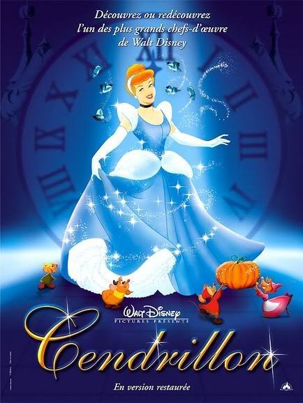
As for Snow White looking too Disney Princess or off-model...well, this Snow White is much, much closer to the original design than we usually see! They got her nose very right. In fact her and The Blu Fairy and Cinderella have very similar classic 30's 40's early 50's looking noses...it's hard to describe. Speaking of, this cover reminds me a little much of Cinderella's restoration in theaters poster:

This one is loads better than the first Platinum DVD one. You know why? It actually has a background instead of everyone floating in purple nothing.
I like the layout and overall I really like the cover. I definately love some things about it. But i also don't like some things. Like most people, I think things will change.
Even though a border around the title might not look right...I wish they could find a way to make one that looks right. Maybe put the title in some of the mirror's own frame?
As for Snow White looking too Disney Princess or off-model...well, this Snow White is much, much closer to the original design than we usually see! They got her nose very right. In fact her and The Blu Fairy and Cinderella have very similar classic 30's 40's early 50's looking noses...it's hard to describe. Speaking of, this cover reminds me a little much of Cinderella's restoration in theaters poster:
What do you mean? The Blu-ray covers have been almost all the same, save for title placement and actual backgrounds instead of just colored space. Even Sleeping Beauty and Pinocchio have kept the main characters large above, other characters small below.toonaspie wrote:They're probably going for similar styles for the bluray films again where the major characters are going to appear bigger and other characters more minor.
Last edited by Disney Duster on Wed Jan 28, 2009 3:44 pm, edited 1 time in total.
