Sleeping Beauty on Blu-Ray: RAH interviews Theo Gluck

All topics relating to Disney-branded content.
Post Reply
User avatar
Escapay
Ultimate Collector's Edition
Posts: 12562
Joined: Tue Jan 27, 2004 5:02 pm
Location: Somewhere in Time and Space
Contact:

Sleeping Beauty on Blu-Ray: RAH interviews Theo Gluck

Post by Escapay »

Sleeping Beauty on Blu-ray

It's a good (and lengthy) read, and I will now humbly eat crow for all my "2.55:1 isn't the OAR!" b!tchings and grumblings.

I was hoping, though, that they'd discuss why Disney decided to use Technirama instead of CinemaScope, which they don't get into much detail with. Also, I'm a bit annoyed that they don't really discuss the 2.20:1 70mm ratio that was used in the premiere and major engagements.

But at least now there's a more firm answer as to why 2.55:1 is chosen, and it thankfully doesn't sound like it's coming from a corporate mouthpiece trying to sell something.

Here's a few highlights from the full article...
  • Theo Gluck, Director of Library Restoration and Preservation for Walt Disney Studios Motion Pictures has been kind enough to answer a number of technical questions regarding the new restoration of the animated Classic Sleeping Beauty, arriving on Blu-ray on October 7th.

    <snip>

    RAH: How was Sleeping Beauty photographed?

    TG: Sleeping Beauty was shot using the successive exposure method. Given the SE process, when coupled with the size of a Technirama frame, the negative for Sleeping Beauty is over 7.5 miles long.

    RAH: Can you briefly explain SE technology?

    TG: Rather than use three-strip Technicolor to capture color images, the successive exposure system utilizes a single strip of black and white film and places the three color records in succession (next to each other). So each single color frame that you see on screen is in fact a "triple exposure" of the three successive frames of negative. This method is ideally suited to filming animation.

    Instead of having three Y-C-M (RGB) records, the Sleeping Beauty negative could best be described as: Y1-C1-M1-Y2-M2-C2-Y3-C3-M3 and so on (albeit through RGB filters). This means that the linear length of an SE negative is three times that of the print that it generates.

    Two key advantages to SE as opposed to three-strip photography is that the optical path is far simpler resulting in a single focal plane for each frame, and the alignment of frames from a single strip of film as opposed to three separate records is far easier. This is clearly evident when we are working with our nitrate negatives.

    Image

    Image
    Sleeping Beauty negative images. (© Disney)

    <snip>

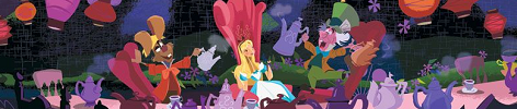
    RAH: What is the proper projected or viewing aspect ratio for Sleeping Beauty, and how was it ascertained?

    TG: Well... there were multiple signs pointing us to presenting the film in a 2.55:1 aspect ratio for this Blu-ray release.

    First and foremost - once our partners at Lowry Digital scanned the full image area on the Technirama negative and we started viewing dailies it became immediately apparent that we were not looking at a 2.35 AR. We normally do not have any crop applied when screening dailies so we knew we were seeing everything possible that is on the negative.

    In addition - when we were looking at surviving cels and backgrounds at the Studio's Animation Research Library (which is an invaluable resource), it was quite obvious that the layout design and camera marks were set for 2.55.

    Then there is the fact that in a memo dated July 28, 1953, the Studio green lit the CinemaScope version of Lady and the Tramp, while it also established a "Standard Version" and a CinemaScope Version production number for Sleeping Beauty -- #2082 and #2083. As the CinemaScope standard at the time was 2.55, (and that is clearly evident in Lady and the Tramp) Sleeping Beauty too would have been designed at 2.55.

    In the end, Lady was adapted for CinemaScope but it was truncated on the left side of the screen when it went out with an optical track since the CinemaScope presentation spec had changed by the time the film was ultimately released in 1955. Sleeping Beauty fared far better as it had been designed to be in CinemaScope and thus could be trimmed to meet the requirements of 2.35 CinemaScope 35mm prints. But in the final analysis, there is animation all the way out to the far edges of the frame that had not been seen. It is this full 2.55 version that is coming out on Blu-ray on October 7.

    Image
    Sleeping Beauty frame showing additional area now viewable at full original 2.55:1. (© Disney)

    <snip>

    RAH: What did you use as reference to color and densities, and if original cells, is there any loss over the years or do they look as they did fifty years ago?

    TG: We are very fortunate in that we have access to the Studio's Animation Research Library (ARL), which contains millions of artifacts spanning the history of the company's animation projects. This includes production cels, backgrounds, and multiplane glass levels. We routinely select dozens of pieces that are then scanned, and split back out to RGB "SE" channels to then be recombined to emulate as best as possible the original photographic methods to ensure that the colors are reproduced much as they would have been (albeit without dye-transfer technologies). These newly photographed set-ups become our wedges that are given to our colorist (Tim Peeler at Technicolor Digital Intermediates) to further aid in this process.

    Of course none of this work is done in an information vacuum since personal opinion foisted as fact never accomplishes anything. Hence the Restoration Team also includes colleagues such as animator Andreas Deja, and special projects director Dave Bossert, both from Disney Animation Studios, and Bruce Tauscher from the Mastering group. They bring a wealth of knowledge about the history of the techniques and the prevailing production conditions and thus help us ensure that we don't inadvertently alter the integrity of the original animation.

    The cels themselves still retain the color. We have not seen anything that would lead us to believe that cels have faded severely or would in any other way not be representative of the original colors.

    And speaking of Technicolor IB, on Sleeping Beauty (and other recent projects), I have been able to get us access to a dye transfer print to really help us understand how the prints were meant to be seen. There is no question that the original cels were designed with a color palette that accounted for SE photography and not for EK color negative. As this film is our first animated classic on Blu-ray we wanted to make sure we did everything possible to fully present the original splendor of the production.

    <snip>

    RAH: What element was scanned?

    TG: We scanned the camera original SE Technirama negative.

    RAH: Did the entire original SE negative survive and what condition was it in?

    TG: Yes - the entire negative survives and it is in very good condition. In fact the vast majority of our negatives, even the nitrate material, are in very good shape.

    RAH: How close to the desired final product did you and your group come with Sleeping Beauty?

    TG: I think it came out exactly as we wanted it to be.

    <snip>

    RAH: Let's chat a bit about audio. What were the earliest extant elements and how were they handled?

    TG: Although the film was released in 70mm back in 1959, the mix session documents and final mix audio elements we have in inventory confirm that the final mix was 4-track (LCRS), not six-track.

    The paperwork also clearly shows which sequences had surround and which did not. Yet many people had very vivid memories of a "wall of sound" type of mix when they first saw it, and all of the original advertising (albeit taken with a grain of marketing salt) trumpet "six-track stereophonic sound".

    RAH: Which would have been technically correct, as the prints were striped for six channel audio.

    TG: Yes they were - and of course we know that there were 70mm releases that did employ 5 discrete channels behind the screen. As part of the audio research, we were able to locate a vintage 70mm print and run it in the Studio's Main Theater. We pulled the audio into ProTools at that time to better help our analysis. By listening to the tracks and looking at the wave forms, it was immediately apparent that when sounding the prints, Todd-AO blended tracks 1 and 3 into channel 2, and tracks 3 and 5 into screen channel 4 to flesh out the on-screen audio stage. In fact you could see quite clearly on the ProTools files how the levels gently sloped off from the center and tapered into 2 and 4.

    <snip>

    We ultimately made a new 5.1 mix, as well as a very special 7.1 stereo mix - exclusively for the Blu-ray version. There is also a new 5.1 and special 7.1 mix contoured for theatrical playback. Terry also cleaned up the original 4.0 mix for this release as well.

    <snip>

    ---

    RAH
albert
WIST #60:
AwallaceUNC: Would you prefer Substi-Blu-tiary Locomotion? :p

WIST #61:
TheSequelOfDisney: Damn, did Lin-Manuel Miranda go and murder all your families?
User avatar
Disneykid
Diamond Edition
Posts: 4816
Joined: Fri Apr 18, 2003 9:10 am
Location: Wonderland

Post by Disneykid »

That was a fantastic interview. The 2.55:1 ratio seemed perfectly framed to me when I watched my copy, so I was having trouble imagining what a 2.35:1 ratio would look like. Based on their example, not terrible, but not so hot, either.

One example while watching the film that I felt was striking in the new ratio was when we see the fairies putting Aurora in bed. The camera zooms in, and in the new ratio, we see that we're actually zooming in through a window via the multiplane camera. On the 2003 SE (and probably the original 2.35:1 ratio), you don't see the multiplane window edges on the sides of the frame, so you don't get a sense of depth when zooming into the room; it just looks like you're already inside.

I also trust the color timing done on this release. I know previous home video masters aren't a reliable source for judging the original intent, but the PE looks a lot more like my old Black Diamond VHS than either the 1997 Masterpiece Collection or the 2003 Special Edition transfers. I wonder how this restoration differed from the other Disney ones done by Lowry and if they're going to go back and make some tweaks before transferring those files to BD. I'm referring mainly to Cinderella as that's the only one I find questionable. All the others (controversial Peter Pan included) seem perfectly fine to me.
User avatar
Jules
Diamond Edition
Posts: 4631
Joined: Sun Mar 12, 2006 9:20 am
Gender: Male
Location: Malta, Europe
Contact:

Post by Jules »

Oh Marky, I'm afraid you're doomed to seeing the characters away and distant from you for the rest of your life! :P That, or you could attempt a terrorist attack on Lowry Digital (or rather DTS Digital Images ... blah).
User avatar
Disney Duster
Ultimate Collector's Edition
Posts: 14133
Joined: Fri Jun 17, 2005 6:02 am
Gender: Male
Location: America

Theo Gluck on Sleeping Beauty's Restoration

Post by Disney Duster »

THANKS for this Escapay, so glad the mystery's finally solved, and the way I wanted it!

I'm also glad that for like once you were wrong about something, even though you did say that you could be wrong anyway and weren't entirely sure of anything.

Marky can save up for a really big TV! And move his couch really close to it! Or watch really close on his computer! Maybe he'l be okay...I have yet to decide how I feel about the faces..will watch it this week, I know it!
Image
User avatar
Escapay
Ultimate Collector's Edition
Posts: 12562
Joined: Tue Jan 27, 2004 5:02 pm
Location: Somewhere in Time and Space
Contact:

Re: Theo Gluck on Sleeping Beauty's Restoration

Post by Escapay »

Mike wrote:I'm also glad that for like once you were wrong about something, even though you did say that you could be wrong anyway and weren't entirely sure of anything.
:lol:

You make it sound like I'm never wrong or that I never say "I'm wrong!" :P :lol:

To prove I can be wrong...

The sky is red.

(looks outside window)

I was wrong, it's blue!

But wait...the sky really isn't blue. Blue is what we label the color of the sky as our eyes interpret the light that reflects from it to us. Therefore, the sky is NOT blue. Blue is the sky, but the sky is not blue.

So I'm not wrong! But I'm not right either! But I'm still not wrong! Am I?

(and that got away from me and now I don't understand what I just wrote...)

albert
WIST #60:
AwallaceUNC: Would you prefer Substi-Blu-tiary Locomotion? :p

WIST #61:
TheSequelOfDisney: Damn, did Lin-Manuel Miranda go and murder all your families?
User avatar
Disney Duster
Ultimate Collector's Edition
Posts: 14133
Joined: Fri Jun 17, 2005 6:02 am
Gender: Male
Location: America

Theo Gluck on Sleeping Beauty's Restoration

Post by Disney Duster »

You're still wrong 'cause you said the sky is red and it's not red.

Anyway, you never say you're never wrong, it just seems like you're always right!

I always saw some animation drawings of Sleeping Beauty that had more than what was in the film, like the bottom of Maleficent when she makes her exits. Now we can see it! Well, I saw a screencap. Can't wait to watch the thing!
Image
User avatar
Escapay
Ultimate Collector's Edition
Posts: 12562
Joined: Tue Jan 27, 2004 5:02 pm
Location: Somewhere in Time and Space
Contact:

Re: Theo Gluck on Sleeping Beauty's Restoration

Post by Escapay »

Disney Duster wrote:You're still wrong 'cause you said the sky is red and it's not red.
Yes, but what if in another universe our sky is red, or the label we give to that color that we know as blue...is red?

Then I'd be right.

But I'd still be wrong in the here and now because this is red as we define it and this is blue as we define it. But at the same time, there is always the possibility that when people decided to name colours this is what they wanted to call red and this is what we might have considered blue (and yes, the shades I chose are secondary colours, but that's beyond the point)...

Gaaah! I'm confusing myself again. Well, either way I'm wrong because the sky is neither red nor blue. It is a color that we define as blue, but that doesn't necessarily mean it is blue.

(For example, a tree really isn't a tree. It's a tree because that's what we call it. Might as well call it goozack, but everyone knows that a goozack is a door...)

albert
WIST #60:
AwallaceUNC: Would you prefer Substi-Blu-tiary Locomotion? :p

WIST #61:
TheSequelOfDisney: Damn, did Lin-Manuel Miranda go and murder all your families?
User avatar
Jules
Diamond Edition
Posts: 4631
Joined: Sun Mar 12, 2006 9:20 am
Gender: Male
Location: Malta, Europe
Contact:

Post by Jules »

Scaps wrote:but everyone knows that a goozack is a door...
Is it? At first I thought you made up the word for the sake of the example.

Some sort of slang, perhaps?
User avatar
Escapay
Ultimate Collector's Edition
Posts: 12562
Joined: Tue Jan 27, 2004 5:02 pm
Location: Somewhere in Time and Space
Contact:

Post by Escapay »

In Wayside School is Falling Down, Principal Kidswatter accidentally walks into his office door and spills coffee all over himself. He blames the door because he always expected it to be open, but the one time it's closed, he doesn't stop to check, thus he walks into it. So he makes a new rule for the school: "door" is now "goozack", and anyone who says the d-word will get in trouble.

albert
WIST #60:
AwallaceUNC: Would you prefer Substi-Blu-tiary Locomotion? :p

WIST #61:
TheSequelOfDisney: Damn, did Lin-Manuel Miranda go and murder all your families?
User avatar
Jules
Diamond Edition
Posts: 4631
Joined: Sun Mar 12, 2006 9:20 am
Gender: Male
Location: Malta, Europe
Contact:

Post by Jules »

Is that a movie, novel, etc.? I'm too tired to check IMDB. :lol:

Oh, and by the way: "Door! Door! Door! Holy mothercuffing doors!" :wink:
User avatar
Escapay
Ultimate Collector's Edition
Posts: 12562
Joined: Tue Jan 27, 2004 5:02 pm
Location: Somewhere in Time and Space
Contact:

Post by Escapay »

Julian Carter wrote:Is that a movie, novel, etc.? I'm too tired to check IMDB. :lol:

Oh, and by the way: "Door! Door! Door! Holy mothercuffing doors!" :wink:
It's a children's book series:

Sideways Stories from Wayside School - in which we are introduced to the crazy teachers and kids of Wayside School, namely Mrs. Jewls and her students on the 30th story.

Sideways Arithmetic from Wayside School - in which we learn that elf + elf = fool, among other things

Wayside School is Falling Down - in which a new kid named Benjamin Nushmutt joins the class as Mark Miller, Allison gets trapped on the 19th story, and everyone yells "STAR BRING PURPLE" at the end.

More Sideways Arithmetic from Wayside School - in which a pop quiz didn't pop at all because of some strange logic.

Wayside School Gets a Little Stranger - in which the kids on the 30th story get three different substitutes, Miss Mush saves the day, and we learn never to laugh at a shoelace.

Nickelodeon then did the impossible and turned the delightful book series into an abysmal cartoon show (simply titled "Wayside"). I reviewed the pilot movie on UD last year and closed the review with this: "The DVD is a waste of time and money, even for the few fans there may be for this wretched adaptation. If you see this on store shelves, just walk away and shut the goozack on your way out."

albert
WIST #60:
AwallaceUNC: Would you prefer Substi-Blu-tiary Locomotion? :p

WIST #61:
TheSequelOfDisney: Damn, did Lin-Manuel Miranda go and murder all your families?
User avatar
Fflewduur
Gold Classic Collection
Posts: 434
Joined: Fri Nov 11, 2005 7:14 am
Location: Waiting For Somebody

Post by Fflewduur »

They used Technirama instead of Cinemascope because it offered a better quality negative. A Cinemascope 35mm 4-perforation negative runs vertically and offers dimensions of 18.6mm x 21.95mm; a Technirama 8-perf 35mm negative runs horizontally and offers dimensions of 25.2mm x 38mm. More real estate = better detail and finer grain, which becomes even more of a consideration if the final destination is a 70mm print (which would magnify the original grain).

Presumably Technirama was also chosen because the studio was sold on the idea of Super Technirama in its horizontal configuration. Generally speaking, films marketed as 70mm (which are not actually blow-ups from 35mm) are shot on a 65mm negative and printed at 70mm, with the additional 5mm dedicated to the optical audio tracks (two on either side at 2.5mm for stereo reproduction). An 8-perf horizontal 70mm print would place the optical audio tracks at the top and bottom of the image, freeing up more space at the sides for printing the image---the same principle that allowed Cinemascope to reach a 2.55:1 AR during the brief period of obligatory magnetic audio.

That's strictly hypothetical, but I'll stand by it till proven otherwise; it seems highly unlikely the studio would have chosen an aspect ratio which could not be realized. Specs found online for Super Technirama 70 are for the vertical 5-perf roadshow prints; there's no confirmation I've yet found for achievable AR with the horizontal 8-perf print, but information is so scanty on this presentation method that the most I've been able to uncover so far is that such prints were made for European exhibition in 1957---I have yet to discover an authoritative declaration of even a single title that actually received such an exhibition. These prints would have required a dedicated projector, which is likely one reason the format never took off. But in 1953 anamorphic widescreen projection for major motion pictures was a new, wide-open ballgame; the studio had no real way of knowing where the industry would go (OR that SB would take so freaking long to complete).

Unfortunately I have yet to appreciate the new release in all its glory because I have a cheap HDTV. I suspected I might have overscan issues when watching The Nightmare Before Christmas---when viewing a 1.66:1 AR on a 16:9 display the image ought to be pillarboxed, though only slightly, but the image fills my screen. While watching SB I measured the onscreen image, did the math, and came up with 1.5:1...sad.
User avatar
pap64
Platinum Edition
Posts: 3535
Joined: Sat Apr 07, 2007 12:57 pm
Location: Puerto Rico
Contact:

Post by pap64 »

So long story short the new aspect ratio found on the new DVD is actually the REAL ration and we never knew it existed till now? Most important, we now have evidence that this is how the movie is supposed to look like?
ImageImageImageImage

Image
User avatar
Fflewduur
Gold Classic Collection
Posts: 434
Joined: Fri Nov 11, 2005 7:14 am
Location: Waiting For Somebody

Post by Fflewduur »

pap64 wrote:So long story short the new aspect ratio found on the new DVD is actually the REAL ration and we never knew it existed till now? Most important, we now have evidence that this is how the movie is supposed to look like?
Short answer: yes. Long answer: read <a href="http://www.thedigitalbits.com/articles/ ... ml">Harris' interview</a> with Theo Gluck.
User avatar
KubrickFan
Anniversary Edition
Posts: 1209
Joined: Sun Sep 17, 2006 11:22 am

Post by KubrickFan »

Well, glad that's finally sorted out :). Good, informing article/interview as well, but you can trust RAH with that.
Image
User avatar
Disney Duster
Ultimate Collector's Edition
Posts: 14133
Joined: Fri Jun 17, 2005 6:02 am
Gender: Male
Location: America

Sleeping Beauty's 2008 Restoration

Post by Disney Duster »

Disneykid, I finally watched the PE, and saw the window, but then I looked at my old SE. The edges of the window are there, too, as I thought, because I didn't think the new ratio was that wide, and that the window was so big and far out of the screen. It's really the restoration that has shown the window so well, because its brightness has revealed the gray, detailed stone. In other words, the window looked all black before, but now you can really see it. Though I bet the ratio also revealing more of the window helps.

I think this restoration is not just wonderful and a huge improvement, but far more correct. I always wondered why Flora's gift of Beauty looked all blue, and while her fairy dust curiously still looks green for that scene, the vision where the princess appears "walking with springtime" is pink/purple in the new restoration, something far more fitting to the flowery gift and Flora herself.

Something I don't understand though is why people have such a problem with the hypnotized Aurora scene, thinking it's wrong. Her hair is bright sunshine gold, why is it a problem if the restoration shows more of it's color than before? The bright green/yellow light couldn't light her hair? I think the new restoration showing her closer to her natural, un-darkened, un-greened colors, looks better, more visually appealing, and more striking to the viewer.
Image
Post Reply