Old Disney Classics

All topics relating to Disney-branded content.
User avatar
2099net
Signature Collection
Posts: 9421
Joined: Sat Apr 19, 2003 1:00 pm
Location: UK
Contact:

Post by 2099net »

Marky_198 wrote:No clear sources of light, no atmosphere, nothing? Just flat and dead?
They can have bright and shiny colors, but if you don't see the rest there's no point in discussing really.
I can see that. But it doesn't mean the LD is "correct". For all you know, perhaps when they were making the LD, somebody (like you) thought it looked a bit flat, and upped the contrast on a whim.

Logically there's a reason for the new DVD being more correct than the LD. Pinocchio was released in 1940. That's about ten years after three strip technicolor was introduced.

Do you really think that in ten years people would have mastered the process enough to achieve such results with lighting? It took years for filmmakers to correctly master sound when that was introduced.

Disney may or may not have been able to achive such results through careful dummy runs and testing, but overall I doubt it.

But that doesn't mean that what Disney did achieve was somewhere between the LD captures and the DVD SE captures. When restoring people can only do the best they can. I have no doubt those responsible for the restoration made the best decisions regarding capturing the look of the original feature film.

Now Deathie will shout at me, but I prefer the Universal UK DVD release of Citizen Kane over the Warners US release. Mainly, because it exhibits lots of film grain, the odd scratch and the odd example of print damage. It looks "older". But that is simply an emotional response rather than an reasoned response. It's just the UK DVD meets my expections of an old film after years of watching old films on TV or VHS with little or no restoration involved.

Hey, I grew up watching Ghostbusters in Pan and Scan. It doesn't mean when the widescreen DVD came out, I refused to accept that there were 4 Ghostbusters rather than 3!

I can understand why people may prefer other, non-restored or non-recent restrations. But that doesn't mean the new restorations are amy more wrong or have any more disraged for the original than the other versions. In fact, given better technology and more research, the new restorations are more likely to be more faithful.
Most of my Blu-ray collection some of my UK discs aren't on their database
User avatar
Jules
Diamond Edition
Posts: 4624
Joined: Sun Mar 12, 2006 9:20 am
Gender: Male
Location: Malta, Europe
Contact:

Post by Jules »

I think he must have tweaked it with some photo editing software.

Something you could achieve too by discovering the blessing that is TV colour/contrast/saturation settings.
Marky_198
Anniversary Edition
Posts: 1019
Joined: Tue May 01, 2007 11:06 am

Post by Marky_198 »

You do have a point there, 2099net.

And they try to do the best they can. The question is, what is better in the end.
I believe everyone will be dragged into the story more with the first screenshot of the candle. It's more touching.
I agree the new one looks crisp and clear, but flat, distant and atmosphereless. Almost like clipart.

So what is better?
User avatar
Jules
Diamond Edition
Posts: 4624
Joined: Sun Mar 12, 2006 9:20 am
Gender: Male
Location: Malta, Europe
Contact:

Post by Jules »

So what is better?
The one which most closely reflects the filmmakers' intentions. If it's the one with the pink flame - so be it!
ichabod
Diamond Edition
Posts: 4676
Joined: Thu Sep 25, 2003 8:29 am
Location: The place where they didn't build EuroDisney
Contact:

Post by ichabod »

Marky_198 wrote:You honestly like the pink flame with NO glow better?
Yes but this is not about what we like. Truth be told, yes I agree with you, the older warmer version does look better. I agree the newer version does look colder. But which one WE prefer is not the issue here.

Just because we thing something looks better does not mean it is supposed to be that way. Judging the fact that we "know" something is wrong because of how a VHS print looks is barmy. It's quite conceivable that an overly red hue was created from something that was awry with the print chosen to be used for the VHS, creating the warmer redder look.

As 2099net correctly points out, to say we prefer the muted, warmer, darker version is all well and good, but that does not mean it is the way it is supposed to be.

I feel at this point we should remind ourselves that the two versions most likely come from completely different sources. VHS were usually taken from existing film prints, which had most likely been siitng around having been used for a theatrical reissue.

For the restorations the source material was the original nitrate camera negatives which had been stored since the film was originally made. These nitrate negatives probably did have a do have a very different colouring from what would essentially be a second generation film print. Then converted to VHS or laserdisc essentially making the VHS or laserdisc print 3rd generation, before even taking into consideration dirt. BUt it's highly plausible that darkening picked up over the years by layers of thin dirt building up could create shadow and atmosphere.
The question is, what is better in the end...So what is better?
Again I'll go back to the Mona Lisa. Should we leave it as it is now the way we are used to seeing it? Or should they restore it to reveal the original colours?

You can't have it both ways. But I believe the restoration team do the best job they can, why else would Lowry be regarded as highly as they are if they didn't know what they were doing?

Just because a restoration looks different from what we are used to, doesn't mean it is wrong.
Last edited by ichabod on Mon May 05, 2008 1:12 am, edited 2 times in total.
User avatar
deathie mouse
Ultraviolet Edition
Posts: 1391
Joined: Thu Jun 10, 2004 1:12 am
Location: Alea jacta est

Post by deathie mouse »

Just remember that a Technicolor film is in black and white and black and white doesn't fade or darken with age. (and Tech IB color neither) so you can reconstruct the original color again. If you know what it is.
User avatar
Jules
Diamond Edition
Posts: 4624
Joined: Sun Mar 12, 2006 9:20 am
Gender: Male
Location: Malta, Europe
Contact:

Post by Jules »

It almost feels stupid to say anymore after bod's excellent post, but since Marky was also complaining about Snow White, I think he should remember that a couple of Walt's (then still living) nine old men (could they have been Frank Thomas and Ollie? I've forgotten ...) gave their approval to Snow's restoration.

I guess you can mistrust a restoration company if you must, but isn't it a tad rash to try proving the old masters wrong?
Lars Vermundsberget
Collector's Edition
Posts: 2483
Joined: Wed Nov 12, 2003 1:50 pm
Location: Norway

Post by Lars Vermundsberget »

Those probably were Frank and Ollie - they were no doubt the most high-profile of the remaining old men in later years, although Marc Davis and Ward Kimball were also still alive and were interviewed now and then.

If Technicolor film indeed doesn't fade or darken over time that should be the best yardstick to go by. Still, the fact that choices and decisions have to be made proves that it's complicated - it doesn't really surprise me that we see different results from time to time. Should one strive to make it look like the original film probably did? Or like it would have looked if they'd had more modern technology back then? Or should it rather be more faithful to the original artwork? Memories fade - and who can tell about artists' intentions from decades ago?
User avatar
Escapay
Ultimate Collector's Edition
Posts: 12562
Joined: Tue Jan 27, 2004 5:02 pm
Location: Somewhere in Time and Space
Contact:

Post by Escapay »

The Bod wrote:But which one WE prefer is not the issue here.

Just because we think something looks better does not mean it is supposed to be that way.

Just because a restoration looks different from what we are used to, doesn't mean it is wrong.
Perhaps the most intelligent things said in this thread regarding opinions about the whole restoration issue. Pink Elephant time!

:clap: :pink:
Albert
WIST #60:
AwallaceUNC: Would you prefer Substi-Blu-tiary Locomotion? :p

WIST #61:
TheSequelOfDisney: Damn, did Lin-Manuel Miranda go and murder all your families?
User avatar
Disney Duster
Ultimate Collector's Edition
Posts: 14030
Joined: Fri Jun 17, 2005 6:02 am
Gender: Male
Location: America

Old Disney Classics

Post by Disney Duster »

Chernabog_Rocks you get a big thank you for everything.
The Bod wrote:But which one WE prefer is not the issue here.

Just because we think something looks better does not mean it is supposed to be that way.

Just because a restoration looks different from what we are used to, doesn't mean it is wrong.
But me and Marky think the original filmakers also preferred what we prefer, because it looks better to us and more like live-action films than cartoons, which is what Walt wanted.
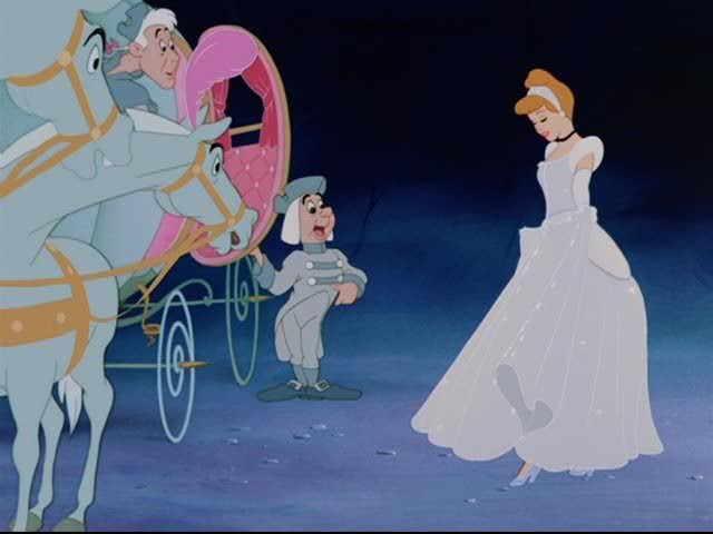
ichabod wrote:Are people reluctant to accept what's in front of them? 2099net post of an actual film cel proves the dress was always and has always been blue. What is with the idiocy that people believe they went through the film and change the colour to match the merchandise.
Anyway, the SILVER/BLUE thing, to both 2009net and ichabod:
I know Cinderella's dress is supposed to be blue sometimes, in fact I know it is supposed to be blue in the pictures that have been posted in here that show it as blue. But there are times when it is blue in the restoration when it was silver on the two previous VHS releases. The DVD does correctly make it silver sometimes, like in the pictures that have been posted in this thread that show it as silver, but it is incorrectly blue other times, and just bluer in general. What are these times and why do I have good reason to think it's incorrect? I will show you in due time. But I can not tell you when, and if you don't care to wait, the main times when it is incorrectly blue when it should be silver are when she enters the ballroom and when she loses her slipper on the stairs.
Image
User avatar
Escapay
Ultimate Collector's Edition
Posts: 12562
Joined: Tue Jan 27, 2004 5:02 pm
Location: Somewhere in Time and Space
Contact:

Re: Old Disney Classics

Post by Escapay »

The Mike wrote:
The Bod wrote:But which one WE prefer is not the issue here.

Just because we think something looks better does not mean it is supposed to be that way.

Just because a restoration looks different from what we are used to, doesn't mean it is wrong.
But me and Marky think the original filmakers also preferred what we prefer, because it looks better to us and more like live-action films than cartoons, which is what Walt wanted.
In 1973, a western known as Pat Garrett and Billy the Kid was released. The film was Sam Peckinpah's first western in some years, and originally previewed at 122 minutes. But the studio (MGM) forced Peckinpah to cut it down to 106 minutes, and it was a disappointment at the box office. About 15 years later, in 1988, Turner released the 122-minute version, dubbed the "Turner Preview Edition", and is generally regarded as the director's cut.

In 2005, the film was released in a two-disc special edition with the 1988 Preview Edition/Director's Cut, and something entirely new: a 2005 Special Edition. Peckinpah biographer Paul Seydor took elements from the 1973 theatrical edition, the 1988 Preview Edition/Director's Cut, and unused materials, and recut the entire film into what *he believed* was what Peckinpah had in mind, as well as what *he believed* works in Hollywood editing (as he is also a well-known editor of films.). This version runs 116 minutes and more about it can be found at this link.

Is it right to call the 2005 SE the definitive version of Pat Garrett and Billy the Kid because it's what a Peckinpah expert believed is what the director intended? No.

Likewise, do Disney fans really have a lot of merit in their complaints that a professionally-done restoration is not what the original filmmakers intended? Sure, they can do comparisons to original cels, laserdiscs, etc. But the truth of the matter is that we are not professionals in the restoration field, and more importantly, we did NOT work on the film. So while it's hard to accept some of their restoration team's works, remember that THEY are professionals, and THEY have a much larger access than we do to archival materials that help them in restorations. Thus, the judgment calls they make regarding what they think the filmmakers intended have a lot more merit and weight than a couple bitchings and grumblings from fans.

What's ironic is that the complaints here are miniscule compared to how anal and nitpicky some of the most diehard Doctor Who fans are. Reading posts at the Restoration Team forum or at Outpost Gallifrey show that they'll have a conniption over every little thing done (or not done) to the DVD restorations of their show.

Albert
WIST #60:
AwallaceUNC: Would you prefer Substi-Blu-tiary Locomotion? :p

WIST #61:
TheSequelOfDisney: Damn, did Lin-Manuel Miranda go and murder all your families?
User avatar
Disney Duster
Ultimate Collector's Edition
Posts: 14030
Joined: Fri Jun 17, 2005 6:02 am
Gender: Male
Location: America

Re: Old Disney Classics

Post by Disney Duster »

Sorry Escapay, but your analagy does not work for me. I've seen so many things, including publicity photos from when the film first came out, that look like how the film has looked to me until the DVD. Granted, that's for publicity, whatever. But I already told you there's other reasons why I know the restoration is wrong, and I will show everyone once I get a good copy of the the unrestored version.
deathie mouse wrote:
Disney Duster wrote:.It even shows an example of one of the things I noticed the restoration did, it made some of the outlines thinner and even disappear.
Ok I'm not saying that this is what's hapening here, but somtimes a characteristic of higher resolution images is lines that are thinner while on low resolution images they might grow "thicker" (specially with sharpening enhancements). It's called point spread function. A higher resolution analog medium "spreads" less the points of light, so lines and points end finer. A lower resolution analog system might spread the points of light across a wider area, resulting in thicker, wider (but less contrasty) lines and points. Add artificial sharpening to bring the contrast up (the amplitude lost), and you might end up with thicker features and details but of not as finer quality as the higher resoltion version. Sorta like comparing an upscaled DVD to a BD at the same sizes but from relatively far away. Again I'm not saying that's what's happening in that case, but you might see on higher res versions of low res images less coarse deliniations. Something to be aware of.
If this was the case, is there a way to fix it in the future?
Image
Marky_198
Anniversary Edition
Posts: 1019
Joined: Tue May 01, 2007 11:06 am

Re: Old Disney Classics

Post by Marky_198 »

Disney Duster wrote:Chernabog_Rocks you get a big thank you for everything.
The Bod wrote:But which one WE prefer is not the issue here.

Just because we think something looks better does not mean it is supposed to be that way.

Just because a restoration looks different from what we are used to, doesn't mean it is wrong.
But me and Marky think the original filmakers also preferred what we prefer, because it looks better to us and more like live-action films than cartoons, which is what Walt wanted.
ichabod wrote:Are people reluctant to accept what's in front of them? 2099net post of an actual film cel proves the dress was always and has always been blue. What is with the idiocy that people believe they went through the film and change the colour to match the merchandise.
Anyway, the SILVER/BLUE thing, to both 2009net and ichabod:
I know Cinderella's dress is supposed to be blue sometimes, in fact I know it is supposed to be blue in the pictures that have been posted in here that show it as blue. But there are times when it is blue in the restoration when it was silver on the two previous VHS releases. The DVD does correctly make it silver sometimes, like in the pictures that have been posted in this thread that show it as silver, but it is incorrectly blue other times, and just bluer in general. What are these times and why do I have good reason to think it's incorrect? I will show you in due time. But I can not tell you when, and if you don't care to wait, the main times when it is incorrectly blue when it should be silver are when she enters the ballroom and when she loses her slipper on the stairs.
Very well said Disney Duster!
Thank you.
User avatar
Ariel'sprince
Platinum Edition
Posts: 3244
Joined: Mon Jan 29, 2007 6:07 am
Location: beyond the meadows of joy and the valley of contentment
Contact:

Re: Old Disney Classics

Post by Ariel'sprince »

Did anyone noticed that there's something similar with Ursula?.
In the original film her skin is gray\blue,in the Little Mermaid PE and cliparts her skin is purple?.
It more fits her.
Image
User avatar
steve
Gold Classic Collection
Posts: 187
Joined: Wed Apr 16, 2008 10:07 am
Location: Ireland

Post by steve »

Ursula's skin was always a light purple (bordering on grey) colour. Check any of the posters, promotional material or merchandise such as books from the time of the film's release.
User avatar
Disney Duster
Ultimate Collector's Edition
Posts: 14030
Joined: Fri Jun 17, 2005 6:02 am
Gender: Male
Location: America

Re: Old Disney Classics

Post by Disney Duster »

WELL...look at how the images ichabod once posted no longer match up...

Disney Duster wrote:
ichabod wrote:*ahem*

Cinderella screen cap
Image
Original Production cel setup
Image
NOT AN ACTUAL PHOTOGRAPH OF THE ORIGINAL PRODUCTION CEL SETUP

Doesn't anyone think it's really weird that the cel setup looks exactly like a frame of the film from the DVD? What about those cel shadows that usually happen, like that picture Netty posted? Why doesn't it look like the other cel setups on the web site it's from?

Basically, I think that web site just posted a picture from the DVD, and that is not an actual photograph of the cel set up.
2099net wrote:
Disney Duster wrote:Doesn't anyone think it's really weird that the cel setup looks exactly like a frame of the film from the DVD? What about those cel shadows that usually happen, like that picture Netty posted? Why doesn't it look like the other cel setups on the web site it's from?

Basically, I think that web site just posted a picture from the DVD, and that is not an actual photograph of the cel set up.
I think perhaps the cell for sale on that site is framed, so the glass in front will be pushing the cell flat to the background. I see no reason why that site (presumably a respected retailer) would lie.
Well, if you remember they had a screencap from the DVD as a picture of the cel before, so THEY LIED. If you don't remember, I'm pretty sure it was the thumbnail here. But NOW on the actual page it has the correct picture of the product they are selling, which looks like a re-drawn, re-painted reproduction, or rather a copy someone made to look like an original cel. That's what Disney does, they make new cels that look just like the originals, by hand. I saw a video on that. It's not lying it's how they do it now.

By the way, I'm not trying to be mean, I am just very passionate about showing, as well as discovering for myself, the original truth of these films!
Image
Post Reply