Old Disney Classics

All topics relating to Disney-branded content.
User avatar
2099net
Signature Collection
Posts: 9421
Joined: Sat Apr 19, 2003 1:00 pm
Location: UK
Contact:

Re: Old Disney Classics

Post by 2099net »

Disney Duster wrote:And actually, the pictures you posted just continue my dissatisfaction with the restoration. Firstly, the pictures of Cinderella under the moonlight differ a lot. It even shows an example of one of the things I noticed the restoration did, it made some of the outlines thinner and even disappear. Just compare Cinderella's face in the cel and the screencap, among the other parts of her. The stepsisters' pictures differ, just less so. I didn't actually have a lot of problems with the stepsisters' colors, I thought they looked how I remembered them in most scenes. Disney would rather change Cinderella because she is what little girls will be looking at. Finally, as deathie said, the cels and the technicolor prints are supposed to look different, anyway, so they shouldn't necessarily match the "orginal cel setups".
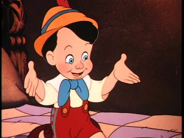
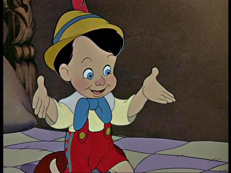
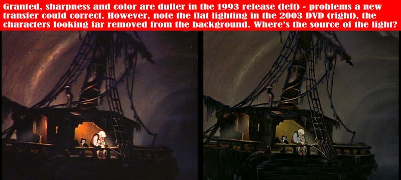
I've never said that the "new" colours are exactly the same as the cels, or even exactly the same as the originals. But I do believe that they are closer to the originals than the copy most people saw first. Marky seems to have the opinion that bright colour didn't exist on film in the 1940s and 1950s, which is totally wrong. MGM was well known for its bright, technicolor musicals for example.

Why wouldn't he use such colouring for his animated movies. Remember, by 1950 Walt's films had to compete and appeal against not only other colour movies but also television.

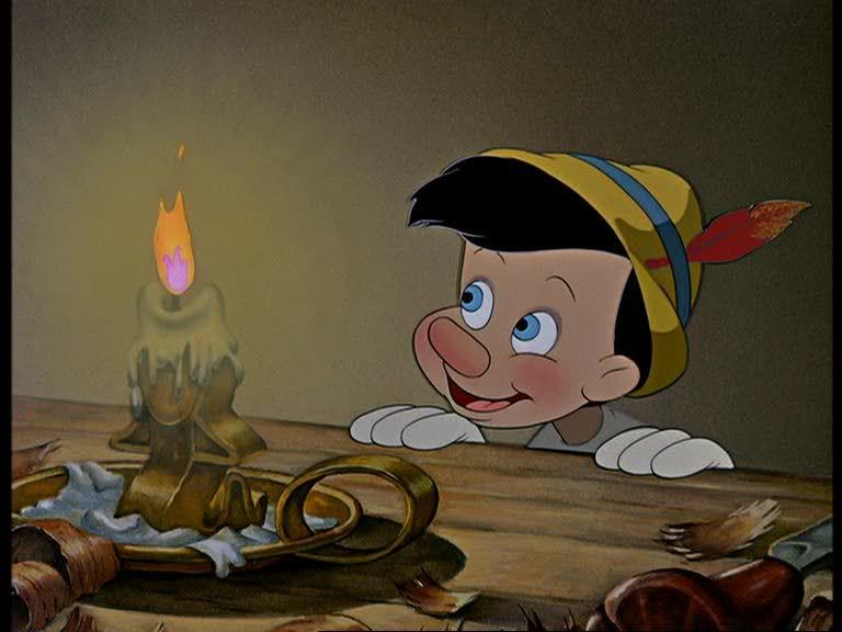
Disney presumably used bright colours for it's animated shorts. I've not seen one person complain about the colours on the various Disney Treasures sets of animated shorts. And I hate to say it so bluntly, but the Animated films from the war time package films onwards until around the time of Oliver and Company used different colouring techniques - presumably to cut costs. They all used primarily single block colour without extensive shading or blending. It's quicker to paint in this manner, and time is money. Cinderella looks different from Snow White or Pinocchio just as much for this change in style as for its intensity of colour.

As for the lines an the Cinderella picture you mention, this is a different issue from people who say "Cinderella's dress is too blue, it should be silver." I will however say this about my screen cap, the entire JPEG file is about 22K, the cel reproduction is about 160K. The Cinderella on the cel reproduction is also bigger. So I don't think you can do a like for like comparison, as detail will be lost. Perhaps somebody else would be able to produce a higher quality screen capture from the DVD of that frame.
However, thank you for going this far into the search for the truth. Some day I will post pictures that will reveal why the restoration is incorrect.
Perhaps you could produce and post a higher quality capture yourself then!
Most of my Blu-ray collection some of my UK discs aren't on their database
Marky_198
Anniversary Edition
Posts: 1019
Joined: Tue May 01, 2007 11:06 am

Post by Marky_198 »

Btw.

"SATURATED, VIBRANT PRIMARY COLOURS" and "RICH CONTRAST" and "FAR MORE BEAUTIFUL THAN REALITY" (technicolor quote)

Is the complete opposite of "NON SATURATED, but "OVERLY BRIGHT", SHINY, NON PRIMARY COLORS, that don't even come close to the beauty of reality. (dvd "restoration")
User avatar
Ariel'sprince
Platinum Edition
Posts: 3244
Joined: Mon Jan 29, 2007 6:07 am
Location: beyond the meadows of joy and the valley of contentment
Contact:

Post by Ariel'sprince »

Escapay wrote:
Sprince wrote:
No,it's not,Cinderella is a film for every,espically for the Disney fans,same for every Disney movie.
I think yukitora meant that even if Cindy is a film for everyone, the dumbass bastards at Disney Marketing decided that they'd aim primarily for the Bratz generation when it came to merch for the movie. Thus, ugly clipart on toy boxes, ugly clipart on the storybooks, and a restoration that to some apparently looks as bad as the ugly clipart that kids today would associate Cindy with.
So are you saying that the restoration had those colors so the small kids won't notice that in the original movie her dress was gray\white and in the merchandise it's blue?.
Anyway,I think it's more shinning and new but that's an annyoing reason :?.
Image
User avatar
Chernabog_Rocks
Collector's Edition
Posts: 2213
Joined: Thu Mar 30, 2006 2:00 am
Location: New West, BC

Post by Chernabog_Rocks »

Ariel'sprince wrote: So are you saying that the restoration had those colors so the small kids won't notice that in the original movie her dress was gray\white and in the merchandise it's blue?.
Anyway,I think it's more shinning and new but that's an annyoing reason :?.
It's because Cinderella's colors should look like what it was meant to be not like a Rainbow Brite puked on her :P
ichabod
Diamond Edition
Posts: 4676
Joined: Thu Sep 25, 2003 8:29 am
Location: The place where they didn't build EuroDisney
Contact:

Post by ichabod »

Chernabog_Rocks wrote:
Ariel'sprince wrote: So are you saying that the restoration had those colors so the small kids won't notice that in the original movie her dress was gray\white and in the merchandise it's blue?.
Anyway,I think it's more shinning and new but that's an annyoing reason :?.
It's because Cinderella's colors should look like what it was meant to be not like a Rainbow Brite puked on her :P
Are people reluctant to accept what's in front of them? 2099net post of an actual film cel proves the dress was always and has always been blue. What is with the idiocy that people believe they went through the film and change the colour to match the merchandise.

Why are some of you insistent the films made in the past are all dull? Have anyone of you seen the Wizard of Oz? How bright and vivid are the colours in that? Why is it so unbelievable Cinderella also has bright colours?

Despite evidence presented to you from a variety of sources about the nature of technicolour, some of you still choose to believe that you know better than a number of industry people, technicolor experts, and better than Lowry digital (arguably the best film restoration firm in the buysiness) and based on what? Because your old VHS says so?
Marky_198
Anniversary Edition
Posts: 1019
Joined: Tue May 01, 2007 11:06 am

Post by Marky_198 »

ichabod wrote:
Chernabog_Rocks wrote:
First of all, the film shouldn't look like the cell, with the green hair and the blue dress. It's the lighting, photography process that changes the colors.

Secondly, Snow White for example was released at a time when virtually every feature film was black and white. Since critics feared audiences couldn't tolerate the bright colors associated with animated cartoons for the length of a feature, the color palette for Snow White was given careful consideration. So it's almost funny that there are people today that say this ""restored" bright, clowny version that hurts your eyes (even today) was like the original version.

And third, the colors were described back then as "SATURATED, VIBRANT PRIMARY COLOURS" and "RICH CONTRAST" and "FAR MORE BEAUTIFUL THAN REALITY" (technicolor quote)
That is the complete opposite of "NON SATURATED (because saturation is a very different thing), but "OVERLY BRIGHT", SHINY, NON PRIMARY COLORS, that don't even come close to the beauty of reality. (dvd "restoration").
So NO WAY it's what was intended back then.
User avatar
deathie mouse
Ultraviolet Edition
Posts: 1391
Joined: Thu Jun 10, 2004 1:12 am
Location: Alea jacta est

Post by deathie mouse »

Marky_198 wrote:"Snow White was released at a time when virtually every feature film was black and white. Since critics feared audiences couldn't tolerate the bright colors associated with animated cartoons for the length of a feature, the color palette for Snow White was given careful consideration."

Exactly.

It's almost funny that there are people today that say this ""restored" bright, clowny version that hurts your eyes (even today) was like the original version.
Marky, my mon saw Snow White when she was little. She remembers the apple being very very red so that she still remembers it vividly.
User avatar
deathie mouse
Ultraviolet Edition
Posts: 1391
Joined: Thu Jun 10, 2004 1:12 am
Location: Alea jacta est

Re: Old Disney Classics

Post by deathie mouse »

Disney Duster wrote:.It even shows an example of one of the things I noticed the restoration did, it made some of the outlines thinner and even disappear.
Ok I'm not saying that this is what's hapening here, but somtimes a characteristic of higher resolution images is lines that are thinner while on low resolution images they might grow "thicker" (specially with sharpening enhancements). It's called point spread function. A higher resolution analog medium "spreads" less the points of light, so lines and points end finer. A lower resolution analog system might spread the points of light across a wider area, resulting in thicker, wider (but less contrasty) lines and points. Add artificial sharpening to bring the contrast up (the amplitude lost), and you might end up with thicker features and details but of not as finer quality as the higher resoltion version. Sorta like comparing an upscaled DVD to a BD at the same sizes but from relatively far away. Again I'm not saying that's what's happening in that case, but you might see on higher res versions of low res images less coarse deliniations. Something to be aware of.
User avatar
Chernabog_Rocks
Collector's Edition
Posts: 2213
Joined: Thu Mar 30, 2006 2:00 am
Location: New West, BC

Post by Chernabog_Rocks »

ichabod wrote: Are people reluctant to accept what's in front of them? 2099net post of an actual film cel proves the dress was always and has always been blue. What is with the idiocy that people believe they went through the film and change the colour to match the merchandise.

Why are some of you insistent the films made in the past are all dull? Have anyone of you seen the Wizard of Oz? How bright and vivid are the colours in that? Why is it so unbelievable Cinderella also has bright colours?

Despite evidence presented to you from a variety of sources about the nature of technicolour, some of you still choose to believe that you know better than a number of industry people, technicolor experts, and better than Lowry digital (arguably the best film restoration firm in the buysiness) and based on what? Because your old VHS says so?
Firstly, I never made any claim that films made in the past are dull, nor did I mention at all that I didn't believe Cinderella has bright colours. For me to claim that would be stupid, I'm not blind I did see the colours of the clothes worn by the stepsisters among other examples of colours used.

I never bothered to read through many of the posts here, just the odd handful, most of which are Disney_Dusters since he speaks in a way that makes sense to me :) So no I didn't see any of this evidence, and at no point did I claim to believe I know more than industry people, technicolor experts or Lowry Digital.
It's because Cinderella's colors should look like what it was meant to be not like a Rainbow Brite puked on her :P
This is my brand of sarcasm, I never intended it to be taken seriously or for it to be taken as my 2cents on the matter but apparently I'm just an idiot that thinks I"m better than experts :roll:
ichabod
Diamond Edition
Posts: 4676
Joined: Thu Sep 25, 2003 8:29 am
Location: The place where they didn't build EuroDisney
Contact:

Post by ichabod »

Marky_198 wrote:First of all, the film shouldn't look like the cell, with the green hair and the blue dress. It's the lighting, photography process that changes the colors.
The colours of the cel obviously will not be 100% replicated because of lighting, slight dullening from cel overlays and also glass, but the fact is lighting is not going to make that much of a difference over the cel colours.

And third, the colors were described back then as "SATURATED, VIBRANT PRIMARY COLOURS" and "RICH CONTRAST" and "FAR MORE BEAUTIFUL THAN REALITY" (technicolor quote)
That is the complete opposite of "NON SATURATED (because saturation is a very different thing), but "OVERLY BRIGHT", SHINY, NON PRIMARY COLORS, that don't even come close to the beauty of reality. (dvd "restoration").
So NO WAY it's what was intended back then.
Do you understand what saturated, vibrant and rich contrast actually mean? Despite the fact you've been given technical descriptions and demonstrations of what terms such as saturation actually mean, you seem to have ignored them.

Those terms describe the DVD far more accurately than the VHS, I mean look at those screencaps of the unrestored version. What exactly is vibrant about them? Nothing. Where is the rich contrast? Nowhere. Where is the saturation? Again nowhere. The unrestored version is dull, washed out and there's about as much color contrast as an albino squirrel in a snowdrift.
User avatar
Jules
Diamond Edition
Posts: 4624
Joined: Sun Mar 12, 2006 9:20 am
Gender: Male
Location: Malta, Europe
Contact:

Post by Jules »

Finally... I know I'm not the only one who thinks Lowry Digital makes great restorations. I love them! As DisneyKid once said, they peel off all the layers of wear and dirt off the picture, leaving a remarkable clarity.

Marky, with all the due respect can you please specify where Snow White looks 'clownish' and hurts your eyes on the DVD? It still looks all earthy to me. The marshland/moat the evil queen/hag crosses with the small boat doesn't really suggest DisneyLand to me. Let's not forget that Snow White wasn't even restored by Lowry. Wasn't it done in partnership with Kodak or something? :?
Marky_198
Anniversary Edition
Posts: 1019
Joined: Tue May 01, 2007 11:06 am

Post by Marky_198 »

You don't seem to understand what saturation means. It means making the colors deep, rich, warm, vibrant, colorful, with a huge atmosphere and warmth. But with all that, they still used natural colors, pastel colors, that look natural, and more beautiful than reality.
Here are some examples of Pinnocchio. The first ones are of what I think is closer to what Disney intended back then and are exactly like what Technicolor describes. The second ones are from the latest Lowry "restoration", and are bright, light, flat and dead.
The exact same thing happened to Cinderella. The same "restoration".

Look at the screenshot with the candle for example.
Yes, it looks brighter. The flame looks pink. I hope they're happy with that. There's no atmosphere left. It looks like cheap clipart, flat and dead.
Look at the color of the wall. Where are the shadows, details, feelings?
Where's the warm glow around the candle?

What do you think looks more saturated? And like what technocolor describes? And what was intended, based on all the descriptions?


drsd2kill wrote:B = PINOCCHIO 1993 CAV Laserdisc [transfer used for 1999 DVD]
C = PINOCCHIO 2003 UK DVD [Lowry restoration released overseas but not in the US]


<a href="http://photobucket.com" target="_blank"><img src="http://i46.photobucket.com/albums/f112/ ... CHIO2B.jpg" border="0" alt="Photobucket - Video and Image Hosting"></a><BR>
<a href="http://photobucket.com" target="_blank"><img src="http://i46.photobucket.com/albums/f112/ ... CHIO2C.jpg" border="0" alt="Photobucket - Video and Image Hosting"></a><BR>


<a href="http://photobucket.com" target="_blank"><img src="http://i46.photobucket.com/albums/f112/ ... CHIO9B.jpg" border="0" alt="Photobucket - Video and Image Hosting"></a><BR>
<a href="http://photobucket.com" target="_blank"><img src="http://i46.photobucket.com/albums/f112/ ... CHIO9C.jpg" border="0" alt="Photobucket - Video and Image Hosting"></a><BR>

<a href="http://photobucket.com" target="_blank"><img src="http://i46.photobucket.com/albums/f112/ ... HIO10B.jpg" border="0" alt="Photobucket - Video and Image Hosting"></a><BR>
<a href="http://photobucket.com" target="_blank"><img src="http://i46.photobucket.com/albums/f112/ ... HIO10C.jpg" border="0" alt="Photobucket - Video and Image Hosting"></a><BR>


<a href="http://photobucket.com" target="_blank"><img src="http://i46.photobucket.com/albums/f112/ ... HIO11B.jpg" border="0" alt="Photobucket - Video and Image Hosting"></a><BR>
<a href="http://photobucket.com" target="_blank"><img src="http://i46.photobucket.com/albums/f112/ ... HIO11C.jpg" border="0" alt="Photobucket - Video and Image Hosting"></a><BR>


<a href="http://photobucket.com" target="_blank"><img src="http://i46.photobucket.com/albums/f112/ ... HIO15B.jpg" border="0" alt="Photobucket - Video and Image Hosting"></a><BR>
<a href="http://photobucket.com" target="_blank"><img src="http://i46.photobucket.com/albums/f112/ ... HIO15C.jpg" border="0" alt="Photobucket - Video and Image Hosting"></a><BR>

Last edited by Marky_198 on Sun May 04, 2008 5:26 am, edited 3 times in total.
Marky_198
Anniversary Edition
Posts: 1019
Joined: Tue May 01, 2007 11:06 am

Post by Marky_198 »

[quote="ichabod

Those terms describe the DVD far more accurately than the VHS, I mean look at those screencaps of the unrestored version. .[/quote]

Are you kidding me?
Please look at the Pinnocchio screencaps I've added. They had the same treatment as Cinderella.
Maybe you should learn a bit more about saturation and natural colors before you comment.

And besides, I know what was intended, but even with that aside, any fool can see that the first screenshot of the candle for example works better and pulls you into the story more. And has more warmth, depth and atmosphere and is more beautiful in general.
If they had just kept it that way and just cleaned it up a bit, like they did with Sleeping Beauty, it would have been perfect.
Marky_198
Anniversary Edition
Posts: 1019
Joined: Tue May 01, 2007 11:06 am

Post by Marky_198 »

ichabod
Diamond Edition
Posts: 4676
Joined: Thu Sep 25, 2003 8:29 am
Location: The place where they didn't build EuroDisney
Contact:

Post by ichabod »

Marky_198 wrote:You don't seem to understand what saturation means. It means making the colors deep, rich, warm, vibrant, colorful, with a huge atmosphere and warmth. But with all that, they still used natural colors, pastel colors, that look natural, and more beautiful than reality.
How many contradictions in that sentence? Whilst at the same time it increases vibrancy and colour at the same time it deepens the colours making them more rich and warm? What!?

Saturation is the intensity of a colour a saturated colour is incredibly bright and vivid hue.

Take these examples.
Picture 1 is an image i just pulled off the internet.
Image
Picture 2 i have taken the image and increased the saturation.
Image

Does saturation make the image deeper, richer, warmer? No! The opposite. Saturation makes it more bright and vivid.

Here are some examples of Pinnocchio. The first ones are of what I think is closer to what Disney intended back then and are exactly like what Technicolor describes.
What "you think Disney intended". Exactly basing your knowledge on what you think was intended 70 years ago. And the older laserdisc screencaps are not what Technicolor descibes at all. The DVD screencaps are far more vivid to my eye.

You know after 70 years do you not think the film will have gathered dirt, grime and other rubbish to darken the image? It's like when the debate of the restoration of the Mona Lisa. They know that if they scraped the centuries of crap off it the colours would be completely different.

Also there's a fascinating doc on the Pollyanna DVD where the restoration team talk about how films can fade over time and they can get either a red, blue or greenish tint to them. Over time the colours can fade and warp meaning that the colours you see on the film and nowhere near what they originally were. The reddish/pinkish hue the older screencaps have could easily be put down to the age of the film.
Look at the screenshot with the candle for example.
Yes, it looks brighter. The flame looks pink. I hope they're happy with that. There's no atmosphere left. It looks like cheap clipart, flat and dead.
Look at the color of the wall. Where are the shadows, details, feelings?
Where's the warm glow around the candle?
Wear and age can create everything youve stated is missing. Did you ever stop to think that the shadows and glow are merely by products of a dirty 70 year old print?
What do you think looks more saturated? And like what technocolor describes? And what was intended, based on all the descriptions?
The DVD is more saturated. You seem to have a misconception in your head about what more saturated means.
Maybe you should learn a bit more about saturation and natural colors before you comment.
God I only spent four years getting a bachelor of arts degree in fine art. What could I possibly know about colour.
And besides, I know what was intended, ...
Oh my God!!!! Will you please sign my Pinocchio DVD if I send it to you! Wow, I could have my DVD signed by somebody who was there and actually involved in the making of Pinocchio!

And on a seperate note, stop f****** triple posting, the edit button is there for a reason.
User avatar
2099net
Signature Collection
Posts: 9421
Joined: Sat Apr 19, 2003 1:00 pm
Location: UK
Contact:

Post by 2099net »

Original SE DVD Capture
Image
My SE DVD Capture
Image

Original SE DVD Capture
Image
My SE DVD Capture
Image

So that seems to prove that the sources are the same.

I also took some more captures:
Notice how Pinocchio's colours change from shot A to B as he enters a shadow. It's important to remember a lot of Pinocchio's scenes do take place in the dark (or gloom to be more accurate - Gepetto's workshop at night, Strombolli's caravan, inside Monstro...)
A
Image
B
Image

Also shots like the two below do exhibit what I associate with Technicolor. Primary colours are strong, colours are saturated.

Image
Image
Image
Look at Gepetto's nose and Strombolli's lips for example. Just as vivid and colourful as the Witch's face on Snow White (or any character in Cinderella).

Pinocchio, like Snow White seems to have a purposely dull colour scheme (again, especially in the backgrounds) But the colours on the characters are, I suggest, the same as those on Cinderella's characters.

It's important to remember the later Cinderella has a totally different style when it comes to its use of colour.

As for the Laserdisc examples, there's such a thing as over contrast and over saturation. Who's to say what decisions were made when the LD transfer was prepared?

Which captures are you saying you prefer Marky? Because to me, it sounds like you prefer the LD captures.If anything the Laserdisc ones exhibit everything which you say you dislike about the restored Cinderella.
Last edited by 2099net on Sun May 04, 2008 6:15 am, edited 1 time in total.
Most of my Blu-ray collection some of my UK discs aren't on their database
Marky_198
Anniversary Edition
Posts: 1019
Joined: Tue May 01, 2007 11:06 am

Post by Marky_198 »

Ok, we absolutely disagree here.

"Wear and age" can create the whole scene?
Give it atmosphere, make it alive?
Makes it work? Makes the candle glow?
Wow, that's a twisted vision.

You honestly like the pink flame with NO glow better?

And you can't compare a real life picture with animation.
In terms of saturation the second pic looks more like the first Pinocchio screencaps. Look at the brighter purple/yellow patches on the bed. Or at anything else really.

I don't know what you have been doing on that art course, but you might have missed the point a bit and got dragged into the hype that everything has to look as bright, vivid, flat, crisp and modern as possible a bit.
Marky_198
Anniversary Edition
Posts: 1019
Joined: Tue May 01, 2007 11:06 am

Post by Marky_198 »

2099net, do you see how empty and flat that screencaps you took look?
Do you see that?

No clear sources of light, no atmosphere, nothing? Just flat and dead?
They can have bright and shiny colors, but if you don't see the rest there's no point in discussing really.
User avatar
deathie mouse
Ultraviolet Edition
Posts: 1391
Joined: Thu Jun 10, 2004 1:12 am
Location: Alea jacta est

Post by deathie mouse »

Is this better? :D

Image
Marky_198
Anniversary Edition
Posts: 1019
Joined: Tue May 01, 2007 11:06 am

Post by Marky_198 »

Wow! Much better actually.
At least the candle glows and there's atmosphere and feeling.

What did you do?
Post Reply