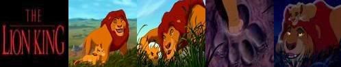
While I don't like the matted widescreen transfers one bit I do see some difference between e.g. Jungle Book and Robin Hood. Both may have been screened matted, but when I look at comparisons it's pretty obvious Jungle book feels cramped in a lot more cases then Robin Hood. In a way that ain't all that weird ... Jungle Book was released in 1967, Robin Hood in 1973.
I'm guessing that by 1973 the animator had gotten used to widescreen a bit more, with less composition screwups (I can imagina it ain't always easy to keep widescreen in mind when you have to draw academy ratio ...). That could possible explain why Jungle Book looks "wrong" more often.
Given that 101 Dalmatians was released in 1961 I'm afraid a matted transfer is gonna be awfull. I've seen the movie more then a few times and I can't really remember seeing a lot of truly dead space. (which isn't all that weird when you got a few dozain dogs on the screen )
I guess this is one issue that'll never get resolved. In the ideal world they'd just make these 3-disc releases which have both options. Marginal extra cost and everyone would be happy
" ... Omnium gallorum fortissimi Belgae sunt ... "
Scaramanga wrote:I'm guessing that by 1973 the animator had gotten used to widescreen a bit more, with less composition screwups (I can imagina it ain't always easy to keep widescreen in mind when you have to draw academy ratio ...). That could possible explain why Jungle Book looks "wrong" more often.
I'm afraid it doesn't. I've watched all of these films cropped from the open matte transfer, and Dalmatians looked perfect, as did Sword in the Stone. The only one I had difficulties with was Jungle Book. I think the old dvd had too little room for overscan - it shows less picture horizontally than the new DVD, in which the framing is still a little tight in places.
I guess our definitions of "perfect" aren't compatible.
Funny you should say you had problems with Jungle Book ... this aspect ratio thing is a black'n'white thingy ... either you matte or either you don't. Matting a little less then 1.75:1 or just a little more is also deviating from the theatrical aspect ratio ... thus proving the point that it looks off in it's supposed original ratio.
How could the framing be tight at all if the movie was designed for that specific ratio anyway ? (And I'm not taking overscan into account, as I consider that a non-issue, the image is there whether you can see it or not)
Anyway ... this is getting old ... in the end it's all Disney's fault for being inconsistent to begin with.
" ... Omnium gallorum fortissimi Belgae sunt ... "
Well just to see what the Aristocats and Dalmatians would look like in matted WS I cut out two pieces of black bristol board, tapped them to my tv at approx. the place where the would be if the films are matted and threw the VHS tapes on.
The Aristocats looked a little odd in a few places like the jungle book but it was still a rather nice presentation. 101 Dalmatians looked absolutely stunning! It looked like it was made for widescreen. All the action is centered and nothing but stale background or extra puppies that are doing nothing are lost. It's made me really hope that Dalmatians is given the WS treatment.
I hate to say, but the formula for these platinum releases is starting to wear on me. With a few exceptions, most of the "extras" are absolute garbage. The sound mixes have been suspect for some time now (Disney enhanced mix, indeed!), and now even the picture quality is being derided. I don't believe these guys can spend the amount of time and money putting together these DVDs with such mediocre results.
Well just to see what the Aristocats and Dalmatians would look like in matted WS I cut out two pieces of black bristol board, tapped them to my tv at approx. the place where the would be if the films are matted and threw the VHS tapes on.
The Aristocats looked a little odd in a few places like the jungle book but it was still a rather nice presentation. 101 Dalmatians looked absolutely stunning! It looked like it was made for widescreen. All the action is centered and nothing but stale background or extra puppies that are doing nothing are lost. It's made me really hope that Dalmatians is given the WS treatment.
Do you have any pics of what you made them look in Widescreen?
This is sure to stop all the aspect ratio arguments for a while... look what I found, NEW cover art!
Amazon.com has this image listed for the cover art for 101 Dalmatians upcoming Platinum Edition release. I think this will be the final cover, as DisneyDVD also has a image up for 101 Dalmatians and it is taken from this picture. Also, this image has the Disney Movie Rewards logo on it as well. I have to say, I love it! I think the red all over looks really great, better than the blue skies on the old version. What does everyone else think?
Simba3 wrote:This is sure to stop all the aspect ratio arguments for a while... look what I found, NEW cover art!
Amazon.com has this image listed for the cover art for 101 Dalmatians upcoming Platinum Edition release. I think this will be the final cover, as DisneyDVD also has a image up for 101 Dalmatians and it is taken from this picture. Also, this image has the Disney Movie Rewards logo on it as well. I have to say, I love it! I think the red all over looks really great, better than the blue skies on the old version. What does everyone else think?
I love it! So much better than the old version. I wonder if Cruella still makes the spine?
Even though I really liked the rough cover art, this is one has a classier feel to it. Too many Disney DVD covers use blues and purples for their color schemes, so it's nice to see red used for once (my favorite color). The gold looks really great with the red, as well, and I'm glad to see Pongo and Perdita are still the focus of the cover rather than Cruella.
I really love the new "official" cover art. I think Perdita looks really pretty in that picture. She looks calm,even though Cruella is right below her,snatching the pups.
cruella looks like she's pulling a Madame... "my foundation for all spotted dogs in london"
she shouldve posed conniving and ruthless towards the little pups.
everybody wants to
skinnnnnnnnnnn..................
aaaaaaaaaaaaaa ..........................
dogggggggggggggggg......
PeterPanfan wrote:I really love the new "official" cover art. I think Perdita looks really pretty in that picture. She looks calm,even though Cruella is right below her,snatching the pups.
Haha, that was my least favorite part of the original cover, where the puppies were looking happily up at Cruella. It was like, "Hello, puppies, have you been watching the movie?".
"Ta ta ta taaaa! Look at me... I'm a snowman! I'm gonna go stand on someone's lawn if I don't get something to do around here pretty soon!"
The more I look at this cover art, the more I love it. Like DisneyKid said, the red and gold look really good together, and the dominating red color all over looks great. I too wish Cruella had a more mischievous look to her, but over all I think this is a great cover art.
This also confirm that the movie will be presented in its 1.33:1 Full Frame version.
Personnaly, I liked the first cover art better; I thought it was more classy thzn the new one, and I prefered the blue than the red...
Chandler (to Phoebe, over the phone) : Listen, Joey isn't gonna be here tonight so why don't you come over and I'll let you uh.. feel my bicep; or maybe more...
Friends, 5.14 - The One Where Everybody Finds Out