according to wikipedia, they didn't do TLM but they did do Peter PanPatrickvD wrote:RKO? That was removed from Snow White, Cinderella, Bambi and a bunch of others. Anything to do with the fact that Lowry isn't restoring the pictures anymore? At least they didn't do Little Mermaid and it looks like they didn't do Peter Pan.
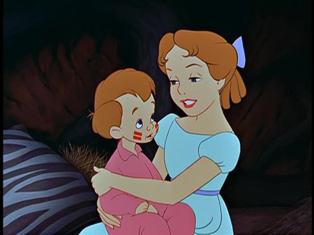
The FIRST screenshots from Peter Pan + RESTORED junglebook

I think that the only non-Lowry (now DTS Images) restoration was Cinderella which was done by Technicolor. (And yet, still people complained about the colours. Technicolor should know!)
Most of my Blu-ray collection some of my UK discs aren't on their database
-
Scaramanga

- Limited Issue
- Posts: 71
- Joined: Fri Jul 25, 2003 3:32 am
- Location: Belgica
- Contact:
Hmmm ... the new PE looks pretty yellow to me ... I could extend that to quite a few of the comparisons posted. The 2 titlecards (Walt Disney Presents & Peter Pan) look incredibly faded to me ...
I'm not too sure about Jungle Book either ... looks like they changed the colours rather then just restoring them. The Before / After shot isn't making me like it at all. It looks like they wanted to restore Mowgli's skin tone, which does look somewhat more natural to me in the restored shot, but somehow the yellowish background feels off to me. But then again I guess they cross-checked with the actual backgrounds in the archives to verify the exact colours
" ... Omnium gallorum fortissimi Belgae sunt ... "
-
singerguy04
- Collector's Edition
- Posts: 2591
- Joined: Wed Feb 09, 2005 4:40 pm
- Location: The Land of Lincoln
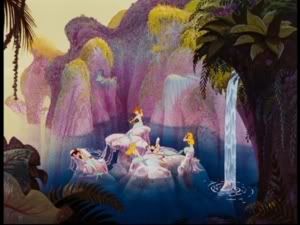
But for me it's more than the yellowish tone that feels off, it's the shading too. look at the cliffs in the background of the mermaid picture. on the right it actually looks like there's a shadow being formed but on the left it just looks like the shadow is purple rock. And some of the details are off. on the right you can see that the mermaid on the highest rock is holding something but on the left you can hardly make out the hand that's holding the object, which is almost dissapeared.
I have a question regarding the pictures from the new PE though, could it be that the program used to upload these images onto the site could've made them a bit more blurry, because i think that's where a lot of my problems lie as well.
I have a question regarding the pictures from the new PE though, could it be that the program used to upload these images onto the site could've made them a bit more blurry, because i think that's where a lot of my problems lie as well.
which one is the PE? left or right? the right looks alot more crisp, sharp and color correct to meScaramanga wrote:
Hmmm ... the new PE looks pretty yellow to me ... I could extend that to quite a few of the comparisons posted. The 2 titlecards (Walt Disney Presents & Peter Pan) look incredibly faded to me ...
I'm not too sure about Jungle Book either ... looks like they changed the colours rather then just restoring them. The Before / After shot isn't making me like it at all. It looks like they wanted to restore Mowgli's skin tone, which does look somewhat more natural to me in the restored shot, but somehow the yellowish background feels off to me. But then again I guess they cross-checked with the actual backgrounds in the archives to verify the exact coloursIf they did and the new transfer reflects exactly that then it just proves we've been watching an abomination for way too long to end up liking it better then the original
-
singerguy04
- Collector's Edition
- Posts: 2591
- Joined: Wed Feb 09, 2005 4:40 pm
- Location: The Land of Lincoln
-
brotherbear

- Special Edition
- Posts: 540
- Joined: Mon Apr 03, 2006 9:44 pm
- Location: In the Jungles of India
I'm really hoping that Luke is right, and it's the program that 271286 is using to get screencaps that's causing the bluriness, and that it's not the actual picture. Compression is another factor I didn't think about, but it it's probably a major reason as to why the screen caps we have now are so blurry. BUT, if it turns out that this IS the picture, I will have to pick up the PE as well as the SE. 
I can't wait until more previews show up! And I'm even more excited about the UD Review! This might seem like a really random question, but it's one I've been wondering for a while. Why is it that UD seems to be recieve the review DVD's from Disney much later than many other websites or (for lack of a better word at the moment) reviewers?
By the way, 271286, you never posted pictures of the disk art....and could you also possibly post pictures of the menus from Disk 2 and pictures in general from Disk 2? I don't mean to be pushy or anything, I'm just really curious.
Thanks!
-BB
MY "FAB FOUR": 1- FANTASIA, 2- THE LION KING, 3- BEAUTY AND THE BEAST, 4- THE JUNGLE BOOK
Soon...
Well, I just re-purchased the CAV PETER PAN Laserdisc release from 1991 - lol - God, I must've sold it over 10 yrs ago to get the THX remaster in 1997... I want to make screencaps from the old LD, the remastered LD (which is the same transfer used for the 1999 initial DVD release), the 2002 SE DVD, and this 2007 SE DVD. Then maybe we'll have something to REALLY compare. Each release looks a little worse to me [colors duller but image is sharper], and I noticed the 2002 DVD - and perhaps the 97 LD and 99 DVD - was missing the brushstrokes on Tinkerbell's dress when she is measuring her hips.
-
akhenaten

- Anniversary Edition
- Posts: 1267
- Joined: Wed Oct 29, 2003 3:12 pm
- Location: kuala lumpur, malaysia
- Contact:
yes! that scene when tinkerbell is measuring her hips have always been the comparison shot for me too! when i watched it on vhs. it was there. so i understood it mustve been an ink and painter's clumsy job. but in the SE dvd its been fixed. i read somewhere peter pan SE was restored using a paintboxing system?? can someone clarify that?
thanks.
thanks.
do you still wait for me Dream Giver?

Most of the other outlets have people in California to review the DVDs, or are getting copies sent out to multiple people. We get just one and ours have to come half-way across the country, and then if I'm not reviewing them, take another 2-4 days to get to their ultimate destination. Plus, print outlets tend to get them sooner than online outlets.brotherbear wrote:Why is it that UD seems to be recieve the review DVD's from Disney much later than many other websites or (for lack of a better word at the moment) reviewers?
Also, though this applies to all online sources, BVHE isn't nearly as good as they used to be about getting review copies out well in advance of release date. Two years ago, it was common to get them just a shade under 3 weeks before release date. Since early last year, that window has tended to crawl to 1-2 weeks, sometimes review copies coming as late as 3 days before release.
"Fifteen years from now, when people are talking about 3-D, they will talk about the business before 'Monsters vs. Aliens' and the business after 'Monsters vs. Aliens.' It's the line in the sand." - Greg Foster, IMAX chairman and president
It should be noted, when the original Peter Pan LE and SE (and the French/Japanese 2 discs) were released, a lot of people did complain about the colours. There was a thread about it on Home Theater Forum for example.
I don't know if the colours were right/wrong on the previous releases, but the general opinion seems to be that they were.
I don't know if the colours were right/wrong on the previous releases, but the general opinion seems to be that they were.
Most of my Blu-ray collection some of my UK discs aren't on their database
-
Thad Komorowski
- Member
- Posts: 18
- Joined: Wed Apr 07, 2004 4:12 pm
- Location: NY
- Contact:
My first post...
A similar debate is raging on dvdtalk.com and on Home Theater Forum.
My personal contribution:
Screen cap from Platinum Edition:

Original production hand-painted cel (on sale here: http://www.animationartgallery.com/WDCK280.html):

Need is say more? (Except to mention how the Chief's coat has gone from jade to pale banana?)
If images don't appear, please go to this post: http://forum.dvdtalk.com/showpost.php?p ... tcount=127
A similar debate is raging on dvdtalk.com and on Home Theater Forum.
My personal contribution:
Screen cap from Platinum Edition:
Original production hand-painted cel (on sale here: http://www.animationartgallery.com/WDCK280.html):
Need is say more? (Except to mention how the Chief's coat has gone from jade to pale banana?)
If images don't appear, please go to this post: http://forum.dvdtalk.com/showpost.php?p ... tcount=127

Well, from what I've been told time and time again, original cels aren't quite reliable because the technicolor process would slightly alter the colors. The animators knew this and had a color chart to guide them so that they can use certain colors to get the desired effect on the actual print. This is why a lot of people have been slamming Lowry's restorations. Apparently they only cross reference their progress with the original cels and backgrounds, not the technicolor charts. But then matters get even more confusing. If Lowry is indeed paying strict attention to the cels and cels only, why does the final result still not match the cel?
2007 Platinum Edition:

And to really muddle up matters, check this out. The 2007 transfer is closer to the 1991 one than the 2002 one that so many people keep praising.
1991 Laserdisc:

2002 Special Edition:

None of these transfers match the cel all that much. One thing I've always found odd is how Peter Pan (in any home video incarnation) never seemed to have the ultra-thin character outlines that Cinderella and Alice in Wonderland had. Its clean-up animation always seemed thicker than those. Yet that cel has thinner, crisper outlines than any of the screencaps, more closely matching the style of the previous Disney films. I really don't know what to think anymore. Personally, I love the 2007 transfer. I find its color scheme to be the most natural of all the transfers (and from a purely digital perspective, creams the 2002 transfer that was plagued with edge enhancement and DVNR). I suppose the question is this: was natural the type of color palette Disney was going for? I wish some of the restoration crew would visit these boards and enlighten us.
2007 Platinum Edition:
And to really muddle up matters, check this out. The 2007 transfer is closer to the 1991 one than the 2002 one that so many people keep praising.
1991 Laserdisc:
2002 Special Edition:
None of these transfers match the cel all that much. One thing I've always found odd is how Peter Pan (in any home video incarnation) never seemed to have the ultra-thin character outlines that Cinderella and Alice in Wonderland had. Its clean-up animation always seemed thicker than those. Yet that cel has thinner, crisper outlines than any of the screencaps, more closely matching the style of the previous Disney films. I really don't know what to think anymore. Personally, I love the 2007 transfer. I find its color scheme to be the most natural of all the transfers (and from a purely digital perspective, creams the 2002 transfer that was plagued with edge enhancement and DVNR). I suppose the question is this: was natural the type of color palette Disney was going for? I wish some of the restoration crew would visit these boards and enlighten us.

The 2002 example is still closest to the cel colour. The face colour is right. The bubble gum pink colour is right and the coat is jade green, although a darker shade in this sunset-coloured frame. The 2007 DTS Images restoration made absolutely NO attempt to recreate the cel or Technicolor colours. It just went on its own tangent regardless of the consequences.
The easy answer is that they wanted to make the Red Man beige in the interest of political correctness. But I also think they wanted to get as far away as possible from the traditional Technicolor deep hues and slickness because Martha Stewart wouldn't approve.
By the way, why won't my posted images appear?
-
myr_heille

- Gold Classic Collection
- Posts: 274
- Joined: Mon Sep 18, 2006 7:14 am
- Location: Sweet Canadaland
Your pics won't post because for some reason, the url tags are from HTF's cache rather than the original sources (maybe once an image is posted on HTF, it's impossible to copy the image location from them?).
I can't say how accurate the 2007 restoration is, but I'm almost certain that the 2002 one is wildly off. Technicolor did produce colors that were saturated, yes, but the 2002 SE strips the color palette of any depth it may have had. It's practically made up of only primary colors. Reds were overly bright (Peter's hair was the same shade as his feather), and contrast was through the roof. Half the time, the characters had this sickly gray color to their skin (especially evident during, "Your Mother and Mine").

Even while taking advantage of the vividness of Technicolor, Disney artists were always careful to give their characters and locations depth. I feel the 2002 SE robbed those intentions and looks, dare I say, more cartoonish than it should. Even in darker scenes, everyone appears to be lit under solid white light.
Again, I can't really defend the 2007 Platinum restoration when I know so little of it (if only we had gotten a restoration featurette on this release). That said, the transfer fits with the deeper, richer palettes of surrounding films like Alice in Wonderland and Lady and the Tramp, so even if it IS tampered with, it appears to be less so than the previous "restoration."
I can't say how accurate the 2007 restoration is, but I'm almost certain that the 2002 one is wildly off. Technicolor did produce colors that were saturated, yes, but the 2002 SE strips the color palette of any depth it may have had. It's practically made up of only primary colors. Reds were overly bright (Peter's hair was the same shade as his feather), and contrast was through the roof. Half the time, the characters had this sickly gray color to their skin (especially evident during, "Your Mother and Mine").
Even while taking advantage of the vividness of Technicolor, Disney artists were always careful to give their characters and locations depth. I feel the 2002 SE robbed those intentions and looks, dare I say, more cartoonish than it should. Even in darker scenes, everyone appears to be lit under solid white light.
Again, I can't really defend the 2007 Platinum restoration when I know so little of it (if only we had gotten a restoration featurette on this release). That said, the transfer fits with the deeper, richer palettes of surrounding films like Alice in Wonderland and Lady and the Tramp, so even if it IS tampered with, it appears to be less so than the previous "restoration."
Original hand-painted cel from Peter Pan:

From this site: http://www.animationartgallery.com/adisneycels5.html
From this site: http://www.animationartgallery.com/adisneycels5.html