Which Platinum Edition cover art is the best?

Which Platinum Edition cover art is the best?
Ok everyone, which cover art for the Platinum Editions do you think is the best? Please vote on cover art alone, and not on favorite film.
Signature courtesy of blackcauldron85!!
-
Just Myself

- Platinum Edition
- Posts: 3552
- Joined: Mon Feb 09, 2004 7:08 pm
- Location: Pawnee, IN
- Contact:
-
Jasmine1022

- Anniversary Edition
- Posts: 1131
- Joined: Sat Oct 28, 2006 6:20 pm
- Location: Agrabah
- Contact:
personally, i HATE the aladdin cover. i think al and jasmine both look ridiculous and not like themselves at ALL.
i chose snow white and the the little mermaid. snow white because i just like it for some reason and the little mermaid because it's just a cool cover. and it's bumpy. i like the bumpy-ness.
i chose snow white and the the little mermaid. snow white because i just like it for some reason and the little mermaid because it's just a cool cover. and it's bumpy. i like the bumpy-ness.
I voted for "Snow White and the Seven Dwarfs" because I think it looks great. Other close contenders were "The Lion King" and "Bambi"
I think the artwork for "Aladdin" is terrible. I really enjoy the concept, but Aladdin and Jasmine look awful. I also am still unsure about "The Little Mermaid"'s cover art, but again I think the animation on Ursula is awful.
I think the artwork for "Aladdin" is terrible. I really enjoy the concept, but Aladdin and Jasmine look awful. I also am still unsure about "The Little Mermaid"'s cover art, but again I think the animation on Ursula is awful.
Signature courtesy of blackcauldron85!!
-
blackcauldron85

- Ultimate Collector's Edition
- Posts: 16705
- Joined: Sat Jun 17, 2006 7:54 am
- Gender: Female
- Contact:
-
Lil' Pixie

- Gold Classic Collection
- Posts: 163
- Joined: Tue Mar 06, 2007 11:25 am
- Location: Maryland


-
blackcauldron85
- Ultimate Collector's Edition
- Posts: 16705
- Joined: Sat Jun 17, 2006 7:54 am
- Gender: Female
- Contact:
Lil' Pixie (or anyone): if you click here : http://www.ultimatedisney.com/releasetypes.htm
and scroll to the Platinum Edition section, there are pictures of them all.
and scroll to the Platinum Edition section, there are pictures of them all.
-
PixarFan2006
- Signature Collection
- Posts: 6166
- Joined: Fri Jun 16, 2006 8:44 am
- Location: Michigan
-
Lil' Pixie
- Gold Classic Collection
- Posts: 163
- Joined: Tue Mar 06, 2007 11:25 am
- Location: Maryland
-
Chernabog_Rocks

- Collector's Edition
- Posts: 2213
- Joined: Thu Mar 30, 2006 2:00 am
- Location: New West, BC
I agree that the Aladdin one is fairly awful, if anyone noticed the picture of Jafar is just recyled from the VHS release. As for the Peter Pan, I like it, it's shiny and bumpy but Michaels kinda off to me, and so is Smee, he reminds me of Doc and Happy from Snow White only in a Pirates outfit. However once my eye caught the shinyness of it I almost forgot entirely about the little details I mentioned  If I had to, I'd say Bambi looks pretty, but it's not my fav. I say Lion King is the best, followed by Beauty and The Beast and Snow White the characters look pretty good as compared to Smee, Aladdin and Jasmine.
-
UmbrellaFish

- Signature Collection
- Posts: 5762
- Joined: Sun Jan 28, 2007 3:09 pm
- Gender: Male (He/Him)

I voted for The Little Mermaid, as it is fresh, bright, and happy. Just like the movie! All the characters look on-model as well, which can sometimes be unusal for Platinum Editions!
My ranking order would be:
1. The Little Mermaid - As above
2. Peter Pan - All on-model, and it looks so magical and beautiful.
3. Bambi - Very pretty cover
4. Beauty and the Beast - Love it and would be higher, if it wasnt the old VHS cover, just tweaked a bit.
5. Snow White and the Seven Dwarfs - Too sparce, and shows none of the warmth from the movie.
6. The Lady and the Tramp - Massive floating heads! Nice colours though.
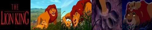
7. The Lion King - Simba appears twice on the cover, I hate it when they do that.
8. Cinderella - Cindy should have been the main focus, not the Prince
9. Aladdin - Just dreadful! I hate this cover!
My ranking order would be:
1. The Little Mermaid - As above
2. Peter Pan - All on-model, and it looks so magical and beautiful.
3. Bambi - Very pretty cover
4. Beauty and the Beast - Love it and would be higher, if it wasnt the old VHS cover, just tweaked a bit.
5. Snow White and the Seven Dwarfs - Too sparce, and shows none of the warmth from the movie.
6. The Lady and the Tramp - Massive floating heads! Nice colours though.
7. The Lion King - Simba appears twice on the cover, I hate it when they do that.
8. Cinderella - Cindy should have been the main focus, not the Prince
9. Aladdin - Just dreadful! I hate this cover!
-
Disney Duster

- Ultimate Collector's Edition
- Posts: 14120
- Joined: Fri Jun 17, 2005 6:02 am
- Gender: Male
- Location: America
Best Platinum Editon Cover
This comment confused me, until I remembered you live in the U.K. I think you got a different cover than us. I've compared the one the United States got to the one I think you got:atlanticaunderthesea wrote:6. The Lady and the Tramp - Massive floating heads! Nice colours though.

If you got that one, it's awful! But I think I know why they made it that way. The United States Lady and the Tramp and Beauty and the Beast covers are the only ones that have the title at the top and every character below. So, other countries got a cover that makes Lady and the Tramp look like most of the other covers, with the main characters' huge heads above the title, and the title in the middle of the cover.
I present the covers in the order they were released:

The first cover, it started the trend of the main character or characters above the main title, usually "floating" there because they start to fade and disappear towards the bottom of the cover, and only their upper bodies are opaque. Then, the other characters are smaller and on the bottom, usually pushed to the sides. I like the mirror bordering the title, but I prefer titles stretched horizontally, not vertically, not the "long way". I like the looks of all the characters, I just hate how they are all plopped there. I'd like them all to feel like they're in the same place. What I hate most of all is that there is no real background, it's just purple color! I'd have liked stone castle walls or the forest in the background.

Beauty and the Beast did the same thing, no real background, only a color, and everyone's just floating around. But I hate this one more than Snow White's because I think the title should be in the middle like most of the other platinums, and Belle and the Beast should be above the title.

I actually feel this is the best cover. It feels like everyone is in the same place, because they could all be on Pride Rock. Simba could be floating, but the other characters feel grounded because baby Simba and Rafiki are on the cliff, while the other characters are anchored to the bottom of the cover. I just like the composition, Simba's body flowing down to the other characters. I don't mind the same character appearing twice if they went through a big change, so baby Simba and adult King Simba son't bother me. I wouldn't have minded seeing Ariel as a mermaid and as a human on her cover, or Cinderella as a servant and as a princess on her cover.

I don't know what this one needs...aside from a better looking Aladdin and Jasmine, but it doesn't work completely. I think there needs to be more desert in the background... Something that also might help would be for Genie's smokey tail to be coming from the lamp, to connect things more.

I love this one. It's pretty much perfect, I just find it weird how huge Bambi is, somehow. I don't like the characters being so big, but it worked for Simba because Simba is a big figure, he's a lion. Maybe it's just Bambi's head that is too big for me.

My favorite cover, I never get tired of looking at it. I don't feel it's the number one best, but it's one of the best. They all feel connected because the mice could be on a ledge looking out at the castle, while the carriage is on a bridge to the castle, and Cinderella and the Prince danced in the night during the film, so it all works for me. The Prince could be drawn more on model and the colors could be more correct, though, and I strangely don't have a huge probelm with the Prince being focused on more, but it is still a problem. What we don't see here is the slipper in the logo, which is a perfect touch.

I would love this if only the title could be in the middle like most other Platinum covers! That's really my only qualm, besides the fact that the colors of the characters, namely Tramp and Lady, aren't correct.

My only problem with this one, actually, is that Ariel is not in the center! She's too far on the left! They should make the ship smaller or move it over so Ariel can be in the center of her own cover! Oh, and the colors are off for Ursula's whole body and Triton's tail. Otherwise, I love it. Ariel is not too big.

But Peter is too big. At first this cover didn't remind me of the film at all, but I remembered that scene where Tink illuminates a close-up of Peter's face, so I guess it sort of fits. I just think that both Tink and Peter should be smaller...especially Tink, but we all know she was made big to promote Disney Fairies... Also, Wendy should be flying in the same direction as John and Michael, so the cover flows well together. Believe me, it would look better if Wendy and was covering Peter's transparent arms.
So, I guess I feel the BEST cover is The Lion King's and my FAVORITE cover is Cinderella's.
