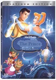
i thought i would post them side by side so people can see the difference, I had to look at it 3 or 4 times to realize some small changes in the cover.
Yeah i mean if i were in charge i'd amke some changes too but I really think we should appreciate what we have. like rodis said, its just them dancing, you're gonna see someone's back...disney could improve their advertising by re-arranging the characters but don't you think they're already pretty smart in that field?
i love the revised art! the characters look SO much better and i love the colour improvement. it's like midnight blue...and the detail in the cover art has REALLY improved. i love it!
-ryan
If we're going to try to find logic in the artwork decisions, one can probably assume that <i>Cinderella</i> is a name which already has the female demographic locked up. By making the Prince appear prominently and using the color blue, perhaps they saying "Hey, guys, this is for you too!"
Or maybe I'm just reading too much into it.
"Fifteen years from now, when people are talking about 3-D, they will talk about the business before 'Monsters vs. Aliens' and the business after 'Monsters vs. Aliens.' It's the line in the sand." - Greg Foster, IMAX chairman and president
Also, them dancing plays up the romantic aspect of the movie that girls love so much. Current animators have said in the past that they have trouble drawing Cinderella, so maybe this was the only position they could manage? I have a hard time imagine the two facing opposite directions.
Yes it is, like in the movie when they are rushing Cinderella to the castle. The horses are already on the other side of the bridge and the coach isn't, so because of the laws of physics the coach sort of "flies" when going up the ramp of the bridge (an object always wants to go a straight path, so the coach wanted to ride into the sky, but the horses will take it from it's straight path).
saving107 wrote:i found this the other day and i thought someone would had posted this by now, i know it is not a big deal but it is nice to see they have changed the title alittle by adding the Slipper in the back on the name, i know some people were requesting that they do that.
Holly Cow I never even noticed that. I saw that the colors changed a bit aslmost back the Orignal Cinderella VHS cover. the Navy dark ballroom blue and that made me happy. But the Glass Slipper in the name is a nice touch. Thanks for pointing that out.
Regarding Cinerella at one point almost being known as the Prince. WOW you learn something new everyday. And I am glad they changed the tittle casue the prince would be so lame. Considering he has no real name in the movie and we only see him twice his dad appears more them Lol .
DreamerQ18 wrote:Regarding Cinerella at one point almost being known as the Prince. WOW you learn something new everyday. And I am glad they changed the tittle casue the prince would be so lame. Considering he has no real name in the movie and we only see him twice his dad appears more them Lol .
I think Wondy was being sarcastic because he thinks we see too much of the prince on the cover.
If we're going to try to find logic in the artwork decisions, one can probably assume that <i>Cinderella</i> is a name which already has the female demographic locked up. By making the Prince appear prominently and using the color blue, perhaps they're saying "Hey, guys, this is for you too!"
Or maybe I'm just reading too much into it.
Ypu are definetely reading too much into it. Most guys would call the prince a derogatory term w/ I won't specify. He doesn't look exaclty like the Rambo type that would attract boys.
Personally I think the cover art looks great !! its pretty and bright and the slipper just gives it that classy disney feel i love it !! good job disney
The newer cover with the touchup looks so much better.
Amazing how a few simple changes can spruce up a cover like that. XD Everything looks more sparkly and magical. The cover's still far from perfect and there's no way everyone will be satisfied with the final result, but I think it's still pretty neat. d:
It's funny - everybody spends so much time discussing the cover and how important it is, and then turns around and wonders why Disney seem to focus on glossy games rather than content on their discs.
If we spent this much effort demanding better supplements (which admittedly, Cinderella seems to have a few of) we'd have the greatest DVDs ever.
Loomis wrote:It's funny - everybody spends so much time discussing the cover and how important it is, and then turns around and wonders why Disney seem to focus on glossy games rather than content on their discs.
If we spent this much effort demanding better supplements (which admittedly, Cinderella seems to have a few of) we'd have the greatest DVDs ever.
It's been nearly seven months since I last did this for you, Loomis, but this post calls for such a response:
"Fifteen years from now, when people are talking about 3-D, they will talk about the business before 'Monsters vs. Aliens' and the business after 'Monsters vs. Aliens.' It's the line in the sand." - Greg Foster, IMAX chairman and president
I love the logo! It looks so great, and i love the fact that the title style from the classic video was moved up, retsored and improved. i liked this style better than the masterpiece ones and the titles that were on books and stuff.
Loomis wrote:It's funny - everybody spends so much time discussing the cover and how important it is, and then turns around and wonders why Disney seem to focus on glossy games rather than content on their discs.
If we spent this much effort demanding better supplements (which admittedly, Cinderella seems to have a few of) we'd have the greatest DVDs ever.
Well said, even though I don't really think it would make a difference what we ask for.
Reviewers have complained about the stupid games but that didn't do much


 R[APRIL.23]K: High School Sweethearts


