First, and before I forget... UniversALLove.... you posted the link for Eric Heintz's website... let's hope he doesn't look at this thread. We have NOT been kind to his artwork (and SOME of it looks really good... but we haven't hit those movies yet).
So on to Hercules... I like this movie. It's a shame they don't really know what to do for the covers. They are all mediocre or worse. Heck, Pocahontas and Hunchback had a better selection! The one general plus, it that the characters are a little more on model on these covers.
So here we go!
1) Limited dvd/US VHS: I must admit this one is kind of a tie with the UK VHS. I'm giving it extra points for the dynamic poses, and the characters are pretty on-model. But there are two main elements that really work for me here: 1) the color of the sky. That tone of blue just SCREAMS Greece to me. Greece is famous in real life for their specific color of the sky. 2) The overall design. Hercules (the movie) has a lot of swirl motifs in it's look... and all the elements here create a swirl...Herc's cape to pegasus, to the clouds, to Phil, to Herc's arms, to the sword. The minuses: like others have mentioned before, meg's dress is way too dark/saturated, and those random curls on her side make no sense... and Hades looks like an afterthought. But I guess they couldn't just leave the space empty.
2) UK VHS: I had never seen this one before! The layout is a little bland, but the characters look very well drawn here. The rendering could be a tad better... and Meg's linework doesn't show enough. But pretty good overall. And I like the bolt-oval for the title. The BIG MINUS: the villains above the title. In this case, it makes it look cheap.... like they were drawn for the cover for the tv series.
3) Blu ray: So the characters are recycled from the Japanese vhs. Fairly well drawn, SUPER BLAND POSES, the rendering is a little lazy... the perspective with the background is very strange. So we are looking at the market from above... but at the characters at-level.... so.... what are the characters standing on? A hill in front of the market?? And what is that white house in the background? Is that supposed to be Herc's villa?? I'm ranking this one above the Japanese VHS cause there is an attempt at a background...
4) Japanese VHS: I can't tell if the characters are well drawn... but the composition is extremely bland. The characters are just... standing there. The blue frame is just a waste of space here (IMO)... this isn't a solemn movie... a frame is a little too high brow for this one.
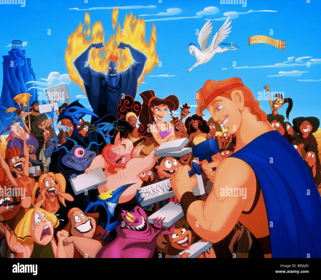
5) Heroes cover: Passable. This is traced from a frame in the movie, but they modified the hands. Does Herc ever do any sort of bodybuilding pose during the film?? This kinda looks like he is showing off. Fairly well rendered, but they messed up the wrinkle under his eye. It's supposed to be the cheek pushing up, not bags under his eye.
6) Villains cover: Pretty good drawing... I find the concept of a lone villain on a cover to be misguided, but it is what it is. Sad that they forgot to give him one more upper tooth. His gums just goes up into his lip... there should be another visible tooth there, even if it's from the side.
7) Gold Collection: ugh. that huge Hercules head looks awful. The anatomy of his arm is way off. If they wanted to make a bold statement and have a large Herc head.... fine. But commit! Don't slap a bunch of other crap on/around him. The characters on Pegasus is a weird idea... specially the inclusion of Pain and Panic (can you imagine a cover for Mermaid where the eels are depicted as part of her gang???). The market in the background is completely random.

Swedish VHS: yes! One worse than the Gold Collection! Meg and Phil look pretty good... the rendering is a little sloppy. BUT HERCULES LOOKS HORRENDOUS. I don't know WHO okayed this cover....
Some have commented/asked about Pain and Panic being over exposed... and they are/were. I guess Disney had this idea that sidekicks sell well... so they shoehorned a lot of small characters into every movie, where they weren't needed and were often irritating... Pain and Panic, Mushu, Cricket, Meeko, Pecy, Flit...THREE gargoyles (I think Hunchback would have been a better film with ONE gargoyle that wasn't just comic relief). And most of them weren't popular... maybe Mushu at best (though I have serious issues w him as a character). Hercules was coming at a time where the Disney formula.... was starting to FEEL formulaic. I still like the film, but certain choices in it aren't really organic to the story. Oh well.


