Better pictures of japanese Pocahontas VHS
http://yahoo.aleado.com/lot?auctionID=d277814260
http://auc.aleado.com/yahoo/lot?auctionID=b279078690
Comparing Home Releases Cover Arts
-
DisneyBluLife

- Gold Classic Collection
- Posts: 381
- Joined: Sun Oct 14, 2012 10:36 am
- Location: Sweden

Re: Comparing Home Releases Cover Arts
^Here's also a bigger picture of the laserdisc: https://www.ebay.com/itm/NM-Laserdisc-w ... Sw7KJXEDZF
Thanks for sharing that Japanese cover, JeanGreyForever! I had never seen it before.
VHS (Italy)

Sources:
https://www.ebay.it/itm/POCAHONTAS-Disn ... 2954632239
https://www.ebay.it/itm/POCAHONTAS-1995 ... XQMTlRatYR
Musical Masterpiece DVD (Brazil)

Source: http://capasanimacao.blogspot.com/2010/ ... tas-1.html
Blu-ray Steelbook (UK)

Source: https://www.zavvi.com/blu-ray/pocahonta ... 75851.html
2-Movie Collection DVD (UK)

Source: https://www.zavvi.com/dvd/pocahontas-mu ... 83830.html
Thanks for sharing that Japanese cover, JeanGreyForever! I had never seen it before.
I don't know, I wasn't able to find anything. However, while I was searching for it, I stumbled upon some other covers I hadn't seen before either. The last two are similar to others already posted, but the first two are quite different from the rest:JeanGreyForever wrote:BTW does anyone know if this image was ever used for a home video release? It was used as a poster and soundtrack cover a lot but I'm not sure if it was ever a DVD/VHS/Laserdisc cover anywhere in the world.
VHS (Italy)
Sources:
https://www.ebay.it/itm/POCAHONTAS-Disn ... 2954632239
https://www.ebay.it/itm/POCAHONTAS-1995 ... XQMTlRatYR
Musical Masterpiece DVD (Brazil)
Source: http://capasanimacao.blogspot.com/2010/ ... tas-1.html
Blu-ray Steelbook (UK)
Source: https://www.zavvi.com/blu-ray/pocahonta ... 75851.html
2-Movie Collection DVD (UK)
Source: https://www.zavvi.com/dvd/pocahontas-mu ... 83830.html
-
Disney Duster

- Ultimate Collector's Edition
- Posts: 14161
- Joined: Fri Jun 17, 2005 6:02 am
- Gender: Male
- Location: America
Re: Comparing Home Releases Cover Arts
I like the poster of Pocahontas and John Smith in shadow JeanGreyForever posted.

-
JeanGreyForever

- Signature Collection
- Posts: 5335
- Joined: Sun Sep 15, 2013 5:29 pm
Re: Comparing Home Releases Cover Arts
It's one of my favorite Pocahontas posters! I wish it was used more in products, but I think they mostly saved it for international audiences.Disney Duster wrote:I like the poster of Pocahontas and John Smith in shadow JeanGreyForever posted.


We’re a dyad in the Force. Two that are one.
"I offered you my hand once. You wanted to take it." - Kylo Ren
"I did want to take your hand. Ben's hand." - Rey
-
JeanGreyForever
- Signature Collection
- Posts: 5335
- Joined: Sun Sep 15, 2013 5:29 pm
Re: Comparing Home Releases Cover Arts
Thanks DisneyBluLife and D82 for finding higher-res pics of that cover!
And thank you D82 for posting those new covers.
I'd never seen that Italian VHS cover though and boy, is that scary. It looks like a cheap Disney knockoff. The actual composition of the cover isn't too bad (even if Ratcliffe looks so inept waving around that wooden sword in the background) but the characters are drawn so cheaply and so off-model. John Smith is based off of clipart so it's shocking that they rendered it so bad here.
The Brazilian DVD cover looks like a Disney Princess product. Funny enough, that hair braiding scene was added into the film for the purpose of selling dolls.
I always liked the Zaavi Steelbook cover but the black border seemed odd and tonally inconsistent with the film for me.
We’re a dyad in the Force. Two that are one.
"I offered you my hand once. You wanted to take it." - Kylo Ren
"I did want to take your hand. Ben's hand." - Rey
Re: Comparing Home Releases Cover Arts
JeanGreyForever.... as usual, we see things very differently. Though that italian cover isn't perfect, the characters ARE on-model... I will post my thoughts on it when I do my ranking.
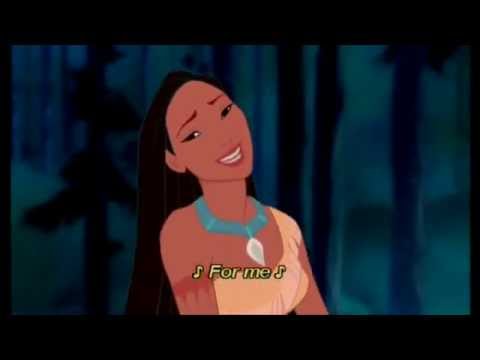
But Pocahontas' face looks like it is based off of a closeup from the movie, during "Just around the riverbend"... after the first chorus, when she says "for me.... coming for me....". The anatomy is good, and the hair is better than a LOT of the other covers.
Again, full thoughts when I post my ranking.
-
blackcauldron85

- Ultimate Collector's Edition
- Posts: 16717
- Joined: Sat Jun 17, 2006 7:54 am
- Gender: Female
- Contact:
Re: Comparing Home Releases Cover Arts
I like the Japanese + Italian VHS covers! And the Brazilian Musical Masterpiece cover brings back memories, since I had a poster with the hair braiding scene in my room at my grandparents' house!
I had no idea Pocahontas had so many "smiling" covers! She's not Kocoum, always "so serious!"
I had no idea Pocahontas had so many "smiling" covers! She's not Kocoum, always "so serious!"


Re: Comparing Home Releases Cover Arts
Well, to me she sort of is with all her dramatic poses throughout the film, so I never understood why of all things she could say about Kocoum, she decided to describe him as "serious". "Lack any personality" seems to fit him more.
-
blackcauldron85
- Ultimate Collector's Edition
- Posts: 16717
- Joined: Sat Jun 17, 2006 7:54 am
- Gender: Female
- Contact:
Re: Comparing Home Releases Cover Arts
She definitely has a playful side, though. I don't think Kokoum would high dive or cartwheel through flowers.  I like Kokoum, though- he had good intentions and cared about Pocahontas.
Re: Comparing Home Releases Cover Arts
I didn't know that, that's really curious. I remember that shot being used in a commercial in Spain. I don't remember what was being advertized, but it was probably a Pocahontas doll.JeanGreyForever wrote:The Brazilian DVD cover looks like a Disney Princess product. Funny enough, that hair braiding scene was added into the film for the purpose of selling dolls.
This time I agree with you. My first impression was a bit like JeanGreyForever's, but the more I looked at the cover, the more I liked it. It's not my favorite because I don't like Will Smith and Ratcliffe just posing there in the background, but I think Pocahontas looks better there than in most of the other covers. And I'm not sure if Will Smith and Ratcliffe are completely on-model, but they also look worse in most of the others.Marce82 wrote:Though that italian cover isn't perfect, the characters ARE on-model... I will post my thoughts on it when I do my ranking.
But Pocahontas' face looks like it is based off of a closeup from the movie, during "Just around the riverbend"... after the first chorus, when she says "for me.... coming for me....". The anatomy is good, and the hair is better than a LOT of the other covers.
-
JeanGreyForever
- Signature Collection
- Posts: 5335
- Joined: Sun Sep 15, 2013 5:29 pm
Re: Comparing Home Releases Cover Arts
I'm sorry but in no world could I ever compare Glen Keane's majestic drawings of Pocahontas with that image of her on the cover. I see barely a similarity between this and that.Marce82 wrote:JeanGreyForever.... as usual, we see things very differently. Though that italian cover isn't perfect, the characters ARE on-model... I will post my thoughts on it when I do my ranking.
But Pocahontas' face looks like it is based off of a closeup from the movie, during "Just around the riverbend"... after the first chorus, when she says "for me.... coming for me....". The anatomy is good, and the hair is better than a LOT of the other covers.
Again, full thoughts when I post my ranking.
Yes, it's mentioned in the commentary for the film on the 10th Anniversary DVD. There's been a discussion about it in another thread with DisneyFan09 pointing it out first.D82 wrote:I didn't know that, that's really curious. I remember that shot being used in a commercial in Spain. I don't remember what was being advertized, but it was probably a Pocahontas doll.JeanGreyForever wrote:The Brazilian DVD cover looks like a Disney Princess product. Funny enough, that hair braiding scene was added into the film for the purpose of selling dolls.
This time I agree with you. My first impression was a bit like JeanGreyForever's, but the more I looked at the cover, the more I liked it. It's not my favorite because I don't like Will Smith and Ratcliffe just posing there in the background, but I think Pocahontas looks better there than in most of the other covers. And I'm not sure if Will Smith and Ratcliffe are completely on-model, but they also look worse in most of the others.Marce82 wrote:Though that italian cover isn't perfect, the characters ARE on-model... I will post my thoughts on it when I do my ranking.
But Pocahontas' face looks like it is based off of a closeup from the movie, during "Just around the riverbend"... after the first chorus, when she says "for me.... coming for me....". The anatomy is good, and the hair is better than a LOT of the other covers.
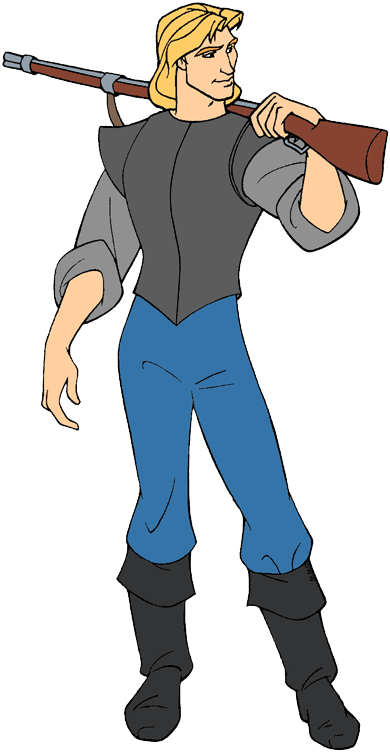
Ratcliffe looks on-model for the most part although he's so far away so it's difficult to tell. John Smith is based off this clipart. The other one is based on how a fan reupdated the clipart.
https://www.disneyclips.com/images/imag ... smith3.png
https://cdn.imgbin.com/23/0/2/imgbin-po ... dQbyDt.jpg
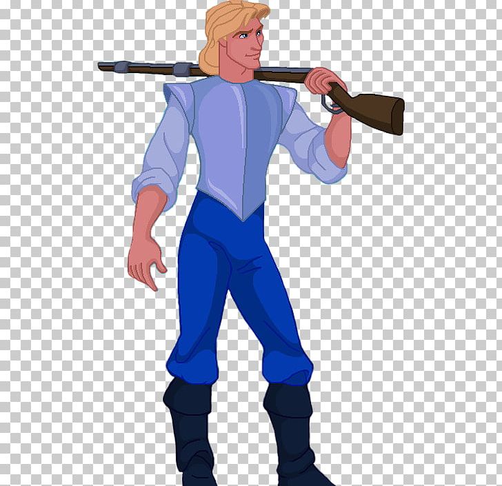
Agreed, Pocahontas isn't the stoic and serious individual people think she is. Her name means little mischief for crying out loud.blackcauldron85 wrote:She definitely has a playful side, though. I don't think Kokoum would high dive or cartwheel through flowers.
I don't really care much for Kocoum. He's fine in the final film but the deleted scenes show he was very controlling and acted very patriarchal towards her so I can see why Pocahontas felt her spirit would be stifled by him.
We’re a dyad in the Force. Two that are one.
"I offered you my hand once. You wanted to take it." - Kylo Ren
"I did want to take your hand. Ben's hand." - Rey
Re: Comparing Home Releases Cover Arts
Oh, OK. I only watched the movie with the audio commentary once a long time ago and I didn't remember that.JeanGreyForever wrote:Yes, it's mentioned in the commentary for the film on the 10th Anniversary DVD. There's been a discussion about it in another thread with DisneyFan09 pointing it out first.
Yes, you're right. That's the clipart he's based off.JeanGreyForever wrote:Ratcliffe looks on-model for the most part although he's so far away so it's difficult to tell. John Smith is based off this clipart. The other one is based on how a fan reupdated the clipart.
https://www.disneyclips.com/images/imag ... smith3.png
https://cdn.imgbin.com/23/0/2/imgbin-po ... dQbyDt.jpg
Here are both a little bit closer. I don't know, I think they don't look too off-model:


And speaking of off-model characters, look how John Smith looks in the UK Musical Masterpiece DVD and try not to laugh

-
Disney Duster
- Ultimate Collector's Edition
- Posts: 14161
- Joined: Fri Jun 17, 2005 6:02 am
- Gender: Male
- Location: America
Re: Comparing Home Releases Cover Arts
Omg! Both characters horribly off-model in all three images to me! But that last one, yikes!
Re: Comparing Home Releases Cover Arts
Here's my top 10:
1. Gold Collection DVD: I really like this cover. I always thought it was an alternate version of the theatrical poster, but Mooky and Sicoe Vlad are right; they just replaced Pocahontas' face with her face in the Masterpiece VHS, and Meeko's pose. I prefer the original poster, but this is still a beautiful cover.
2. Masterpiece VHS: The VHS cover we got in Spain is the same as the UK one and I'm fond of it, but I actually think the US one is better. I like that they chose that iconic pose of Pocahontas that was also used as one of the theatrical posters. She doesn't look as good as in the still from the poster, but not bad either. I'm not a big fan of the bottom half, though, with the characters just posing there artificially. And I especially dislike John Smith looking at the camera, but I get what they were trying to do; showing the two conflicting parties, one on each side.
3. UK VHS: This one is clearly based on the Masterpiece VHS. I like it too, and as I said, I have good memories of it. There are also certain elements I prefer here, like the color of the background. I'm not sure it's the sky, though, I think it's just the background of the part with Pocahontas that blends into the sky at the bottom. However, though Pocahontas doesn't look bad here, this is not the same iconic pose of her anymore and the symmetry and symbology of the lower part is partially lost. Here Powhatan is smiling and doesn't seem bothered by the invaders. Not to mention, at least he and Ratcliffe are drawn worse. I still like the cover, though.
4. Italian VHS: As I previously mentioned, in my opinion Pocahontas looks more accurate here (and more beautiful) than in many other covers. The other characters don't look bad either. What I don't like here, though, is the background. I guess they wanted to do something similar to the Masterpiece cover with the opposing characters, but it doesn't work very well and their poses are even more ridiculous here. I wish it was just Pocahontas with the forest behind. I guess something about the drawing or coloring makes it look a bit cheap as well, like JeanGreyForever pointed out, but that doesn't bother me too much.
5. French DVD: Like Mooky, I never liked how Pocahontas looked in the shot featured here, but the idea of the feather is clever and it's an elegant cover.
6. Deluxe Laserdisc: This one is classy too. Pocahontas is well drawn and the effect of the colorful leaves versus the rest in monochromatic hues is cool. However, I think they could've done something a bit more interesting with all these elements.
7. Japanese VHS/Laserdisc: I like how different it is from all the other covers and the layout is good. I just wish the characters had been more on-model. Plus, Smith is just posing there again. He could be doing something a little more interesting. It seems they don't know what to do with him in most of the covers.
8. Brazilian Musical Edition DVD: I had a coloring book with that pose and I've always liked how Pocahontas looked there. It's not as well drawn here as in the clipart, but not too bad either, and Grandmother Willow is on model for once! I don't think this is the best image to represent the movie, but given that it's for an alternate musical version, that doesn't mind too much. Though, come to think of it, shouldn't the musical edition show a scene from one of the musical numbers?
9. Zavvi Steelbook: This uses the same drawing of Pocahontas than the DMC Exclusive and the Heroes cover, but at least here it's used to create a nice composition and the ornate frame adds interest (though I agree with JeanGreyForever that the colors of it are not the most appropriate for the movie). Poor Flit seems to be dragged by the wind here, but he complements the layout nicely. However, why did they have to make the lower part of Pocahontas fade here? She seems to be a ghost. If it's to make the title more visible, they could've just put a frame behind it.
10. 10th Anniversary Edition DVD: This one is not very well drawn and not too representative of the film, plus I hate the green border (the UK version without it is better), but at least the composition is pleasant. Plus, I have bigger issues with the remaining covers.
I agree with the ones who said that the Musical Masterpiece DVD is the worst one. The layout is not bad, but the execution is horrible.
1. Gold Collection DVD: I really like this cover. I always thought it was an alternate version of the theatrical poster, but Mooky and Sicoe Vlad are right; they just replaced Pocahontas' face with her face in the Masterpiece VHS, and Meeko's pose. I prefer the original poster, but this is still a beautiful cover.
It's true! That's exactly the frame from the film the original poster was based on.Mooky wrote:Original poster:
https://d1w8cc2yygc27j.cloudfront.net/7 ... 173625.jpg
(The poster itself seems to be based on this image.)
2. Masterpiece VHS: The VHS cover we got in Spain is the same as the UK one and I'm fond of it, but I actually think the US one is better. I like that they chose that iconic pose of Pocahontas that was also used as one of the theatrical posters. She doesn't look as good as in the still from the poster, but not bad either. I'm not a big fan of the bottom half, though, with the characters just posing there artificially. And I especially dislike John Smith looking at the camera, but I get what they were trying to do; showing the two conflicting parties, one on each side.
3. UK VHS: This one is clearly based on the Masterpiece VHS. I like it too, and as I said, I have good memories of it. There are also certain elements I prefer here, like the color of the background. I'm not sure it's the sky, though, I think it's just the background of the part with Pocahontas that blends into the sky at the bottom. However, though Pocahontas doesn't look bad here, this is not the same iconic pose of her anymore and the symmetry and symbology of the lower part is partially lost. Here Powhatan is smiling and doesn't seem bothered by the invaders. Not to mention, at least he and Ratcliffe are drawn worse. I still like the cover, though.
4. Italian VHS: As I previously mentioned, in my opinion Pocahontas looks more accurate here (and more beautiful) than in many other covers. The other characters don't look bad either. What I don't like here, though, is the background. I guess they wanted to do something similar to the Masterpiece cover with the opposing characters, but it doesn't work very well and their poses are even more ridiculous here. I wish it was just Pocahontas with the forest behind. I guess something about the drawing or coloring makes it look a bit cheap as well, like JeanGreyForever pointed out, but that doesn't bother me too much.
5. French DVD: Like Mooky, I never liked how Pocahontas looked in the shot featured here, but the idea of the feather is clever and it's an elegant cover.
6. Deluxe Laserdisc: This one is classy too. Pocahontas is well drawn and the effect of the colorful leaves versus the rest in monochromatic hues is cool. However, I think they could've done something a bit more interesting with all these elements.
7. Japanese VHS/Laserdisc: I like how different it is from all the other covers and the layout is good. I just wish the characters had been more on-model. Plus, Smith is just posing there again. He could be doing something a little more interesting. It seems they don't know what to do with him in most of the covers.
8. Brazilian Musical Edition DVD: I had a coloring book with that pose and I've always liked how Pocahontas looked there. It's not as well drawn here as in the clipart, but not too bad either, and Grandmother Willow is on model for once! I don't think this is the best image to represent the movie, but given that it's for an alternate musical version, that doesn't mind too much. Though, come to think of it, shouldn't the musical edition show a scene from one of the musical numbers?
9. Zavvi Steelbook: This uses the same drawing of Pocahontas than the DMC Exclusive and the Heroes cover, but at least here it's used to create a nice composition and the ornate frame adds interest (though I agree with JeanGreyForever that the colors of it are not the most appropriate for the movie). Poor Flit seems to be dragged by the wind here, but he complements the layout nicely. However, why did they have to make the lower part of Pocahontas fade here? She seems to be a ghost. If it's to make the title more visible, they could've just put a frame behind it.
10. 10th Anniversary Edition DVD: This one is not very well drawn and not too representative of the film, plus I hate the green border (the UK version without it is better), but at least the composition is pleasant. Plus, I have bigger issues with the remaining covers.
I agree with the ones who said that the Musical Masterpiece DVD is the worst one. The layout is not bad, but the execution is horrible.
I had noticed Pocahontas' shorter hair, but not that we can't see Grandmother Willow because of the title. Poor Grandmother Willow, she's not treated very well in the covers. Where she's not off-model, she's obscured by something, like the strange glow around Pocahontas in the DMC Exclusive or the title again in the Brazilian cover.Mooky wrote:3. Musical Masterpiece Edition - it's true that Pocahontas is off-model (making her hair shorter is a crime!), but I think this cover has a great layout and I like the colors. Another messed up thing is that Grandmother Willow's face is obscured by the title. Yikes.
Re: Comparing Home Releases Cover Arts
John Smith looks like Phineas looking forward.D82 wrote: And speaking of off-model characters, look how John Smith looks in the UK Musical Masterpiece DVD and try not to laugh

-
blackcauldron85
- Ultimate Collector's Edition
- Posts: 16717
- Joined: Sat Jun 17, 2006 7:54 am
- Gender: Female
- Contact:
Re: Comparing Home Releases Cover Arts
I don't think he's right for Pocahontas, and I adore John Smith, but I don't think, in the final film, that he was such a bad guy.JeanGreyForever wrote: I don't really care much for Kocoum. He's fine in the final film but the deleted scenes show he was very controlling and acted very patriarchal towards her so I can see why Pocahontas felt her spirit would be stifled by him.
-
Disney's Divinity

- Ultimate Collector's Edition
- Posts: 16407
- Joined: Thu Mar 17, 2005 9:26 am
- Gender: Male
Re: Comparing Home Releases Cover Arts
I don’t think Kocoum was too bad either. He just seemed like the type to be incredibly focused on his community and wanted a family. Then again, I can't remember the deleted scenes too well. I should go check them out again some time.
The funny thing is, now you pointed it out, it’s funny that Pocahontas does criticize him for being serious because I always think of Pocahontas as being a “serious” character and her film being very “serious.” Which is odd because of her behavior at the beginning of the film like you said; I guess all the dramatic poses, violence, etc. makes me forget about that. I always liked that art of her hair being braided because it's a lighter/funner moment.
The funny thing is, now you pointed it out, it’s funny that Pocahontas does criticize him for being serious because I always think of Pocahontas as being a “serious” character and her film being very “serious.”

Listening to most often lately:
Christina Aguilera ~ "Cruz"
Sombr ~ "homewrecker"
Megan Moroney ~ "Beautiful Things"
Re: Comparing Home Releases Cover Arts
I've never watched Phineas and Ferb, so I didn't know he looked like that when he looks forward. It's a bit disturbing.Avaitor wrote:John Smith looks like Phineas looking forward.
https://i.pinimg.com/originals/99/ab/e4 ... afe43e.jpg
-
JeanGreyForever
- Signature Collection
- Posts: 5335
- Joined: Sun Sep 15, 2013 5:29 pm
Re: Comparing Home Releases Cover Arts
I'm with Duster in that all three images look pretty bad to me especially the two John Smith ones.D82 wrote:Oh, OK. I only watched the movie with the audio commentary once a long time ago and I didn't remember that.JeanGreyForever wrote:Yes, it's mentioned in the commentary for the film on the 10th Anniversary DVD. There's been a discussion about it in another thread with DisneyFan09 pointing it out first.
Yes, you're right. That's the clipart he's based off.JeanGreyForever wrote:Ratcliffe looks on-model for the most part although he's so far away so it's difficult to tell. John Smith is based off this clipart. The other one is based on how a fan reupdated the clipart.
https://www.disneyclips.com/images/imag ... smith3.png
https://cdn.imgbin.com/23/0/2/imgbin-po ... dQbyDt.jpg
Here are both a little bit closer. I don't know, I think they don't look too off-model:
And speaking of off-model characters, look how John Smith looks in the UK Musical Masterpiece DVD and try not to laugh
And thanks for pointing out that the UK version of the 10th Anniversary DVD didn't feature the green border. It really does look better that way.
In the final product I agree, but my feelings are somewhat colored by how he was presented in the deleted scenes. Particularly Dancing to the Wedding Drum. And I think some other deleted songs (Different Drummer maybe) also depict him in a controlling manner.blackcauldron85 wrote:I don't think he's right for Pocahontas, and I adore John Smith, but I don't think, in the final film, that he was such a bad guy.JeanGreyForever wrote: I don't really care much for Kocoum. He's fine in the final film but the deleted scenes show he was very controlling and acted very patriarchal towards her so I can see why Pocahontas felt her spirit would be stifled by him.
https://www.youtube.com/watch?v=lYZ3K6YiLm8
We’re a dyad in the Force. Two that are one.
"I offered you my hand once. You wanted to take it." - Kylo Ren
"I did want to take your hand. Ben's hand." - Rey
-
DisneyBluLife
- Gold Classic Collection
- Posts: 381
- Joined: Sun Oct 14, 2012 10:36 am
- Location: Sweden
Re: Comparing Home Releases Cover Arts
Yes, Kockum in the final movie actually seems kind of a nice guy. He is "serious", the kids in the village adore him and when he hears from Nakoma that Pocahontas is in danger, he runs away to "save" her.