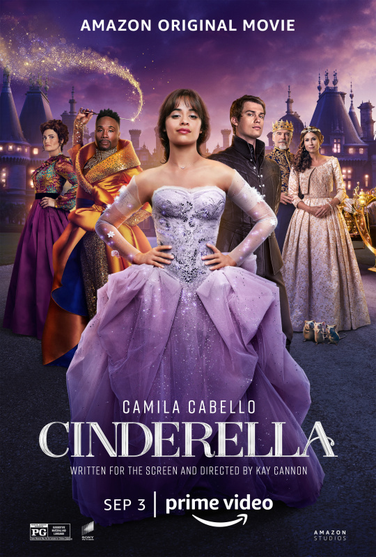
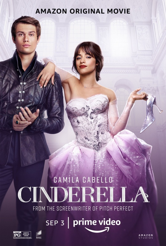
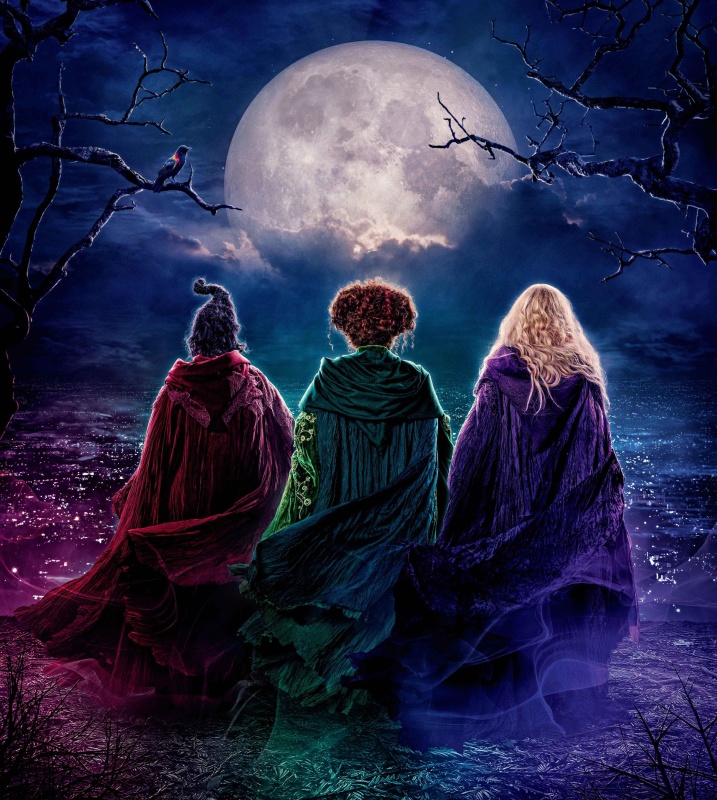
I couldn't see the Cinderella poster you can't find a textless version of.
I like the Cinderella II picture on the right better as well, because the drawing of Cinderella in the center is better drawn and the colors of everything are better.
Disney Duster wrote:I couldn't see the Cinderella poster you can't find a textless version of.
I like the Cinderella II picture on the right better as well, because the drawing of Cinderella in the center is better drawn and the colors of everything are better.
That first Pinocchio image is badly drawn!
Hey Duster, I meant the poster you requested. That one doesn't have a textless version yet.
I'm glad you share my opinion about the Cinderella II art.
Hey.... Teppy.... were you summoning ME... with your telepathic powers?
Bad news tho: I'm not a "her"... which makes the "marcey" nickname extra funny :-p
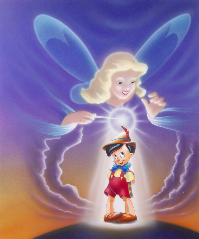
The Cinderella2 Posters/covers.... neither drawing of her is right. Here is the weird part: both are (fairly) good drawings, but her face is off-model in both. The top one has better rendering, and the hair looks right (shape wise)... face is way off, and I think there is an issue with the shape/size of her head.
The bottom one... clearly taken from Merchandising... lines are too thick. Her hair and shape of her head make NO SENSE at all (look at her bangs... they don't even look like bangs... "fringe" for the brits). And yet, her face is a little bit more on-model than the top one. Her eyes are off (strange: her right eye is wider than her left... and it should be the other way around, considering perspective)... mouth could be drawn better.
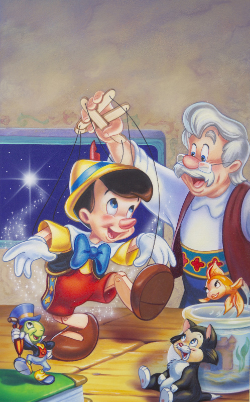
The Pinocchio ones... I assume you meant the preliminary ones.
Poster 1: nice layout, but the characters are terribly drawn. Pinocchio has some mighty WIDE hips, doesn't he? The whole thing is a mess.
Poster 2: not bad, but needs some polish. Nice concept and composition... overall poses are good. The bow looks very odd... the hands are off... the bottom of his shoes have a texture that doesn't match anything else. The thing that bother's me the most is his eyes... the shading makes it seem like they are sunken into his skull. And what's with the BROWN hair???
Poster 3: this one is actually very good. Most of the anatomy and poses are good. Nice layout. The bad: Pino's eyes should be rounder... there is a line missing from his right hand (which would fully define the thumb)... Gepetto's eyes are uneven, same for Figaro. Biggest issue though: color/shading. It is WAY too bright and flat... specially for a night-time scene, which should be candle lit, with warmer tones. THis one looks like bright studio lights...
Whoops!!! I was sure you were a "her", Marcey. I'm sorry, I hope I didn't offend you. Thank you for your opinions on the posters, it's always fun to read your comments.
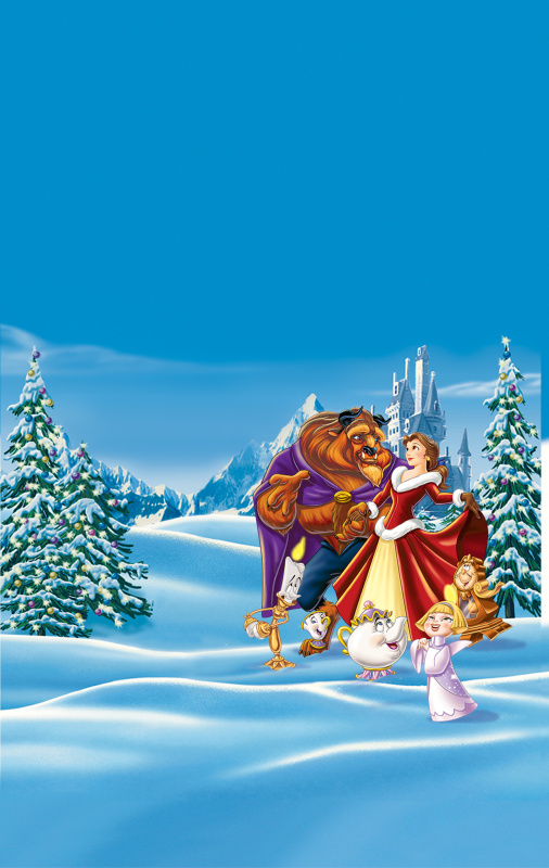
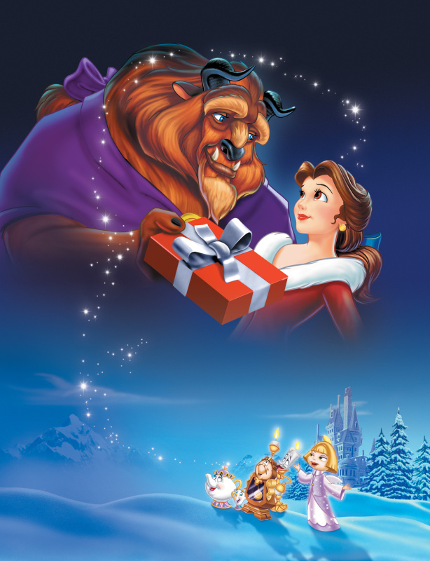
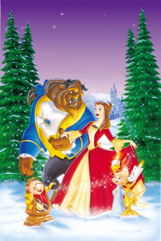
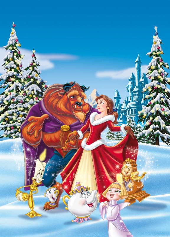
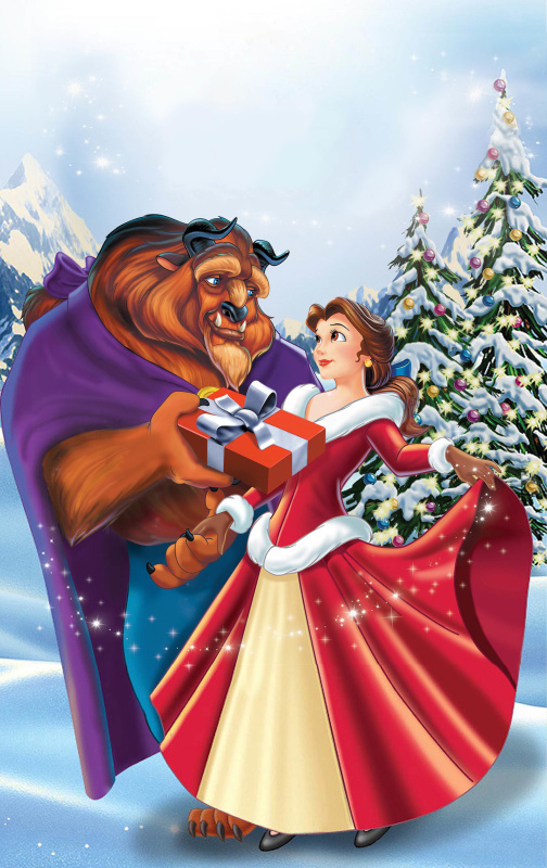
Here are some Beauty and the Beast: The Enchanted Christmas posters, since Christmas season is almost here
I never noticed how Belle and the Beast were copied over from the Platinum Edition cover. They modified Belle's hairdo, but they kept her golden earring, and for the Beast, they kept his ponytail, but drew him in his casual outfit. Her dress is very weirdly drawn.
I never noticed how Belle and the Beast were copied over from the Platinum Edition cover. They modified Belle's hairdo, but they kept her golden earring, and for the Beast, they kept his ponytail, but drew him in his casual outfit. Her dress is very weirdly drawn.
Thank you, once again, Vlad And you're right about Belle's dress. It is weirdly drawn. Also, it looks like she has VERY short legs, compared to the rest of her body.