My Coustom DVD Artworks
-
Disney Guru

- Platinum Edition
- Posts: 3294
- Joined: Thu Nov 20, 2003 5:31 pm
- Location: Utah
Hmm
Well thanks Maerj! But I agree with them I should do a little bit of remodeling on them.
"I have this tremendous energy. I just loved and love life. I love it today. I never want to die."
~Jayne Meadows Allen~
~Jayne Meadows Allen~
-
Maerj
- Collector's Edition
- Posts: 2748
- Joined: Sun Apr 20, 2003 11:31 pm
- Location: Ephrata, PA
- Contact:
Well, on the one hand there is only so much you can do really. A lot of these films, to make a cover for them, you sort of have to use the old posters, etc. But maybe you can do that and add some zippy fonts or borders or something? Try using some of the software that was suggested then come back and post your next cover when it is really spectacular. YOU CAN DO IT!
-
DisneyChris

- Special Edition
- Posts: 646
- Joined: Fri Feb 27, 2004 11:24 pm
- Location: Hong Kong

I think *some* people are being a little hard on DG here!
It's interesting to see DG's journey from his earliest covers to his newer ones. They definitely show growth. Also, DG's covers are very "modern" in the "modern art" sense. Have you ever thought that he makes his artistic decisions for a reason? A true definition of art is "concepts that make you think" and DG's cover art challenges us to think, as did the artwork of Pollock, Picasso and Enim.
It's obvious to me that his extensive use of Original Poster Art and Lobby Cards is a deliberate attempt at a faux-retro look and design. Just like Warner no use original poster artworks on their vintage releases for similar effect, so does DG. It's his way or rejecting the current fixation of "floating heads" and wishy-washy montages common on so many contemporary DVD covers. (Which I personally hate and I'm sure so does DG himself).
Hey, if Warner can do it for their films, why can't DG?
Other common design aspects of DG's covers are rectangular or "boxed" designs. Now some my take this to be lazy positioning, but have you ever wondered if perhaps DG is making a statement with these designs. It's almost as if, by using the "boxey" layouts, DG is challenging our own "boxed-in" concept of cover art designs. He's simultaneously acknowledging the limitation of the rectangular area he has to work with, while at the same time artistically playing with our preconceived perceptions and laughing – hopefully laughing with us, not at us - at the absurdity of his simplistic design.
And don't forget sometimes simplistic designs are the best. Look at Picasso's later works.
The final common element of DG's cover art is the seemingly random placement of the "DVD Video" logo. Again, this could be interpreted as laziness, but I think the more likely reason is DG doesn't consider the medium of the film's storage important. DG is more concerned with the actual film itself. Therefore, the ersatz slap-happy logo placement is DG's statement. It's almost as if DG is showing artistically a conversational "Oh, by the way guys, this film is available on DVD". Again, the placement seems wrong as DG is bold enough to go against the self-created industry standard of the DVD logo being placed unobtrusively in a corner. Out of all the custom DVD artwork presented on this site and others, only DG has the tenacity to break this meaningless convention.
I think comments about DG's tools and the low-res nature of his source material are fair criticisms and there is no doubt DG's artwork would dramatically improve should these be enhanced. After all, a high-res reproduction of Tammy Tell Me True with perhaps better fonts would look no worse than many DVD and VHS covers currently in existence. But maybe DG simply cannot get hi-res images for the, shall we say, "underappreciated" films he chooses to pick as his subjects. It just may not be possible to source hi-res images if he doesn't have the materials or equipment to hand.
Yes I'm sure DG can do better both physically and artistically (but I hope he sticks to a lot of his existing design elements now that I have defended them). But everybody has to start somewhere and learn by doing.
I hope DG continues to post his artwork on this thread, although I will inwardly wince at every low-res design posted, as it is a great disservice to himself and also to his viewers.
Most of my Blu-ray collection some of my UK discs aren't on their database
-
Disney Guru
- Platinum Edition
- Posts: 3294
- Joined: Thu Nov 20, 2003 5:31 pm
- Location: Utah
Thanks
Thanks 2099net for backing me up.2099net wrote:I think *some* people are being a little hard on DG here!
It's interesting to see DG's journey from his earliest covers to his newer ones. They definitely show growth. Also, DG's covers are very "modern" in the "modern art" sense. Have you ever thought that he makes his artistic decisions for a reason? A true definition of art is "concepts that make you think" and DG's cover art challenges us to think, as did the artwork of Pollock, Picasso and Enim.
It's obvious to me that his extensive use of Original Poster Art and Lobby Cards is a deliberate attempt at a faux-retro look and design. Just like Warner no use original poster artworks on their vintage releases for similar effect, so does DG. It's his way or rejecting the current fixation of "floating heads" and wishy-washy montages common on so many contemporary DVD covers. (Which I personally hate and I'm sure so does DG himself).
Hey, if Warner can do it for their films, why can't DG?
Other common design aspects of DG's covers are rectangular or "boxed" designs. Now some my take this to be lazy positioning, but have you ever wondered if perhaps DG is making a statement with these designs. It's almost as if, by using the "boxey" layouts, DG is challenging our own "boxed-in" concept of cover art designs. He's simultaneously acknowledging the limitation of the rectangular area he has to work with, while at the same time artistically playing with our preconceived perceptions and laughing – hopefully laughing with us, not at us - at the absurdity of his simplistic design.
And don't forget sometimes simplistic designs are the best. Look at Picasso's later works.
The final common element of DG's cover art is the seemingly random placement of the "DVD Video" logo. Again, this could be interpreted as laziness, but I think the more likely reason is DG doesn't consider the medium of the film's storage important. DG is more concerned with the actual film itself. Therefore, the ersatz slap-happy logo placement is DG's statement. It's almost as if DG is showing artistically a conversational "Oh, by the way guys, this film is available on DVD". Again, the placement seems wrong as DG is bold enough to go against the self-created industry standard of the DVD logo being placed unobtrusively in a corner. Out of all the custom DVD artwork presented on this site and others, only DG has the tenacity to break this meaningless convention.
I think comments about DG's tools and the low-res nature of his source material are fair criticisms and there is no doubt DG's artwork would dramatically improve should these be enhanced. After all, a high-res reproduction of Tammy Tell Me True with perhaps better fonts would look no worse than many DVD and VHS covers currently in existence. But maybe DG simply cannot get hi-res images for the, shall we say, "underappreciated" films he chooses to pick as his subjects. It just may not be possible to source hi-res images if he doesn't have the materials or equipment to hand.
Yes I'm sure DG can do better both physically and artistically (but I hope he sticks to a lot of his existing design elements now that I have defended them). But everybody has to start somewhere and learn by doing.
I hope DG continues to post his artwork on this thread, although I will inwardly wince at every low-res design posted, as it is a great disservice to himself and also to his viewers.
But I dn't have a lot of the equipment at hand to do a lot of this stuff, all I have to use on my projects is Microsoft Paint, and that can be kinda hard to make "perfect" artworks with.
"I have this tremendous energy. I just loved and love life. I love it today. I never want to die."
~Jayne Meadows Allen~
~Jayne Meadows Allen~

As the saying goes, Guru, "Reach for the moon. Even if you miss, you'll land among the stars."
I think it applies here.
I think it applies here.
"Fifteen years from now, when people are talking about 3-D, they will talk about the business before 'Monsters vs. Aliens' and the business after 'Monsters vs. Aliens.' It's the line in the sand." - Greg Foster, IMAX chairman and president
-
Disney Guru
- Platinum Edition
- Posts: 3294
- Joined: Thu Nov 20, 2003 5:31 pm
- Location: Utah
Here is a nother one of my Coustom Artworks
Here is a new one
"I have this tremendous energy. I just loved and love life. I love it today. I never want to die."
~Jayne Meadows Allen~
~Jayne Meadows Allen~
-
Maerj
- Collector's Edition
- Posts: 2748
- Joined: Sun Apr 20, 2003 11:31 pm
- Location: Ephrata, PA
- Contact:
In the Winter of 1921, my grandparents, Salie (Sale-ee) and Bill Utz began cooking handmade potato chips in the summer kitchen of our home in Hanover, Pennsylvania. After cooking and packaging the chips by hand, Bill took them to local stores, fairs and farmer's markets in the area.DisneyChris wrote:Oh, that is so touching.Isn't it, Escapay?
Let me take an excerpt from the song "Where Have All The Flowers Gone":
Oh when will they ever learn?
Oh when will they... ever learn?
Besides that, I have nothing else to say. This is nuts. Just nuts.
As their business grew, a new and larger hand cooker was installed. By the 1930's, the first automatic cookers went into operation in a building behind our house. Salie and Bill Utz saw the company grow steadily until their passing in the 1960's.
Today, family members still run the business and insist upon producing only the finest quality products from the best available ingredients.
It is in this tradition, that we bring you GRANDMA UTS'S, made with the same care and pride that Salie and Bill had back in 1921.
These chips are made from slightly thicker and unrinsed slices that are hand stirred in individual batches. The finished chips are drained, lightly salted while still warm, cooled and then sealed in protective laminated packaging materials, unlike the plain paper bags that Salie and Bill first used.
We hope you enjoy them as much as we enjoy bringing them to you.
Mike Rice
Chairman
-
Disney Guru
- Platinum Edition
- Posts: 3294
- Joined: Thu Nov 20, 2003 5:31 pm
- Location: Utah
WHAT IS WRONG ???
Hey look what Warner Brothers Does With Its DVDs
DVD Cover For Coutship Of Eddies Father

Origional Movie Poster

I like using that method, it brings a nostalgic factor. And if Warner brothers can do it why can't I ?
DVD Cover For Coutship Of Eddies Father
Origional Movie Poster
I like using that method, it brings a nostalgic factor. And if Warner brothers can do it why can't I ?
"I have this tremendous energy. I just loved and love life. I love it today. I never want to die."
~Jayne Meadows Allen~
~Jayne Meadows Allen~
I agree, Guru! The artwork on the movie posters is often pretty good and it's neat to see it used again on the DVD cover. Sometimes, new artwork is good, but you're right about the nostalgic factor. 
"Fifteen years from now, when people are talking about 3-D, they will talk about the business before 'Monsters vs. Aliens' and the business after 'Monsters vs. Aliens.' It's the line in the sand." - Greg Foster, IMAX chairman and president
-
deathie mouse

- Ultraviolet Edition
- Posts: 1391
- Joined: Thu Jun 10, 2004 1:12 am
- Location: Alea jacta est
Hello there Guru. Well, when I said clean nice design I meant it. I wasn't thinking about original posters, pics, covers and copy pastings, technical issues, etc, since if that DG cover was derived from those materials or not i hadn't seen them in any case. All i thought it was a kind of nice cover that told me a little of the movie inside and made me think maybe i'd like to see this movie. Which many real DVD covers seem to fail to do! In my opinion many official DVD covers are ussually cluttered till no end and not atractive at all, even tho they are profesionally composed, airbrushed recolored and typesetted. If that's the way Disney Guru sees his version, well, Disney Guru's covers might not reach the level of art that should be hanged on a museum yet, but hey they are his thing and his style. He can obviously improve if he wants to, as most human beings improve in anything if they dedicate time and effort. Not everybody is Alex Ross you know. And now here's where I come in 
Some of the critiscism have been about the resolution/image quality and yes in some cases the technical quality is a little low, and he has stated he has simple tools. I'm not familiar with your MS Picture program, but I wonder if it does not have a good resizing (up-rezing) interpolation tool? As i explained to STASHONE on a thread when he needed info on resizing stuff, there's usually a few choices when one resizes/composites stuff and maybe your program has these or their equivalents somewhere, and maybe the lowest quality algorithm (which is usually the fastest one) is the deafult? normally they are called 1- nearest neighbor (fastest but worst) 2- bilinear (average) 2 bicubic (slowest but best) interpolation. Using that last one (with a little sharpening afterwards) might get you higher resolution (or actually cleaner smoother jaggie-less edges) on your results. Specially if you change their sizes when working on them. Also I sometimes see kind of exagerated jpeg compression noise on some of your images, like if at some point they were compressed a little too much before, or when saving them, or something. (or maybe that's how the quality of the source material is?) Well anyway what I mean to say is, before doing editing/compositing/manipulation of images it's a good idea to make them bitmaps ( .bmp ) (even if the source is a .jpg) cus if you work changes on them (specially several subsequent ones) the jpeg compression could add up. So using things as bitmaps, at their original size or the largest you can, and then when you're satisfied with them and finished them, resized to their final size still as .bmp, saving that finalized image only once as .jpg, might get cleaner less noisier results. (Also selecting a high quality setting on the jpeg compression settings helps.) Programs like Photoshop have huge powerful tools but they also can have high learning curves for some of the good stuff, but there's no reason that with care and practice and some fine tuning of methods maybe your MS program can give you improved quality in your work
(If your program dont have something like bicubic interpolation etc maybe some other small (free) program might be available that has it?)
well hope this helps in your exploration of making great DVD covers
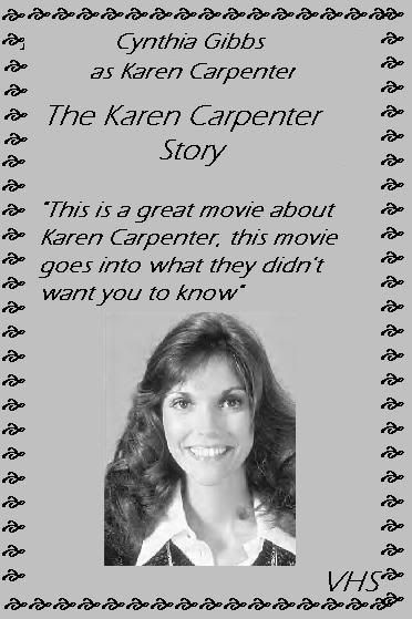
btw is the Karen Carpenter Story out of print or is from a TV broadcast?
Some of the critiscism have been about the resolution/image quality and yes in some cases the technical quality is a little low, and he has stated he has simple tools. I'm not familiar with your MS Picture program, but I wonder if it does not have a good resizing (up-rezing) interpolation tool? As i explained to STASHONE on a thread when he needed info on resizing stuff, there's usually a few choices when one resizes/composites stuff and maybe your program has these or their equivalents somewhere, and maybe the lowest quality algorithm (which is usually the fastest one) is the deafult? normally they are called 1- nearest neighbor (fastest but worst) 2- bilinear (average) 2 bicubic (slowest but best) interpolation. Using that last one (with a little sharpening afterwards) might get you higher resolution (or actually cleaner smoother jaggie-less edges) on your results. Specially if you change their sizes when working on them. Also I sometimes see kind of exagerated jpeg compression noise on some of your images, like if at some point they were compressed a little too much before, or when saving them, or something. (or maybe that's how the quality of the source material is?) Well anyway what I mean to say is, before doing editing/compositing/manipulation of images it's a good idea to make them bitmaps ( .bmp ) (even if the source is a .jpg) cus if you work changes on them (specially several subsequent ones) the jpeg compression could add up. So using things as bitmaps, at their original size or the largest you can, and then when you're satisfied with them and finished them, resized to their final size still as .bmp, saving that finalized image only once as .jpg, might get cleaner less noisier results. (Also selecting a high quality setting on the jpeg compression settings helps.) Programs like Photoshop have huge powerful tools but they also can have high learning curves for some of the good stuff, but there's no reason that with care and practice and some fine tuning of methods maybe your MS program can give you improved quality in your work
(If your program dont have something like bicubic interpolation etc maybe some other small (free) program might be available that has it?)
well hope this helps in your exploration of making great DVD covers
btw is the Karen Carpenter Story out of print or is from a TV broadcast?

-
Disney Guru
- Platinum Edition
- Posts: 3294
- Joined: Thu Nov 20, 2003 5:31 pm
- Location: Utah
Hmm
Oh and with the Karen Carpenter Story. It was a made for tv movie that has never been released on any format in the world. And almost impossible to find. I just did that artwork as an example.
"I have this tremendous energy. I just loved and love life. I love it today. I never want to die."
~Jayne Meadows Allen~
~Jayne Meadows Allen~
-
Disney Guru
- Platinum Edition
- Posts: 3294
- Joined: Thu Nov 20, 2003 5:31 pm
- Location: Utah
Hi
I have made a new dvd artwork, that I hope you will enjoy.
I'll let it explain for itself
I'll let it explain for itself
"I have this tremendous energy. I just loved and love life. I love it today. I never want to die."
~Jayne Meadows Allen~
~Jayne Meadows Allen~
-
Wonderlicious
- Diamond Edition
- Posts: 4661
- Joined: Wed Jun 23, 2004 9:47 am
- Location: UK
- Contact:
That is a nice enough cover art, especially considering it's of such an obscure film, but I have to share some things which you may find negative, yet I honestly want you to take as constructive criticism for future cover arts:
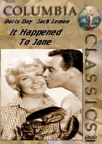
1. The main picture of Doris and Jack seems a little distorted. They seem a bit unnatural in shape, and I think that it would be a better idea to make sure that they dont look a bit odd by keeping them in similar dimensions to what they originally were.
2. The fonts clash. Classy fonts like the Columbia Classics logo and your average fonts that one would use in a normal document like for the film title seem too much a contrast. It would be better if the film title was a bit fancier.
3. I've noticed that there is another layer beneath the title which is pretty noticeable, and although that may just be rightly used to cover up a hole that occured in creation, it could be done in a better manner.
Sorry if I sound a bit harsh and I may sound repetitive (Escapay and Disney Chris have made a number of negative comments), but this is really my opinion and I honestly think these covers could benefit from a little bit of help to move them from okay to great.

But Escapay, you can't keep your "mouth shut" on a forum..we can't hear you!Escapay wrote:Lemmon, not Lemon.
Other than that...keeping my mouth shut.
Escapay
----------------
a little more photoshopping and you'll be fine with the artwork, Guru.
BTW, Wonder, input is always good.
I don't have any other input/remarks...
And I don't make artworks or anything fancy schmancy so I can't really say anything.
 R[APRIL.23]K: High School Sweethearts
-
Disney Guru
- Platinum Edition
- Posts: 3294
- Joined: Thu Nov 20, 2003 5:31 pm
- Location: Utah
Hi
I just noticed the spelling mistake on Jack Lemmon.
Also, I thought they were pretty good, seeing that the only program that I had to make it was Microsoft Paint.
Also, I thought they were pretty good, seeing that the only program that I had to make it was Microsoft Paint.
"I have this tremendous energy. I just loved and love life. I love it today. I never want to die."
~Jayne Meadows Allen~
~Jayne Meadows Allen~
-
Disney Guru
- Platinum Edition
- Posts: 3294
- Joined: Thu Nov 20, 2003 5:31 pm
- Location: Utah
Hi
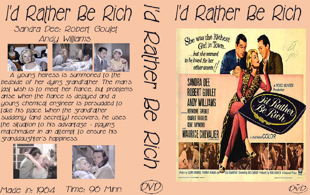
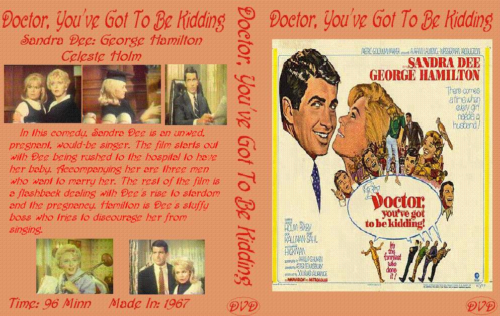
2 More Artworks:
http://i7.photobucket.com/albums/y251/D ... ichDVD.gif
http://i7.photobucket.com/albums/y251/D ... ingDVD.gif
http://i7.photobucket.com/albums/y251/D ... ichDVD.gif
http://i7.photobucket.com/albums/y251/D ... ingDVD.gif
"I have this tremendous energy. I just loved and love life. I love it today. I never want to die."
~Jayne Meadows Allen~
~Jayne Meadows Allen~
-
Disney Guru
- Platinum Edition
- Posts: 3294
- Joined: Thu Nov 20, 2003 5:31 pm
- Location: Utah
Hi
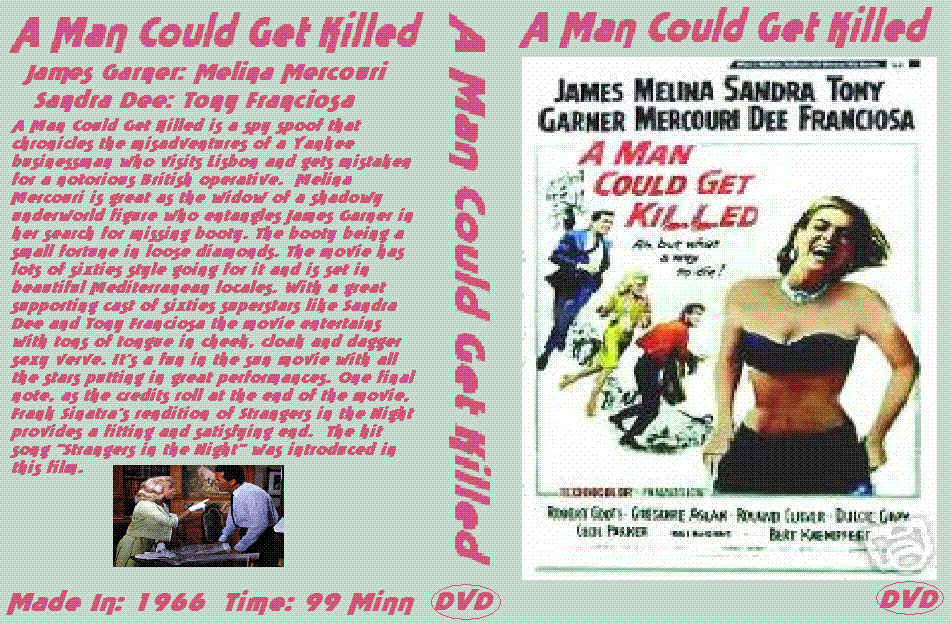
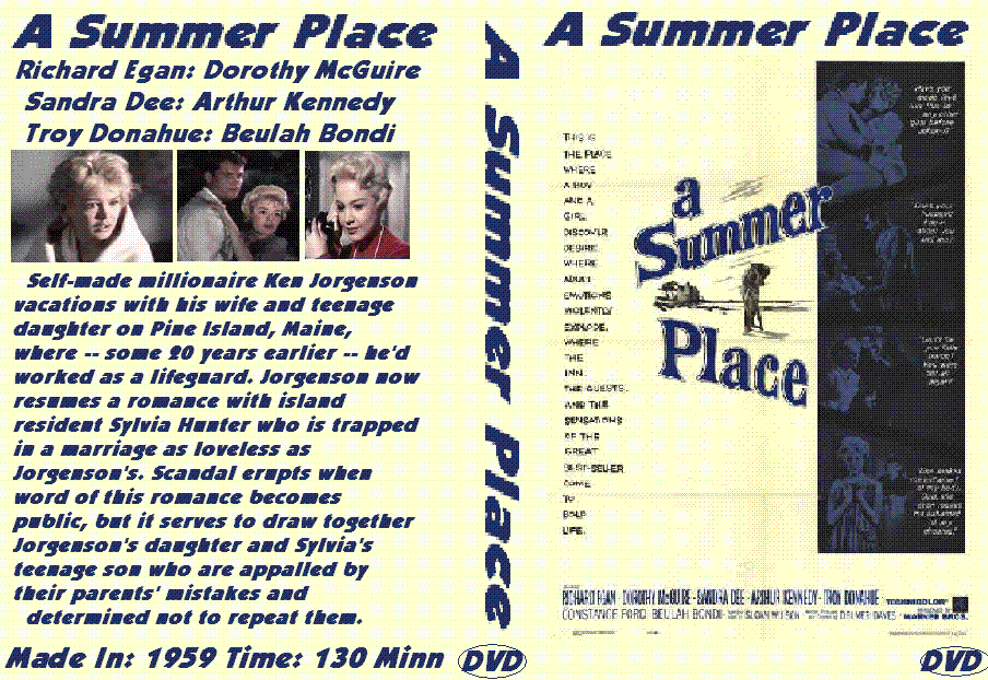
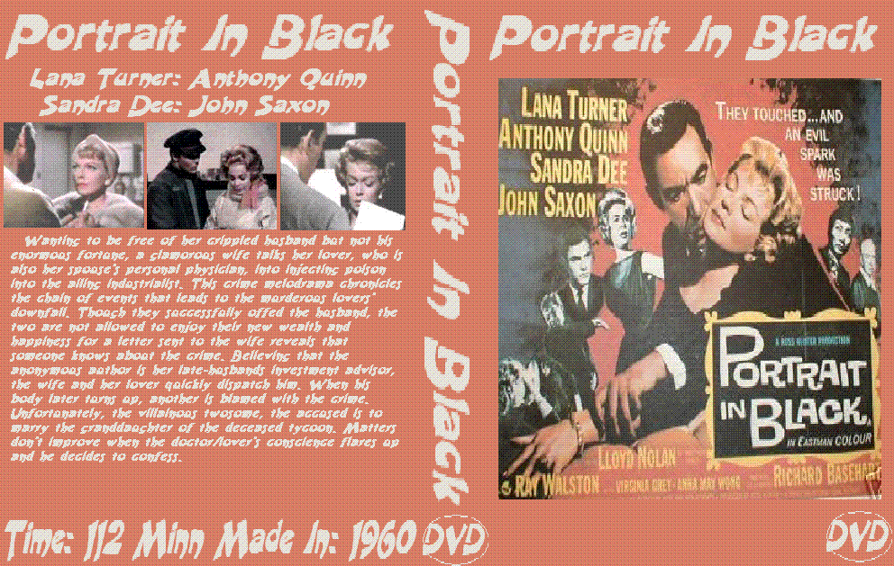
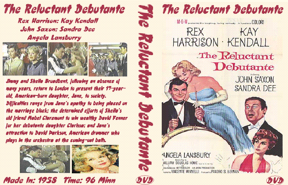
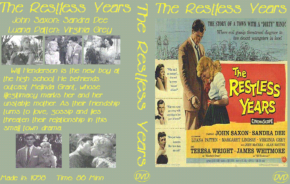
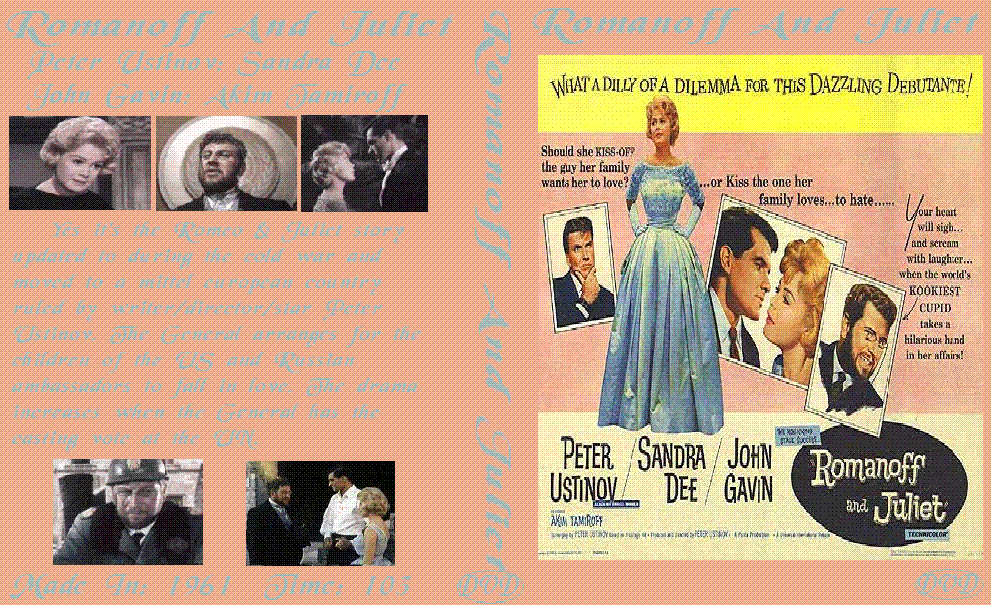
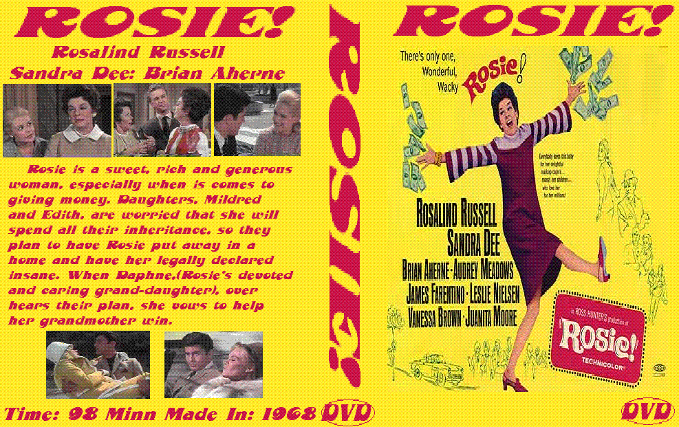
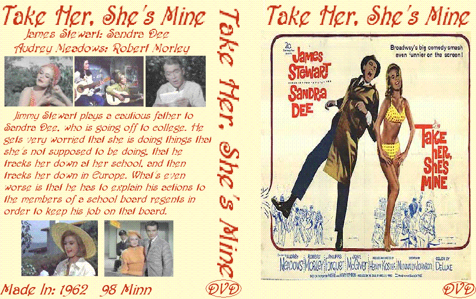
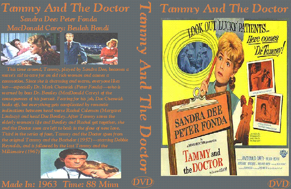
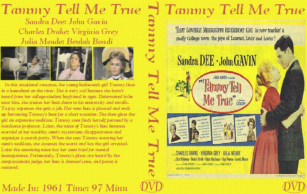
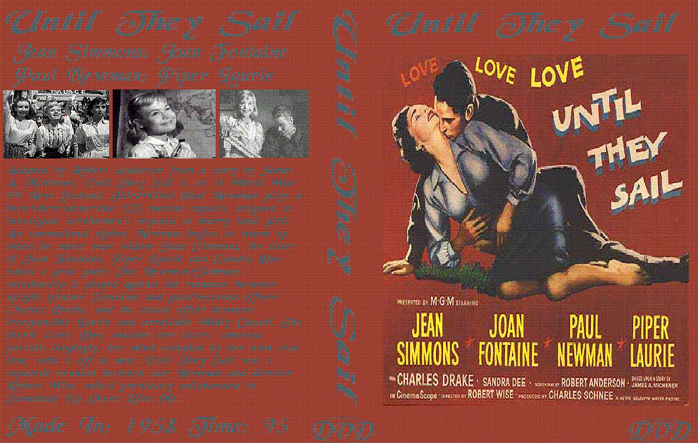
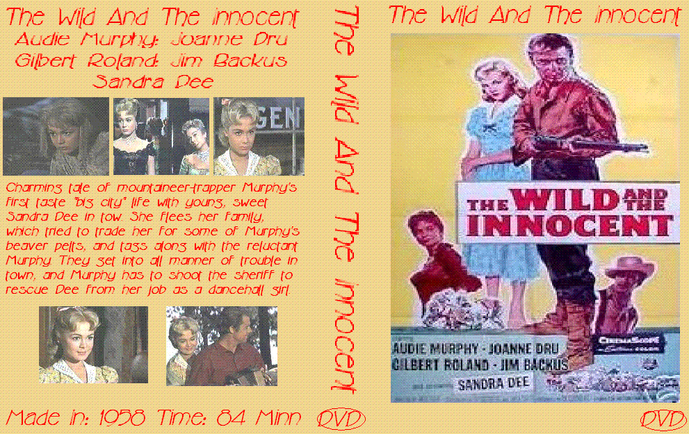
12 More Artworks:
http://i7.photobucket.com/albums/y251/D ... ledDVD.gif
http://i7.photobucket.com/albums/y251/D ... aceDVD.gif
http://i7.photobucket.com/albums/y251/D ... ackDVD.gif
http://i7.photobucket.com/albums/y251/D ... nteDVD.gif
http://i7.photobucket.com/albums/y251/D ... arsDVD.gif
http://i7.photobucket.com/albums/y251/D ... ietDVD.gif
http://i7.photobucket.com/albums/y251/D ... sieDVD.gif
http://i7.photobucket.com/albums/y251/D ... ineDVD.gif
http://i7.photobucket.com/albums/y251/D ... torDVD.gif
http://i7.photobucket.com/albums/y251/D ... rueDVD.gif
http://i7.photobucket.com/albums/y251/D ... ailDVD.gif
http://i7.photobucket.com/albums/y251/D ... entDVD.gif
"I have this tremendous energy. I just loved and love life. I love it today. I never want to die."
~Jayne Meadows Allen~
~Jayne Meadows Allen~
-
Escapay

- Ultimate Collector's Edition
- Posts: 12562
- Joined: Tue Jan 27, 2004 5:02 pm
- Location: Somewhere in Time and Space
- Contact:
Mm-mmm-mmhmph-mrmrwm-mm.
Sorry, my lips were sealed.
Good effort, Guru. They're all nice and uniform, with similar color schemes.
BTW, I just made a nice pitcher of lemonade. Anyone care for some?
Escapay
Sorry, my lips were sealed.
Good effort, Guru. They're all nice and uniform, with similar color schemes.
BTW, I just made a nice pitcher of lemonade. Anyone care for some?
Escapay
WIST #60:
AwallaceUNC: Would you prefer Substi-Blu-tiary Locomotion?
WIST #61:
TheSequelOfDisney: Damn, did Lin-Manuel Miranda go and murder all your families?
AwallaceUNC: Would you prefer Substi-Blu-tiary Locomotion?
WIST #61:
TheSequelOfDisney: Damn, did Lin-Manuel Miranda go and murder all your families?