I think we are aaaaall ready for the Lion King covers...
As far as Cinderella's dress: I've decided. The way to go is mid-light grey (maybe mild blue tint)... but most imortant: white linework.
It won't ever happen
Comparing Home Releases Cover Arts

Re: Comparing Home Releases Cover Arts
Marce82 wrote:D82: Classic VHS as yr number 1 in this case is definitely nostalgia
Marce82 wrote:Speaking of which.... D82.... given that you posted that style guide.... I'm pretty sure JeanGreyForever is hiring a hitman to kill you AS WE SPEAK.
It's true, Jafar could be farther away, but most likely, he's in the same plane as the lamp.Marce82 wrote:Good observation about Jafar and the lamp on the Signature 4K cover... but we don't see the bottom of jafar's gown, so his placement isn't 100% clear.... so I give them a pass on that. But good catch!
I hadn't noticed they had also changed the colors of the palace and the carpet. And, Marce82, I don't know if you have noticed that the image on the link is actually a slideshow. If you keep clicking on the arrow in the right, you can see close-ups of the parts modified from the original cover.DisneyBluLife wrote:They changed Aladdin's face and added some of his hair. Colors of Jasmine's clothes and shoes and her face. Jafar's face. And the colors of the palace and carpet.Marce82 wrote:A little unclear on something.... this fan edit: https://www.instagram.com/p/B0b2LKHopl4/
What did they change? the color of Jasmine's outfit? Or something else?
By the way, DisneyBluLife, I've just remembered something. Wasn't Aladdin one of the classics to have three cover options in France?
It's true, that could be why they chose to make her outfit green/greener in merchandise.Marce82 wrote:Im thinking the difference in color for Jasmine from film to merchandise might be so she doesn't blend with the genie. Jasmine and the genie barely share any shots int he film.... but when you stick her in front of the genie in the merchandise... her blue clothes kinda blend into the genie.
I agree that the colors are inconsistent in the movie. That's why it's difficult to know which colors are the real ones.JeanGreyForever wrote:While it does look greenish in some of those scenes you pointed out, it's all very blue in some of those same scenes. The colors are pretty inconsistent because in that fountain scene alone, the shade of blue drastically changes multiple times.
In these storyboards, for instance, her clothes are teal. Anyway, you bring up good points to support your stance, JeanGreyForever, but in my opinion, none of them completely proves that the color of her clothes was intended to be light blue and not a slightly greener variant. Nor do mine prove the opposite. It's a shame the color palettes for the characters aren't available to us, as you say. I agree with you that the teals, greens and the more intense shades of turquoise/aqua they use in merchandise and promotional material are not accurate, and also that the outfit looks light blue in several parts of the movie. If it was turquoise, it would be more blue than green anyway. It still would be a hue of the blue family, in my opinion.JeanGreyForever wrote:I personally haven't seen anything in her concept art gallery where she was given an aqua, turquoise, or teal outfit. She has outfits in red, pink, orange, purple but nothing green.
Re: Comparing Home Releases Cover Arts
By the way, here's some info I've found about how colors were used in the movie:
Source: https://www.smithsonianmag.com/arts-cul ... 180971536/Eric Goldberg, who was the supervising animator for the genie in the original 1992 animated Aladdin, had a simple answer for why the Disney genie looks the way he does. “I can tell you exactly,” he says, citing the film’s distinctive color script, as developed by then-Disney production designer Richard Vander Wende. “The reds and the darks are the bad peoples’ colors,” Goldberg says. “The blues and the turquoises and the aquas are the good peoples’ colors.” So, if Williams’ warm baritone didn’t instantly clue you in on the genie’s moral fiber, the clear-as-day blue coloring was there to telegraph him as one of the good guys (in turn, Aladdin’s foil, the evil Jafar, turns scarlet when he gets genie-fied).
Vander Wende adds more to the story over email. The color blue itself was an intentional choice, he says, grounded in the resilience of Aladdin and his allies. “Certain blues in Persian miniatures and tiled mosques stand out brilliantly in the context of the sun-bleached desert,” he writes, “their suggestion of water and sky connoting life, freedom, and hope in such a harsh environment.”
Source: https://archive.org/details/AladdinArtb ... 1/mode/2upVander Wende extended his own notion of color contrasts into a “general color contrasts" scheme in which evil was darker in value than good, more intense in saturation, and hotter in temperature; evil moving always toward red (Jafar) while good moves always toward blue-yellow.
He assigned general meanings to Aladdin's palette:
Blue would stand for good, idealistic, romantic, cerebral, creative—and for sky and water.
Red would stand for “evil, hellish, fire, destructive/consumptive.”
Green would be the natural color of “the good place," “the earthly paradise.”
Yellow is an ambiguous color in Aladdin. An intense yellow symbolizes a mild evil, the evil that money is the root of. It is the color of gold and the material wealth of both the treasure cave and the palace. A more neutral yellow, however, is “down-to-earth," and, therefore, good—the color of natural elements, of sand and city.
And so, he designed a great mandala, evenly divided between Evil and Good. Jo far and Jasmine are its opposite poles. The Genie has a foot in both hemispheres. The city, the Sultan and his Palace, and Abu are all in the good half, but nearest to the evil half. The Flying Carpet is in the Genie’s good quadrant, Aladdin is moving toward the polestar of Jasmine’s goodness.
Last edited by D82 on Wed Feb 26, 2020 11:23 pm, edited 1 time in total.
-
Disney's Divinity

- Ultimate Collector's Edition
- Posts: 16407
- Joined: Thu Mar 17, 2005 9:26 am
- Gender: Male
Re: Comparing Home Releases Cover Arts
When are the films coming into public domain? Is it a century after release? For some reason I assumed Disney might have found a workaround to prevent that kind of thing from happening to their films. And random DVD/Blu-ray releases won't be illegal or labeled bootlegs?rodrigo_ca wrote:Can I just go slightly off-topic while you are comparing restorations? Man, how I hate that everything coming from Disney Animation needs to be so nice and clean these days. Don't get me wrong, I'm too young to be pestering about the 'good old days' and the first time I saw Aladdin was a digital transfer already, but how I wish they used the original negatives and kept all the film grain intact. Looking at that 35mm trailer farerb posted - THAT'S how I always thought Aladdin should look. I hate how they scrub Snow White and Cinderella so hard to look like it came out yesterday from a computer. I hope these movies get a better treatment in public domain than Disney has ever cared for the past 30 years. Anyway... back to the topic!

Listening to most often lately:
Christina Aguilera ~ "Cruz"
Sombr ~ "homewrecker"
Megan Moroney ~ "Beautiful Things"
-
Disney Duster

- Ultimate Collector's Edition
- Posts: 14163
- Joined: Fri Jun 17, 2005 6:02 am
- Gender: Male
- Location: America
Re: Comparing Home Releases Cover Arts
Wow JeanGreyForever, thanks for the Little Mermaid color scheme image and the great, absolutely phenomenal writing of what all the colors mean in the film at the different times!
Marce82, I have always thought Cinderella's dress looked best in between silver and blue. A bluish silver if you will. But that's just my personal preference and that isn't really seen in the film anyway. I must admit, it probably was meant to be just plain silver originally. Then again, maybe they intended it to look blue originally and we just think it's silver. But that, I just don't think we should, or even can, get into here lol. We probably could never know anyway unless we had a seance with the ghosts of the people who made Cinderella. White lines on her skirt and the front of her bodice would help, because in the film there were sometimes, not all the time, but sometimes white lines on her skirt and the front of her bodice, but I don't need them for me to be satisfied.
Farerb, I always associated Beauty and the Beast with deep blue. Also, I just feel like mentioning Cinderella to me was always a purplish blue.
Thanks D82 for those quotes about the colors in Aladdin!


Re: Comparing Home Releases Cover Arts
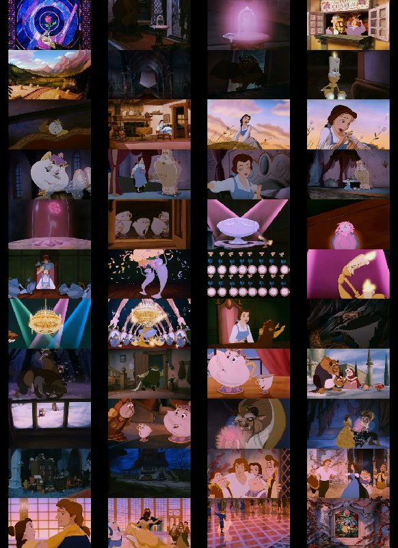
D82, what you provided reminded of the color symbolism in Beauty and the Beast. Red = bad. Blue = Good. Gaston wears red throughout the film while the Beast wear red in the beginning, then purple in Something There, then finally blue in the ballroom.
Re: Comparing Home Releases Cover Arts
Disney Duster, other than the balcony scene, Belle's dress, Beast's outfit and eyes and Gaston's eyes, I don't find a lot of blue in the film. If anything the filmmakers made it a point to not have a lot of blue in order to embolden the characters and the Beast's transition.
Re: Comparing Home Releases Cover Arts
Here is all of them:
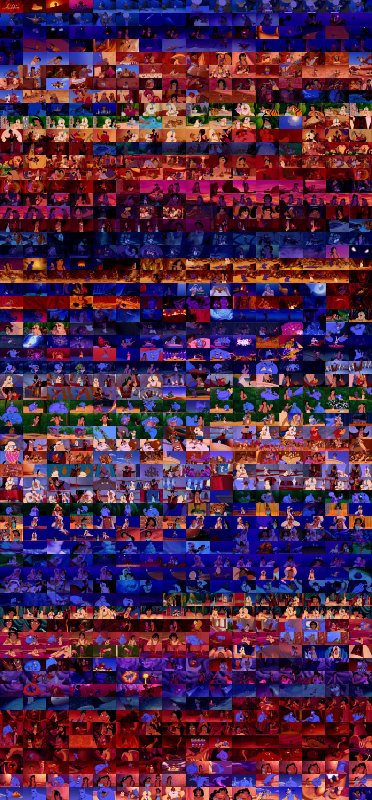
The Little Mermaid:
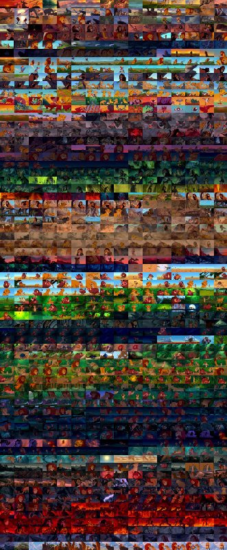
Beauty and the Beast:
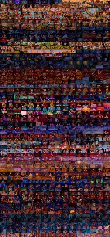
Aladdin:
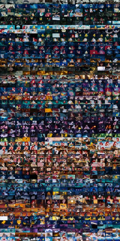
The Lion King:
The Little Mermaid:
Beauty and the Beast:
Aladdin:
The Lion King:
Re: Comparing Home Releases Cover Arts
Beauty and the Beast:
-
Disney Duster
- Ultimate Collector's Edition
- Posts: 14163
- Joined: Fri Jun 17, 2005 6:02 am
- Gender: Male
- Location: America
Re: Comparing Home Releases Cover Arts
I see some purple in Beauty and the Beast, but actually that is is very varied. Ok, I agree it's purple the most.
EDIT: You added that very purple picture later, but yes, looking at that, it's very purple. Purple's my favorite color so it's a wonder I didn't love Beauty and the Beast more than I did as a kid.
I just always think of the stairs with the big blue curtain and windows, the ballroom, the balconey scene and the Beast's outfit. I guess it's because that's what Disney constantly uses.
-
JeanGreyForever

- Signature Collection
- Posts: 5335
- Joined: Sun Sep 15, 2013 5:29 pm
Re: Comparing Home Releases Cover Arts
Yes, Aladdin had multiple covers as well. They've been posted in other threads before.D82 wrote: By the way, DisneyBluLife, I've just remembered something. Wasn't Aladdin one of the classics to have three cover options in France?
It's true, that could be why they chose to make her outfit green/greener in merchandise.Marce82 wrote:Im thinking the difference in color for Jasmine from film to merchandise might be so she doesn't blend with the genie. Jasmine and the genie barely share any shots int he film.... but when you stick her in front of the genie in the merchandise... her blue clothes kinda blend into the genie.
I agree that the colors are inconsistent in the movie. That's why it's difficult to know which colors are the real ones.JeanGreyForever wrote:While it does look greenish in some of those scenes you pointed out, it's all very blue in some of those same scenes. The colors are pretty inconsistent because in that fountain scene alone, the shade of blue drastically changes multiple times.
In these storyboards, for instance, her clothes are teal. Anyway, you bring up good points to support your stance, JeanGreyForever, but in my opinion, none of them completely proves that the color of her clothes was intended to be light blue and not a slightly greener variant. Nor do mine prove the opposite. It's a shame the color palettes for the characters aren't available to us, as you say. I agree with you that the teals, greens and the more intense shades of turquoise/aqua they use in merchandise and promotional material are not accurate, and also that the outfit looks light blue in several parts of the movie. If it was turquoise, it would be more blue than green anyway. It still would be a hue of the blue family, in my opinion.JeanGreyForever wrote:I personally haven't seen anything in her concept art gallery where she was given an aqua, turquoise, or teal outfit. She has outfits in red, pink, orange, purple but nothing green.
That reminds me of how people suggested that even with Cinderella, the change of her dress from silvery white to blue is because in those early covers, it was difficult for the white sparkles to show up on white. Whereas with a blue dress, those sparkles were more clearly visible.
Wow, those storyboards are gorgeous! I didn't know those ever existed so thank you for sharing! That's really neat that the magic carpet ride started off from the garden at one point rather than Jasmine's balcony. I'm glad for the change but I would have loved to have seen Aladdin and Jasmine have a scene in the gardens and fountain. You're right that Jasmine's color is ambiguous but I'm still going with light blue because in the VHS it's clearly light blue.
Then while promotional material had her in aqua, the main film products that came out in 1992 and beyond all had her in light blue like:
- the Mouseworks book
the official comic book adaptation
Aladdin's Six New Adventures book set (Disney used to release "sequel" books after the film's release. They did this for Aladdin, The Lion King, Pocahontas, and Hunchback)
the actual Aladdin sequels and TV series
Disney's House of Mouse
the Illustrated Classic Series book (Disney had a line of books which were these really gorgeous storybooks which really described the story in detail rather than just a page for a scene and they had movie-accurate illustrations. I own this and Jasmine is completely in light blue. The BATB one also uses movie-accurate colors which is a nice change from the usual)
the WDCC Disney Classics line of figurines which also uses movie accurate colors for their figurines and not merchandise colors and Jasmine is clearly in light blue as seen below.

https://sep.yimg.com/ca/I/yhst-42280649 ... 1032289908
Her outfit only comes across as aqua or greenish in the film when there is heavy yellow light like the sun pointing down on her and while she's in her room with those golden curtains and background. Even then, in my Blu-Ray/4K with the HDR, her outfit still looks mainly blue with the slightest bit of teal.


We’re a dyad in the Force. Two that are one.
"I offered you my hand once. You wanted to take it." - Kylo Ren
"I did want to take your hand. Ben's hand." - Rey
-
JeanGreyForever
- Signature Collection
- Posts: 5335
- Joined: Sun Sep 15, 2013 5:29 pm
Re: Comparing Home Releases Cover Arts
The Lion King covers should come out tonight but we're all having civil discussions here so you shouldn't try and erase that. If you feel uncomfortable with the manner of conversation then perhaps you could refrain from posting until the topic changes rather than force others to follow suit who are all enjoying themselves.Marce82 wrote:I think we are aaaaall ready for the Lion King covers...
As far as Cinderella's dress: I've decided. The way to go is mid-light grey (maybe mild blue tint)... but most imortant: white linework.
It won't ever happen
Well I think the clipart I've posted is proof that you can get a silvery white dress to work, and the burnt orange hair to match.
We’re a dyad in the Force. Two that are one.
"I offered you my hand once. You wanted to take it." - Kylo Ren
"I did want to take your hand. Ben's hand." - Rey
-
JeanGreyForever
- Signature Collection
- Posts: 5335
- Joined: Sun Sep 15, 2013 5:29 pm
Re: Comparing Home Releases Cover Arts
Also Belle being the only one wearing a cool color like blue in the village while everyone else has warm colors. Then Belle's dress going from blue to green (representing change and growth) to pink/red (the color of romance and love) to yellow/golden (representing joy from the yellow and royalty from the gold). It's no coincidence that the film ends with her in the yellow/golden dress again since that showcases her happy ending.farerb wrote:D82, what you provided reminded of the color symbolism in Beauty and the Beast. Red = bad. Blue = Good. Gaston wears red throughout the film while the Beast wear red in the beginning, then purple in Something There, then finally blue in the ballroom.
Thanks for posting the color schemes of the Big Four films. Clearly TLM's dominant color is blue while all the land seas are golden and warm.
I never realized BATB's main color is purple. That explains why so much official material for the film (and not Belle in the DP franchise) always uses purple.
We’re a dyad in the Force. Two that are one.
"I offered you my hand once. You wanted to take it." - Kylo Ren
"I did want to take your hand. Ben's hand." - Rey
Re: Comparing Home Releases Cover Arts
JeanGreyForever...
My comment was made in jest, I am not trying to stop anyone, nor am I uncomfortable. I also didn't address fareb requesting he put up the Lion King covers early.
But yes, I think the conversation has derailed from the "covers" topic, and had been going around in circles for a couple of days now. That said, carry on. I'm not stopping you.
-
Disney's Divinity
- Ultimate Collector's Edition
- Posts: 16407
- Joined: Thu Mar 17, 2005 9:26 am
- Gender: Male
Re: Comparing Home Releases Cover Arts
Oh, yes, I forgot "Kiss the Girl" is also majorly blue. Otherwise, I actually think Aladdin has more undiluted blue than TLM. Most of the sea scenes combine another color with the blue; I see lots of blue-green in there, in particular.farerb wrote:Here is all of them:
The Little Mermaid:
https://i.postimg.cc/90PhnMJG/the-littl ... l-copy.jpg
Beauty and the Beast:
https://i.postimg.cc/mrqBcKPF/beauty-an ... l-copy.jpg
Aladdin:
https://i.postimg.cc/15PPNG3M/aladdin-c ... l-copy.jpg
The Lion King:
https://i.postimg.cc/598b07b6/the-lion- ... -final.jpg
Anyway, I forgot how much green there is in The Lion King. Maybe it's because the main character is gold and red that I usually think of orange as being the dominant color for the movie, too. I don't really see a lot of purple with B&tB, but it's probably the color I would associate most with the film likewise. I guess because Mrs. Potts and the dishware have purple in their pattern and Beast has the purple cloak. Oh, and the stained glass, of course.
Listening to most often lately:
Christina Aguilera ~ "Cruz"
Sombr ~ "homewrecker"
Megan Moroney ~ "Beautiful Things"
-
JeanGreyForever
- Signature Collection
- Posts: 5335
- Joined: Sun Sep 15, 2013 5:29 pm
Re: Comparing Home Releases Cover Arts
It's hard to detect sarcasm online but you alluded to wanting to be done with the conversation a few times so I took it literally. I didn't say you told farerb to put the covers early. You said you were ready for them and I said that they should be out tonight going by the usual schedule. Ergo, you won't have to wait long for the conversation topic to change.Marce82 wrote:JeanGreyForever...
My comment was made in jest, I am not trying to stop anyone, nor am I uncomfortable. I also didn't address fareb requesting he put up the Lion King covers early.
But yes, I think the conversation has derailed from the "covers" topic, and had been going around in circles for a couple of days now. That said, carry on. I'm not stopping you.
Colors are part of the topic and I'm sure if farerb had an issue with it, he would have mentioned it and put a stop to it by now rather than engage in part of the conversation.
Anyway before The Lion King covers are posted, I was trying to find the French Aladdin covers which you could vote for but I wasn't able to find a link to them. Hopefully somebody has access to them.
We’re a dyad in the Force. Two that are one.
"I offered you my hand once. You wanted to take it." - Kylo Ren
"I did want to take your hand. Ben's hand." - Rey
Re: Comparing Home Releases Cover Arts
I hasn't been easy, but I've finally found them:JeanGreyForever wrote:Anyway before The Lion King covers are posted, I was trying to find the French Aladdin covers which you could vote for but I wasn't able to find a link to them. Hopefully somebody has access to them.


If I've understood correctly, it seems at first Disney France gave fans the option to choose between the three covers above, but given that each of them got more or less the same amount of votes they decided to start the voting process again adding a fourth cover (below), which is the one that eventually won.

Here's the info Disney France posted about the voting. If someone knows French, maybe they can confirm if it's as I've said.

Source: http://www.animations.com.br/viewtopic. ... &start=105
Re: Comparing Home Releases Cover Arts
Seriously?! People voted for the cliparts of Jasmine looking annoyed at Aladdin and not the beautiful silhouette?!D82 wrote:I hasn't been easy, but I've finally found them:JeanGreyForever wrote:Anyway before The Lion King covers are posted, I was trying to find the French Aladdin covers which you could vote for but I wasn't able to find a link to them. Hopefully somebody has access to them.
If I've understood correctly, it seems at first Disney France gave fans the option to choose between the three covers above, but given that each of them got more or less the same amount of votes they decided to start the voting process again adding a fourth cover (below), which is the one that eventually won.
Here's the info Disney France posted about the voting. If someone knows French, maybe they can confirm if it's as I've said.
Source: http://www.animations.com.br/viewtopic. ... &start=105
What was chosen eventually is fine, but I really like the silhouette.
Re: Comparing Home Releases Cover Arts
Oh nevermind, I now noticed that's the awful Platinum Edition clipart. So I guess what was chosen is actually the best.
Re: Comparing Home Releases Cover Arts
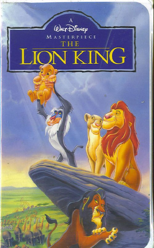
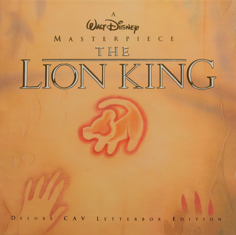
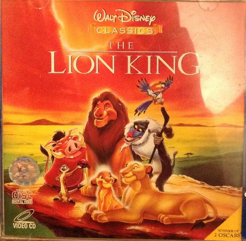
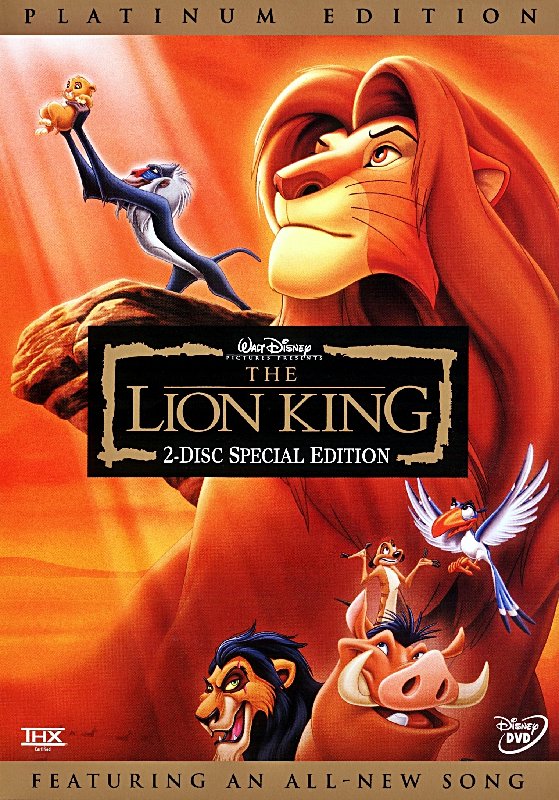
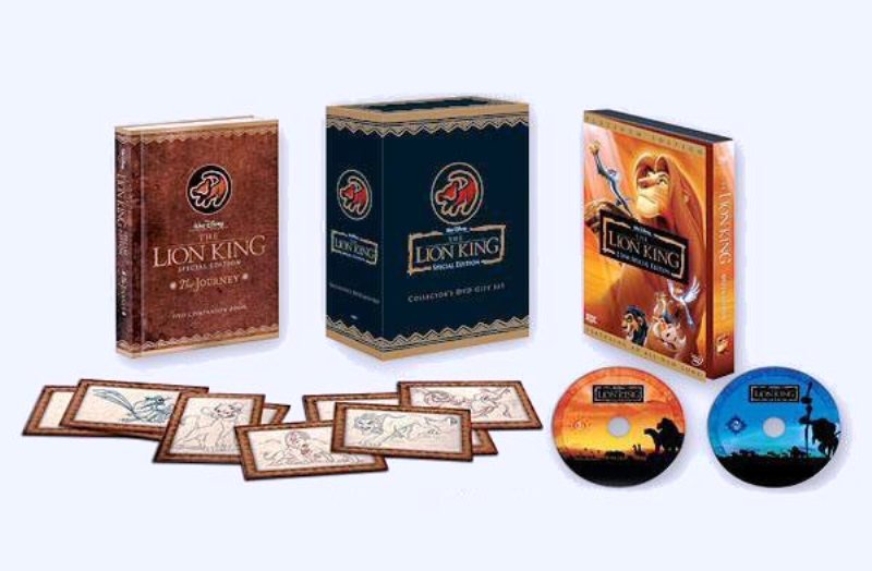
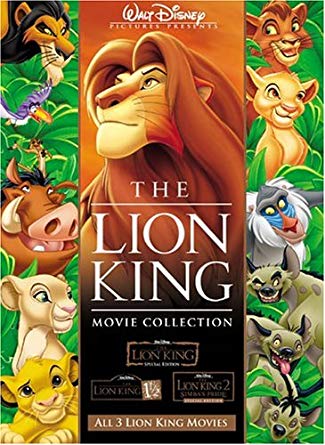
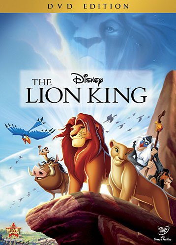
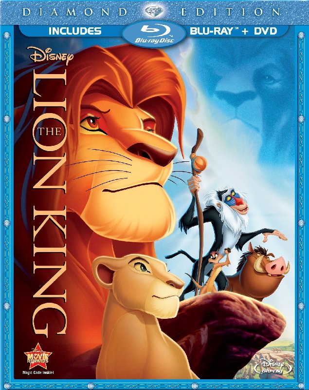
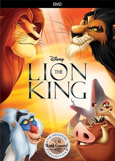
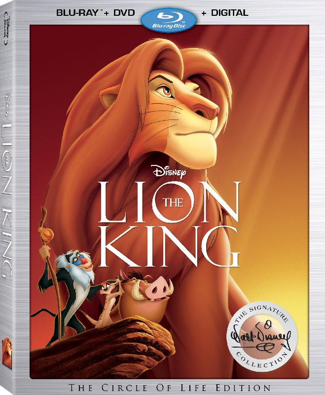
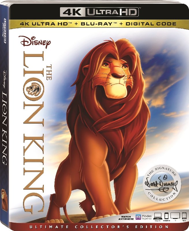
The Lion King:
Masterpiece VHS:
Deluxe Laserdisc:
VCD (whatever that is):
Platinum Edition DVD:
Platinum Edition Box Set:
Platinum Edition 3 movie collection:
Diamond Edition DVD:
Diamond Edition Blu-ray:
Signature Collection DVD:
Signature Collection Blu-ray:
Signature Collection 4K UHD:
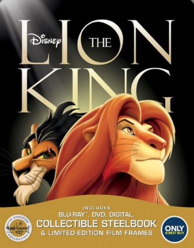
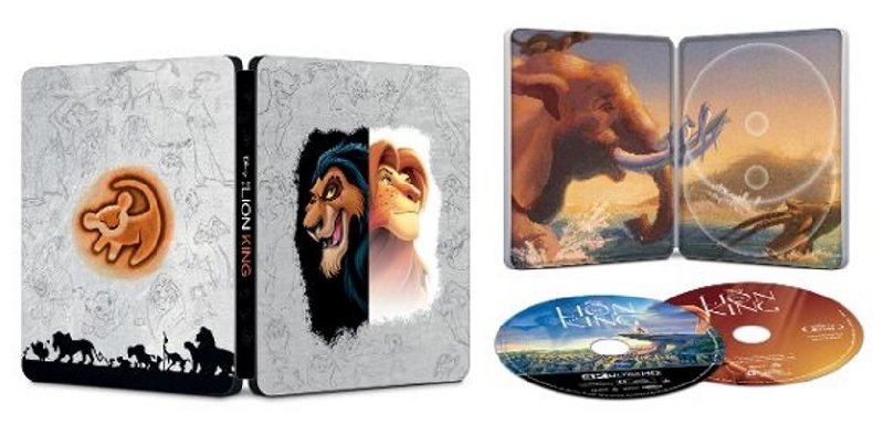
Best Buy Steelbook (Standard Blu-ray):
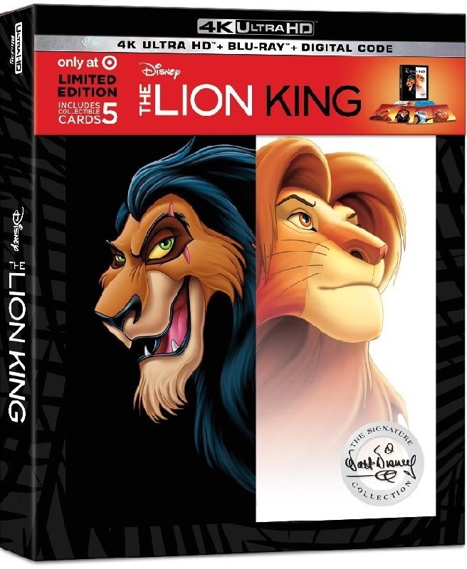
Best Buy Steelbook 4K:
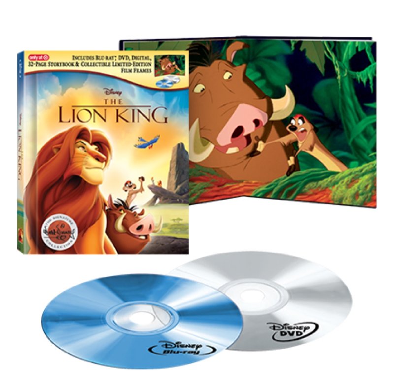
Target Digibook:
Target whatever exclusive:
Masterpiece VHS:
Deluxe Laserdisc:
VCD (whatever that is):
Platinum Edition DVD:
Platinum Edition Box Set:
Platinum Edition 3 movie collection:
Diamond Edition DVD:
Diamond Edition Blu-ray:
Signature Collection DVD:
Signature Collection Blu-ray:
Signature Collection 4K UHD:
Best Buy Steelbook (Standard Blu-ray):
Best Buy Steelbook 4K:
Target Digibook:
Target whatever exclusive: