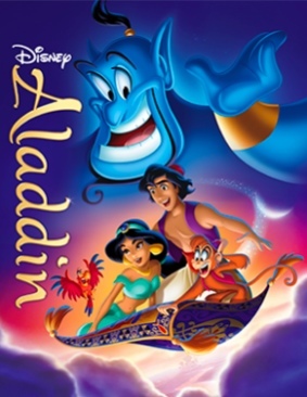
Comparing Home Releases Cover Arts

-
JeanGreyForever

- Signature Collection
- Posts: 5335
- Joined: Sun Sep 15, 2013 5:29 pm
Re: Comparing Home Releases Cover Arts
Doesn't that feature the theme of To Be Free? It certainly sounds like it to me, particularly the song from the Hyperion show.


We’re a dyad in the Force. Two that are one.
"I offered you my hand once. You wanted to take it." - Kylo Ren
"I did want to take your hand. Ben's hand." - Rey
Re: Comparing Home Releases Cover Arts
It's a variation of this:
https://youtu.be/_PU040h9PTA
Then goes to "A Whole New World" and then goes back.
https://youtu.be/_PU040h9PTA
Then goes to "A Whole New World" and then goes back.
Re: Comparing Home Releases Cover Arts
I don't know why Menken decided to attribute the theme to Jasmine on that show, but it was originally meant to become a song sung by Genie and was dropped because the Genie already had A Friend Like Me and Prince Ali.
Re: Comparing Home Releases Cover Arts
The song in the show uses Jasmine's theme as the first part and Genie's them as the second part.
-
JeanGreyForever
- Signature Collection
- Posts: 5335
- Joined: Sun Sep 15, 2013 5:29 pm
Re: Comparing Home Releases Cover Arts
Thanks for explaining. And wow, do you have a link with more information about it being a song for Genie that was cut? I've never heard of that before. Was it back when Ashman was still alive?
We’re a dyad in the Force. Two that are one.
"I offered you my hand once. You wanted to take it." - Kylo Ren
"I did want to take your hand. Ben's hand." - Rey
Re: Comparing Home Releases Cover Arts
Actually I read it in a wiki and I see that they didn't provide any sources so it might not be true.
-
JeanGreyForever
- Signature Collection
- Posts: 5335
- Joined: Sun Sep 15, 2013 5:29 pm
Re: Comparing Home Releases Cover Arts
Oh I see. I think that might be incorrect then because in all the Aladdin sources, this is the first I've heard about that.
BTW, after my previous posts, what do you think about Jasmine's outfit being light blue then?
BTW, after my previous posts, what do you think about Jasmine's outfit being light blue then?
We’re a dyad in the Force. Two that are one.
"I offered you my hand once. You wanted to take it." - Kylo Ren
"I did want to take your hand. Ben's hand." - Rey
Re: Comparing Home Releases Cover Arts
Yeah, after trying to search it, I didn't find anything so I guess it's incorrect.
Re: Comparing Home Releases Cover Arts
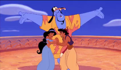
I agree that it's inconsistent in the film and I'm surprised that it's not even a DVD/Blu-ray transfer mistake. I do agree that in the VHS and Signature slipcover/digipack her outfit is too green. The Diamond and Steelbook seems to go for color 3242 and the Platinum is light blue.
-
Disney's Divinity

- Ultimate Collector's Edition
- Posts: 16407
- Joined: Thu Mar 17, 2005 9:26 am
- Gender: Male
Re: Comparing Home Releases Cover Arts
True, I associate the music of "To Be Free" with Genie first, but I think it kind of suits all the main characters. They're all trapped in a sense by their station in life (although Genie's is the only one that's literally an enslavement).farerb wrote:Jasmine has a different theme than "To be Free", it's "Jasmine Runs Away" and you can hear it in different variations throughout the film. I don't think I ever heard "To be Free" when Jasmine appears on screen, only the Genie. I don't think this confusion would have occurred if it weren't for that show that combined the two themes in order to make a new Jasmine song.

Listening to most often lately:
Christina Aguilera ~ "Cruz"
Sombr ~ "homewrecker"
Megan Moroney ~ "Beautiful Things"
-
JeanGreyForever
- Signature Collection
- Posts: 5335
- Joined: Sun Sep 15, 2013 5:29 pm
Re: Comparing Home Releases Cover Arts
Hmm, I think the Diamond and Signature edition covers are pretty much the same shade of teal though. And much darker and greener than color 3242 if you compare here.farerb wrote:I agree that it's inconsistent in the film and I'm surprised that it's not even a DVD/Blu-ray transfer mistake. I do agree that in the VHS and Signature slipcover/digipack her outfit is too green. The Diamond and Steelbook seems to go for color 3242 and the Platinum is light blue.


We’re a dyad in the Force. Two that are one.
"I offered you my hand once. You wanted to take it." - Kylo Ren
"I did want to take your hand. Ben's hand." - Rey
Re: Comparing Home Releases Cover Arts
Hmmm.... I do think they use 3242 on Jasmine's clothes in those two covers, but probably only for the midtone, and then there is heavy shading, so you don't see it as much. (look at the lower left part of her right breast, for example)
Im thinking the difference in color for Jasmine from film to merchandise might be so she doesn't blend with the genie. Jasmine and the genie barely share any shots int he film.... but when you stick her in front of the genie in the merchandise... her blue clothes kinda blend into the genie.
Definitely crossed my mind when I saw the modified Signature 4K cover...
Side note: turquoise is DEFINITELY associated with water. it is the color usually used to describe the sea in the caribbean...
Re: Comparing Home Releases Cover Arts
Oh.... by the way, JeanGreyForever....
I have been to Disneyland maaaany times, and have seen Jasmine. Her costume ain't blue.... turquoise. Once again, that still you have was filmed (probably only video) and screencapped... a few generations from the real color.
I have been to Disneyland maaaany times, and have seen Jasmine. Her costume ain't blue.... turquoise. Once again, that still you have was filmed (probably only video) and screencapped... a few generations from the real color.
-
JeanGreyForever
- Signature Collection
- Posts: 5335
- Joined: Sun Sep 15, 2013 5:29 pm
Re: Comparing Home Releases Cover Arts

I compared the colors of her outfit from the two covers with 3242 (the big box in the bottom right). The highlights are similar, yes, but even then they are more green than 3242. And the rest of the shades are a much darker shade of teal or outright green in the case of the Diamond Edition.

You might have a point about Genie vs Jasmine. That's a pity if that's the case though. Reminds me of the same contrived reasoning they use for Aurora having to be in pink because Cinderella is already in blue and you can't have two blonde princesses in blue, nevermind that one princess is neither blonde nor does she wear a blue dress.
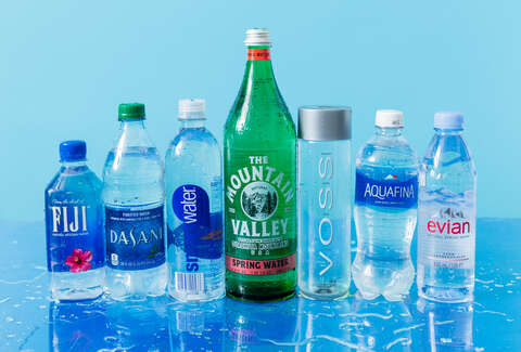
The way I see it is like this. When you're a child, you're taught some basic colors like green for grass, red for apple, yellow for the sun, and blue for the sky or water. When little kids color in water, whether it's in a glass or it's a lake or ocean, they use the regular blue crayon. Not green, let alone blue-green. And while blue-green, or aqua, is associated with water, most people still regularly identify water as blue. Just look at water bottle companies like Dasaani, Aquafina, Smartwater, Fiji Water, etc.
So when the creators of the film say that they gave her blue to associate her with water, I take it as pure blue and not a blue that's really more of a green. Especially when the few bits of water we see in the film are always light blue and not really blue-green or green. The same way that even in The Little Mermaid, the water is pretty much always blue, whether it's under the sea or we see the water from above on the surface. The backgrounds are predominantly blue and there's not much of a presence of green.
We’re a dyad in the Force. Two that are one.
"I offered you my hand once. You wanted to take it." - Kylo Ren
"I did want to take your hand. Ben's hand." - Rey
Re: Comparing Home Releases Cover Arts
Well Jean.... you can rationalize this whichever way you want. But I think we can all agree on this:
Jasmine's clothes in the movie are light blue (occasionally greenish, depending on lighting) and they are generally aqua/turquoise in merchandising. Im not bothered by this. And I get what you are saying about kids and color association, but the whole Jasmine/Genie/Water is good, hence blue... is supposed to be an unconscious thing... don't think that was intended to appease the kids in the audience.
As far as the Princess line.... yes, ridiculous. Specially if you consider Alice was part of the line when it first started... and she was another blonde in blue. Like you, Im not happy about the color changes to Aurora and Cinderella.
And oooooh boy... you never should have brought up TLM and blue water... the filmmakers say in the commentary that they often wanted to use other colors, but Katzenberg would say "guys... water is blue".... but they didn't want 3/4ths of the film to be blue. So they snuck a little bit of blue in the corners to appease him, when the rest of the scene was another color. But Under the Sea is reds, Ursula's lair is purples, the sunken ship scene is greys... it's hardly all blue.
Side note: can't believe we've been discussing this for so long.
Rodrigo.... welcome! I would prefer the films be sourced from a film print too. I will say, it bothers me more with BATB more than any other of the caps films. I feel the rest (of the caps films) are fairly faithful the original, color wise. And, like you, I would prefer some film grain for the older films...
-
Disney's Divinity
- Ultimate Collector's Edition
- Posts: 16407
- Joined: Thu Mar 17, 2005 9:26 am
- Gender: Male
Re: Comparing Home Releases Cover Arts
The palace has greens, too. Actually, the only scene I really associate with blue in the whole movie is "Part of That World" in Ariel's grotto--and blue definitely fits the melancholy longing of the song.the filmmakers say in the commentary that they often wanted to use other colors, but Katzenberg would say "guys... water is blue".... but they didn't want 3/4ths of the film to be blue. So they snuck a little bit of blue in the corners to appease him, when the rest of the scene was another color. But Under the Sea is reds, Ursula's lair is purples, the sunken ship scene is greys... it's hardly all blue.
This is the first time I've heard--as far as I can remember anyway--about Jasmine and Genie having been associated with water (ie, characters that are as rare or soothing in the setting of the story as water in a desert). If that's true, I wonder why Aladdin isn't put in blues? I mean, he is the Diamond in the Rough, supposedly the most unique and pure of heart of all the characters? Or is that why he's in pure white and gold for a big chunk of the film?
Listening to most often lately:
Christina Aguilera ~ "Cruz"
Sombr ~ "homewrecker"
Megan Moroney ~ "Beautiful Things"
-
JeanGreyForever
- Signature Collection
- Posts: 5335
- Joined: Sun Sep 15, 2013 5:29 pm
Re: Comparing Home Releases Cover Arts
Yes, I agree that her outfit is supposed to be light blue in the film. Depending on the lighting it can look greenish the same way that Cinderella's silver dress can look blue depending on the lighting or even Aurora's blue dress can look greenish when Maleficent hypnotizes her. In the marketing, Disney, for whatever inexplicable reason, has decided to put Jasmine in aqua or teal if not outright green sometimes. The same way Belle is yellow instead of gold, Snow White is bright blue and bright yellow instead of navy blue and pastel yellow/beige, Ariel has a dark purple bra instead of a lavender one and a bright green tail instead of a blue-green tail, etc. I personally am bothered by how Disney feels the need to change these colors when the original ones from the film are what audiences fell in love with.
I was using blue for water as an example, not that the makers of Aladdin specifically chose that shade of blue because they felt children wouldn't accept anything else. At the end of the day, ask anybody what color water is, and the general answer you'll get is blue. Not aqua, or turquoise, or teal, or cerulean, but plain old basic blue. Like if you want something to represent the sun, you pick yellow even though the real sun isn't a big blob of yellow like Teletubbies would make you think. However, ask the average person on the street what color the sun is or to draw the sun with a specific crayon, and they'll pick yellow. It's as simple as that.
Look at the color scheme for TLM and blue pops up the most.
https://thedcontinuum.files.wordpress.c ... l-copy.jpg
It's used the first time we go underwater and are introduced to merpeople and Atlantica. It's used when we meet Scuttle for the first time. It's the color of Ariel's grotto and Part of Your World. Blue is the dominant color when Ariel goes to the surface and first lays eyes on Eric (she is bathed in shadow in stark juxtaposition to the bright golden color of the ship demonstrating the allure of the world of the sun that Ariel so wants to be a part of). When the storm comes, suddenly that color turns into grey. By the time Ariel is singing the reprise of POYW, the backgrounds are blue again demonstrating the calm after the storm. Under the Sea starts off as primarily blue when Ariel is picking petals from a flower before blowing up into a colorful extravaganza. More blue in Ariel's grotto again which becomes grey and lifeless after Triton destroys all her collection. Purple is dominant for Ursula's lair and then we go to the surface world where everything is bright and warm so a bit of an end to blue for a while. Kiss the Girl and the night scenes return to the blue color palette as Ariel is back in her natural habitat again. The finale is purple, coded after Ursula and to show the violence and unnatural threat Ursula poses to the main characters and the ocean. The wedding scene uses a bright, medium-shade of blue that would be happy. Not too light, not too dark. But the overall happy ending is overall coded blue.
Green is pretty much only prominent during the throne room scenes, the concert scene and Ariel exploring the shipwreck because the dark green is meant to be foreboding and threatening, unlike the natural blue of the ocean we see in Atlantica.
Another good example is Finding Nemo where the ocean is predominantly blue (as it should be) especially during the happiest scenes, such as in the coral reef which is abundant with life.
We’re a dyad in the Force. Two that are one.
"I offered you my hand once. You wanted to take it." - Kylo Ren
"I did want to take your hand. Ben's hand." - Rey
Re: Comparing Home Releases Cover Arts
The Little Mermaid is light blue.
Beauty and the Beast is purple.
Aladdin is blue.
The Lion King is orange.
Beauty and the Beast is purple.
Aladdin is blue.
The Lion King is orange.
-
JeanGreyForever
- Signature Collection
- Posts: 5335
- Joined: Sun Sep 15, 2013 5:29 pm
Re: Comparing Home Releases Cover Arts
What color is the Blu-Ray transfer of Beauty and the Beast lol? That awful pink tint.
We’re a dyad in the Force. Two that are one.
"I offered you my hand once. You wanted to take it." - Kylo Ren
"I did want to take your hand. Ben's hand." - Rey