Comparing Home Releases Cover Arts

Re: Comparing Home Releases Cover Arts
The only time it's inappropriately blue is when she's running down on the steps of the palace and we all know it's because of the hack job of the restoration.
Re: Comparing Home Releases Cover Arts
Hahah.... no no, Fareb. I'm not questioning that the dress appears blue in the DARK scenes in the movie... I am saying that it appropriately looks grey in the well lit scenes.
I'm saying that the dress should be silver in the merchandise, not blue, since merchandise is not meant to be lit as nighttime.
I'm saying that the dress should be silver in the merchandise, not blue, since merchandise is not meant to be lit as nighttime.
-
Disney Duster

- Ultimate Collector's Edition
- Posts: 14161
- Joined: Fri Jun 17, 2005 6:02 am
- Gender: Male
- Location: America
Re: Comparing Home Releases Cover Arts
Ok, back it up!
Lol I am going to be all tongue-in-cheek bitchy please forgive me lol but this is my fave movie.
Ok, first off, I was trying to say, though I admit it didn't really come through, that if her dress can't be silver, blue is the next best color because it is blue sometimes, even if those sometimes are supposed to be the dark.
But, in the restored version of the film, her dress actually is blue sometimes in the light. Farerb pointed out it is blue on the stairs, here I am also showing it is when she enters the palace. The dress is blue in the bottom picture. That is not silver:

Now, farerb brings up a good point that the restoration changed her dress from silver to blue on the stairs, but actually, it is also supposed to be silver pre-restoration when she gets to the palace, as the top picture shows. But if Disney goes by the restoration, blue is actually correct even in light scenes.
Also, the Prince's jacket is not off-white, but gold or yellow:

Anyway, what I was trying to say was regardless of what lighting there is, I'm ok with Cinderella's dress being blue in depictions because it is blue in the film sometimes, even if it's only supposed to be blue in the dark. And of course, when I say I am ok with it being blue in merchandise, I mean I am just ok with it, it's not what I want. What I want is for it to be silver!
Lol I am going to be all tongue-in-cheek bitchy please forgive me lol but this is my fave movie.
Ok, first off, I was trying to say, though I admit it didn't really come through, that if her dress can't be silver, blue is the next best color because it is blue sometimes, even if those sometimes are supposed to be the dark.
But, in the restored version of the film, her dress actually is blue sometimes in the light. Farerb pointed out it is blue on the stairs, here I am also showing it is when she enters the palace. The dress is blue in the bottom picture. That is not silver:
Now, farerb brings up a good point that the restoration changed her dress from silver to blue on the stairs, but actually, it is also supposed to be silver pre-restoration when she gets to the palace, as the top picture shows. But if Disney goes by the restoration, blue is actually correct even in light scenes.
Also, the Prince's jacket is not off-white, but gold or yellow:
Anyway, what I was trying to say was regardless of what lighting there is, I'm ok with Cinderella's dress being blue in depictions because it is blue in the film sometimes, even if it's only supposed to be blue in the dark. And of course, when I say I am ok with it being blue in merchandise, I mean I am just ok with it, it's not what I want. What I want is for it to be silver!

-
JeanGreyForever

- Signature Collection
- Posts: 5335
- Joined: Sun Sep 15, 2013 5:29 pm
Re: Comparing Home Releases Cover Arts
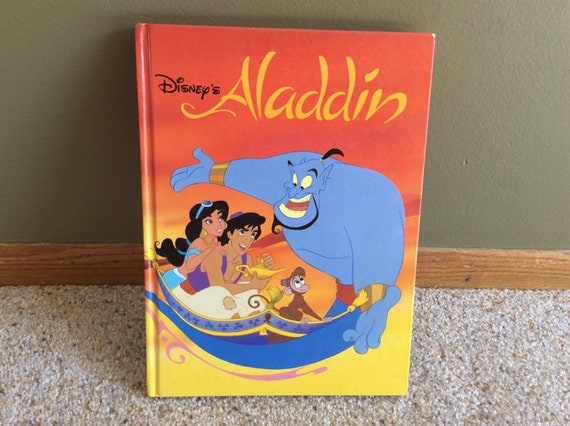
Marce82: Even in concept art though, the final color palette was light blue and from what I remember, she never really had an aqua or turquoise look. I think they just choose more marketable colors (or what they deem more marketable) for merchandise. Hence why Belle's dress, which is clearly gold, was marketed as yellow as far back as the 90s. Cinderella's dress was already turning into a pale blue then instead of silver, white, or gray. Jasmine's outfit in particular was always meant to be light blue to represent water and connect to the Genie since both want to be free (hence why To Be Free serves as a theme for them both).
At least the Disney Infinity game gave her the proper light blue color for her outfit.
Yes, I agree that because of the angle of the sun, in that one shot with the birds, her outfit looks green but it's still odd since in the VHS it was blue even then.
The animation is terrible for Return of Jafar and the TV series but the point stands that the colors used for her outfit are the authentic ones from how the film was intended to look. The same reason that Belle has pale skin and dark brown hair in the two BATB sequels and not tanned skin and reddish hair like in the new restorations.
Disney Duster: But look how dark that scene is. Not just the background, with the ballroom floor being almost purple and black from the lack of light, but the skin tones of the prince and Cinderella are super dark as well. Those aren't their natural colors. The prince's outfit is clearly cream but it's blue here, much like Cinderella's dress and even in that screencap, it's an icy blue but never as dark or vivid a blue like in the clipart or even the live-action film. Pale or ice blue is one thing but they seldom even use that in the clipart which is my issue.


We’re a dyad in the Force. Two that are one.
"I offered you my hand once. You wanted to take it." - Kylo Ren
"I did want to take your hand. Ben's hand." - Rey
Re: Comparing Home Releases Cover Arts
Hey,
DisneyDuster, you aren't being bitchy at all. We are all being pretty cordial here.
I agree with you about your approach to the blue dress. I don't like that it's being marketed as blue, but yes, that is the closest thing if silver isn't an option.
Those two frames comparing the pre-restoration colors.... sigh.... hurts my eyes to see the new one. And I believe Disney modified the film to try to make it match the marketing. The blue-dress thing started in the late 90s, after the 97 VHS cover. And I get it, blue is an easier color to use in illustration, and each princess gets her own color. Silver wouldn't work as well.
But it has gotten to the point where every item on Cinderella is a shade of blue.... her gloves, sleeves and bustle are no longer white... no reason for that. Even her choker now has blue shading.
About the prince... I would say that jacket is a very light yellow (or cream, like Jeangrey says).... the epaullettes are gold... the jacket is way lighter. And my point still stands: when they are dancing in the darkness, that jacket looks super dark.
JeanGreyForever: I agree with everything you just said.
I'm just saying the discrepancies in Jasmine's color don't bug me that much because they have been there since day 1.
And I would be 100% ok with Cinderella's dress being a pale blue, or a grayish blue... how else can you depict silver without special effects? I think in the film that was achieves with the light gray coloring combined with the white outlines and the white sparkles...
And I agree.... Cinderella in those rich and/or dark blues in the clipart is crap...
-
Disney Duster
- Ultimate Collector's Edition
- Posts: 14161
- Joined: Fri Jun 17, 2005 6:02 am
- Gender: Male
- Location: America
Re: Comparing Home Releases Cover Arts
Ok, I think we have all come to an understanding?
JeanGreyForever, your response doesn't feel like you saw my last post, but if you saw me and Marce82's last posts, do you get what we mean now?
I think I only have one more thing left to say, and that is that Cinderella's bustle, sleeves, and gloves are slightly, slightly, ever so slightly blue in the lit scenes where she is blue, and they are all very blue in the dark scenes where she is blue, so that is where their blue probably comes from in marketing and merchandise. Fun Fact: Cinderella's bustle in normal lighting is actually not white but a much lighter silver than her skirt and bodice!

Re: Comparing Home Releases Cover Arts
Here's my ranking:
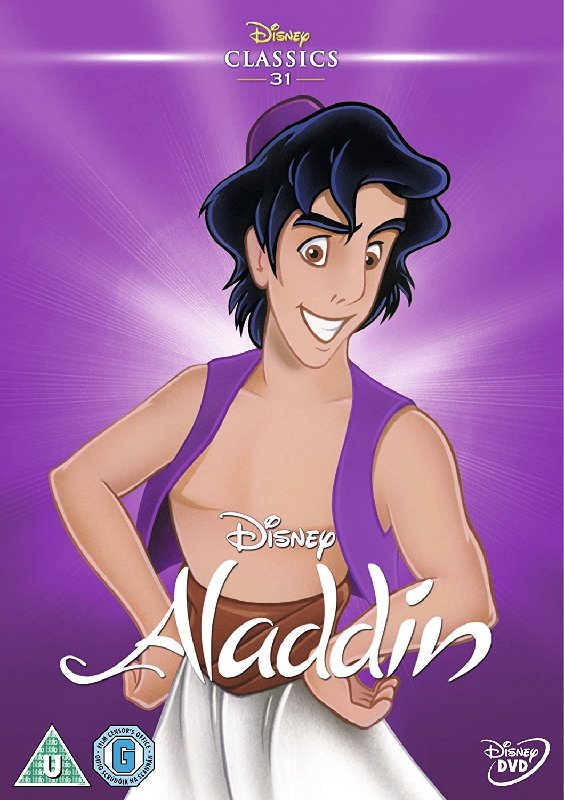
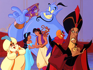
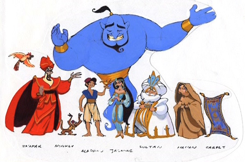
1. Classics VHS: Maybe it's nostalgia, but I really like this cover. The layout is good in my opinion and Genie, Jafar and Iago look OK. Aladdin and Jasmine are not on-model (and you're right that their anatomy is bad, Marce82, I hadn't noticed that before), but at least they don't look ugly like in other covers. On that note, Aladdin's design was a bit inspired by Tom Cruise, but it's curious that he looks more like him here than in the movie. I also like the purple sky and the city of Agrabah in the background.
2. Japanese Laserdisc: I don't like it as much as the Japanese Laserdisc for Beauty and the Beast, and from John Alvin's posters for the film, I prefer the one that shows Aladdin's hands rubbing the lamp, but this one is also beautiful.
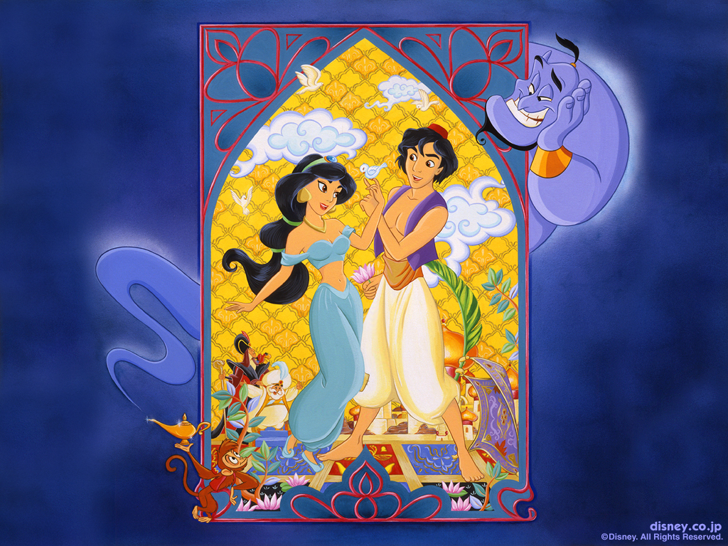
3. Target Signature Digipack: I agree with the majority that this one is great. I really like the idea, the colors, the poses, the palace and the smoke. The characters maybe are not 100% on-model, but they're drawn quite decently. The reason I haven't ranked it higher is because I prefer Aladdin and Jasmine, or at least Aladdin, to be more prominent on the cover. I think it might've been inspired by this art made at the time of the film's release:

4. Australian Aladdin 1-3 DVD set: This one is beautiful too, but it's a bit too noticeable that the top part with Aladdin and Jasmine is a still from the movie and it clashes a bit with the rest of the drawing. I much prefer this cover to the Platinum Edition Box Set though, because I don't think the Cave of Wonders alone is not an important enough character to represent the film.
5. Platinum Edition DVD: I always hated that the Genie's body doesn't continue below the logo. They show the blue smoke part instead, which should start after the belt/sash. I never liked how Aladdin and Jasmine look here either, but I do like their poses and I think the overall composition is not bad.
6. Best Buy Diamond Lenticular Exclusive: The idea for using the lenticular effect is cool and Genie looks good. Aladdin looks OK too in the first image when he's rubbing the lamp, but not in the second and the drawing of him seems taken from a book illustration.
7. UK Mondo steelbook: I'm not a big fan of Mondo covers, as I've said before, but this one's not bad. I like all the characters' poses, but of course, Jasmine's outfit shouldn't be red.
8. Platinum Edition Box Set: I don't have anything against the drawing, in fact I like it, but I don't rank this higher for the reason I mentioned in my fourth spot.
9. Signature Collection 4K UHD: Though it's nice to have Aladdin in his Prince Ali outfit for a change, his pose is ridiculous (I thought he was about to jump from the carpet, but I think Marce82 is right and he's like surfing) and he and Jasmine seem to be posing for the camera. Also, the lamp is too big compared to Jafar, who's more or less in the same plane as it, but Genie looks good and I like the color of the background.
10. Best Buy Signature Steelbook: I like the idea and the fact that the drawing continues on the back, but the composition of the front cover doesn't work separately without the back, in my opinion. Not to mention that Aladdin and Jasmine are quite off-model.
1. Classics VHS: Maybe it's nostalgia, but I really like this cover. The layout is good in my opinion and Genie, Jafar and Iago look OK. Aladdin and Jasmine are not on-model (and you're right that their anatomy is bad, Marce82, I hadn't noticed that before), but at least they don't look ugly like in other covers. On that note, Aladdin's design was a bit inspired by Tom Cruise, but it's curious that he looks more like him here than in the movie. I also like the purple sky and the city of Agrabah in the background.
2. Japanese Laserdisc: I don't like it as much as the Japanese Laserdisc for Beauty and the Beast, and from John Alvin's posters for the film, I prefer the one that shows Aladdin's hands rubbing the lamp, but this one is also beautiful.
3. Target Signature Digipack: I agree with the majority that this one is great. I really like the idea, the colors, the poses, the palace and the smoke. The characters maybe are not 100% on-model, but they're drawn quite decently. The reason I haven't ranked it higher is because I prefer Aladdin and Jasmine, or at least Aladdin, to be more prominent on the cover. I think it might've been inspired by this art made at the time of the film's release:
4. Australian Aladdin 1-3 DVD set: This one is beautiful too, but it's a bit too noticeable that the top part with Aladdin and Jasmine is a still from the movie and it clashes a bit with the rest of the drawing. I much prefer this cover to the Platinum Edition Box Set though, because I don't think the Cave of Wonders alone is not an important enough character to represent the film.
5. Platinum Edition DVD: I always hated that the Genie's body doesn't continue below the logo. They show the blue smoke part instead, which should start after the belt/sash. I never liked how Aladdin and Jasmine look here either, but I do like their poses and I think the overall composition is not bad.
6. Best Buy Diamond Lenticular Exclusive: The idea for using the lenticular effect is cool and Genie looks good. Aladdin looks OK too in the first image when he's rubbing the lamp, but not in the second and the drawing of him seems taken from a book illustration.
7. UK Mondo steelbook: I'm not a big fan of Mondo covers, as I've said before, but this one's not bad. I like all the characters' poses, but of course, Jasmine's outfit shouldn't be red.
8. Platinum Edition Box Set: I don't have anything against the drawing, in fact I like it, but I don't rank this higher for the reason I mentioned in my fourth spot.
9. Signature Collection 4K UHD: Though it's nice to have Aladdin in his Prince Ali outfit for a change, his pose is ridiculous (I thought he was about to jump from the carpet, but I think Marce82 is right and he's like surfing) and he and Jasmine seem to be posing for the camera. Also, the lamp is too big compared to Jafar, who's more or less in the same plane as it, but Genie looks good and I like the color of the background.
You're right, they're quite improved there.JeanGreyForever wrote:This fanedit is better.
https://www.instagram.com/p/B0b2LKHopl4/
10. Best Buy Signature Steelbook: I like the idea and the fact that the drawing continues on the back, but the composition of the front cover doesn't work separately without the back, in my opinion. Not to mention that Aladdin and Jasmine are quite off-model.
I agree, I don't remember having seen a worse one either.Disney Duster wrote:OMG LOL This must be the worst cover for a Disney film I have ever seen!!! Look how he's drawn!!!farerb wrote:Heroes cover:
https://i.postimg.cc/2jdwss60/Aladdin-U ... -cover.jpg
Re: Comparing Home Releases Cover Arts
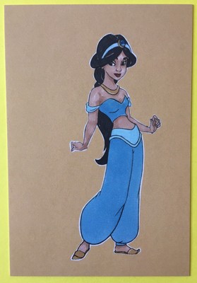
Regarding the color of Jasmine's outfit, I've found the following chart, which is part of this style guide from 1992 for the use of the characters in licensed products:

Source: https://www.loc.gov/exhibits/music-and- ... .html#obj1
According to it, the color of her clothes is "3242". I don't know how to find out what color is that, but it looks turquoise in the picture. Of course, that just proves that that color has been used for her in merchandise since the film's release, as you guys have already been saying.
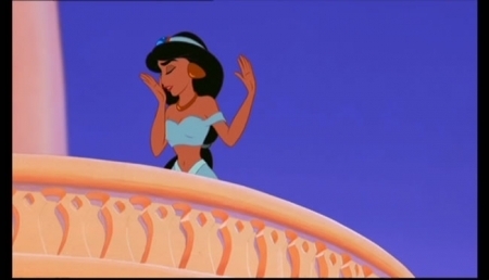
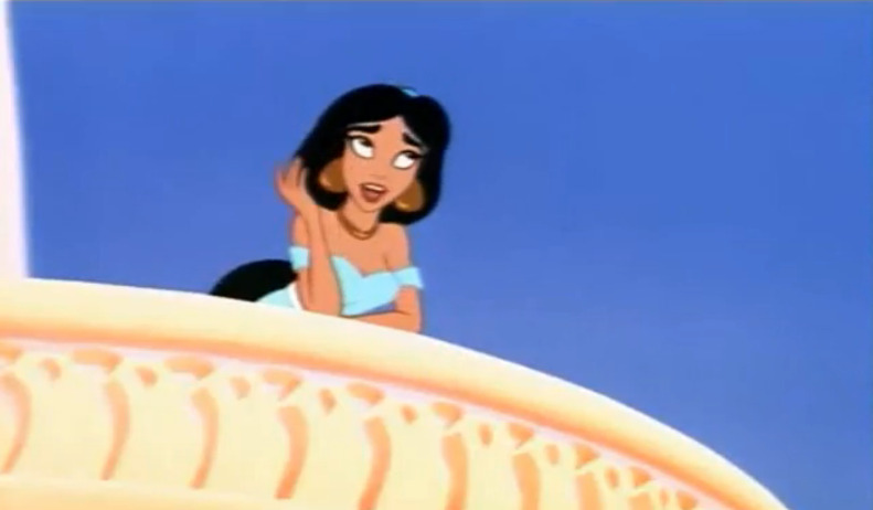
However, I personally think her outfit was intended to be at least slightly turquoise/aqua in the movie too for three reasons. Firstly, it looks greenish in several parts of the movie and not just when she's under a warm light, including some shots from her first scene:


Secondly, the things she uses to hold her hair (sorry, I don't know their name) are greenish too, and I don't think they would use that color if she didn't wear anything else with green in it, as it's common for Disney characters to have several shades of the same color in their outfits, like Aurora in her blue dress or Belle in her golden one.
And lastly, it would match the color in her father's outfit, which is not a big reason, but I think they probably wanted them to have that in common as members of the royal family.
But that's just my opinion. Light blue is actually my favorite color, so I don't mind if I'm wrong.
Source: https://www.loc.gov/exhibits/music-and- ... .html#obj1
According to it, the color of her clothes is "3242". I don't know how to find out what color is that, but it looks turquoise in the picture. Of course, that just proves that that color has been used for her in merchandise since the film's release, as you guys have already been saying.
However, I personally think her outfit was intended to be at least slightly turquoise/aqua in the movie too for three reasons. Firstly, it looks greenish in several parts of the movie and not just when she's under a warm light, including some shots from her first scene:
Secondly, the things she uses to hold her hair (sorry, I don't know their name) are greenish too, and I don't think they would use that color if she didn't wear anything else with green in it, as it's common for Disney characters to have several shades of the same color in their outfits, like Aurora in her blue dress or Belle in her golden one.
And lastly, it would match the color in her father's outfit, which is not a big reason, but I think they probably wanted them to have that in common as members of the royal family.
But that's just my opinion. Light blue is actually my favorite color, so I don't mind if I'm wrong.
The color of the water in the fountain from her first scene, though, looks more turquoise that blue. And turquoise is a kind of blue, so the comparison would still work if that was the color of her clothes.JeanGreyForever wrote:Jasmine's outfit in particular was always meant to be light blue to represent water and connect to the Genie since both want to be free (hence why To Be Free serves as a theme for them both).
Last edited by D82 on Wed Feb 26, 2020 12:30 am, edited 3 times in total.
Re: Comparing Home Releases Cover Arts
Color 3242:

Re: Comparing Home Releases Cover Arts
^Thanks, farerb.
Re: Comparing Home Releases Cover Arts
Disney Duster: about the bustle... you mean in the pre-restoration Cinderella, CORRECT?
D82: Classic VHS as yr number 1 in this case is definitely nostalgia
That artwork you posted from the time of the film's release... I actually had a sweatshirt with that image when I was a kid. Look all those characters... ALL on model and well drawn. And Jasmine's outfit is... I don't want to say what color...
Speaking of which.... D82.... given that you posted that style guide.... I'm pretty sure JeanGreyForever is hiring a hitman to kill you AS WE SPEAK.
Good observation about Jafar and the lamp on the Signature 4K cover... but we don't see the bottom of jafar's gown, so his placement isn't 100% clear.... so I give them a pass on that. But good catch!
A little unclear on something.... this fan edit: https://www.instagram.com/p/B0b2LKHopl4/
What did they change? the color of Jasmine's outfit? Or something else?
D82: Classic VHS as yr number 1 in this case is definitely nostalgia
That artwork you posted from the time of the film's release... I actually had a sweatshirt with that image when I was a kid. Look all those characters... ALL on model and well drawn. And Jasmine's outfit is... I don't want to say what color...
Speaking of which.... D82.... given that you posted that style guide.... I'm pretty sure JeanGreyForever is hiring a hitman to kill you AS WE SPEAK
Good observation about Jafar and the lamp on the Signature 4K cover... but we don't see the bottom of jafar's gown, so his placement isn't 100% clear.... so I give them a pass on that. But good catch!
A little unclear on something.... this fan edit: https://www.instagram.com/p/B0b2LKHopl4/
What did they change? the color of Jasmine's outfit? Or something else?
-
Disney Duster
- Ultimate Collector's Edition
- Posts: 14161
- Joined: Fri Jun 17, 2005 6:02 am
- Gender: Male
- Location: America
Re: Comparing Home Releases Cover Arts
Yes, correct! About JeanGreyForever's hitman...LOL!!! I hope she feels ok with what we now know...Marce82 wrote:Disney Duster: about the bustle... you mean in the pre-restoration Cinderella, CORRECT?
Re: Comparing Home Releases Cover Arts
Jasmine has a different theme than "To be Free", it's "Jasmine Runs Away" and you can hear it in different variations throughout the film. I don't think I ever heard "To be Free" when Jasmine appears on screen, only the Genie. I don't think this confusion would have occurred if it weren't for that show that combined the two themes in order to make a new Jasmine song.
Re: Comparing Home Releases Cover Arts
I also think Jasmine's outfit looks more light blue in shadowy or night scenes.
-
rodrigo_ca

- Special Edition
- Posts: 618
- Joined: Wed Sep 26, 2012 2:49 pm
Re: Comparing Home Releases Cover Arts
Can I just go slightly off-topic while you are comparing restorations? Man, how I hate that everything coming from Disney Animation needs to be so nice and clean these days. Don't get me wrong, I'm too young to be pestering about the 'good old days' and the first time I saw Aladdin was a digital transfer already, but how I wish they used the original negatives and kept all the film grain intact. Looking at that 35mm trailer farerb posted - THAT'S how I always thought Aladdin should look. I hate how they scrub Snow White and Cinderella so hard to look like it came out yesterday from a computer. I hope these movies get a better treatment in public domain than Disney has ever cared for the past 30 years. Anyway... back to the topic!
-
DisneyBluLife

- Gold Classic Collection
- Posts: 381
- Joined: Sun Oct 14, 2012 10:36 am
- Location: Sweden
Re: Comparing Home Releases Cover Arts
They changed Aladdin's face and added some of his hair. Colors of Jasmine's clothes and shoes and her face. Jafar's face. And the colors of the palace and carpet.Marce82 wrote:Disney Duster: about the bustle... you mean in the pre-restoration Cinderella, CORRECT
A little unclear on something.... this fan edit: https://www.instagram.com/p/B0b2LKHopl4/
What did they change? the color of Jasmine's outfit? Or something else?

Re: Comparing Home Releases Cover Arts
Maybe in The Enchanted Christmas, but Belle's Magical World is notorious for giving Belle a tanJeanGreyForever wrote:The animation is terrible for Return of Jafar and the TV series but the point stands that the colors used for her outfit are the authentic ones from how the film was intended to look. The same reason that Belle has pale skin and dark brown hair in the two BATB sequels and not tanned skin and reddish hair like in the new restorations.
Both of DVDizzy's / UltimateDisney's DVD reviews mention it.
-
JeanGreyForever
- Signature Collection
- Posts: 5335
- Joined: Sun Sep 15, 2013 5:29 pm
Re: Comparing Home Releases Cover Arts
@D82
As you pointed out, that's for how the characters were presented in merchandise and we know she's been presented in aqua/turquoise since the film's release. On Hunchback's laserdisc features, the art galleries feature the color palettes for the characters from the films so it's a pity we don't have something like that for Aladdin available to us. However, Jasmine appeared in light blue in many of the books released from that time period. The lithographs for the film (for the Diamond Edition at least) also used more movie accurate colors than the clipart style lithographs from the 90s and Jasmine is in light blue. She's also in light blue in House of Mouse.


Also in these Disney Parks commercials, her outfit is clearly pale blue.
https://www.youtube.com/watch?v=Yu8I_JMhs1g

While it does look greenish in some of those scenes you pointed out, it's all very blue in some of those same scenes. The colors are pretty inconsistent because in that fountain scene alone, the shade of blue drastically changes multiple times. It's a super pale blue at first which becomes a brighter blue and then the aqua/turquoise you said. Then back to regular blue and then almost aqua green for the final shot when the birds have flown away and we only see her from the back (probably because of the lighting as others speculated) If you pay special attention to Rajah, the color of his stripes changes a lot too in that same scene, from brown to black. Reminds me of how in Sleeping Beauty's forest scene, Aurora's hair and skirt changes color in every scene.


Personally I think the water looks more blue in that scene especially in other shots when you see the fountain in the background. Also water is most closely associated with blue, not green, and she was explicitly given the same color as water to show her rarity. The same way Jafar was given red to be connected with fire which is why in early concept art (as seen below), he was in flame red to explicitly show that before his colors were darkened.
Her ponytail bands are indeed teal. And you're right that the princesses are pretty much always in monochromatic looks but I'm pretty sure the intention was for her to have a light blue outfit with teal bands in her hair and golden shoes. Such as in here.
https://3.bp.blogspot.com/-VIt380GJagY/ ... normal.jpg
And this concept art also suggests light blue. I personally haven't seen anything in her concept art gallery where she was given an aqua, turquoise, or teal outfit. She has outfits in red, pink, orange, purple but nothing green.

As you pointed out, that's for how the characters were presented in merchandise and we know she's been presented in aqua/turquoise since the film's release. On Hunchback's laserdisc features, the art galleries feature the color palettes for the characters from the films so it's a pity we don't have something like that for Aladdin available to us. However, Jasmine appeared in light blue in many of the books released from that time period. The lithographs for the film (for the Diamond Edition at least) also used more movie accurate colors than the clipart style lithographs from the 90s and Jasmine is in light blue. She's also in light blue in House of Mouse.
Also in these Disney Parks commercials, her outfit is clearly pale blue.
https://www.youtube.com/watch?v=Yu8I_JMhs1g
While it does look greenish in some of those scenes you pointed out, it's all very blue in some of those same scenes. The colors are pretty inconsistent because in that fountain scene alone, the shade of blue drastically changes multiple times. It's a super pale blue at first which becomes a brighter blue and then the aqua/turquoise you said. Then back to regular blue and then almost aqua green for the final shot when the birds have flown away and we only see her from the back (probably because of the lighting as others speculated) If you pay special attention to Rajah, the color of his stripes changes a lot too in that same scene, from brown to black. Reminds me of how in Sleeping Beauty's forest scene, Aurora's hair and skirt changes color in every scene.
Personally I think the water looks more blue in that scene especially in other shots when you see the fountain in the background. Also water is most closely associated with blue, not green, and she was explicitly given the same color as water to show her rarity. The same way Jafar was given red to be connected with fire which is why in early concept art (as seen below), he was in flame red to explicitly show that before his colors were darkened.
Her ponytail bands are indeed teal. And you're right that the princesses are pretty much always in monochromatic looks but I'm pretty sure the intention was for her to have a light blue outfit with teal bands in her hair and golden shoes. Such as in here.
https://3.bp.blogspot.com/-VIt380GJagY/ ... normal.jpg
And this concept art also suggests light blue. I personally haven't seen anything in her concept art gallery where she was given an aqua, turquoise, or teal outfit. She has outfits in red, pink, orange, purple but nothing green.
We’re a dyad in the Force. Two that are one.
"I offered you my hand once. You wanted to take it." - Kylo Ren
"I did want to take your hand. Ben's hand." - Rey
-
JeanGreyForever
- Signature Collection
- Posts: 5335
- Joined: Sun Sep 15, 2013 5:29 pm
Re: Comparing Home Releases Cover Arts
It's light blue in most of the fountain scene and in the final scene when Genie is freed. Even in the Prince Ali song. And it's explicitly blue in the VHS.farerb wrote:I also think Jasmine's outfit looks more light blue in shadowy or night scenes.


So is the song that plays when the birds fly away from the bird cage not To Be Free but Jasmine Runs Away? I've always heard people say that To Be Free was used as the theme for both Genie and Jasmine, hence also why Menken turned it into a full-fledged song for the Hyperion musical.farerb wrote:Jasmine has a different theme than "To be Free", it's "Jasmine Runs Away" and you can hear it in different variations throughout the film. I don't think I ever heard "To be Free" when Jasmine appears on screen, only the Genie. I don't think this confusion would have occurred if it weren't for that show that combined the two themes in order to make a new Jasmine song.
Lol that's true. I feel embraced for not remembering that since I recently rewatched it on Disney+. Actually I'm more embarrassed for admitting to that publicly.Mooky wrote:Maybe in The Enchanted Christmas, but Belle's Magical World is notorious for giving Belle a tanJeanGreyForever wrote:The animation is terrible for Return of Jafar and the TV series but the point stands that the colors used for her outfit are the authentic ones from how the film was intended to look. The same reason that Belle has pale skin and dark brown hair in the two BATB sequels and not tanned skin and reddish hair like in the new restorations.
Both of DVDizzy's / UltimateDisney's DVD reviews mention it.
We’re a dyad in the Force. Two that are one.
"I offered you my hand once. You wanted to take it." - Kylo Ren
"I did want to take your hand. Ben's hand." - Rey
-
JeanGreyForever
- Signature Collection
- Posts: 5335
- Joined: Sun Sep 15, 2013 5:29 pm
Re: Comparing Home Releases Cover Arts
It definitely became the trend in the late 90s but it was already the case in the early 90s for Cinderella to be in blue, albeit a light blue and not the dark blue they started to go with later. And Cinderella in blue also dates back to the original theatrical poster in 1950 and even in some merch/promotion back then so this isn't a new to Cinderella technically even if it's become way more widespread of an issue since the DP franchise. And similar to Jasmine, Belle has suffered from this too with her multi-shaded golden dress becoming depicted as monochromatic yellow since the film came out in merchandise and clipart. I'm not anymore accepting of it with Belle as I am with Jasmine.Marce82 wrote: Those two frames comparing the pre-restoration colors.... sigh.... hurts my eyes to see the new one. And I believe Disney modified the film to try to make it match the marketing. The blue-dress thing started in the late 90s, after the 97 VHS cover. And I get it, blue is an easier color to use in illustration, and each princess gets her own color. Silver wouldn't work as well.
But it has gotten to the point where every item on Cinderella is a shade of blue.... her gloves, sleeves and bustle are no longer white... no reason for that. Even her choker now has blue shading.
About the prince... I would say that jacket is a very light yellow (or cream, like Jeangrey says).... the epaullettes are gold... the jacket is way lighter. And my point still stands: when they are dancing in the darkness, that jacket looks super dark.
JeanGreyForever: I agree with everything you just said.
I'm just saying the discrepancies in Jasmine's color don't bug me that much because they have been there since day 1.
And I would be 100% ok with Cinderella's dress being a pale blue, or a grayish blue... how else can you depict silver without special effects? I think in the film that was achieves with the light gray coloring combined with the white outlines and the white sparkles...
And I agree.... Cinderella in those rich and/or dark blues in the clipart is crap...
I personally think they could pull off silver for clipart (without as many sparkles as those first two images use). And that last one could easily work if they removed the greenish tinge. Gray isn't an issue because I've heard some people describe the dress as dove grey.
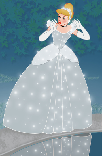


This link features some great clipart of Cinderella recolored to resemble her movie accurate self and proof that they could make a silver/gray dress work. Also another image below which was too large to post.
http://averymerryunblog.blogspot.com/20 ... ipart.html
https://ic.pics.livejournal.com/shisora ... iginal.png
I did, but I still agree with Marce82 on the matter.Disney Duster wrote: JeanGreyForever, your response doesn't feel like you saw my last post, but if you saw me and Marce82's last posts, do you get what we mean now?
We’re a dyad in the Force. Two that are one.
"I offered you my hand once. You wanted to take it." - Kylo Ren
"I did want to take your hand. Ben's hand." - Rey