
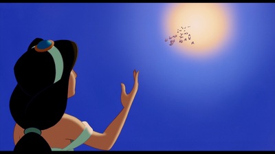
I knew I forgot something.... I could have liked it had Jasmine not wear red.


Jasmine always had light blue clothes.Marce82 wrote:Actually, JeanGreyForever....
This may be one of those issues where the transfer to film and eventually to VHS modified the colors a bit. Jasmine's clothes were turquoise/aqua in certain transfers.... and on A LOT of the original merchandise. My cousin had the original Jasmine doll, and her clothes were turquoise. Or look up the cover for "princess stories: volume one".
But yes, looking at the current color palette for the film, it is definitely light blue. But not so clear if watching older materials...
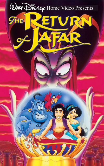
I'm not sure if you got your reply, but yes, the Aladdin one is fan-made. There were actual 2-movie and 3-movie releases in France (see below), but Aladdin never got one in the same vein.Marce82 wrote:WAIT WAIT WAIT!!! The image you just posted... that cover with Aladdin and Jasmine with the black and white sketches behind them.... is that real??? I have seen that before, but I thought it was fan art. Was that a french 3 movie release???
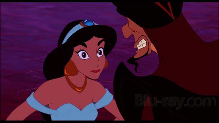
That could be but even in the Blu-Ray/4K version of the film, her outfit is pretty much always light blue and only slightly greenish in certain lightings and barely even that. I do remember that even when the film came out though, the clipart of her was in turquoise or green including her first doll. So Disney changing the colors of their princesses existed even as far back as the 90s.Marce82 wrote:Actually, JeanGreyForever....
This may be one of those issues where the transfer to film and eventually to VHS modified the colors a bit. Jasmine's clothes were turquoise/aqua in certain transfers.... and on A LOT of the original merchandise. My cousin had the original Jasmine doll, and her clothes were turquoise. Or look up the cover for "princess stories: volume one".
But yes, looking at the current color palette for the film, it is definitely light blue. But not so clear if watching older materials...
Yes, same with the scene where she is brushing her hair. That is very much light blue in the VHS.farerb wrote:Jasmine always had light blue clothes.Marce82 wrote:Actually, JeanGreyForever....
This may be one of those issues where the transfer to film and eventually to VHS modified the colors a bit. Jasmine's clothes were turquoise/aqua in certain transfers.... and on A LOT of the original merchandise. My cousin had the original Jasmine doll, and her clothes were turquoise. Or look up the cover for "princess stories: volume one".
But yes, looking at the current color palette for the film, it is definitely light blue. But not so clear if watching older materials...
https://youtu.be/JbaUpVknaRQ
https://youtu.be/YN7C1657K1E
But I can believe that they put her in green/turquoise in merchandise.
Marce82 wrote:Well...
Are you watching those clips on a tube tv or a modern monitor or HD tv? that would make a difference.
Also... I took this still from some promotional material from 1993 for the film... you can't see a lot of it, but her clothes look kinda greenish to me.
I do think they were intended to be light blue though.
https://ibb.co/By0WYtb
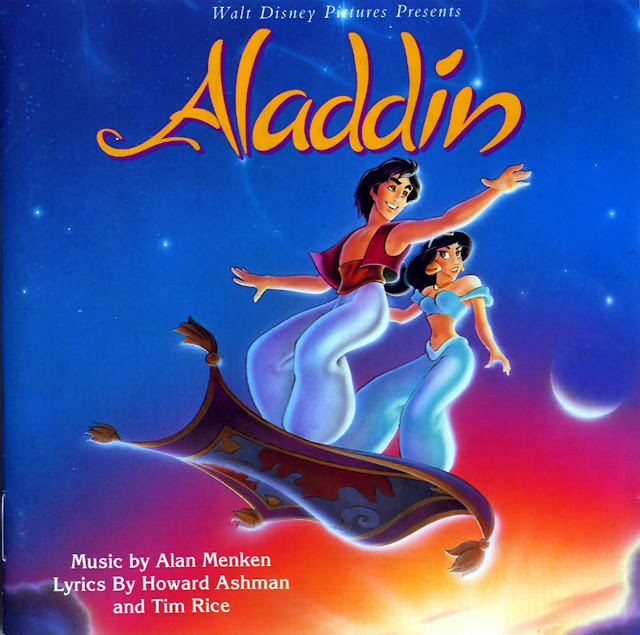
And if you look at the artwork for the soundtrack... her clothing is definitely green/turquoise.
And JeanGreyForever: sad to hear that is indeed fanart like I suspected... it would have made a gorgeous cover (that french release thing)
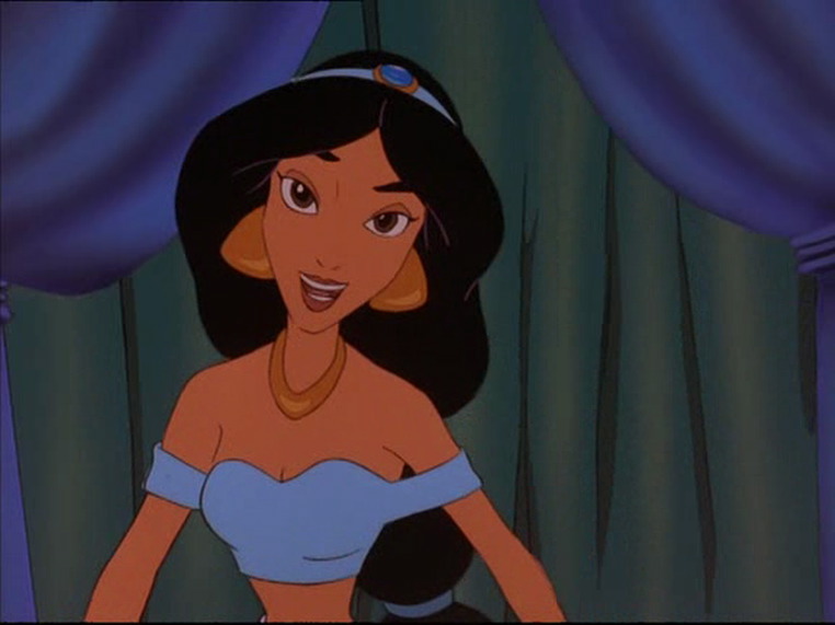


That's true but it's never as blue in the movie as the clipart sometimes depicts her.Disney Duster wrote:I'm ok with Cinderella's dress being any shade of blue if it can't be silver, because in the film it varies from light to dark blue at the palace. I only hate her in blues that are too greenish but I don't even know if I have ever seen her wear a greenish blue. But if it can't be silver, and it can't be blue, yes, pink is the next one I would be the most ok with. She does still look lovely in pink. So Jasmine is really in light blue? Well, you would know!


