About the name.... I was never thrilled that the name in Spanish was Bella. It always sounded awkward to me, cause it's not a real name in Spanish, only an adjective. I think I would have preferred Belle...
Imagine if her name in English was Beauty... "Beauty, it's about you got your head out of those books..." don't you guys find it awkward??
Comparing Home Releases Cover Arts

Re: Comparing Home Releases Cover Arts
Yes it have been awkward and I think there are some Disney knock offs out there that do actually use "Beauty" as her name and it's weird.
-
JeanGreyForever

- Signature Collection
- Posts: 5335
- Joined: Sun Sep 15, 2013 5:29 pm
Re: Comparing Home Releases Cover Arts
I mean the English versions of the story do call her Beauty but I never found that particularly jarring in a world where Snow Whites, Cinderellas, and Sleeping Beauties exist (even if the latter doesn't get directly called that in the story). And I don't know about Spanish, but Bella is a common name in other cultures, even as short for Isabella. One of the most popular contemporary Beauty and the Beast stories features a Bella after all.


We’re a dyad in the Force. Two that are one.
"I offered you my hand once. You wanted to take it." - Kylo Ren
"I did want to take your hand. Ben's hand." - Rey

Re: Comparing Home Releases Cover Arts
I had forgotten about the original soundtrack cover. It's true, that one has the same poses as well. In fact, I think the VHS is more based on that drawing than on the still I posted, because the details you mentioned that are different in the still (Belle's hands and the Beast's on her back), look exactly like on the CD cover. It would be interesting to know which of the versions came first. According to Drew Struzan's official website, his artwork is from 1991 and it says the following there about it:Marce82 wrote:D82: I have seen that promotional still before, and I like it a lot. There are a few differences... we only see one of Belle's hands, and we don't see the beast's on her back. I'm not crazy about how they handle Belle's jaw and pupils on that still (like I said, a head tilted up is hard to draw), I think I like the official cover better.
That said...I am not sure what came first... that still, the cover, or the famous Struzan poster that was used for the original soundtrack, which looks INCREDIBLE. I love it, but I find the lighting a little too dramatic for a home video cover. Anyway... I don't know which version came first.
The original art was created for the cover of the CD but once Michael Eisner (Pres. of Disney) saw it, he said he wished he had used this art as the poster for the movie.
That makes a lot of sense. Thanks for your explanations.Marce82 wrote:About the skirt... it probably IS 8 sections... but the number doesn't really matter. What matters is logic/perspective. The whole thing is supposed to have a bell-shape, and whichever section is closest to camera will be the widest, and they should become slimmer as they recede to the sides of the skirt. That's the way it is handled in the movie... and in the good depictions of Belle.
It's true that Bella is not a real name in Spanish. I guess it doesn't sound strange to me because I'm used to her being called that way in the dubbing for Spain. And also, as JeanGreyForever said, there are people who have uncommon names, especially in fairy tales. But I understand why it sounds awkward to you.Marce82 wrote:About the name.... I was never thrilled that the name in Spanish was Bella. It always sounded awkward to me, cause it's not a real name in Spanish, only an adjective. I think I would have preferred Belle...
Imagine if her name in English was Beauty... "Beauty, it's about you got your head out of those books..." don't you guys find it awkward??
By the way, as you point out, Bella is an adjective in Spanish and means beautiful, while Beauty is a noun. So that, though a small one, is also a difference between the two names.
I don't know anyone with that name in Spain, but you're right; it's not uncommon in some cultures. However, Belle's name is pronounced differently in Spanish. The double "L" is pronounced like the English "Y" (from yellow, for example) here. For that reason, the Bella you're talking about sounds like a completely different name to me.JeanGreyForever wrote:And I don't know about Spanish, but Bella is a common name in other cultures, even as short for Isabella. One of the most popular contemporary Beauty and the Beast stories features a Bella after all.
Last edited by D82 on Mon Feb 17, 2020 10:33 pm, edited 1 time in total.
-
Disney's Divinity

- Ultimate Collector's Edition
- Posts: 16407
- Joined: Thu Mar 17, 2005 9:26 am
- Gender: Male
Re: Comparing Home Releases Cover Arts
I think Belle looks better here, too, other than the mouth. The arms don't look as freaky, too. I think the Classics VHS is still very good overall, but Belle almost has the same problem as one of the Sleeping Beauty covers, where Aurora's head is just way too big for the body that goes with it.farerb wrote:D82, the image you shared have the characters look the best:
https://i.postimg.cc/Tw2w44NG/3-Kon-Z9l-d.jpg
Interesting, D82. I think I prefer the finished cover over the mockup, personally. Belle's face looks worse in the mock-up. I don't care as much if the dress is a little off (plus it looks more vibrant than in the mock-up).

Listening to most often lately:
Christina Aguilera ~ "Cruz"
Sombr ~ "homewrecker"
Megan Moroney ~ "Beautiful Things"
Re: Comparing Home Releases Cover Arts
Belle's face is better in the finished cover, but her dress looks better in the mock up if the added "tent/curtain" is removed. At least the shape is better that way.
-
DisneyBluLife

- Gold Classic Collection
- Posts: 381
- Joined: Sun Oct 14, 2012 10:36 am
- Location: Sweden
Re: Comparing Home Releases Cover Arts
Original version of the covers for the Diamond Edition of Beauty and the beast.
Look at Belle's face
https://www.fanpop.com/clubs/disney/ima ... tion-photo
https://m.barnesandnoble.com/p/dvd-beau ... 2306772738
Look at Belle's face
https://www.fanpop.com/clubs/disney/ima ... tion-photo
https://m.barnesandnoble.com/p/dvd-beau ... 2306772738
-
Disney's Divinity
- Ultimate Collector's Edition
- Posts: 16407
- Joined: Thu Mar 17, 2005 9:26 am
- Gender: Male
Re: Comparing Home Releases Cover Arts
They look mostly the same except the colors are darker and a little more regal-feeling. I suppose at least the finished covers show you the way the film looks now with the hi-bright restoration. The only other difference I could see was for the Blu-ray, and that was Belle's face + "Diamond Edition" being a part of the logo box. I liked Belle's face there and in the finished version.
Listening to most often lately:
Christina Aguilera ~ "Cruz"
Sombr ~ "homewrecker"
Megan Moroney ~ "Beautiful Things"
Re: Comparing Home Releases Cover Arts
I remember the first of the original covers for the Diamond Edition, but I had never seen the second one. The biggest change in both cases is Belle. I personally prefer how she looks in the final versions.
Speaking of where characters are looking, I think someone mentioned Belle was looking at the ceiling in one cover. Was it the Diamond Blu-ray? I think she's looking at the Beast there.
I also got the impression her head was a bit too big there, but maybe that's accentuated by the fact that her shoulders don't face the front, but she's slightly turned to the right. That makes them look narrow compared to the head. The bow probably also contributes to produce that effect.Disney's Divinity wrote:I think the Classics VHS is still very good overall, but Belle almost has the same problem as one of the Sleeping Beauty covers, where Aurora's head is just way too big for the body that goes with it.
Here's a hi-res version of the poster, Disney Duster (click on the image to see it bigger). Personally, I've always thought she was looking at the camera, and I still do, but now that I've seen the image so close I think you're partly right. It's not completely clear where she looks at. I think the intention was for her to look at the camera and it's where the right eye is looking, but the left one is slightly turned to the left of the image. Well, that's my opinion, but maybe I'm wrong.Disney Duster wrote:Marce82, I can't find a huge version of the poster, but I've looked at it and looked at it and I only see Ariel looking to her right. Sorry, we just have to disagree.
Speaking of where characters are looking, I think someone mentioned Belle was looking at the ceiling in one cover. Was it the Diamond Blu-ray? I think she's looking at the Beast there.
-
Disney Duster

- Ultimate Collector's Edition
- Posts: 14163
- Joined: Fri Jun 17, 2005 6:02 am
- Gender: Male
- Location: America
Re: Comparing Home Releases Cover Arts
Yes, thank you D82, I now think Ariel is looking in between the camera and her right. Marce82 sent me a close-up of the image to show me as well.

Re: Comparing Home Releases Cover Arts
OK, I'm glad that has been cleared up.Disney Duster wrote:Yes, thank you D82, I now think Ariel is looking in between the camera and her right. Marce82 sent me a close-up of the image to show me as well.
Re: Comparing Home Releases Cover Arts
D82, thank you for your kind words toward me, and my lengthy explanations  .
.
I 100% echo your views on the name (including the different pronunciation). The first time I saw the movie it was in Spanish, and I found it odd. Once I got the VHS in English, I hardly ever watched it in Spanish, so the weirdness never faded for me.
As for the TLM poster and Ariel's face.... I agree 100% with your assessment: they were trying to have her look at the camera, but they got it slightly off. Doesn't bother me. Still a gorgeous poster.
Disney Duster..... yuuuup.
DisneyDivinity.... I agree, Belle's face looks worse in the mockup for the Diamond. The final version isn't good either tho.
Fareb, I agree that the dress looks better (except for that final added section) in the mockup. But if you remove that final section, it isn't quite bell shaped. They would have had to re-draw the skirt.... I guess that is too much work.
Re: Comparing Home Releases Cover Arts
I'm glad we agree on that. It doesn't bother me either. In my opinion it's not very noticeable. Unless you analyze it closely as we have done, you'd think she's looking at the camera. I agree that it's a great poster nonetheless. As I previously said, it's my favorite poster for the movie. I have a special fondness for it because it's the first thing I ever saw related to the movie and I already fell in love with it before falling in love with the movie.Marce82 wrote:As for the TLM poster and Ariel's face.... I agree 100% with your assessment: they were trying to have her look at the camera, but they got it slightly off. Doesn't bother me. Still a gorgeous poster.
Re: Comparing Home Releases Cover Arts
I grew up on the English version of the film as well since my parents bought the UK VHS (In Israel the English versions of Disney films were imported from UK). I always found it odd and awkward that Belle says "Beast" when she arrives at the balcony. When I saw the film in in Hebrew years later I didn't like it very much with the exception of that line where they changed it to have her say "You're Alive". I was wondering what were your thoughts on that in the English version and how did the Spanish version handle it?Marce82 wrote: I 100% echo your views on the name (including the different pronunciation). The first time I saw the movie it was in Spanish, and I found it odd. Once I got the VHS in English, I hardly ever watched it in Spanish, so the weirdness never faded for me.
Re: Comparing Home Releases Cover Arts
D82: Interesting... it was the first thing I saw for TLM as well... I didn't even know it was being made. Not only that... it made me realize that Disney movies were still being made, and they weren't just a thing of the past (though I had seen Oliver and Co in the theater, but I think I was VERY young and didn't put it together).
Fareb: I agree, that line is pretty awkward. The (latin) Spanish version has her call him "Bestia" in that moment, so it's a direct translation. Like D82 mentioned, this was the first movie to get a Latin Spanish and Spaniard Spanish dub. Not sure what the Spaniards got for that scene. I do like the hebrew adaptation for that line! It works!
As much as I LOOOOVE this movie, and as close-to-flawless as I think it is.... they should have given the Beast a name. Maybe in the scene where Belle is healing his wounds, she could have asked for his name. It is kind of dehumanizing that she doesn't know his name.
-
JeanGreyForever
- Signature Collection
- Posts: 5335
- Joined: Sun Sep 15, 2013 5:29 pm
Re: Comparing Home Releases Cover Arts
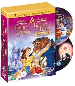
This is a 2-movie collection cover art that uses the Belle/Beast clipart from the Platinum DVD.
We’re a dyad in the Force. Two that are one.
"I offered you my hand once. You wanted to take it." - Kylo Ren
"I did want to take your hand. Ben's hand." - Rey
-
Disney's Divinity
- Ultimate Collector's Edition
- Posts: 16407
- Joined: Thu Mar 17, 2005 9:26 am
- Gender: Male
Re: Comparing Home Releases Cover Arts
Marce82 wrote: DisneyDivinity.... I agree, Belle's face looks worse in the mockup for the Diamond. The final version isn't good either tho.
Listening to most often lately:
Christina Aguilera ~ "Cruz"
Sombr ~ "homewrecker"
Megan Moroney ~ "Beautiful Things"
Re: Comparing Home Releases Cover Arts
I think it was the same for me, because I hadn't seen any of the most recent Disney movies at the time in theaters when I first saw that poster.Marce82 wrote:D82: Interesting... it was the first thing I saw for TLM as well... I didn't even know it was being made. Not only that... it made me realize that Disney movies were still being made, and they weren't just a thing of the past (though I had seen Oliver and Co in the theater, but I think I was VERY young and didn't put it together).
In the dubbing for Spain she says "Are you OK?". I had never noticed she doesn't say the same as in the original there. Well, it's not until recently that I've started to watch Disney films in English, so I know the Spanish version much better. It's curious that some countries have translated that line differently. I guess the translators didn't like the original line either.Marce82 wrote:The (latin) Spanish version has her call him "Bestia" in that moment, so it's a direct translation. Like D82 mentioned, this was the first movie to get a Latin Spanish and Spaniard Spanish dub. Not sure what the Spaniards got for that scene. I do like the hebrew adaptation for that line! It works!
Yes, emojis can help convey the intended tone, but you're right, sometimes not even that is enough.Disney's Divinity wrote:I believe that, too. I try to use emoji's so often in order to try to get my tone of voice across, but even then sometimes it's lost.D82 wrote:I believe if we were talking face to face, these arguments wouldn't happen so frequently.
I think an artwork based on this unused concept by John Alvin could be nice as a cover:Disney's Divinity wrote:I just had a thought that I hope they have a cover of the film in the future of Belle and Beast on the balcony

Thanks for sharing! I hadn't seen that cover before.JeanGreyForever wrote:This is a 2-movie collection cover art that uses the Belle/Beast clipart from the Platinum DVD.
By the way, I've noticed that the Deluxe VHS Edition (the one that included the work in progress version) for the UK (below right) is different than the American one:


-
Disney Duster
- Ultimate Collector's Edition
- Posts: 14163
- Joined: Fri Jun 17, 2005 6:02 am
- Gender: Male
- Location: America
Re: Comparing Home Releases Cover Arts
I think that's a really great idea! That's beautiful!D82 wrote:I think an artwork based on this unused concept by John Alvin could be nice as a cover:
Re: Comparing Home Releases Cover Arts
Hey,
JeanGreyForever: oh, I like that 2-movie collection cover! Would be interesting to see it in detail... the layout looks interesting.
Disney's Divinity: see... that's where you and I differ. I don't expect perfection, but I expect "great". This is a multi-billion dollar company with an arsenal of brilliant visual artists... there is no reason why the covers should be anything less than great-looking. "Not an eyesore" is a pretty low bar...
D82: That is so interesting about BATB in Spain! I kinda like that line you guys got better than the original.
That mockup with them on the balcony is ok... but not great to me. It's not like the balcony scene is super iconic or significant.
As for the Deluxe covers... I like the purple one better! I also just noticed that the American one shows the two main characters without the enchanted objects. So I looked it up in high res, and they have sort of photoshopped the other characters out... pretty poorly (specially Belle's skirt). If you look closely, it looks like bad airbrushing....