Snow White Re-release Platinum Discussion & Cover Art Th
-
PixarFan2006
- Signature Collection
- Posts: 6166
- Joined: Fri Jun 16, 2006 8:44 am
- Location: Michigan

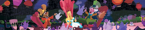
The only character I see that is off model is grumpy. He looks a bit deformed even!
But there's a lot to like about this cover....
- We see the entire main character rather than his or her head
- The logo is not floating in the middle
- Nearly all of the characters are presented in an organized matter
- More color and detail to the backgrounds
Its hard to hate the cover.
But there's a lot to like about this cover....
- We see the entire main character rather than his or her head
- The logo is not floating in the middle
- Nearly all of the characters are presented in an organized matter
- More color and detail to the backgrounds
Its hard to hate the cover.


I actually love the cover overall. I like that they broke their "giant-protagonist-above-framed-logo-with-the-villain-and-sidekicks-on-the-bottom" layout. Like magicalwands, though, I wish Disney had chosen Sleeping Beauty as the cover to break their routine since then my Blu-rays would then have a uniform style all their own. What impresses me most is that (with the exception of the Queen) this isn't made up of touched-up clipart the way most of the Platinum covers have been. I love that they included the Prince, even if I don't personally care his character (or lack thereof).
I do, however, think everything above Snow White's head needs to be changed. The Queen looks too vampirish, it's odd having no apostrophe after "Walt Disney," and the logo's a bit plain. Grumpy's face also looks like it's melting...
Disney Duster: I don't think Snow White herself on this cover is much closer to the film design than usual. The Masterpiece Edition VHS got her perfectly, and the Platinum DVD from 2001 is also pretty close. If you're comparing this new cover to overused clipart of her on merchandise, I still think those are a step closer. Snow White on this cover is, how shall I say this, not as full as she should be. The character in the film is by no means fat, but she has a considerably fuller frame than the other princesses, partly because she's so young and partly because that was the popular body type in the 30s. On the new cover, her figure is too slim, and her eyes and mouth are too wide. Even most stock clipart of her (while also too slim) give her a bit more meat than here. Unlike other people in this thread, though, the off-modelness doesn't actually bother me. I think it's a very pretty image of her, even if it's not really accurate.
Funnily enough, that French Cinderella poster you compared it to is perhaps the most on-model I've seen Cindy ANYWHERE outside the film. That artist needs to be commissioned to do more Disney art, or at least more of her.
-
Elladorine

- Diamond Edition
- Posts: 4372
- Joined: Wed Jan 25, 2006 1:02 pm
- Location: SouthernCaliforniaLiscious SunnyWingadocious
- Contact:

-
TheSequelOfDisney
- Signature Collection
- Posts: 5263
- Joined: Wed Nov 09, 2005 3:30 pm
- Location: Ohio, United States of America
I see ten fingernails... But, true, I do not see all ten fingers.enigmawing wrote:Has anyone else noticed the queen doesn't have enough fingers?
The Divulgations of One Desmond Leica: http://desmondleica.wordpress.com/
-
The Little Merboy
- Special Edition
- Posts: 508
- Joined: Tue Oct 10, 2006 10:10 am
- Location: By the sea
-
Disney's Divinity

- Ultimate Collector's Edition
- Posts: 16407
- Joined: Thu Mar 17, 2005 9:26 am
- Gender: Male
I hope the cover gets a serious facelift. The concept is definitely great, but the coloring is far too cheap-looking imo. Far too bright and, like PixarFan said, almost seems horribly Photoshopped. Also, I'm wondering why the castle behind the prince seems like it's just been copied and pasted, without blending at all. And there's something wrong with the dwarfs' skin tones...  Really, the only part about the cover currently that I like is the Prince's horse--the way his raised hoof is highlighted.
Also, I find it strange that people complain about "floating heads," but don't mind when several characters are depicted around each other and they're all different sizes. Neither concept bothers me, but if you're going to dislike one, it's only consistent to dislike the other. Overall, I like the original Platinum cover better. Maybe if this one's changed, I might change my mind. As is, though, I can't stand looking at it.
Also, I find it strange that people complain about "floating heads," but don't mind when several characters are depicted around each other and they're all different sizes. Neither concept bothers me, but if you're going to dislike one, it's only consistent to dislike the other. Overall, I like the original Platinum cover better. Maybe if this one's changed, I might change my mind. As is, though, I can't stand looking at it.

Listening to most often lately:
Christina Aguilera ~ "Cruz"
Sombr ~ "homewrecker"
Megan Moroney ~ "Beautiful Things"


-
Disney Duster

- Ultimate Collector's Edition
- Posts: 14151
- Joined: Fri Jun 17, 2005 6:02 am
- Gender: Male
- Location: America
Snow White Blu-ray
Thanks for addressing what I have said Disneykid, I always like hearing what you say and we seem to like talking about a lot of the same subjects. And thanks for being one of the few who will probably notice the comparison I have at the bottom of the last page...!
You know, after I thought Cinderella looked kind of bad in the revised cover for Twist in Time, but you said she was more on-model, I came to realize that you were right, she really was drawn closer to the original in the revision, I guess her eyes just seemed a little too...well, her eyes were the one thing the old cover had that I still think might've been better.
Ahem, back on to this topic, I guess you pointed out what Snow White really needs, but I still think her face, most of her face, is better than a lot of the Princessed versions I've seen on merchandise. But I guess the point is she could definately be more on model.
I third Sleeping Beauty should've started this new, great look. I mean the SB Platinum was basically a re-do of the already Platinum-looking SE! And the title on Pinocchio's PE better move into the middle... I'm also glad this isn't using previous clipart...but I do think I've seen almost all the characters in at least very, very similar poses before, either in clipart or elsewhere, except perhaps Snow White, though she's posed a lot like Cinderella on that french poster...but of course princesses do similar princess poses!
I have seen quite a bit of very on-model Cinderella images. I have been thinking of E-mailing you and now I have more incentive so, I will try to remember to bring them up.
Disney's Divinity, as always I also look forward to what you say. The cover does need work, but need as it may, I see it as beautiful right now. As for this and floating heads, well there's a difference between floating with no background, and then some cool ideas about perspective and distance done with Snow White emerging from the mirror magically while the dwarfs and prince are on the ground. I dunno. I think people sometimes miss the artisticness and imagination needed to fathom an artwork that does these unnatural things. Not you, but I was trying to explain that the difference is...purple or blue empty space is what bothers me and makes them really seem to just be floating, while Snow White is coming out of the mirror through magic and the Queen looks like she's flying out of the shadows, and she's magical. Though she needs look like she's just appearing, not flying.
Speaking of, I think the Queen's pinkies could just be hidden behind her ring fingers...

-
Disney's Divinity
- Ultimate Collector's Edition
- Posts: 16407
- Joined: Thu Mar 17, 2005 9:26 am
- Gender: Male
Re-reading my post, that 2nd paragraph came off a little more negative than I intended and that was, like, less than an hour ago. Jeez at me and my moods. 
I agree on the background being better in this cover. I don't really have anything against a blank/solid background like with the original cover, but I do prefer when there's something going on there, which this cover does. And I don't think I could bear a SW cover without the Magic Mirror somewhere on it, so I'm glad they used it.
And I agree with you, Neal. Now that I think of it, SW covers rarely focus on the kind part of SW anymore. She seems far more glamorous in the past few covers, which might have something to do with her merchandising. I actually bought a calendar recently made of old Walt posters, with that picture as the cover. It's easily one of my favorites. The characters aren't entirely identical to the movie, but the mood, coloring and arrangement are very classic imo.
Listening to most often lately:
Christina Aguilera ~ "Cruz"
Sombr ~ "homewrecker"
Megan Moroney ~ "Beautiful Things"
-
Disney's Divinity
- Ultimate Collector's Edition
- Posts: 16407
- Joined: Thu Mar 17, 2005 9:26 am
- Gender: Male
http://www.amazon.com/Disneys-Classic-M ... 0767148606
It's a 2008 calendar, but I really just bought it for the poster pictures anyway.
It's a 2008 calendar, but I really just bought it for the poster pictures anyway.
Listening to most often lately:
Christina Aguilera ~ "Cruz"
Sombr ~ "homewrecker"
Megan Moroney ~ "Beautiful Things"
-
tlc38tlc38

- Special Edition
- Posts: 785
- Joined: Thu Oct 02, 2008 11:14 am
What I don't understand is they used a giant apple on the Pinocchio cover and NO apple on the Snow White cover. This really makes no sense to me when the apple actually plays a role in Snow White and it doesn't in Pinocchio.
IMO, the only thing missing from the Snow White cover is the apple.
IMO, the only thing missing from the Snow White cover is the apple.
Walmart: the perfect place to shop for a headache at a discount price.
-
supertalies
- Special Edition
- Posts: 931
- Joined: Mon Jan 01, 2007 6:11 am
- Location: The Netherlands
Re: Snow White: Platinum Edition Blu-Ray Cover
OMG!!!
The cover actually look good.
You, know, I thought we were gettting a uglier cover than the first platinum, but I guess I'm wrong!
(But I still think the old one was way prettier)
The cover actually look good.
You, know, I thought we were gettting a uglier cover than the first platinum, but I guess I'm wrong!
(But I still think the old one was way prettier)
Last edited by supertalies on Sat Jan 31, 2009 10:01 am, edited 2 times in total.


-
geniuswalt

- Gold Classic Collection
- Posts: 329
- Joined: Tue Jun 15, 2004 2:09 pm
Re: Snow White Blu-ray Cover
I mean how can you honestly say that the SW in the proposed Bluray cover is closer to the original design?Disney Duster wrote:As for Snow White looking too Disney Princess or off-model...well, this Snow White is much, much closer to the original design than we usually see! They got her nose very right. .

-
Jack Skellington
- Anniversary Edition
- Posts: 1230
- Joined: Fri Aug 24, 2007 10:07 am
- Location: Dubai
I think that they should change the word art to look like this :
<a href="http://s231.photobucket.com/albums/ee23 ... e_0002.jpg" target="_blank"><img src="http://i231.photobucket.com/albums/ee23 ... e_0002.jpg" border="0" alt="Photobucket"></a>
<a href="http://s231.photobucket.com/albums/ee23 ... e_0002.jpg" target="_blank"><img src="http://i231.photobucket.com/albums/ee23 ... e_0002.jpg" border="0" alt="Photobucket"></a>