Cinderella: Diamond Edition - ETA 2012
They have gotten terribly lazy though at the moment; they are literally just plonking old DVD artwork straight on the Bluray ! No alterations or anything! But yes, as you say, if it is a great piece of artwork certainly use it again, but not just a 100% re-hash !
See Treasure Planet Bluray, Pocahontas, and Tarzan.
See Treasure Planet Bluray, Pocahontas, and Tarzan.
Couldn't they have picked a less generic title font for this release? It looks really cheap and diminishes the artwork. What was wrong with the previous one to warrant this change anyway? I just wish they'd stuck with one title style for each of the DACs, applied them to all things related to that film (sequels, merchandise, etc.), and have it become a brand in itself, much like Pixar has done with their films. Disney sort of did it with Aladdin onwards, but everything pre-1992 is a mixed bag.
I get that original title art may sometimes be old-fashioned, but that's no reason for constant 'updates'. Just look at all these:
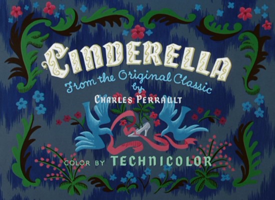
Original title:

1980s VHS:

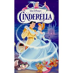
1990s VHS (US):

1990s VHS (UK); probably the best Cinderella cover art I've ever seen - her hair is strawberry blond and her gown is silver!

1990s other merchandise logo:

2005 DVD:

2012 Blu-ray:

Just pick one (except the final one) already, Disney.
I get that original title art may sometimes be old-fashioned, but that's no reason for constant 'updates'. Just look at all these:
Original title:

1980s VHS:

1990s VHS (US):

1990s VHS (UK); probably the best Cinderella cover art I've ever seen - her hair is strawberry blond and her gown is silver!

1990s other merchandise logo:

2005 DVD:

2012 Blu-ray:

Just pick one (except the final one) already, Disney.
- Disney Duster
- Ultimate Collector's Edition
- Posts: 14120
- Joined: Fri Jun 17, 2005 6:02 am
- Gender: Male
- Location: America
Well, I think if they started the practice of new art for each new release, they can't jip on some releases and call it fair.
But re-using old title art does make sense, if they establish a standard to use all the time. I actually really like the latest font though, the one on the cover. I like the way they do the C. I thought I saw a better one they recently made somewhere for this release, but I can't remember, maybe I'm wrong.
My ideal title would be just an updated version of the title card one, in the first picture. I hate the one they used on the Masterpiece cover and the really good cover where her dress is silver (acually I think it's just white with shadows of blue). It's the same one Cinderella II had. Yuck.

Fortunately, it has stayed the same in EuropeVicturtle wrote:Not even Winnie the Pooh could maintain it's logo for the home release
The original title is a bit leaner/elongated compared to the one from 2001/2006, but yes, it's still the same font. I agree about the BD version.Victurtle wrote:They restored the original title logo with Dumbo back in 2006. Much better than the BD version.
But why start in the first place, especially when it looks terrible compared to a prior one?Disney Duster wrote:Well, I think if they started the practice of new art for each new release, they can't jip on some releases and call it fair.
New font is basically 'Book Antiqua' font processed through WordArt, there's nothing special about it. It looks more like those mock-up titles (usually in Arial) they put on preliminary cover art than something official. It would look slightly better if there was a border around it.Disney Duster wrote:But re-using old title art does make sense, if they establish a standard to use all the time. I actually really like the latest font though, the one on the cover. I like the way they do the C. I thought I saw a better one they recently made somewhere for this release, but I can't remember, maybe I'm wrong.
My favorite of the ones here is the 1980s/PE title, it's classy, not a bit stiff and formal like the '90s VHS one and not a bit 'too girly' like the '90s merchandise one. The only thing I dislike about it is the weird 'n'. But they're all great compared to the current one.Disney Duster wrote:My ideal title would be just an updated version of the title card one, in the first picture. I hate the one they used on the Masterpiece cover and the really good cover where her dress is silver (acually I think it's just white with shadows of blue). It's the same one Cinderella II had. Yuck.
Actually, they only used it on the original VHS. For every subsequent release/merchandise they used the one from the TV series or the one from the 1997 re-release.atlanticaunderthesea wrote:I think the only (or one of the only) logos to stay faithful to the original is The Little Mermaid ? With the exception of adding a shell between 'The' and 'Little'.
I think only Lady and the Tramp, The Aristocats, The Rescuers, The Black Cauldron and The Great Mouse Detective original titles are/were in dire need of a revision; for everything else they could/should have used the original typeface. The Rescuers' is even the easiest to 'fix': just use part of the sequel's title art.
- Disney Duster
- Ultimate Collector's Edition
- Posts: 14120
- Joined: Fri Jun 17, 2005 6:02 am
- Gender: Male
- Location: America
New art is one the things I look forward to with every release! It's what a lot of people do! It helps make the release feel special and new in the first place, and since these days they're cheaping on bonus features and not making many new restorations but just making things HD, the new artwork is one of the few things special!Mooky wrote:But why start in the first place, especially when it looks terrible compared to a prior one?Disney Duster wrote:Well, I think if they started the practice of new art for each new release, they can't jip on some releases and call it fair.
I understand there needs to be a balance. New art is cool, but good art is even better. If the new art was always good, you would understand why I love it all the time. But these days usually all there art is mostly on-model and what is good is kind of subjective so, I feel it's a good, exciting thing all the time.
I actually still like it as it is, though I agree maybe it could be better I'm just saying I do like it. I wish I could remember if they released a better one in some preliminary Diamond artwork somewhere.Mooky wrote:New font is basically 'Book Antiqua' font processed through WordArt, there's nothing special about it. It looks more like those mock-up titles (usually in Arial) they put on preliminary cover art than something official. It would look slightly better if there was a border around it.
It's my favorite too with the "girly" one being my second favorite, and I actually like the weird 'n'. It looks curlier, fancier. Maybe if the other letters looked more like that, it would be even better and the uniformity would make you like it, too. I dunno.Mooky wrote:My favorite of the ones here is the 1980s/PE title, it's classy, not a bit stiff and formal like the '90s VHS one and not a bit 'too girly' like the '90s merchandise one. The only thing I dislike about it is the weird 'n'. But they're all great compared to the current one.

Disney Movies UK @DisneyMoviesUK (twitter)
https://twitter.com/DisneyMoviesUK/stat ... 9595124736#Cinderella will be released on glorious high definition Diamond Edition Blu-ray on 27 August!
Quite a free interpretation... Since when is lace the same as glass?atlanticaunderthesea wrote:http://www.vogue.co.uk/news/2012/07/05/ ... ss-slipper

I absolutely love this cover because of two main reasons:
1. Cinderella is finally facing the public, unlike the cover of the 2005 PE DVD, where it looks like the unnamed Prince is the main character;
2. Disney finally uses different imagery of Cinderella. Not the always predictable dance scene or the dress transformation.
And I also like the fact that she's on model.
It would have been nice if the cover were blue, instead of purple-pink.
I'm just sayin'...why is it that whenever it comes to Cinderella, Disney makes it look like it'a girls' movie? I know she's the face of the Disney Princesses, but....come on!!!!
I was actually referring just to title art/font; I too like to see Disney come up with new cover art - provided it's on-model, simple, artistic and classy, which sadly doesn't seem to be the case lately.Disney Duster wrote:New art is one the things I look forward to with every release! It's what a lot of people do! It helps make the release feel special and new in the first place, and since these days they're cheaping on bonus features and not making many new restorations but just making things HD, the new artwork is one of the few things special!
It's a mess... I almost thought it was a Blu-ray containing Cinderella clipart - but why would Disney release that...Sicoe6256 wrote:
I absolutely love this cover because of two main reasons:
1. Cinderella is finally facing the public, unlike the cover of the 2005 PE DVD, where it looks like the unnamed Prince is the main character;
2. Disney finally uses different imagery of Cinderella. Not the always predictable dance scene or the dress transformation.
And I also like the fact that she's on model.
It would have been nice if the cover were blue, instead of purple-pink.
I'm just sayin'...why is it that whenever it comes to Cinderella, Disney makes it look like it'a girls' movie? I know she's the face of the Disney Princesses, but....come on!!!!
- Scarred4life
- Anniversary Edition
- Posts: 1410
- Joined: Sat Dec 26, 2009 12:18 pm
- Disney Duster
- Ultimate Collector's Edition
- Posts: 14120
- Joined: Fri Jun 17, 2005 6:02 am
- Gender: Male
- Location: America
Sico, I agree with you, I love the cover (even though they actually don't really use Cinderella's dress transformation on their covers much either).
But we discovered more about one of the Blu-ray's bonus features! :
WOW! Thanks atlantica! But 271286, maybe the Swarovski crystals count as some glass...you know, glass crystal. But yea, he even used butterflies instead of hearts. I think he could have used real glass in some parts or all glass but covered with enough crystals to make it look more like he pleased.271286 wrote:Quite a free interpretation... Since when is lace the same as glass?atlanticaunderthesea wrote:http://www.vogue.co.uk/news/2012/07/05/ ... ss-slipper
But we discovered more about one of the Blu-ray's bonus features! :
But now I'm even more dissapointed with the bonus features. : /Louboutin also makes his acting debut in a Disney-produced 10-minute short, done in the spirit of Louboutin's own Disney favorite, Bedknobs and Broomsticks, starring Angela Lansbury. It is called The Magic of the Glass Slipper: A Cinderella Story and will appear as a bonus feature on the Cinderella Blu-ray DVD. "The movie is about how that shoe got invented by the person who is known as the Red Sole Man. Which is me," he says with a chuckle.
As Cinderella's number one fan here and an artist, too, I would say that clipart is really on-model and there's not much more you could do to make it more on-model. Can you explain or do you feel differently now?SWillie! wrote:Haha I was gonna say the same thing. It may not be the worst Cinderella we've seen, but it's definitely not on model. Unless you count the Princess merchandise level of "on model".Scamander wrote: Did you look at her face? oO
