Walt Disney Pictures Has a New Logo
-
Buzz Lightyear

- Limited Issue
- Posts: 72
- Joined: Sat Sep 03, 2005 3:20 pm
- Location: Vancouver, Canada
Maybe the new logo will be kinda like the orange one, where it goes mostly in front of live action films and the animated ones get the old blue one. Or maybe dtv films might get the old logo for now, or maybe they originally had Brother Bear 2 set for release before Pirates or something. But I think the logo should, and probably will go at the start of all Disney movies, with the exception of Pixar films, which will have the CG they've used since Toy Story.
-
Pluto Region1

- Special Edition
- Posts: 684
- Joined: Wed Oct 26, 2005 9:13 pm
- Location: Where Walt is Buried
Well it looks to me like the only differences between the first logo you posted and this one is that this one is a deeper blue and perhaps the font for "Pictures" is different. Gee, I don't think the logo was that deep of a navy blue - it looked to me like the powder blue one you posted before this. So that would mean it is not the original logo that was used with the film (assuming the VHS version was the original logo used when the film was released in the theaters) - and if that's the case, why wouldn't they just use the new logo then if they aren't sticking with the original? (of course the DVD will come out and it will turn out I was wrong and it was really the deeper blue one.... remember I was in the 3rd row and it was only on screen for a moment, but if I was a betting person, I'd bet what I saw was the powder blue version)musicradio77 wrote: Here is what it originally looked like on the first VHS release of "The Little Mermaid".

Pluto Region1, Disney fan in training


agreed. the new 3d intro only seems fitting for a big budget live action movie. never animation, and especially not hand drawn.PatrickvD wrote:the new logo was always meant to be a theatrical one for all new Disney live action features.
I don't understand the surprise over Brother Bear 2 not having the new logo. It's an animated DTV, not a theatrical live action film... right? why the big surprise?
-
Jules

- Diamond Edition
- Posts: 4639
- Joined: Sun Mar 12, 2006 9:20 am
- Gender: Male
- Location: Malta, Europe
- Contact:
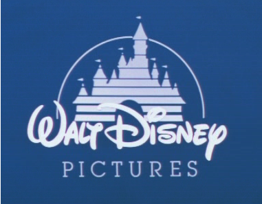
Besides the deeper blue, the "oldest logo" also has a white castle, where as in the other logo it had white signature, pale blue castle, and powdery blue background. Also note that the shooting star trail on the oldest logo descends below the "W" of "Walt", whereas in the newer logo, the trail cuts just above the "W".
This logo (navy blue) is visible on the DVD of the Black Cauldron. It has the original theatrical version.
If the other blue logo is used for Mermaid, I think I'll be satisfied, as there isn't much difference between the two really; but I still prefer the navy blue one in any case.
This logo (navy blue) is visible on the DVD of the Black Cauldron. It has the original theatrical version.
If the other blue logo is used for Mermaid, I think I'll be satisfied, as there isn't much difference between the two really; but I still prefer the navy blue one in any case.
-
Jules
- Diamond Edition
- Posts: 4639
- Joined: Sun Mar 12, 2006 9:20 am
- Gender: Male
- Location: Malta, Europe
- Contact:
Right. I'm getting weirded out with these logos! Just look at this:
This is the logo that starts before Aladdin, on my "Aladdin 2-Disc Special Edition - Region 2":
"That's the newer powder blue logo." you might think, and I agree. The castle is pale blue, and the shooting star trails end on top of the "W". However, I'm not quite sure whether this is Aladdin's original theatrical logo. I'm thinking that Aladdin might have had Mermaid's older logo, but since it was intended for Imax (although it never made it), it might have had its logo changed (like the Lion King, although that one had the orange one) to the "newer" blue one, and it retained that one for the DVD.
Anyway, that is beside the point...the fact is that on the DVD, Aladdin has the "newer" blue logo.
Now, this the logo for the Black Cauldron, taken from my "The Black Cauldron Gold Classic Collection - Region 1"
AAAARGH! That's the old logo alright. The castle is white and the shooting star trails end below the "W". But the colour of the background is almost the same as that of the Aladdin logo! It's just a teeny weeny little bit duller. If this is navy blue, then Aladdin's logo's background should be more saturated and lighter in colour!
Um... it should look something like this:
No, I didn't tweak the same image of Aladdin's logo with Photoshop. The logo you see above is taken from the Region 1 DVD of "The Hunchback of Notre Dame"
Why all these variations!?
P.S. I also have the older "navy blue" logo on my Region 2 copy of Fantasia. As far as I know, in Region 1, the film had no logo as it preserved the original Roadshow version, but in Region 2, the DVD has the print of the 1990 VHS. (So don't reply saying that Fantasia is not supposed to have a logo or anything like that... it does in Region 2 )
)
This is the logo that starts before Aladdin, on my "Aladdin 2-Disc Special Edition - Region 2":
"That's the newer powder blue logo." you might think, and I agree. The castle is pale blue, and the shooting star trails end on top of the "W". However, I'm not quite sure whether this is Aladdin's original theatrical logo. I'm thinking that Aladdin might have had Mermaid's older logo, but since it was intended for Imax (although it never made it), it might have had its logo changed (like the Lion King, although that one had the orange one) to the "newer" blue one, and it retained that one for the DVD.
Anyway, that is beside the point...the fact is that on the DVD, Aladdin has the "newer" blue logo.
Now, this the logo for the Black Cauldron, taken from my "The Black Cauldron Gold Classic Collection - Region 1"
AAAARGH! That's the old logo alright. The castle is white and the shooting star trails end below the "W". But the colour of the background is almost the same as that of the Aladdin logo! It's just a teeny weeny little bit duller. If this is navy blue, then Aladdin's logo's background should be more saturated and lighter in colour!
Um... it should look something like this:
No, I didn't tweak the same image of Aladdin's logo with Photoshop. The logo you see above is taken from the Region 1 DVD of "The Hunchback of Notre Dame"
Why all these variations!?
P.S. I also have the older "navy blue" logo on my Region 2 copy of Fantasia. As far as I know, in Region 1, the film had no logo as it preserved the original Roadshow version, but in Region 2, the DVD has the print of the 1990 VHS. (So don't reply saying that Fantasia is not supposed to have a logo or anything like that... it does in Region 2
-
Pluto Region1
- Special Edition
- Posts: 684
- Joined: Wed Oct 26, 2005 9:13 pm
- Location: Where Walt is Buried
Well now that you all know I missed these fine details between the 2 blue logos, I wouldn't listen to anything I have to say about what logo I saw with TLM.Julian Carter wrote:Besides the deeper blue, the "oldest logo" also has a white castle, where as in the other logo it had white signature, pale blue castle, and powdery blue background. Also note that the shooting star trail on the oldest logo descends below the "W" of "Walt", whereas in the newer logo, the trail cuts just above the "W".
(But I still think I saw the powder blue one)
I can understand a logo getting modified over the years, but why bother switching out the original logo that came with the film for another older version of the logo if you are re-releasing the original release? To me that would be more curious if that is what is happening. Makes no sense to go to a slightly newer version of the blue logo that didn't come with the film.
Pluto Region1, Disney fan in training
I think the bottom line here is that its still the classic logo. sure, its been refined over the years, but usually its for the better. I personally think the white logo looks dated now, and much prefer the powder blue logo.
as long as they didn't go and replace it with the 3d excessively long intro I'm good.
as long as they didn't go and replace it with the 3d excessively long intro I'm good.
-
Jules
- Diamond Edition
- Posts: 4639
- Joined: Sun Mar 12, 2006 9:20 am
- Gender: Male
- Location: Malta, Europe
- Contact:
By the way, there actually are even 2 different versions of the powder blue logo! 
The reflection of the shooting star on the castle of the "older" powder blue logo (though "newer" than the navy blue" logo) is edgy. On the "newer" powder blue logo, the reflection is soft.
So basically, we've had 5 Walt Disney Pictures logos:
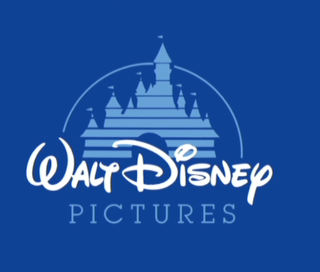
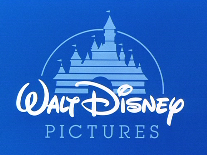
1) Oldest. White Castle and Signature and navy blue background. Shooting Star trails end below the "W". No shooting star reflection on the castle.
2) Powder blue background, pale blue castle and white signature. Shooting star trails end above the "W". Shooting star reflections on castle are hard-looking and edgy.
3) Powder blue background, pale blue castle and white signature. Shooting star trails end above the "W". Shooting star reflections on castle are soft and more refined than the previous version of the logo.
4) Black background, orange castle and signature. Animation doesn't start from the forming of the castle, the flashing Walt Disney signature etc., but from the shooting star, which travels more slowly than in previous logos. No musical score.
5) New CG logo. Slightly different castle on a night-time landscape. Silver Walt Disney signature. Shooting star trails appear but then disappear so that the final logo does not have any trails. "Pictures" font changed to something that closely resembles Times New Roman.
The reflection of the shooting star on the castle of the "older" powder blue logo (though "newer" than the navy blue" logo) is edgy. On the "newer" powder blue logo, the reflection is soft.
So basically, we've had 5 Walt Disney Pictures logos:
1) Oldest. White Castle and Signature and navy blue background. Shooting Star trails end below the "W". No shooting star reflection on the castle.
2) Powder blue background, pale blue castle and white signature. Shooting star trails end above the "W". Shooting star reflections on castle are hard-looking and edgy.
3) Powder blue background, pale blue castle and white signature. Shooting star trails end above the "W". Shooting star reflections on castle are soft and more refined than the previous version of the logo.
4) Black background, orange castle and signature. Animation doesn't start from the forming of the castle, the flashing Walt Disney signature etc., but from the shooting star, which travels more slowly than in previous logos. No musical score.
5) New CG logo. Slightly different castle on a night-time landscape. Silver Walt Disney signature. Shooting star trails appear but then disappear so that the final logo does not have any trails. "Pictures" font changed to something that closely resembles Times New Roman.
-
Disney Duster

- Ultimate Collector's Edition
- Posts: 14161
- Joined: Fri Jun 17, 2005 6:02 am
- Gender: Male
- Location: America
Too Many Logos!
I think that there are two reasons:Pluto Region1 wrote:I can understand a logo getting modified over the years, but why bother switching out the original logo that came with the film for another older version of the logo if you are re-releasing the original release? To me that would be more curious if that is what is happening. Makes no sense to go to a slightly newer version of the blue logo that didn't come with the film.
1) The new CGI animated logo would look out of place with a 2-D animated movie.
2) Disney wants to make all of their 2-D animated classics uniform.
Since you saw The Little Mermaid restored with the blue 2-D castle logo, it will probably be like that on the DVD, and so the only classic on DVD without that logo will be The Lion King, which has the orange one. So this way, just about all the 2-D animated classics will have the same, 2-D logo. So any variations on the logo would make them non-uniform. Why The Lion King has the orange one is a tad puzzling.

-
musicradio77

- Anniversary Edition
- Posts: 1642
- Joined: Sun Aug 28, 2005 9:35 pm
- Location: Brooklyn, NY USA
- Contact:
Thanks for these pics of the original logo that re-surfaced over the years. We have that in the photo section of the CLG (Closing Logo Group) from Yahoo! Groups.Julian Carter wrote:Right. I'm getting weirded out with these logos! Just look at this:
This is the logo that starts before Aladdin, on my "Aladdin 2-Disc Special Edition - Region 2":
"That's the newer powder blue logo." you might think, and I agree. The castle is pale blue, and the shooting star trails end on top of the "W". However, I'm not quite sure whether this is Aladdin's original theatrical logo. I'm thinking that Aladdin might have had Mermaid's older logo, but since it was intended for Imax (although it never made it), it might have had its logo changed (like the Lion King, although that one had the orange one) to the "newer" blue one, and it retained that one for the DVD.
Anyway, that is beside the point...the fact is that on the DVD, Aladdin has the "newer" blue logo.
Now, this the logo for the Black Cauldron, taken from my "The Black Cauldron Gold Classic Collection - Region 1"
AAAARGH! That's the old logo alright. The castle is white and the shooting star trails end below the "W". But the colour of the background is almost the same as that of the Aladdin logo! It's just a teeny weeny little bit duller. If this is navy blue, then Aladdin's logo's background should be more saturated and lighter in colour!
Um... it should look something like this:
No, I didn't tweak the same image of Aladdin's logo with Photoshop. The logo you see above is taken from the Region 1 DVD of "The Hunchback of Notre Dame"
Why all these variations!?
P.S. I also have the older "navy blue" logo on my Region 2 copy of Fantasia. As far as I know, in Region 1, the film had no logo as it preserved the original Roadshow version, but in Region 2, the DVD has the print of the 1990 VHS. (So don't reply saying that Fantasia is not supposed to have a logo or anything like that... it does in Region 2
-
musicradio77
- Anniversary Edition
- Posts: 1642
- Joined: Sun Aug 28, 2005 9:35 pm
- Location: Brooklyn, NY USA
- Contact:
Speaking of the logos, I have a few movies that had the old logo when it was originally powdered white with navy blue background are:
1. "Return to Oz"
2. "The Black Cauldron"
3. "Journey of Natty Gann"
4. "Return to Snowy River"
5. "Flight of the Navigator"
6. "Cinderella" (1987 reissue)
7. "Oliver & Company"
8. "Peter Pan" (1989 reissue)
9. "The Rescuers" (1989 reissue)
10. "101 Dalmatians" (1985 reissue)
11. "The Little Mermaid"
12. "Snow White" (1987 reissue)
13. "Song of the South" (1986 reissue) - The film was not released on VHS and DVD in the US, but elsewhere in other countries.
-
KubrickFan

- Anniversary Edition
- Posts: 1209
- Joined: Sun Sep 17, 2006 11:22 am
-
musicradio77
- Anniversary Edition
- Posts: 1642
- Joined: Sun Aug 28, 2005 9:35 pm
- Location: Brooklyn, NY USA
- Contact:
Julian Carter, I have a movie "Meet the Deedles" and it still has the old logo where it dessolves into the water. I have this screencap. As I mentioned before, the WPIX on-screen logo was shown at the bottom right of the screen. It had the old WB11 logo on it. I missed the WB after 11 years with the network. Now it's CW11. I have a bunch of Disney movies that I used to taped off of WPIX in my area for several years where it had the WB11 watermark on it. I do missed that logo so much. Here it is.

-
Jules
- Diamond Edition
- Posts: 4639
- Joined: Sun Mar 12, 2006 9:20 am
- Gender: Male
- Location: Malta, Europe
- Contact:
Musicradio77, that doesn't look like the old logo! I'm getting confused... On the screencap you posted, the castle is pale blue and the shooting star trails end above the "W" of "Walt Disney". That must be at least the second generation of the logo.musicradio77 wrote:
By the "old logo", do you mean the one with the navy blue background, white castle, and the one where the shooting star trails end below the "W"? In other words, the one used for "Black Cauldron"? If so, then the one you posted is not it, but a newer one.
I placed a request for that on the thread started by lighthousemike, but I think it's been accidentally overlooked. I also am dying to find out.Kyle wrote:hey, since some people have the little mermaid DVD, has it been answered which logo appears before the movie? I have no reason to think its anything other than the one that is most used these days, but Im sure there are people in here waiting to find out for sure.
-
musicradio77
- Anniversary Edition
- Posts: 1642
- Joined: Sun Aug 28, 2005 9:35 pm
- Location: Brooklyn, NY USA
- Contact:
That was the first one. The new CGI logo was from "Pirates 2" and "Invincible". The screencap of the later version of the logo was from "Meet the Deedles". It has the "TV-PG" rated on the upper left side and the WPIX on-screen logo on the bottom right was formerly the WB11 (now CW11) in New York City.Julian Carter wrote:Musicradio77, that doesn't look like the old logo! I'm getting confused... On the screencap you posted, the castle is pale blue and the shooting star trails end above the "W" of "Walt Disney". That must be at least the second generation of the logo.
By the "old logo", do you mean the one with the navy blue background, white castle, and the one where the shooting star trails end below the "W"? In other words, the one used for "Black Cauldron"? If so, then the one you posted is not it, but a newer one.
Lighthousemike got this newer and better version of the old logo. Check it out. It's for "The Little Mermaid" Platinum Edition DVD.Julian Carter wrote:I placed a request for that on the thread started by lighthousemike, but I think it's been accidentally overlooked. I also am dying to find out.

Last edited by musicradio77 on Tue Dec 05, 2006 6:58 pm, edited 1 time in total.
-
musicradio77
- Anniversary Edition
- Posts: 1642
- Joined: Sun Aug 28, 2005 9:35 pm
- Location: Brooklyn, NY USA
- Contact:
I bought the "The Little Mermaid" DVD today, I saw the Walt Disney Pictures old logo restored with the original 1985 logo music with a few bars of "When You Wish Upon a Star". That original logo jingle was brought back. I posted it on the Closing Logo Group board on Yahoo! Group about the original Walt Disney Pictures logo restored. The one thing I was wrong was the new logo used in both "Pirates 2" and "Invincible" does not belong there. The original logo is a perfect fit for TLM Platinum Edition. They did a great job restoring the retired old logo. I should give lighthousemike credit for posting the retired old logo for its PE release.
-
musicradio77
- Anniversary Edition
- Posts: 1642
- Joined: Sun Aug 28, 2005 9:35 pm
- Location: Brooklyn, NY USA
- Contact:
Oh wait! There's a DVD coming out today called "Pirates of the Caribbean: Dead Man's Chest", but it contains a much better and much cleaner version of the new logo. If anybody who bought the DVD which it has a better copy of the new logo which is a cleaner version. I hope YouTube would have a much cleaner version of the new logo soon or maybe a better pic of the new logo, but it suppose to be a bigger one. I hope this one would help.
And by the way. I used the Walt Disney Pictures old logo for my own podcast. I started my podcast back in October for the Disney and More Podcast. It has the Walt Disney Pictures logo jingle used for movies pre-Pirates 2. I love the old jingles used at the beginning of every podcast. That would be an appropriate selection for the show. Here is a link:
http://musicradio77.podomatic.com
You might see an old logo on the right which is me.
I saw the commercial for the DVD of the Direct to Video film "Fox and the Hound 2" which is next week. Did they still use the old logo for that? I got no clue, but "Santa Clause 3" still has the new logo.
Wait a minute! I forgot to tell you, Waltdisney123 had posted a link to a much crappier version of the new logo, that was awhile back, and guess what? I found this one on YouTube is a much better and much cleaner version of the new logo. Thanks to POTC: DMC, the movie which is already out on DVD today. Here is the link to this outstanding version.
http://www.youtube.com/watch?v=CIVSYhuuPU0
-
The Merman

- Gold Classic Collection
- Posts: 219
- Joined: Sat Sep 23, 2006 9:26 am
- Location: Belgium
There is an even beter version on the Walt Disney site.
http://disney.go.com/disneypictures/index.html
Just surf to that link and click Walt Disney pictures button below the video screen. It is the best version out there at the moment if ye ask me.
http://disney.go.com/disneypictures/index.html
Just surf to that link and click Walt Disney pictures button below the video screen. It is the best version out there at the moment if ye ask me.
