Sleeping Beauty Confirmed for DVD AND BLU-RAY in 2008 !!!
-
Beast_enchantment
- Special Edition
- Posts: 635
- Joined: Thu Dec 13, 2007 12:57 pm
- Location: The West Wing, UK
- Contact:
i disagree about snow white and bambi, but i see his point. i think he means when the covers are poorly designed, overly bright colours used and the charcters are off model - in other words a half-assed effort that doesnt do the movie any justice and is merely to appeal to younger audiences
<a href="http://photobucket.com" target="_blank"><img src="http://i109.photobucket.com/albums/n71/ ... nner-1.png" border="0" alt="Photobucket"></a>
Don't Call It a Comeback, I've Been Here For Years...
Don't Call It a Comeback, I've Been Here For Years...
-
Disney Duster

- Ultimate Collector's Edition
- Posts: 14176
- Joined: Fri Jun 17, 2005 6:02 am
- Gender: Male
- Location: America
Sleeping Blu-ray Covers!!!!
I can see how those covers can be viewed as kiddish, but I don't find them that way myself. But it seems to me almost any cover that's dark is considered more adult or classy than the bright ones. Like the Disney films don't have any bright colors...ha! That's part of the reason they are so beautiful!
Anyway, I just realized that these covers borrowed from the thetarical poster more than I thought. Aurora's incorrect white cuffs on her sleeves on the 1st cover come from the incorrect white cuffs on the poster! And the pink used isn't many shades away from the poster's dress color:
In fact, the 1st cover has the theatrical poster's arc of characters in reverse. The poster starts at the top with the castle and goes to Aurora, and the 1st cover starts with Aurora and leads to the castle! It's all interesting.
Two other complaints of mine is Aurora's collar should be tinted pink, it was never pure white but a very light shade of the dress color, and the spinning wheel's spindle's glow should be green, not blue.
Last edited by Disney Duster on Thu Jan 10, 2008 2:15 pm, edited 2 times in total.

-
Dottie
- Collector's Edition
- Posts: 2576
- Joined: Wed Aug 23, 2006 1:51 pm
- Location: The Pie-Hole
- Contact:
As most people here I love the third cover. It looks mature and not clip-art like, since the characters are on-model.
I also like the 5th one, because it has the shield. And I like Phillip kissing Aurora better then seeing her sleeping what makes those two covers just beautiful. The first one is absolutely ridiculous.
I also like the 5th one, because it has the shield. And I like Phillip kissing Aurora better then seeing her sleeping what makes those two covers just beautiful. The first one is absolutely ridiculous.

-
UmbrellaFish

- Signature Collection
- Posts: 5764
- Joined: Sun Jan 28, 2007 3:09 pm
- Gender: Male (He/Him)
They are classy, but I find them all pretty clustered. To tell the truth, they all have flaws. The third one was pretty good but I don't know if it was the best. They're better than nothing, though, and better than TLM for sure. Pretty sure the classy-er ones won't come to America.
Just thought, maybe the reason we are getting the darker colors is because since this will be the first DAC on Blu-Ray, they don't want mommies and daddies getting confused. You know what I mean?
Just thought, maybe the reason we are getting the darker colors is because since this will be the first DAC on Blu-Ray, they don't want mommies and daddies getting confused. You know what I mean?
-
Disney Villain

- Special Edition
- Posts: 607
- Joined: Wed Mar 03, 2004 7:37 pm
- Location: Windermere, FL
The more and more I look at these covers, the more and more I truly believe that the Walt Disney Company reads every single word we write on this forum! Disney did exactly what we asked; they took a movie poster and re-drew it magically in one cover. Amazing. I really feel Disney reads the posts on this forum all the time. It’s amazing. Many of us wanted to see re-drawn movie posters, and lo and behold they deliver!
My analysis on the Covers:
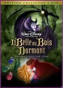
Cover 1:
- The concept behind it is a really cool one; let’s show the major point of the story on the cover (like some of us asked for in the past). From that concept you have an Aurora who is about to prick her finger. However the rest of the cover is a mess! If the characters were arranged better, I’d love it; however, everything is misplaced. Being a Graphic Design student if I wanted this to work I would put Maleficent lurking over Aurora as she is about to prick her finger. I would move Phillip and Samson to the lower left hand corner, looking up in shock as Maleficent leads Aurora to her doom. I’d then move the animals and other clipart to the lower right corner. That would make the cover so much better. I really like this cover, but it’s a mess.
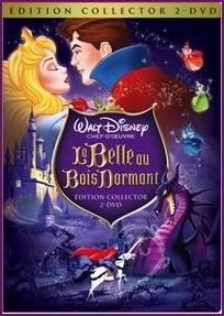
Cover 2:
- Now we’re getting somewhere. This is really nice. It is exactly what some of us asked for- a re-drawn movie poster. I really like this cover and its idea; however, it looks like clipart was just slapped on a purple background. Like the first cover it could be arranged better. Although that would miss the point of having a re-drawn movie poster. But kudos to Disney for listening to us! The more and more I look at this cover though, the more and more I really like it. But I love that new Clipart of Maleficent on the third cover so much more!
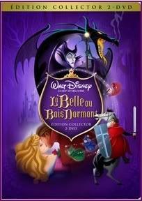
Cover 3:
- Wow, just wow. This cover is beautiful . I originally said in this thread that the cover should feature art of Maleficent transforming into the Dragon over the logo. Well that’s exactly what Disney did, and it’s beautiful!! In this cover all the characters are on model and the cover has some class. If the average Joe was walking down the DVD aisle this would catch their attention. Whoever drew Maleficent transforming into a Dragon should win a prize. Disney give the poor guy or gal a raise!!! They deserve it!! I also love how it borrows the “swooping motion” of Maleficent from the laserdisc. It’s truly magical. I would love to see the green smoke as purple smoke (I know that goes against the film, but I would like to see what it looks like.). I also miss the Shield Logo from the other covers; however I can see how that logo would not look right on that cover. Maybe some minor color changes, but that’s all. Disney please release the film with this cover and I’ll die happily. WOW, AMAZING, is all I can say for this cover.
Cover 4:
- Absolute and complete crap. I was devastated when I saw that clipart on the 2003 SE, I wanted to cry. If the film gets released with this cover Disney will be getting allot of nasty e-mail and phone calls from me. All the characters are off-model. When I saw this cover originally in 2003 I felt like Disney raped Sleeping Beauty. Please Disney you’ve released poor Princess Aurora’s film once with this horrific art, and then had the nerve to change her voice in Enchanted Tales and turn her into a blonde teenage idiot. Don’t disgust me again. The logo and background however is beautiful. I think this cover was a template for the artists to draw a real Sleeping Beauty PE cover. It had the new logo and new background to give them an idea of what to create.
Cover 5:
- This one is wonderful as well. It’s very classic Disney DVD style. I love the background and the characters, especially Maleficent. I do not like how Phillip is featured riding Samson. Remove Phillip and Samson. Center and make larger the image of Sleeping Aurora and Kissing Phillip. That would make the cover perfect! If this ended up as the actual cover I would not be disappointed.
Here is my suggestion to Disney… release a different cover for the DVD and Blu-Ray. Make Cover 3 the Blu-Ray cover and Cover 5 the DVD cover. Not many soccer moms have Blu-Ray so giving us collectors a more classy cover would be the way to go. Then by having Cover 5 on the DVD the kiddies and soccormoms will still have that classic Disney DVD feel. And Don’t worry I’ll be buying numerous copies of both the Blu-Ray disc and DVD.
-------------------------------------------------------------------------------------------------------------------------------
Disney Duster the book is from the Random House website. I last visited the website in July to see if they had any Enchanted Tales books, but they didn’t. Last week I checked the site and saw that all the Princess books had been updated. There was now an Enchanted Tales book listed, but as I scrolled down something caught my eye- the new Aurora cover. When I clicked on it, I got the info about the Sleeping Beauty book that was released in 2003, and can be found in many bookstores. They only difference was the cover- it now featured the art and logo from the upcoming Platinum Edition. My guess is that come October that same book from 2003 will be re-leased with the new cover to promote the PE, and when Random House was updating their site sometime between last July and now they posted the new cover art. I hope that makes sense, I tried to explain it as best as I could. Here is the link:
http://www.randomhouse.com/kids/disney/ ... 0736420983
While you’re there browse around, I just realized that there are new books for Bolt, 101 Dalmatians, Tinkerbell, and Wall-e (but no art is shown, except for 101 Dalmatians which features a new book cover, and the font from the PE, not the Logo shape)
-------------------------------------------------------------------------------------------------------------------------------
Thank you Disney Duster. You see I fell asleep with the film on and had a dream. That happens often; if I fall asleep listening to something I’ll dream about it. I’m glad my Princess Aurora is making her way up on your list, lol. Cinderella is my third favorite Animated Classic. First two being Sleeping Beauty and 101 Dalmatians. However I love them both equally and really can’t put one above the other. So you can say Cinderella is my second favorite Animated Classic followed by Snow White. Those are my top 3’s (or 4’s if you prefer). Recently (meaning past two years, or so) I have come to really like Cinderella. I don’t want to totally stray off-topic, but I just feel this connection with her. Whatever, I’m odd, I know, lol.
Thank you, once again Ariel’sPrince for your kind words. As I said I’d be happy to make you a nice Maleficent wallpaper, like those featured on my site. I’m glad when you dream of Disney your wishes come true, lol.
lol.
My analysis on the Covers:
Cover 1:
- The concept behind it is a really cool one; let’s show the major point of the story on the cover (like some of us asked for in the past). From that concept you have an Aurora who is about to prick her finger. However the rest of the cover is a mess! If the characters were arranged better, I’d love it; however, everything is misplaced. Being a Graphic Design student if I wanted this to work I would put Maleficent lurking over Aurora as she is about to prick her finger. I would move Phillip and Samson to the lower left hand corner, looking up in shock as Maleficent leads Aurora to her doom. I’d then move the animals and other clipart to the lower right corner. That would make the cover so much better. I really like this cover, but it’s a mess.
Cover 2:
- Now we’re getting somewhere. This is really nice. It is exactly what some of us asked for- a re-drawn movie poster. I really like this cover and its idea; however, it looks like clipart was just slapped on a purple background. Like the first cover it could be arranged better. Although that would miss the point of having a re-drawn movie poster. But kudos to Disney for listening to us! The more and more I look at this cover though, the more and more I really like it. But I love that new Clipart of Maleficent on the third cover so much more!
Cover 3:
- Wow, just wow. This cover is beautiful . I originally said in this thread that the cover should feature art of Maleficent transforming into the Dragon over the logo. Well that’s exactly what Disney did, and it’s beautiful!! In this cover all the characters are on model and the cover has some class. If the average Joe was walking down the DVD aisle this would catch their attention. Whoever drew Maleficent transforming into a Dragon should win a prize. Disney give the poor guy or gal a raise!!! They deserve it!! I also love how it borrows the “swooping motion” of Maleficent from the laserdisc. It’s truly magical. I would love to see the green smoke as purple smoke (I know that goes against the film, but I would like to see what it looks like.). I also miss the Shield Logo from the other covers; however I can see how that logo would not look right on that cover. Maybe some minor color changes, but that’s all. Disney please release the film with this cover and I’ll die happily. WOW, AMAZING, is all I can say for this cover.
Cover 4:
- Absolute and complete crap. I was devastated when I saw that clipart on the 2003 SE, I wanted to cry. If the film gets released with this cover Disney will be getting allot of nasty e-mail and phone calls from me. All the characters are off-model. When I saw this cover originally in 2003 I felt like Disney raped Sleeping Beauty. Please Disney you’ve released poor Princess Aurora’s film once with this horrific art, and then had the nerve to change her voice in Enchanted Tales and turn her into a blonde teenage idiot. Don’t disgust me again. The logo and background however is beautiful. I think this cover was a template for the artists to draw a real Sleeping Beauty PE cover. It had the new logo and new background to give them an idea of what to create.
Cover 5:
- This one is wonderful as well. It’s very classic Disney DVD style. I love the background and the characters, especially Maleficent. I do not like how Phillip is featured riding Samson. Remove Phillip and Samson. Center and make larger the image of Sleeping Aurora and Kissing Phillip. That would make the cover perfect! If this ended up as the actual cover I would not be disappointed.
Here is my suggestion to Disney… release a different cover for the DVD and Blu-Ray. Make Cover 3 the Blu-Ray cover and Cover 5 the DVD cover. Not many soccer moms have Blu-Ray so giving us collectors a more classy cover would be the way to go. Then by having Cover 5 on the DVD the kiddies and soccormoms will still have that classic Disney DVD feel. And Don’t worry I’ll be buying numerous copies of both the Blu-Ray disc and DVD.
-------------------------------------------------------------------------------------------------------------------------------
Disney Duster the book is from the Random House website. I last visited the website in July to see if they had any Enchanted Tales books, but they didn’t. Last week I checked the site and saw that all the Princess books had been updated. There was now an Enchanted Tales book listed, but as I scrolled down something caught my eye- the new Aurora cover. When I clicked on it, I got the info about the Sleeping Beauty book that was released in 2003, and can be found in many bookstores. They only difference was the cover- it now featured the art and logo from the upcoming Platinum Edition. My guess is that come October that same book from 2003 will be re-leased with the new cover to promote the PE, and when Random House was updating their site sometime between last July and now they posted the new cover art. I hope that makes sense, I tried to explain it as best as I could. Here is the link:
http://www.randomhouse.com/kids/disney/ ... 0736420983
While you’re there browse around, I just realized that there are new books for Bolt, 101 Dalmatians, Tinkerbell, and Wall-e (but no art is shown, except for 101 Dalmatians which features a new book cover, and the font from the PE, not the Logo shape)
-------------------------------------------------------------------------------------------------------------------------------
Thank you Disney Duster. You see I fell asleep with the film on and had a dream. That happens often; if I fall asleep listening to something I’ll dream about it. I’m glad my Princess Aurora is making her way up on your list, lol. Cinderella is my third favorite Animated Classic. First two being Sleeping Beauty and 101 Dalmatians. However I love them both equally and really can’t put one above the other. So you can say Cinderella is my second favorite Animated Classic followed by Snow White. Those are my top 3’s (or 4’s if you prefer). Recently (meaning past two years, or so) I have come to really like Cinderella. I don’t want to totally stray off-topic, but I just feel this connection with her. Whatever, I’m odd, I know, lol.
Thank you, once again Ariel’sPrince for your kind words. As I said I’d be happy to make you a nice Maleficent wallpaper, like those featured on my site. I’m glad when you dream of Disney your wishes come true,
I just noticed that's not the finger she pricks on the movie! And it was interesting to see that this cover also has inspiration on the original poster.Cover 1:
- The concept behind it is a really cool one; let’s show the major point of the story on the cover (like some of us asked for in the past). From that concept you have an Aurora who is about to prick her finger. However the rest of the cover is a mess! If the characters were arranged better, I’d love it; however, everything is misplaced. Being a Graphic Design student if I wanted this to work I would put Maleficent lurking over Aurora as she is about to prick her finger. I would move Phillip and Samson to the lower left hand corner, looking up in shock as Maleficent leads Aurora to her doom. I’d then move the animals and other clipart to the lower right corner. That would make the cover so much better. I really like this cover, but it’s a mess.
Last edited by L&E on Wed Jan 09, 2008 11:09 pm, edited 1 time in total.
The Art of Sleeping Beauty is a blog dedicated to one of the most enchanting Disney Classics.
http://theartofsleepingbeauty.blogspot.com/
-
Ariel'sprince

- Platinum Edition
- Posts: 3244
- Joined: Mon Jan 29, 2007 6:07 am
- Location: beyond the meadows of joy and the valley of contentment
- Contact:
That's a wonderfull idea Disney Villain! it'll be perfact if they'll release Cover 5 for DVD and Cover 3 for Blu-Ray then we'll both have this cover and a classic cliparty cover.
Thanks again for making the wallpaper and you're wellcome i once had a few dreams that i went to a Disney Store and bought some Ariel,Giselle and Aurora stuff (maybe even something about TinkerBell) but i don't think that dream can come true  .
.
Thanks again for making the wallpaper and you're wellcome

-
KubrickFan

- Anniversary Edition
- Posts: 1209
- Joined: Sun Sep 17, 2006 11:22 am
-
Ariel'sprince
- Platinum Edition
- Posts: 3244
- Joined: Mon Jan 29, 2007 6:07 am
- Location: beyond the meadows of joy and the valley of contentment
- Contact:
-
Ariel'sprince
- Platinum Edition
- Posts: 3244
- Joined: Mon Jan 29, 2007 6:07 am
- Location: beyond the meadows of joy and the valley of contentment
- Contact:
Take a look at what i found,it's the book from Disney Villain's dream that he found in better quality:

It's beautifull,i"m making an avater from this.
I can't wait for the Platinum Edition (i"ll buy the DVD since i don't have Blue-Ray,i don't think that they even sell it around here (and PS3 isn't a good idea since it can ruine it)),i"m also sure that there will be a Sleeping Beauty DS game with the PE.
Does anyone remember that last year we found a pictures of Disney Princess:Enchanted Tales and Enchanted from a toys fair? so next mounth i think that it's this year's one and they'll pictures of the Sleeping Beauty PE marchandise.
It's beautifull,i"m making an avater from this
I can't wait for the Platinum Edition
Does anyone remember that last year we found a pictures of Disney Princess:Enchanted Tales and Enchanted from a toys fair? so next mounth i think that it's this year's one and they'll pictures of the Sleeping Beauty PE marchandise.
-
Aladdin from Agrabah
- Special Edition
- Posts: 831
- Joined: Wed Jun 15, 2005 1:10 pm
These are my favourite covers. But I think I'd choose the 1st one just because it has Aurora doing what the whole story is about : touching the spinning wheel. I don't care if the rest of the cover is a mess (if they choose this they'll fix, I suppose), I just want to have something new and diferrent to look at, not the same old stuff recycled in a more classy way. The second one is good too because it shows Aurora from a different angle. The third is really classy but boring.L&E wrote:


Anyway, I don't know but not all of them seem original to me. Some of them look like mock ups.
-
Mickeyfan1990
- Collector's Edition
- Posts: 2562
- Joined: Sat May 05, 2007 12:24 pm
-
Disney Duster
- Ultimate Collector's Edition
- Posts: 14176
- Joined: Fri Jun 17, 2005 6:02 am
- Gender: Male
- Location: America
Sleeping Blu-ray Covers!!!!
ESCAPAY I just capitalized your name to find it through all this, why is it that the pan & scan version of Sleeping Beauty shows more on the top and bottom? And then why wouldn't widescreen try to fill up as much space as it can by having the little bit of top and bottom pan & scan has? We all want as much picture a possible.
Disney Villain, it may be that Disney is doing things because of what we avid fans said on here, but I don't think you can expect Disney to change everything. They can't please everyone, though the most we ask for is things drawn and colored correctly, which we shouldn't need to ask for. But these are the French covers for the French voters, and it's up to them now. Maybe they'll listen to you still, but it is weird that these covers are for French voters and was found in a French forum if they were reading what we said on this English forum. Still, it's all very cool, especially the fact that you asked for Maleficent transforming above the title and that's exactly what we got... Hehe, it looks like they'll never listen to us about Aurora in blue, though! Your book cover is our only hope.
I like your idea to fix the 1st cover with Maleficent looming over Aurora, and I suppose it would make more sense to have Phillip in Maleficent's place, riding toward the castle. The only thing I'm not sure of is the animals in the lower right corner. That would break the cover into four sections, and I don't like that. I'd rather have it more like it is, with the characters sweeping from top right to lower middle (roughly).
I love the 2nd cover to death, and I feel the characters are indeed floating around, but not slapped on, just...magically floating! It also follows a sweeping arc, as does the 5th one, my favorite. I think purple smoke on the 3rd one could ruin what they were going for, which was to make a background that looks like one from the film, color and all. Then again, attempts to make it feel like the film is slightly stopped with the absence of the correct yellow on the dragon or the correct blue on Aurora.
Now, I definately don't like having the 5th cover lose Phillip on Samson to make way for a bigger Phillip on Aurora (hehe!). No wonder you want that, it makes it look even more similar to the 3rd one, just with a purple background! And then the covers won't really be different at all. I like the arc that sweeps from the transformation to the kiss, and perhaps the only problem with Phillip I have is that he's not facing forward, but I suppose he could be charging to battle the dragon instead of riding to rescue Aurora. The 5th cover's my favorite because it has the coolness we love from the 3rd with more story packed in, via Phillip riding, the woods in the background, and the forest of thorns around the bottom (look closely). Besides, Phillip is featured more and does more than Aurora in the movie. If you really have a problem with him being there twice, why not just remove him from the kissing scene? I wouldn't mind that (I think, I'd have to see it).
I don't mind having the 3rd cover for Blu-ray and the 5th for DVD, that's not a bad idea. I would probably buy both anyway! You never know what's gonna happen to Blu-ray...
Thank you for telling me about the book! I suspected it was a Read-Aloud-Storybook, the little gold bar at the bottom is on all the Read-Aloud-Storybooks. Your explanation made perfect sense, and in fact I have noticed Disney re-releases the same books with new covers (sort of what they do with DVDs...). I've bought Disney books just for the new cover before, I may with this one, too (but I wish Disney would put new art on the inside, too)! The cover's obviously beautiful, but I don't like the composition. Ah well, it's just the book! But something scares, me, something that I suspected for a long time - Flora's gold colors are pink! It's clear on the large book cover, and I'm wondering about it for the DVD covers! They do that all the time. The only way they could get away with it woud be if it's dark enough on the cover, because in the dark, Flora's gold does turn light pink...kinda. I'm still not satisfied with that, though.
I'm happy about everything you said about Cinderella. Now, I am very happy and excited for the covers Sleeping Beauty has, but I must say this makes me really excited for what Cinderella's cover(s I hope!) will look like! But I'm not expecting Disney to have voters decide the covers all the time, and we did get to see Cinderella's multiple covers for the Platinum, but I'm greedy. Since Sleeping Beauty is the first movie people care about for Blu-ray oops I mean Platinum Edition animated classic for Blu-ray, maybe they are just doing the voting for this special one, and the cover chosen will choose the way the rest of the PE Blu-ray covers look. That sounds about right if Disney wants the covers to look uniform, but I will still hope and dream!
Ariel'sprince, aw sorry about your merchandise wishes unfulfilled, maybe someday, when you're older and can travel! Anyway, I wanted to tell you I do like your avatar and signature, except I think the avatar should keep Phillip out of it and focus all on Aurora (if you can).
AladdinfromAgrabah, I agree that I would like to see something new and different, but with the title of the film Sleeping Beauty, I think it's okay having her sleep all the time. Still, it'd be nice to have one of her performing one of her few actions. Hehe, I liked how you said the covers are mostly old art in a classy way, how true. I also noticed and liked the different angle of Aurora sleeping. And if you meant these look like mock ups because they look unfinished or quickly put together, I see that and think the chosen cover will be "fixed".
KubrickFan and Mickeyfan1990,
Last edited by Disney Duster on Thu Jan 10, 2008 6:01 pm, edited 2 times in total.
-
Escapay

- Ultimate Collector's Edition
- Posts: 12562
- Joined: Tue Jan 27, 2004 5:02 pm
- Location: Somewhere in Time and Space
- Contact:
Re: Sleeping Blu-ray Covers!!!!
It's likely that the VHS is a P&S from the 2.25:1 OAR, while the DVD is mistakenly overmatted to 2.35:1. (Anders offered a better - and more accurate - explanation of Technirama).Disney Duster wrote:ESCAPAY I just capitalized your name to find it through all this, why is it that the pan & scan version of Sleeping Beauty shows more on the top and bottom? And then why wouldn't widescreen try to fill up as much space as it can by having the little bit of top and bottom pan & scan has? We all want as much picture a possible.
Anyway, from the covers, I really like the third (maybe because it's the "darkest" in terms of composition and placement), but the first just looks so abysmal, ugly, and just plain WRONG.
Scaps
WIST #60:
AwallaceUNC: Would you prefer Substi-Blu-tiary Locomotion?
WIST #61:
TheSequelOfDisney: Damn, did Lin-Manuel Miranda go and murder all your families?
AwallaceUNC: Would you prefer Substi-Blu-tiary Locomotion?
WIST #61:
TheSequelOfDisney: Damn, did Lin-Manuel Miranda go and murder all your families?
-
Ariel'sprince
- Platinum Edition
- Posts: 3244
- Joined: Mon Jan 29, 2007 6:07 am
- Location: beyond the meadows of joy and the valley of contentment
- Contact:
Re: Sleeping Blu-ray Covers!!!!
It's allright,thanks for caringDisney Duster wrote:Ariel'sprince, aw sorry about your merchandise wishes unfulfilled, maybe someday, when you're older and can travel! Anyway, I wanted to tell you I do like your avatar and signature, except I think the avatar should keep Phillip out of it and focus all on Aurora (if you can).
About the avater and siggy-thanks
Edit:okay,i tried but i can't delete without messing up the background,should i leave it that way or make a new one? how about this one?:

So the covers are only for Franch? then i guess that the final US cover will be cover 5 or 2
-
Kram Nebuer

- Anniversary Edition
- Posts: 1992
- Joined: Fri Jan 02, 2004 2:03 pm
- Location: Happiest Place on Earth :)
- Contact:
Escapay just showed me these last night, so here are my comments:
The first one is weird. Really really weird...
I like the 2nd one if they removed Philip and Samson and got a better picture of Maleficent.
I would love the 3rd one if it didn't have the all of the smog in the background. It reminds me of pollution and global warming...not exactly something I wanted to be reminded of when I go to grab this movie off the shelf.
The layout of the 4th one is nice. I think it would look better if they had the pose from the 2nd cover since this one doesn't look like the characters or the style of the movie at all. I like that the castle is really clear on this cover. It looks a lot like the first DVD and is like a reminder of double dipping or could confuse people at stores if there's leftovers of the old edition and people are looking for the new edition (most likely will have a new Disney Channel pop star cover of "Once Upon a Dream")
My favorite is the 5th one. It would be great if it had the layout and size of the characters of the 3rd one and the purple background.
If we were betting on what the cover would actually be, I am guessing the 2nd one...
p.s. Was this PE and Cinderella PE the only time there were multiple covers that Disney let people vote on?

-
Vermin Friends
- Gold Classic Collection
- Posts: 458
- Joined: Thu Jan 10, 2008 12:53 am
- Location: Hawaii
- Contact:
While I was waiting for my account to be activated, I kept coming back to this page to see the covers. Honestly, I think all five of them look great, and I wouldn't mind getting either one of them. Whenever I think of Sleeping Beauty, I think purple- the same purple that covers 2, 4, and 5 have. Definitely good job there. If I can't have purple, I'd like to see the rich and sinister green color that Maleficent uses when she turns into a dragon. Cover 3 is close to that... but a little too weak. I want that thick green.
I think I'll review them all one by one, as Disney Villian did.
Cover 1: I love the new art, and it's really refreshing to see Aurora doing something other than sleeping. However, that's just the point... she's supposed to be the sleeping beauty. Still, seeing that new drawing of her pricking her finger looks brilliant. Unfortunately, I don't really like the rest. To me, Maleficent was one of (if not) the greatest Disney Villain(s) to... be animated. So they squish her in the corner, where she looks so innocent and very pale...
Also, Phillip looks like he's trying to do some kind of a "sneak attack" on Aurora! Or, trying to swat the fairies away like they're flies or something. Don't really like the forest friends being such a big part of the cover, either.
Cover 2: As most of you pointed out, it is very reminiscent of the original movie poster, except more accurate colors are used. I like the forest and castle backgrounds, and as I said earlier, I love the purple. Maleficent's looks a lot more like a villain, especially with the dragon right in back of her. However, the dragon looks more like a pet... again with the forest friends, lol Although I love how the spinning wheel just sits there.
Cover 3: I love the simplicity of this one. It's not crowded with Phillip and his horse, no forest friends, no emblem, just the text. Very clean, and I like that. I think this is the best version for any fan of Maleficent. I love how it looks like (as some have already mentioned) she's turning into the dragon. And in this case, it doesn't look like a pet.
Love the clouds, too- very mystic, in my opinion. The castle works well, too. Everything looks great, and I wouldn't mind buying this one. However, as I said early, the green looks a little weak. Very sinister, but not the kind of powerful green I envision when I think of Maleficent.
Cover 4: It reminds me of the art for the first release, on VHS... not my favorite. I love the fairies, though. They look very nice. I also love how they depict the climax of the film, with the final battle with Maleficent... however, there's no Maleficent, just the dragon.
Cover 5: This one is nice, taking my favorite parts of covers 1-3 and turning it into one, that's awesome. However... there's two Phillips, and only one Aurora. Still, it looks great!
They all look great in their own way, so major props to whoever designed the covers. Nice job (guys)!
I think I'll review them all one by one, as Disney Villian did.
Cover 1: I love the new art, and it's really refreshing to see Aurora doing something other than sleeping. However, that's just the point... she's supposed to be the sleeping beauty. Still, seeing that new drawing of her pricking her finger looks brilliant. Unfortunately, I don't really like the rest. To me, Maleficent was one of (if not) the greatest Disney Villain(s) to... be animated. So they squish her in the corner, where she looks so innocent and very pale...
Also, Phillip looks like he's trying to do some kind of a "sneak attack" on Aurora! Or, trying to swat the fairies away like they're flies or something. Don't really like the forest friends being such a big part of the cover, either.
Cover 2: As most of you pointed out, it is very reminiscent of the original movie poster, except more accurate colors are used. I like the forest and castle backgrounds, and as I said earlier, I love the purple. Maleficent's looks a lot more like a villain, especially with the dragon right in back of her. However, the dragon looks more like a pet... again with the forest friends, lol Although I love how the spinning wheel just sits there.
Cover 3: I love the simplicity of this one. It's not crowded with Phillip and his horse, no forest friends, no emblem, just the text. Very clean, and I like that. I think this is the best version for any fan of Maleficent. I love how it looks like (as some have already mentioned) she's turning into the dragon. And in this case, it doesn't look like a pet.
Love the clouds, too- very mystic, in my opinion. The castle works well, too. Everything looks great, and I wouldn't mind buying this one. However, as I said early, the green looks a little weak. Very sinister, but not the kind of powerful green I envision when I think of Maleficent.
Cover 4: It reminds me of the art for the first release, on VHS... not my favorite. I love the fairies, though. They look very nice. I also love how they depict the climax of the film, with the final battle with Maleficent... however, there's no Maleficent, just the dragon.
Cover 5: This one is nice, taking my favorite parts of covers 1-3 and turning it into one, that's awesome. However... there's two Phillips, and only one Aurora.
They all look great in their own way, so major props to whoever designed the covers. Nice job (guys)!
-
Disney 181

- Gold Classic Collection
- Posts: 499
- Joined: Wed Feb 11, 2004 3:21 pm
I think Disney would be wise to pay attention to these sort of forums, cause we're sort of the main consumers. I would be pleased to have any of those covers! They had a similar attempt with the Cinderella cover (they leaked 5 previews and chose 1 later on). I found the SB ones were all nice but I liked these two the most.L&E wrote:

Thanks for posting these!


