cool!
thank you!
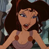
Frog Princess found & renamed!
-
supertalies
- Special Edition
- Posts: 931
- Joined: Mon Jan 01, 2007 6:11 am
- Location: The Netherlands


I say...We should wait to see how Tiana looks in motion before we jump to conclusions.
Its true that Tiana does look more refined, but there's a difference between "looking" good and animating fantastically, as Tiana may be hard to watch thanks to God-awful animation.
If I'm not mistaken, some people weren't too hot for the Enchanted characters back when they were first unveiled, saying they were generic and looked too much like the classic Disney characters, and now the film is praised for its brief moments of animation.


a good design is good even when not in motion. the only way it wouldn't look good in a still is if it was a rushed inbetween (which clearly it is not, as its a promo pic). this is a key frame pose, so it accurately represents the design. the other one was more specific. you shouldn't need the character to move to be able to get an idea of their personality if designed right.
I still say the concept for the characters in Enchanted were really good, but when they got animated it kind of fell apart, design wise(I kinda blame that on just how rushed the animators were). the animation itself was good but that's not what I'm judging about the Frog Princess.
just to be clear I don't think its bad, just more bland than the older design. it would have animated better too because the newer design looks to be more difficult to draw. the older one looks more cartoony, and more expressive in turn. the facial features are larger, meaning her emotions would have read more clearly.
I myself am really digging the pimped up dresssotiris2006 wrote:@Vermin Friends: You are very welcome
@Ariel'sprince: My turn to say a big thanks for finding a close up pic of the new Tiana
Comparison (close up):
The first picture is the new character design and the second one is of the previous design of Tiana.
To be honest, i prefer the old one better...
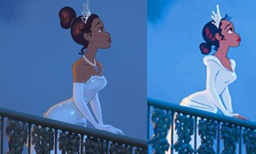
Face is much clearer now, I still think she looks like a Southern Belle
ripp-off, design looks great though!
When it comes to brains, I got the lion-share,
but when it comes to bruth strength, I'm afraid I'm at the shallow end of the gene pool

but when it comes to bruth strength, I'm afraid I'm at the shallow end of the gene pool
I disagree with you here.Kyle wrote:just to be clear I don't think its bad, just more bland than the older design. it would have animated better too because the newer design looks to be more difficult to draw. the older one looks more cartoony, and more expressive in turn. the facial features are larger, meaning her emotions would have read more clearly.
The older design is more bland. More cartoony, childish, so less expressive and real.
If I look at the 2 pictures, the old design doesn't give me any feeling at all. Just a cartoony pic. The new design pulls me into the story, makes me feel for her, makes me excited about what she's going through and the situation she's in.
The new design is also more in the style of Snowwhite, Belle and Jasmine. I don't see why it should be too difficult.
The old design is more "Betty Boop" like. Huge lips that are touching her nose. Big forehead. Not exactly what you'd expect from a Disney animated classic. She actually looks like a monkey there.
It's good to see some decent comment for a changeKyle wrote:a good design is good even when not in motion. the only way it wouldn't look good in a still is if it was a rushed inbetween (which clearly it is not, as its a promo pic). this is a key frame pose, so it accurately represents the design. the other one was more specific. you shouldn't need the character to move to be able to get an idea of their personality if designed right.
I still say the concept for the characters in Enchanted were really good, but when they got animated it kind of fell apart, design wise(I kinda blame that on just how rushed the animators were). the animation itself was good but that's not what I'm judging about the Frog Princess.
just to be clear I don't think its bad, just more bland than the older design. it would have animated better too because the newer design looks to be more difficult to draw. the older one looks more cartoony, and more expressive in turn. the facial features are larger, meaning her emotions would have read more clearly.
When it comes to brains, I got the lion-share,
but when it comes to bruth strength, I'm afraid I'm at the shallow end of the gene pool
but when it comes to bruth strength, I'm afraid I'm at the shallow end of the gene pool
(quote)
The older design is more bland. More cartoony, childish
The old design is more "Betty Boop" like.
Huge lips that are touching her nose. Big forehead. Not exactly what you'd expect from a Disney animated classic. She actually looks like a monkey there.[/quote]
Enough with the compliments already
The older design is more bland. More cartoony, childish
The old design is more "Betty Boop" like.
Huge lips that are touching her nose. Big forehead. Not exactly what you'd expect from a Disney animated classic. She actually looks like a monkey there.[/quote]
Enough with the compliments already
When it comes to brains, I got the lion-share,
but when it comes to bruth strength, I'm afraid I'm at the shallow end of the gene pool
but when it comes to bruth strength, I'm afraid I'm at the shallow end of the gene pool

I may be incredibly stupid, but I can see no difference in the designs for the most part.Marky_198 wrote:The older design is more bland. More cartoony, childish, so less expressive and real.
If I look at the 2 pictures, the old design doesn't give me any feeling at all. Just a cartoony pic. The new design pulls me into the story, makes me feel for her, makes me excited about what she's going through and the situation she's in.
The new design is also more in the style of Snowwhite, Belle and Jasmine. I don't see why it should be too difficult.
The old design is more "Betty Boop" like. Huge lips that are touching her nose. Big forehead. Not exactly what you'd expect from a Disney animated classic. She actually looks like a monkey there.
Obviously the first design is not as "polished" as the later design but I doubt either is a capture from a finished film frame. The first is clearly developed concept art, and the second is most likely - although more refined - simply a publicity shot.
Are we going to pull out our Snow White DVDs and critisise the concept art in the galleries as being too colourful, not as detailed or too childish?
Most of the differences can be attributed to the later shot simply being more refined, having thinner lines and some animation "effects" applied. Presumably the artists have done this as its going out to the media to represent the finished film, rather than the other shot where I expect it was clearly labeled as a work in progress.
Yes, the hair is different (for the record I perfer the 1st because it actually looks more 1920s) and the dress is different (ditto - for the same reason). If you're making a film in the 1920's make it look like the 1920's not the 21st century.
Oh and the new design has a stupidly thin neck.
An no, neither design looks like a monkey.
Most of my Blu-ray collection some of my UK discs aren't on their database
-
Ariel'sprince

- Platinum Edition
- Posts: 3244
- Joined: Mon Jan 29, 2007 6:07 am
- Location: beyond the meadows of joy and the valley of contentment
- Contact:
Agree,and again I think the new desgin is better.Marky_198 wrote:I disagree with you here.Kyle wrote:just to be clear I don't think its bad, just more bland than the older design. it would have animated better too because the newer design looks to be more difficult to draw. the older one looks more cartoony, and more expressive in turn. the facial features are larger, meaning her emotions would have read more clearly.
The older design is more bland. More cartoony, childish, so less expressive and real.
If I look at the 2 pictures, the old design doesn't give me any feeling at all. Just a cartoony pic. The new design pulls me into the story, makes me feel for her, makes me excited about what she's going through and the situation she's in.
The new design is also more in the style of Snowwhite, Belle and Jasmine. I don't see why it should be too difficult.
The old design is more "Betty Boop" like. Huge lips that are touching her nose. Big forehead. Not exactly what you'd expect from a Disney animated classic. She actually looks like a monkey there.
Thanks for the storyboard animation and concept art,Vermin Friends

Yes, God forbid a cartoon look cartoony. you seem to think cartoony means "badly drawn" which it does not. if your going to use animation it would be nice to actually take advantage of the medium a bit by exaggerating the design a bit more to set it apart from the rest. take nani from Lilo and Stitch for example. I know she's no princess but she had a more unique style. the fact that Tiana resembles other Disney princesses is exactly what being bland means. she seems like a black version of Cinderella now to me.Marky_198 wrote:The older design is more bland. More cartoony, childish, so less expressive and real.
If I look at the 2 pictures, the old design doesn't give me any feeling at all. Just a cartoony pic. The new design pulls me into the story, makes me feel for her, makes me excited about what she's going through and the situation she's in.
The new design is also more in the style of Snowwhite, Belle and Jasmine. I don't see why it should be too difficult.
The old design is more "Betty Boop" like. Huge lips that are touching her nose. Big forehead. Not exactly what you'd expect from a Disney animated classic. She actually looks like a monkey there.
but I know we wont see eye to eye on this.
It's animation anyway, so even in the new concept things are cartoony and exaggerated.
But with a story like this, it's necessary that the audiences can feel for the character.
And I feel that it works better with a more realistic look.
I don't think Snowwhite or The Little Mermaid would have been as successful if they had used such a Betty Boop design. It might work for Lilo and Stitch and the cows in Home on the Range, but not for this.
Last edited by Marky_198 on Mon Apr 21, 2008 10:43 am, edited 1 time in total.
-
yukitora
- Special Edition
- Posts: 947
- Joined: Fri Apr 11, 2008 10:01 am
- Location: at home apparently
- Contact:
The two pictures give completely different messages to me. The older one seems as if she's looking for something better, whilst the new one is simply solemn. It's amazing how such subtle differences can do that! Either way, it's hard to judge which one is better because we don't know which emotion they are going for in the scene
either way, Ariel and Belle sure had huge cartoony eyes, and it worked well. I much prefer that to Snow Whites eyes (that were NEVER open), or Cinderella, who was so realistic she lost her nose....
either way, Ariel and Belle sure had huge cartoony eyes, and it worked well. I much prefer that to Snow Whites eyes (that were NEVER open), or Cinderella, who was so realistic she lost her nose....
-
bluemoon86
- Gold Classic Collection
- Posts: 102
- Joined: Sun Nov 28, 2004 4:13 pm


-
Ariel'sprince
- Platinum Edition
- Posts: 3244
- Joined: Mon Jan 29, 2007 6:07 am
- Location: beyond the meadows of joy and the valley of contentment
- Contact: