Disneykid, that Enchanted poster also looks just like the Snow White one you posted, probably intentional, as Enchanted is so like Snow White, and Peter in that poster you posted looks almost real! I have always liked that one. And of course most of all that 2005 Cinderella one. I thought that image was taken from when Cinderella span around in the film saying "A wonderful dream come true", but it seems to be an original, non-copied pose. So yes, accolades to that artist for being perfectly on-model!
Here's some of my favorites. They are listed in chronological order, and
within that,
roughly, the order of favorite to most favorite:
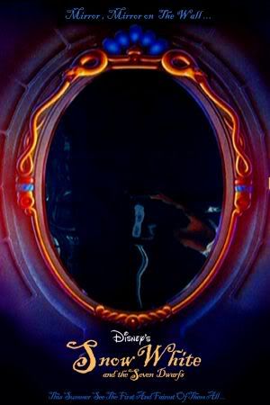
Who would think my favorite Snow White poster would be one of just the mirror? I think I had this one, and the mirror actually was foil that worked as a mirror! But it didn't work very well, lol. But still, between this one and the one
Disneykid posted of Snow White in the field with the queen looming above her, which I also had in my room, either that one or this one is my favorite, and it may just be this one even if the field one is a better one:
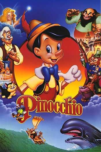
I think this is my favorite Pinocchio poster aside from the one where the Blue Fairy sheds a ray of light from above in the clouds on the title character looking all sheepish, posted somewhere else in this thread. I saw this poster in a store when I was little, and asked for it. But even though I liked it so much, I was scared of Monstro in it, being in my room!
Now my favorites of the Cinderella posters! This next one is good except for the Prince's pants colors need to be more accurate, and I wish they re-drew him and Cindy a little bit (instead of just re-drawing her facial expression) because I'm confused as to whether she's gasping that she has to leave (as the scene it's taken from) or amazed at the castle, magic, gown, prince, and everything else happening to her. Still, I like it for the idea and visuals.
If only this one changed the composition, and re-drew the bottom parts to be on-model with the film, it could be near my most favorite, because the very idea, and visuals, are fantastic:

This next one I am not sure if it is a theatrical poster as it says "La Bal Royal" before it, but I love it for everything else, the idea, the right colors, the fitting Frenchness, the beauty...!

This next one if from that wonderful period for entertainment, and the decade I was born in, the 80's, and they made an almost perfect poster (just need to fix the on model-ness, and the castle). I love this one. And it has so many stunning, fantastic ideas and execution, it almost takes the cake.
But even though I can't really say these last two posters are better than that one, and it's very hard to say which of that one and these is my favorite, I am just so amazed at these last two and love them so much, if I must, I have to say I like these the most. What an excellent idea to have the castle and steps lead all the way down the poster to the coach. I can't even believe they did it, it's one of the ideas I would do (it's even similar to ideas I came up with). One of the many things I love is what they did with the clouds covering the castle, made out of the white of the poster. The only thing wrong is the Prince being where he is, he should be on the steps, the extra footman needs to be removed, and the coachmen's uniform colors are wrong.

I like this next poster even better than that one. This one makes the great concept turn into something even more amazing and beautiful. The only sad thing is the coach isn't the right color, but it could just be turning back into the pumpkin, which, if it was the intention, I think I like even better, and so is in a way perfect, bar the wrong colors of the coachmen's uniforms again!

I hope you liked that one! Now, my favorites of Sleeping Beauty's. This poster is pretty great and beautiful, but I do have some small problems with it, mainly that I don't like seeing Phillip twice. The funny thing is I usually don't have a problem with seeing a character more than once on the poster...if it looks like they're in a different scene. But the way this poster does the two Phillips, it looks like they're in the same scene, on the same happy cloud! I am not sure what to do to fix it, whether to make it look more like a different scene with purple smoke/sky, or have Aurora and Phillip more in the middle and two different scenes on their sides, or what. Also, I can't decide if I'm okay with Aurora's headband being in a scene it was never in, but I kind of like that, too.
These next posters are so close, it's very, very hard to put them in an order of favorites, but if I must, I think this one comes next. If this just had the correct colors and was done in a more air-brushed, beautifully colored way (like the usual Disney covers and last few posters I show), it could very well be my actual most favorite for Sleeping Beauty. Two words: HELL YEA!

This one is so weird. Seriously, I find it almost bizarre they did this one. But it is so great that they did it and so cool, it took some balls to make a poster as scary as flaming Maleficent angrily looming over the sleeping princess. With her and the orange sun setting (or moon rising?) behind the castle, it also feels like Halloween, and very eerie.

This next one is a lot like that one, but everything is better and more awesome. The shaded coloring, the choice of images, but mainly, Maleficent looming over the princess and over everything, in the sky. The only problem is I'm not sure Phillip going through the thorns looks the best. If only it look more like he and the thorns were on the ground/ in some cloudy fog in the sky. The whole thing reminds me of outer space a little too much though, with the fairies looking like comets, the clouds above the castle looking like a far away galaxy, and Maleficent looking like a green alien, lol.
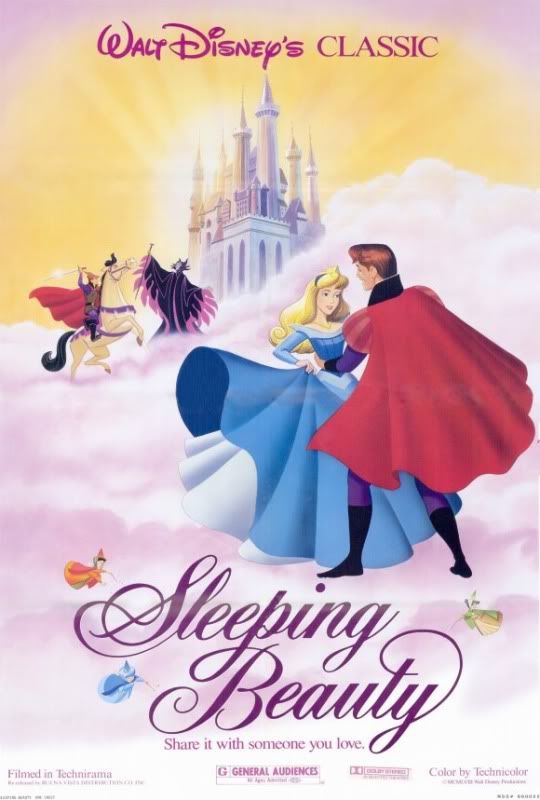
This next one, I can't even believe they did. It's so amazing, perfect, and the kind of thing I would dream of drawing. They have both castles, on opposite sides, they have so much of what happens in the film, with all the excitement and drama. Damn this one's great. The only thing is it needs better, air-brushed coloring.

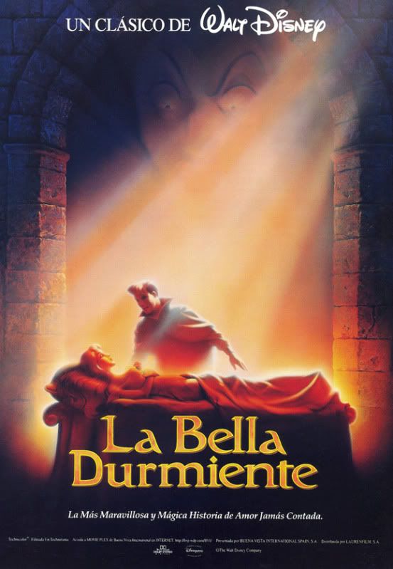
Now, what is without a doubt my favorite. One of the few posters to, I feel, get the meaning of the film across, as well as look absolutely, stunningly gorgeous. Hope and love overcoming even the most powerful evil and death. The sleeping princess. Her saving true love. The ray of hope. Maleficent's great power looming over them, just barely able to be seen, just like in other parts of the film, but partially eclipsed by the ray of good magic and love.
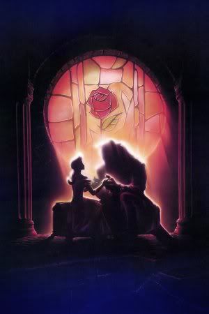
Finally we have Beauty and the Beast. Of all the posters for this film, I think this must be the best. It offers at least more than the one of them just dancing together. The only problem I have is that I wish you could see just a a little bit of them and their faces, and I wish that the architecture, costumes, and everything was more on-model to the film, but at least it still looks gorgeous.
The only thing is, I'm not sure if it's a theatrical poster or was only for home video covers. Does anyone know?

So that's it. Now, if you wanted to know my order for all the poster, least to most favorite, that's so hard. I'm guessing my top 4 would be the last two Sleeping Beauty posters, then the 80's Prince kissing Cinderella's hand poster, and then the second Cinderella going down the steps poster (with the orange coach).
Honorable mention:
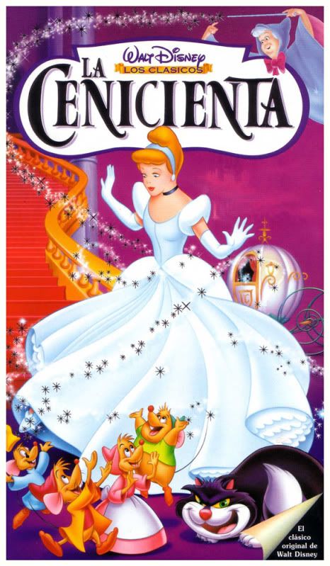
I love this poster, but it looks like an image I've seen for a home video cover of the film, so I don't think it counts as a theatrical poster. Also, it steals the Fairy Godmother from the 80's VHS cover. If this thing was fixed up, by having re-drawing of the Fairy Godmother, some magical disney dusted fading effect for her, and better and more accurate drawing and coloring of everything else, and Cinderella facing the other way, it might be my favorite poster, mainly because it's like Cinderella's transformation from the film, but everything else is also great. But as it is, it probably comes just before the 80's poster in my favorites.
This one I don't think is a theatrical poster, I've seen it on books and other places. But if it was a theatrical poster, and the image was flipped horizontally, it would be my absolute favorite.

SPECIAL TREAT:
For those that stuck with me this long, here's a version of that Beauty and the Beast poster without the title. If you find a bigger, better one, that's great, too, but this is all I could find!


