COVER ART (The Best & The Worst)

-
anger is pointless

- Special Edition
- Posts: 589
- Joined: Wed Feb 23, 2005 1:38 pm
- Location: texas
- Contact:
-
BambiFan87
- Gold Classic Collection
- Posts: 142
- Joined: Sun Sep 03, 2006 4:31 pm
- Location: Halifax, PA
- Contact:
wow I love those poster art for lion king and aladdin and that. those are very pretty and would be awesome as dvd art. at least for the gift sets and stuff. I think disney should really use the 1-disc and 2-disc releases at the same time have kiddie covers for the single discs and these awesome poster art for the 2 discers. that woudl awesome!
-
Escapay

- Ultimate Collector's Edition
- Posts: 12562
- Joined: Tue Jan 27, 2004 5:02 pm
- Location: Somewhere in Time and Space
- Contact:
That's because Disney started releasing different "press" pictures for those sites.Scamander wrote:
Atlantis CE- The font is so cheap
Examples: (real one on left, "press" one on right)


Maybe it's me, but I didn't read what he said as being rude, just as being informative and correcting...RebelPrince1986 wrote:i am sorry for saying animation instead of artwork, i didn't realize it was such a big deal, but i don't think it is necessary to be rude about it.
Yes, to each his own, but I don't think he was singling anyone out with his opinions.RebelPrince1986 wrote:and also the whole point of this thread is to see who likes and dislikes which covers. i don't have to like the same ones as you and you don't have to like the same ones as me.
Sometimes it's easier for people to list what they don't like about something than what they do like.RebelPrince1986 wrote:i couldn't help but notice that you had the most negative post on this entire thread... only posting the worst ones and picking them apart just like you picked apart the fact that i said "animation." maybe you should cheer up and not be so negative!!
Again, I don't think he was picking apart any one particular person's choice, perhaps you took it too personally...RebelPrince1986 wrote:maybe you should consider how the things you say will come across before you say them, this was just supposed to be a fun thread, nothing more, nothing less, i don't think you need to come pick apart what people say.
I could go and say that I hate every Disney cover out there and that anyone who likes them is an idiot, but I don't say that because obviously it's not true and obviously I actually enjoy some of Disney's cover art.
Anyways, to actually contribute to the subject at hand:
Best:
The Package Features Gold Collection - maybe because they're just...package features, but their cover art is so low-key and not in your face like others that it actually works for the movie. Plus, it'll probably be the last time we'll see character on-model in the cover art.
Lady and the Tramp Limited Issue - slightly better than the Platinum version, though it suffers from early cover art design of not having enough (while the Platinum has too much).
Robin Hood Gold Collection - It works because it's on model, but the MWE looks okay.
The Many Adventures of Winnie the Pooh 25AE - It's so fitting as it shows various scenes around a central picture of Pooh. Truly the many adventures...
Beauty and the Beast Platinum Edition - any region version of this cover art is just gorgeous. The R1 is way too similar to its Black Diamond VHS, but the dark night background helps make it work.
Aladdin and The Lion King Gift Sets - two versions of what Gift Sets should look like. Sadly, I don't have Aladdin's, and I don't care enough for The Lion King to get the gift set.
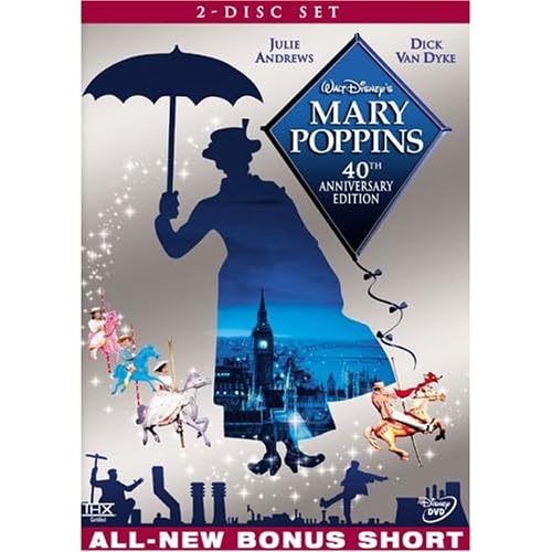
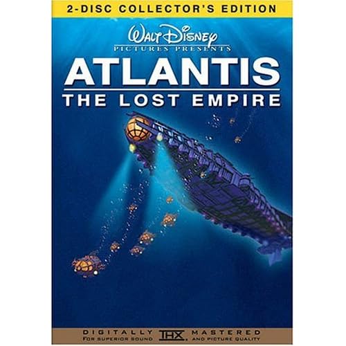
Tarzan/The Emperor's New Groove/Atlantis CE's - ahh...back when Disney KNEW how to make both good DVDs and good DVD Covers!
Tarzan NSSE - Hell, if it were the two-discs it should've been, I'd have bought it again even though I already own the CE. The cover for this is kickass.
Worst:
Snow White, Cinderella, Sleeping Beauty, Little Mermaid, and Pocahontas - all are just too cluttered and SB especially is too off-model to be taken seriously. Oddly, they're all princesses I don't care much for either (except Poca, cause she's cool).
Chicken Little - as much as Justin and I love the film, I just don't like the MIB ripoff/parody that they attempted. And the fact that 3-line Morkupine Porcupine got on the front cover while Abby Mallard didn't.
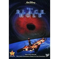
Also have to say that the most unimaginative cover I've seen yet for any Disney film has to be the one for The Black Hole. The movie's great (if you watch it to enjoy it, not watch it to criticize it), and the cover unfortunately is indicative of what people thought it to be: dull.
Escapay
WIST #60:
AwallaceUNC: Would you prefer Substi-Blu-tiary Locomotion?
WIST #61:
TheSequelOfDisney: Damn, did Lin-Manuel Miranda go and murder all your families?
AwallaceUNC: Would you prefer Substi-Blu-tiary Locomotion?
WIST #61:
TheSequelOfDisney: Damn, did Lin-Manuel Miranda go and murder all your families?
-
Jordan

- Gold Classic Collection
- Posts: 413
- Joined: Thu Sep 25, 2003 11:15 am
- Location: DisneyLand Paris
Umh... My pick for worse cover just changed second ago as I discovered on UD the one that will apparently be the one for the Peter Pan PE!! Yeurk, this one is horrible, I really hope they change it!
This make make SO glad to own the exclusive French 2 Disc Special Edition released a few years ago, with a gorgeous digipack artwork lol
And then, my second worse US cover is Aladdin, which is also horrible
This make make SO glad to own the exclusive French 2 Disc Special Edition released a few years ago, with a gorgeous digipack artwork lol
And then, my second worse US cover is Aladdin, which is also horrible
Chandler (to Phoebe, over the phone) : Listen, Joey isn't gonna be here tonight so why don't you come over and I'll let you uh.. feel my bicep; or maybe more...
Friends, 5.14 - The One Where Everybody Finds Out
Friends, 5.14 - The One Where Everybody Finds Out
-
PixarFan2006
- Signature Collection
- Posts: 6166
- Joined: Fri Jun 16, 2006 8:44 am
- Location: Michigan

Best:
Snow White and the Seven Dwafts PE. The color is wonderful, it is fairly simple but still really great.
The Lion King PE: Again the color is wonderful and it is simple and beautiful.
The Little Mermaid PE: Many people argue that the cover is too cluttered (which it is cluttered) but the animation (with the exception of Ursula who I think looks awful) looks really great. Also, it is very colorful and very visually appealing.
Bambi PE: The animation is very beautiful and it is simple and overall satisfying.
Beauty and the Beast PE: Belle and Beast look great, I especially love the glittery rose. The supporting characters look great too.
Sleeping Beauty SE: I think this might be one of the most beautiful covers of all. I think the top with Aurora and the Prince kissing looks great, and I think it is awesome that they have Maleficent as the dragon on the bottom, and the faries floating around the movie title.
Worst:
Aladdin PE: The concept is ok, but I think the animation looks awful.
Alice In Wonderland ME: I think this cover could have been a lot more creative and more visually appealing. It looks like it was just thrown together quickly.
Dumbo BTE: Again, I think it was just pretty boring and Dumbo is way too big. I think something much better could have been done here.
Signature courtesy of blackcauldron85!!
-
Beastboyravenz
- Special Edition
- Posts: 804
- Joined: Thu Oct 12, 2006 6:49 pm
- Location: Los Angeles, California
-
goofystitch
- Collector's Edition
- Posts: 2948
- Joined: Sun Jun 22, 2003 1:30 pm
- Location: Walt Disney World
It's hard for me to pick a best and worst, but I have to say one of the worst is deffinatley "Pollyanna." I just watched it and the cover art is so ugly.

I hate the way Haly Mills' face dissapears into the clouds and it's a weird picture of her. The bottom is boring with just Haly Mills pulling a wagon. They should have added at least Jimmy Bean, or better yet, found a way to incorporate Aunt Polly and Nancy into the cover. The highlight of the whole cover for me is the "Vault Disney" bannar. I wish they would make more of these DVDs, but this is deffinatley the worst cover art out of the line.
I think the most boring cover art for any Disney film is for "Melody Time."

It's just Donald and no other characters from one of the best of the package features. It also is false advertisement because Donald never appears in a conductors suit and never conducts anything in the film. It almost looks like Mickey's Phillarmagic: The Movie!
I hate the way Haly Mills' face dissapears into the clouds and it's a weird picture of her. The bottom is boring with just Haly Mills pulling a wagon. They should have added at least Jimmy Bean, or better yet, found a way to incorporate Aunt Polly and Nancy into the cover. The highlight of the whole cover for me is the "Vault Disney" bannar. I wish they would make more of these DVDs, but this is deffinatley the worst cover art out of the line.
I think the most boring cover art for any Disney film is for "Melody Time."
It's just Donald and no other characters from one of the best of the package features. It also is false advertisement because Donald never appears in a conductors suit and never conducts anything in the film. It almost looks like Mickey's Phillarmagic: The Movie!
-
DisneyFreak5282

- Anniversary Edition
- Posts: 1537
- Joined: Fri Oct 13, 2006 1:41 pm
- Location: U.S.A.
-
Dottie
- Collector's Edition
- Posts: 2576
- Joined: Wed Aug 23, 2006 1:51 pm
- Location: The Pie-Hole
- Contact:
Her teeth are so big!! She looks a bit "off model" although it's a photograph of hergoofystitch wrote:It's hard for me to pick a best and worst, but I have to say one of the worst is deffinatley "Pollyanna." I just watched it and the cover art is so ugly.
I hate the way Haly Mills' face dissapears into the clouds and it's a weird picture of her.

-
DisneyFreak5282
- Anniversary Edition
- Posts: 1537
- Joined: Fri Oct 13, 2006 1:41 pm
- Location: U.S.A.
DisneyFreak5282 wrote:Geez, you're right, what does she do other than acting? Chop wood?
Kudos to you for that one.
<img src="http://i53.tinypic.com/314xj87.jpg">
-
DisneyFreak5282
- Anniversary Edition
- Posts: 1537
- Joined: Fri Oct 13, 2006 1:41 pm
- Location: U.S.A.
-
disneylover2006
- Member
- Posts: 44
- Joined: Wed Aug 02, 2006 12:53 pm


