Comparing Home Releases Cover Arts
-
thedisneyspirit
- Anniversary Edition
- Posts: 1503
- Joined: Tue Feb 28, 2012 11:42 am
Re: Comparing Home Releases Cover Arts
Rapunzel and Moana are the only princesses I can recall that don't wear blue in any outfit of theirs. Of the non-princesses, Eilonwy, Jane, Esmeralda and Megara also don't wear blue (though Esmeralda has her corset). I'm not sure if it's a "thing" or so.
-
Disney Duster

- Ultimate Collector's Edition
- Posts: 14175
- Joined: Fri Jun 17, 2005 6:02 am
- Gender: Male
- Location: America
Re: Comparing Home Releases Cover Arts
Wow thedisneyspirit, yeah, only a few have no blue!
Oh yeah, the dogs, too! And don't forget, Cinderella had blue dresses as a child.farerb wrote:Yes. Disney had a tendency to have the women wear blue and the men wear red. Even with the dogs - the females have blue collars and males have red collars. Ironically Cinderella only has blue sleeves but she's the most identified with the blue color.

-
JeanGreyForever

- Signature Collection
- Posts: 5335
- Joined: Sun Sep 15, 2013 5:29 pm
Re: Comparing Home Releases Cover Arts
It always bothers me when old storybooks or covers will show Michael in blue or red instead of pink while Wendy might get pink instead.Disney Duster wrote: Good picks, and I hate the Diamond blu-ray composition so much! I never noticed the wrong colors! I hate that, too! Glad we love the black diamond together DisneyFreak5282.
Michael comes from when boys wore pink instead of gjrls, because since pink is a lighter shade of red, they thought it suited boys, since they are supposed to be attacking and aggresive, powerful, all that. Plus I guess blue was considered prettier...? So it fit girls more. Yes, that's why Disney's first princesses are more blue and the princes are more red. Also notice the pink for the baby boy in Lady and the Tramp.
Yeah she only has blue sleeves in her maid dress plus her blue nightgown, but that's all as an adult. Lady/Tramp and Pongo/Perdita are excellent examples.farerb wrote:Yes. Disney had a tendency to have the women wear blue and the men wear red. Even with the dogs - the females have blue collars and males have red collars. Ironically Cinderella only has blue sleeves but she's the most identified with the blue color.
Esmeralda has the blue cloak she uses as a disguise during several scenes in Hunchback.Disney Duster wrote:Wow thedisneyspirit, yeah, only a few have no blue!
Oh yeah, the dogs, too! And don't forget, Cinderella had blue dresses as a child.
You're right, both of young Cinderella's dresses were blue.


We’re a dyad in the Force. Two that are one.
"I offered you my hand once. You wanted to take it." - Kylo Ren
"I did want to take your hand. Ben's hand." - Rey

Re: Comparing Home Releases Cover Arts
I also think Peter Pan is one of the classics with best covers so far. The only ones I don't like are the Special Edition DVD (Peter's proportions are really off there) and the Signature Collection (I don't like the composition of that one). I'm not a fan of the second Diamond Edition either (the one that includes the digital copy), though the use of Peter's shadow there is kind of clever.
My favorites are the Classic VHS, the Limited Issue and the Platinum Edition (in that order).
I like the regular Diamond Edition cover too, but I hadn't noticed Michael's clothes were blue in it before. I don't like they changed that. And the Signature Collection Best Buy Exclusive is quite cool, though they could've drawn Peter a bit better there.
I didn't know that. That's really curious.Disney Duster wrote:Michael comes from when boys wore pink instead of gjrls, because since pink is a lighter shade of red, they thought it suited boys, since they are supposed to be attacking and aggresive, powerful, all that. Plus I guess blue was considered prettier...? So it fit girls more. Yes, that's why Disney's first princesses are more blue and the princes are more red. Also notice the pink for the baby boy in Lady and the Tramp.
It's true. I hadn't thought of that before.farerb wrote:Yes. Disney had a tendency to have the women wear blue and the men wear red. Even with the dogs - the females have blue collars and males have red collars.
I like that one much more than the regular edition. The composition of the laserdisc cover looks a bit unbalanced to me; there are too many elements on the left side of the image. In this edition, however, the decorations on the right help balance the composition a bit.Disney Duster wrote:Sorry it's so late, but wanted to add to the Cinderella cover arts, the Video Edition of the Laserdisc:
I like that one even better than the regular laserdisc what with the latch and the edge decorations, it looks even more like a storybook!

-
Disney Duster
- Ultimate Collector's Edition
- Posts: 14175
- Joined: Fri Jun 17, 2005 6:02 am
- Gender: Male
- Location: America
Re: Comparing Home Releases Cover Arts
Didn't know that about Michael and Wendy, JeanGreyForever! Yes, Cinderella's nightgown, too. And yes, Esmeralda's cloak.
You're also right about Peter Pan's proportions being off in the Special Edition cover! I don't like that!
You're right about the cover being more balanced that way.D82 wrote:I like that one much more than the regular edition. The composition of the laserdisc cover looks a bit unbalanced to me; there are too many elements on the left side of the image. In this edition, however, the decorations on the right help balance the composition a bit.
You're also right about Peter Pan's proportions being off in the Special Edition cover! I don't like that!

Re: Comparing Home Releases Cover Arts
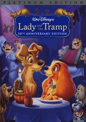
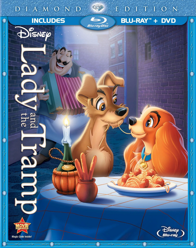
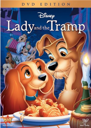
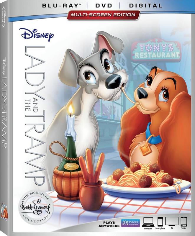
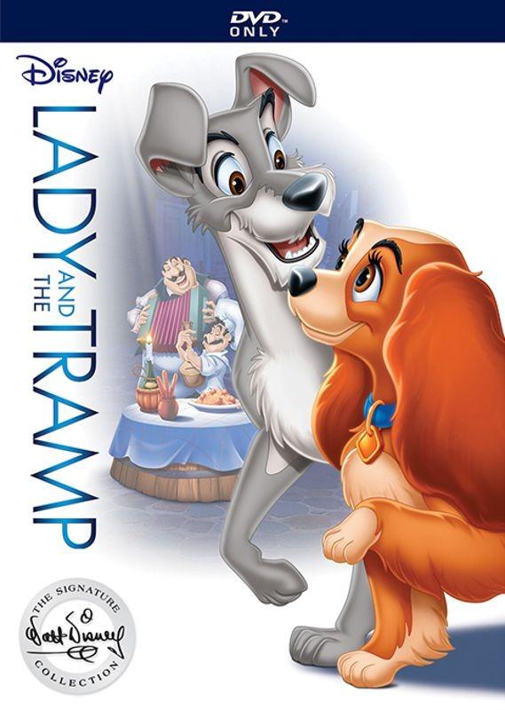
Lady and the Tramp:
Classics VHS:
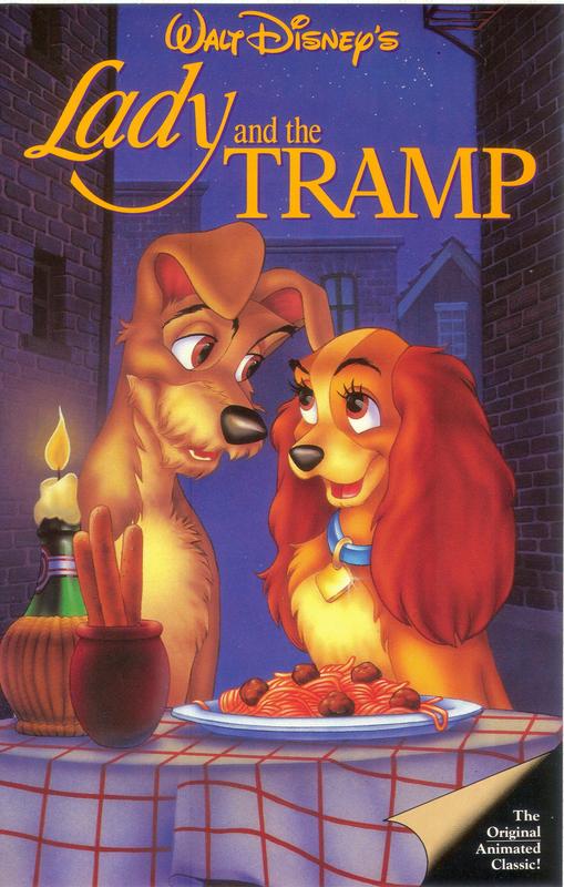
Masterpiece VHS (Widescreen):
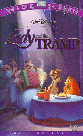
Limited Issue DVD:
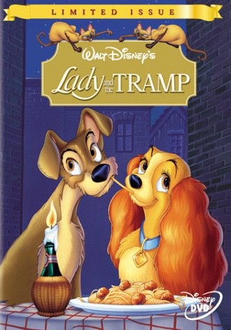
Platinum Edition DVD:
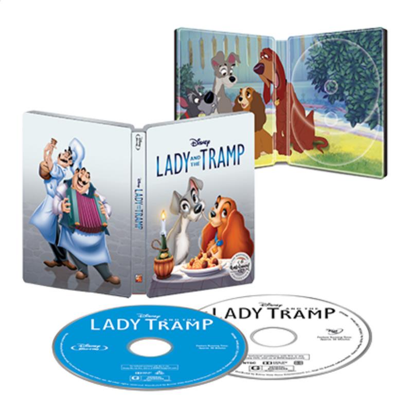
Diamond Edition Blu-ray:
Diamond Edition DVD:
Signature Collection Blu-ray:
Signature Collection DVD:
Best Buy Exclusive:
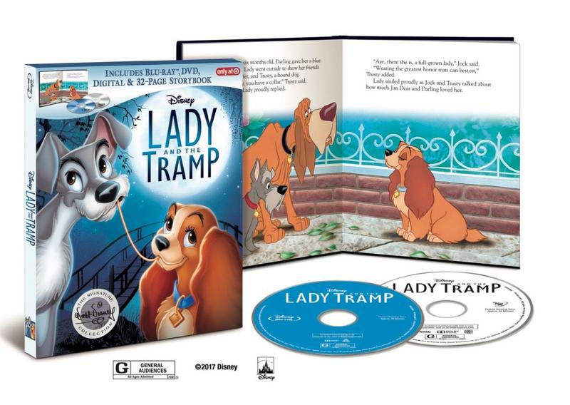
Target Exclusive:
Classics VHS:
Masterpiece VHS (Widescreen):
Limited Issue DVD:
Platinum Edition DVD:
Diamond Edition Blu-ray:
Diamond Edition DVD:
Signature Collection Blu-ray:
Signature Collection DVD:
Best Buy Exclusive:
Target Exclusive:
-
JeanGreyForever
- Signature Collection
- Posts: 5335
- Joined: Sun Sep 15, 2013 5:29 pm
Re: Comparing Home Releases Cover Arts
So I love the Widescreen Masterpiece Edition VHS and Limited Issue DVD covers the most. One thing I do like about the Signature Edition covers is that Tramp is finally gray instead of brown.
We’re a dyad in the Force. Two that are one.
"I offered you my hand once. You wanted to take it." - Kylo Ren
"I did want to take your hand. Ben's hand." - Rey
Re: Comparing Home Releases Cover Arts
I like the Widescreen edition, the Limited Issue and the Signature Collection, which uses the same art as the Limited Issue but with the Tramp being gray, so it's better. I don't like the covers where they look at each while eating the Spaghetti cause that's not what happened in the scene. It's either looking at each other or eating the Spaghetti nonchalantly not knowing what's gonna happen.
-
Disney's Divinity

- Ultimate Collector's Edition
- Posts: 16432
- Joined: Thu Mar 17, 2005 9:26 am
- Gender: Male
Re: Comparing Home Releases Cover Arts
The only covers I'm crazy about are the standard Signature, the Target Signature, and Limited Issue DVD covers. The others are inoffensive, but don't look quite right.

Listening to most often lately:
Ariana Grande ~ "hate that I made you love me"
Sombr ~ "My Body Isn't Ready"
Kelly Clarkson ~ "I'd Be Lyin'"
Re: Comparing Home Releases Cover Arts
Seeing the Target exclusive, I kind if wish they had them just going up the bridge or even have them up on the hill. Something different for a change, though I understand why they keep using the Spaghetti moment, since it is pretty iconic that even people who haven't seen the film know about this scene.
-
JeanGreyForever
- Signature Collection
- Posts: 5335
- Joined: Sun Sep 15, 2013 5:29 pm
Re: Comparing Home Releases Cover Arts
Same, the hill scene is gorgeous and it would be a nice change for once. Like a Sleeping Beauty cover with Briar Rose in the forest rather than the kiss scene over and over again.farerb wrote:Seeing the Target exclusive, I kind if wish they had them just going up the bridge or even have them up on the hill. Something different for a change, though I understand why they keep using the Spaghetti moment, since it is pretty iconic that even people who haven't seen the film know about this scene.
We’re a dyad in the Force. Two that are one.
"I offered you my hand once. You wanted to take it." - Kylo Ren
"I did want to take your hand. Ben's hand." - Rey
-
Disney's Divinity
- Ultimate Collector's Edition
- Posts: 16432
- Joined: Thu Mar 17, 2005 9:26 am
- Gender: Male
Re: Comparing Home Releases Cover Arts
I love that they used that background for the backdrop of the iconic pose.farerb wrote:Seeing the Target exclusive, I kind if wish they had them just going up the bridge or even have them up on the hill. Something different for a change, though I understand why they keep using the Spaghetti moment, since it is pretty iconic that even people who haven't seen the film know about this scene.
Listening to most often lately:
Ariana Grande ~ "hate that I made you love me"
Sombr ~ "My Body Isn't Ready"
Kelly Clarkson ~ "I'd Be Lyin'"
-
Disney Duster
- Ultimate Collector's Edition
- Posts: 14175
- Joined: Fri Jun 17, 2005 6:02 am
- Gender: Male
- Location: America
Re: Comparing Home Releases Cover Arts
It's so funny seeing the same scene over and over except for one, them walking. But the spaghetti's in the background. I only like the Masterpiece VHS, love how big the scope feels and with the nice colors, the Platinum Edition, great composition, and the Limited Issue, great composition again.
-
DisneyBluLife

- Gold Classic Collection
- Posts: 381
- Joined: Sun Oct 14, 2012 10:36 am
- Location: Sweden
Re: Comparing Home Releases Cover Arts
Lady and the tramp UK 2006 DVD edition cover art
https://www.ebay.co.uk/p/Lady-And-The-T ... 3394010961
https://www.ebay.co.uk/p/Lady-And-The-T ... 3394010961
-
Disney Duster
- Ultimate Collector's Edition
- Posts: 14175
- Joined: Fri Jun 17, 2005 6:02 am
- Gender: Male
- Location: America
-
DisneyBluLife
- Gold Classic Collection
- Posts: 381
- Joined: Sun Oct 14, 2012 10:36 am
- Location: Sweden
Re: Comparing Home Releases Cover Arts
I think it is funny to see how they drew the food for all the covers of Lady and the tramp. They must like the plate from the Masterpiece VHS and Platinum edition DVD, they use that drawing of the food alot.
And the Diamond Edition use the exact same image of the spaghetti and meatballs on the Blu-ray and DVD. But on the DVD the image is mirrored/reversed.
The same image of the spaghetti and meatballs appear again on the Signature cover but they have recolor the meatballs to be more brown. But you can see that the position of the spaghetti is still the same.
-
Disney Duster
- Ultimate Collector's Edition
- Posts: 14175
- Joined: Fri Jun 17, 2005 6:02 am
- Gender: Male
- Location: America
Re: Comparing Home Releases Cover Arts
That's freaking hilarious! It's the same damn spaghetti and meatballs every time! 
Re: Comparing Home Releases Cover Arts
For Lady and the Tramp:
Im surprised to see how much they have recycled the artwork for this one... and yes, almost always depicting the same spaghetti-eating scene. And yes, always the same plate... good catch!
Best to worst:
By far the Limited Issue dvd cover. Beautiful! Characters super on model, well drawn, well rendered. Fur looks like fur. My one objection to that one is that is recycled from a poster that was even better... the breadsticks have been removed, so Tramp has a very awkward grey area near the table (near the left edge of the cover).
Masterpiece VHS does some very nice things with lighting... though Tramp is a little off. Specially the perspective in the eyes.
Classic VHS: Nice image overall... simple. Rendering looks a little soft, and the artist didn't understand the logic behind cartoon eyes/eyelashes (particularly Tramp's pupils/irises)
Diamond blu: mostly recycled... but check out the eyebrow on Lady! So long it reaches her cheek!
Platinum: mostly recycled... but the dogs on the sides make no sense from perspective/scale standpoint. They don't look far, they look small, and on a different ground level.
Signature: mostly recycled... a little too white, specially since the scene takes place at night. Both characters are mildly off.
Diamond dvd: Oddly large heads... table is too high in relation to their bodies... Lady is slightly off... at least the background characters look good.
Signature dvd: Has lady been doing coke???? She looks crazy. Strange angle for her head too... Tramp looks good. More recycled background... Oh well.
I skipped commenting on Peter Pan and Alice... maybe I will do a separate post.
Re: Comparing Home Releases Cover Arts
For Peter Pan, from best to worst:
Best: By far the classics vhs. Even though it's not perfect, this has been one of my favorite Disney covers OF ALL movies. Although the characters aren't completely on model (but close!), it is an extremely good drawing. Anatomy, perspective and layout are all great, nothing feels randomly placed. Rendering is beautiful, and it depicts what is possibly the film's most memorable scene. They even bothered to render both the Big Ben, the parliament building attached and even some of the city. Just beautiful.
Diamond w digital copy: is it amazing artwork? No. But I give them points for having a minimalist cover, where barely any characters are present.
Diamond blu ray: Though not super on model, it's a pretty good drawing... good anatomy, interesting lighting. Shows a scene from the film itself.
Signature: Is that a drawing of Big Ben, or a retouched picture? Anyway... meh cover. The ship seems tacked on, Big Ben seems to exist in a vaccum... no buildings around it. Peter and Tink look ok.
Limited issue: perspective on Peter is off, his body looks limp, even though he is flying. His pupils are too small. Michael looks terrible. John and Wendy are ok. At least there is a sense of depth on this one... more than can be said for the following ones on my list.
The following ones are pretty bad:
Platinum: "let's just put every character in the film in there! Doesn't matter where or what size!". Terrible composition. Peter looks like his self from Return to Neverland, not the original film. Captain Hook has been robbed of all his refinement and dignity. No character is on model.
Diamond DVD: Passable. At least there is an attempt at composition here. Wendy is very poorly drawn, Peter is recycled from Platinum... very odd expression on Hook.
Special Edition: strange concept and composition. Is Peter flying? standing... on water? The "Tink to Peter" size ratio is off... he looks ok, she is way off model. The ship in the back seems tacked on, and creates a weird tension between the bowsprit and Peter's head.
Yay for the classics cover!
-
Disney Duster
- Ultimate Collector's Edition
- Posts: 14175
- Joined: Fri Jun 17, 2005 6:02 am
- Gender: Male
- Location: America
Re: Comparing Home Releases Cover Arts
Marce82, what do you think of Peter Pan's Signature Best Buy exclusive?