The Sword in the Stone SE DVD Discussion

Those "scratchy lines" were the results of the Xerox machine (which transferred the animator's drawings directly onto a cel paper), and they weren't removed, if you look close enough. I personally like that look, it gives it a very artistic and rough look to the character, which can be very interesting to look at, and The Sword in the Stone is LOADED with it...as well as Robin Hood, The Aristocats, and even Winnie the Pooh.yukitora wrote:yayI think this movie will worth it just for the restoration... Hopefully they'll remove the scratchy lines on the characters like they did on the 101 Dalmatians PE, but I doubt it'll get the same treatment...
-
SpringHeelJack

- Platinum Edition
- Posts: 3673
- Joined: Fri Nov 10, 2006 3:20 pm
- Location: Boston, MA
- Contact:


BTW where's Madame Mim, she's the only thing keeping this movie together!
I think disney really went wrong with this movie, this could have been so much better, it's just the overall look of it, as well as the crappy storytelling.
I'm stunned that they chose to do a live action ''King Arthur'' several years later (again f**ckn that up as well!) instead of revisiting the glorious mythology of king Arthur with an entirely different approach!
This movie (again soley expressing my own humble opinion)along with Alice in Wonderland are the worst disney adaptations ever.
Luckily they nailed every other movie!
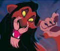
When it comes to brains, I got the lion-share,
but when it comes to bruth strength, I'm afraid I'm at the shallow end of the gene pool

but when it comes to bruth strength, I'm afraid I'm at the shallow end of the gene pool
-
SpringHeelJack
- Platinum Edition
- Posts: 3673
- Joined: Fri Nov 10, 2006 3:20 pm
- Location: Boston, MA
- Contact:
-
yukitora
- Special Edition
- Posts: 947
- Joined: Fri Apr 11, 2008 10:01 am
- Location: at home apparently
- Contact:
I liked that style too, but only in the backgrounds or for objects etc. I found them distracting on the characters themselves as it was very inconsistent, since they only appeared every now and then. I'd rather what they did with 101 Dalmatians, where the characters were perfectly clean whilst keeping the rough look on everything else. That's the way to do it imo.TonyWDA wrote:Those "scratchy lines" were the results of the Xerox machine (which transferred the animator's drawings directly onto a cel paper), and they weren't removed, if you look close enough. I personally like that look, it gives it a very artistic and rough look to the character, which can be very interesting to look at, and The Sword in the Stone is LOADED with it...as well as Robin Hood, The Aristocats, and even Winnie the Pooh.yukitora wrote:yay
Sigh... the cover got even MORE overdramatic... especially since that never happened in the movie... how much more misleading to they wanna get?
-
UmbrellaFish

- Signature Collection
- Posts: 5762
- Joined: Sun Jan 28, 2007 3:09 pm
- Gender: Male (He/Him)
Thank GOD ! ! !Simba3 wrote:We have revised cover art for "The Sword in the Stone", take a look...
Personally I think it looks great, a vast improvement over the original draft of the cover art. What do you all think?
Looks much better !
Merlin looks a bit odd (out of place - being so small up in the corner like that)
But for the most part, I like this cover a lot
-
SwordInTheStone777
- Special Edition
- Posts: 575
- Joined: Tue Mar 06, 2007 12:46 pm
- Location: Virginia
Love the new improved revised cover, not to happy with the font though, but over all it's so much better than the first draft.
Has disney released ther offical press release yet? if not i'd really like for them to inculed this a special features, a featurette on Olie Johnson, since he was apart of The Sword In The Stone and a slew of many other animated disney classics aswell.
Has disney released ther offical press release yet? if not i'd really like for them to inculed this a special features, a featurette on Olie Johnson, since he was apart of The Sword In The Stone and a slew of many other animated disney classics aswell.


-
Kendris

- Limited Issue
- Posts: 69
- Joined: Mon Apr 14, 2008 9:50 pm
- Location: Somewhere out there....
- Contact:
I like your second alternative title. It's giving me the feel of the time period in which the movie is set, that's why typography is important. It says a lot about a product. (hee hee, my minor in graphic design actually has JUST come in handyChernobog wrote:
I don't like the typography chosen for the title, it's the Albertus font which looks too serious for the film, i think.
So, here there are two alternate titles i made:
-
JiminyCrick91

- Platinum Edition
- Posts: 3930
- Joined: Thu Dec 02, 2004 8:39 pm
- Location: ont. canada
- Contact:

-
Disney Duster

- Ultimate Collector's Edition
- Posts: 14161
- Joined: Fri Jun 17, 2005 6:02 am
- Gender: Male
- Location: America
The Sword in the Stone: 45th Anniversary Edition
The cover has VASTLY improved, and is actually one of the best cover's I think Disney's EVER made! It's really quite beautiful, actually. The colors are even better. It needs Chernabog's title treatment, though. But I really hate the metallic border, it doesn't fit.Chernobog wrote:
My only problem left is it gives away the film's ending. We can know that Arthur might try to lift the sword, but should we know he'll actually succeed? Many people may know the legend of King Arthur already, but not all kids, who will be the target audience of the film.
...and I guess it would be a little better if Merlin were a little bigger.
...Okay, and Madam Mim could be in the bottom right to fill the empty space.

-
magicalwands

- Collector's Edition
- Posts: 2099
- Joined: Wed Mar 23, 2005 9:24 am
- Location: Gusteau's Restaurant

-
Escapay

- Ultimate Collector's Edition
- Posts: 12562
- Joined: Tue Jan 27, 2004 5:02 pm
- Location: Somewhere in Time and Space
- Contact:
Re: The Sword in the Stone: 45th Anniversary Edition
Disney Duster wrote:My only problem left is it gives away the film's ending. We can know that Arthur might try to lift the sword, but should we know he'll actually succeed? Many people may know the legend of King Arthur already, but not all kids, who will be the target audience of the film.
True! And the cover for Sleeping Beauty spoils the ending too, somewhat, as it shows Phillip leaning in to kiss the (unsurprisingly) sleeping beauty.
I guess we can add those two (SB and SITS) to the list of DVD covers that spoil the ending by showcasing an iconic moment or image (like Planet of the Apes, The Wicker Man, Carrie, etc.)
Albert
WIST #60:
AwallaceUNC: Would you prefer Substi-Blu-tiary Locomotion?
WIST #61:
TheSequelOfDisney: Damn, did Lin-Manuel Miranda go and murder all your families?
AwallaceUNC: Would you prefer Substi-Blu-tiary Locomotion?
WIST #61:
TheSequelOfDisney: Damn, did Lin-Manuel Miranda go and murder all your families?
