Hey Fareb,
Thanks for your explanation. Reading that first message, it kinda seemed like "if it's un-disney, I cannot consider them Disney-good".
I prefer the fantasy-musicals as well, but I think it's good for them to explore other avenues. And I agree with everything you just said about what Disney did in the 90's and the current market. But yeah, I don't think we can have the same kind of theme/tone consistency Disney had back in the day, and that might be a good thing. And movies can still be impactful and memorable when the ideas are original and well executed.
Not sure how remembered Inside Out is, but Coco still seems pretty prevalent. It has presence in the Disney parks, I see merchandise for it pretty often (I dont mean in stores... I mean I see people w Coco Merch)... and of course, I see people dressed like the characters from it on Halloween (when there is no Covid...). But yes, not every movie will have the cultural impact Frozen did.
I agree that Big Hero 6 was kinda forgettable (it also had a lot of story issues, from what I do recall). I think it would/works better as a TV show than a movie. Wreck-it Ralph... Disney or not, I think it has super strong story and characters, and I don't even like videogames.
Oh, I dont only like fantasy-musical Disney films... good films come in all shapes and genres. Lilo and Stitch is brilliant, 101 Dalmatians is simple but great, Emperor's new groove is a little uneven, but overall hilarious.
Great Mouse... well... not terrible, but feels a little cheap to me. Like a tv movie. And Treasure Planet... better I not say anything. Hee hee.
I really need to rewatch Moana...
Comparing Home Releases Cover Arts
Re: Comparing Home Releases Cover Arts
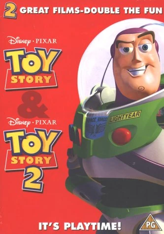
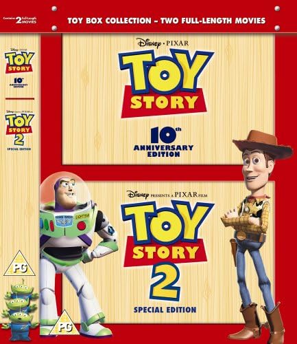
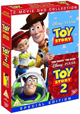
About the Toy Story Covers...
I don't know if I can rank them. Almost all of them are just clip art in front of Andy's wallpaper... here is an attempt:
1) VHS: Great cover. Interesting and unusual angle, makes the whole thing feel very dynamic. Good representation of the plot, includes many characters without feeling cluttered. It even has an unique placement for the title. I always found it interesting that this is a recycled poster, EXCEPT for Woody's face, which looked terrified in the original poster.
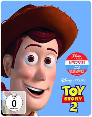
2) Best Buy Steelbook: lovely art style, beautifully executed. Surprisingly minimalist, I love the idea of the characters turning away from camera. But why THAT scene??? It's not particularly representative of the film....
3) 4K UHD: I am including this one cause there is an attempt at a background, and I like it. It's semi abstract, but includes some of the minor characters. But... this cover could work for ANY of the TS movies... and compare to the VHS cover: that one ONLY works for TS1. Big difference.
Here is something odd: look at the blu-ray+CD (Mexico) cover... isnt it weird that when you remove the transparent slip cover, it seems completely devoid of the color red??? Feels so off!!!
I hope other Pixar films get better covers...
I don't know if I can rank them. Almost all of them are just clip art in front of Andy's wallpaper... here is an attempt:
1) VHS: Great cover. Interesting and unusual angle, makes the whole thing feel very dynamic. Good representation of the plot, includes many characters without feeling cluttered. It even has an unique placement for the title. I always found it interesting that this is a recycled poster, EXCEPT for Woody's face, which looked terrified in the original poster.
2) Best Buy Steelbook: lovely art style, beautifully executed. Surprisingly minimalist, I love the idea of the characters turning away from camera. But why THAT scene??? It's not particularly representative of the film....
3) 4K UHD: I am including this one cause there is an attempt at a background, and I like it. It's semi abstract, but includes some of the minor characters. But... this cover could work for ANY of the TS movies... and compare to the VHS cover: that one ONLY works for TS1. Big difference.
Here is something odd: look at the blu-ray+CD (Mexico) cover... isnt it weird that when you remove the transparent slip cover, it seems completely devoid of the color red??? Feels so off!!!
I hope other Pixar films get better covers...

Re: Comparing Home Releases Cover Arts
Agreed! In the end if the movie has good characters and an interesting story then it doesn't really matter what the genre is.
I totally understand that TGMD looks cheap but I guess all 70's-80's look like that. I like it for what it is, even if it's only a Saturday morning cartoon.
And I understand the Treasure Planet feeling as well, I used to not like it and I only got it on Blu-ray to complete M&C films. I don't watch it as often as other films and it has a very unappealing design.
Re: Comparing Home Releases Cover Arts
Treasure Planet... you mean poor design on the characters or the overall art direction?
And TGMD... I don't think all Disney movies from 70s and 80s have a cheap, saturday morning cartoon feel. I think I perceive that in TGMD for two reasons: the anthropomorphic mouse designs are very close to Chip n Dale Rescue Rangers... but also, the timing of it's animation. It feels like characters get to a key pose, then they have very few in-betweens until the next key pose. It makes the movements look a little too snappy. Slow...super quick... slow. Just stuff I notice.
I don't like The Fox and the Hound, but it doesnt feel like TV animation AT ALL.
Re: Comparing Home Releases Cover Arts
The colors are off putting, too much browns and greens and not the kind that makes you think of trees and nature but the kind that makes you think of vomit. I think it was the first film to have the backgrounds digitally painted so that might explain.Marce82 wrote:Treasure Planet... you mean poor design on the characters or the overall art direction?
I don't mind that they decided to do it in space, but if that was their decision then they should have gone all the way with it, no wooden ship.
But yes the characters design is the worst, all those weird monsters and some anthropomorphic animals and Jim and his mother are the only humans.
I just think that all of these weird choices distract from the story which at its core is fine, maybe it has flaws but it is not so different than other films.
I get what you mean and I agree, but I also think that's what makes it charming. It's not deep, don't have this complex plot or characters and not really worth any analysis, but it is 70 minutes of pure fun and humor. Sometimes it's just great seeing this film and actually feel like a child again, seeing a cartoon on Saturday morning, unlike its three depressing predecessors.Marce82 wrote:And TGMD... I don't think all Disney movies from 70s and 80s have a cheap, saturday morning cartoon feel. I think I perceive that in TGMD for two reasons: the anthropomorphic mouse designs are very close to Chip n Dale Rescue Rangers... but also, the timing of it's animation. It feels like characters get to a key pose, then they have very few in-betweens until the next key pose. It makes the movements look a little too snappy. Slow...super quick... slow. Just stuff I notice.
I don't like The Fox and the Hound, but it doesnt feel like TV animation AT ALL.
Re: Comparing Home Releases Cover Arts
I see what you mean about Treasure Planet. I remember the film being VERY brown... I did like the sequences in space, and some of their ideas were interesting. But the character design felt lazy... a lot of the creatures are "furries"... and even the human characters are super bland. Young Jim looks just like young Tarzan... his mother looks like Tarzan's mother. And she looks so young she looks like a romantic interest for him.
And I freakin HATE the way they drew Jim's face. No nose bridge... makes his face look like a weird cylinder. And there is WAY too much CG in that film.
Oh... btw, no... Disney started doing digital painting on Tarzan, for their deep canvas technique.
As far as TGMD... I was ONLY talking about the visuals, not the simplicity of the plot or characters. I think it is an overall good movie, vastly superior to most ones Disney did in the 70s and early 80s. But looks wise... yeah, saturday morning. It's fine. But personally, if I watch a mouse movie from 1986... Im watching An American Tail
Re: Comparing Home Releases Cover Arts
I see what you mean about the nose bridge, but aren't a lot of characters like that? Snow White, Cinderella, Pocahontas, Mulan, Tiana, Jane?
I'm sorry to say that I'm not really a fan of Don Bluth's films and I haven't really seen An American Tail since I was a child.
I'm sorry to say that I'm not really a fan of Don Bluth's films and I haven't really seen An American Tail since I was a child.
Re: Comparing Home Releases Cover Arts
Not drawing the bridge of the nose is a hindrance in most of the cases you just mentioned. In the earlier films, it worked because the proportions in the face were more realistic, the eyes move in perspective better, and noses were placed where a nose WOULD be in a real person. Plus, in almost all those cases, the shape of the face has an indentation for where the eyes are. The location of the nose in Jane was an issue as well, but it worked better because of how all the other facial elements were handled.
Jim Hawkin's eyes are generally handled like there is a completely flat surface between them, and that is "supported" by the very flat shape of his face.
Im not a crazy fan of Don Bluth's; some of his films are really good, some are utter trash. An American Tail is a very good one... and story and emotion wise, much better than TGMD. Thumbelina, on the other hand... ugh. Nauseating.
Re: Comparing Home Releases Cover Arts
I see what you mean. Yes if I imagined a nose bridge, it would be a really long nose bridge:
Thumbelina basically ripped off The Little Mermaid, Beauty and the Beast and Aladdin, and it did it badly as well.
Thumbelina basically ripped off The Little Mermaid, Beauty and the Beast and Aladdin, and it did it badly as well.
Re: Comparing Home Releases Cover Arts
Yup... you get my point.
Also, now that I look at it again, those eyes have zero dimension. They would look exactly the same if viewed from the front. Like they are stickers on a cylinder.
Also, now that I look at it again, those eyes have zero dimension. They would look exactly the same if viewed from the front. Like they are stickers on a cylinder.
Re: Comparing Home Releases Cover Arts
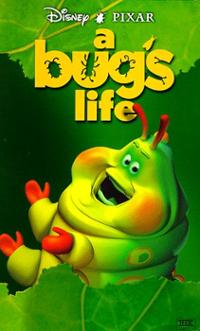
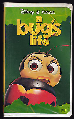
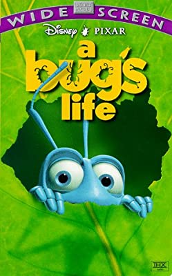
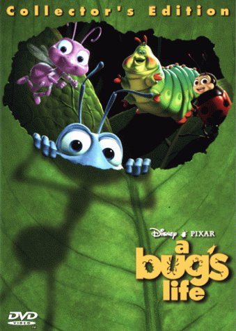
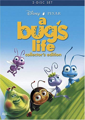
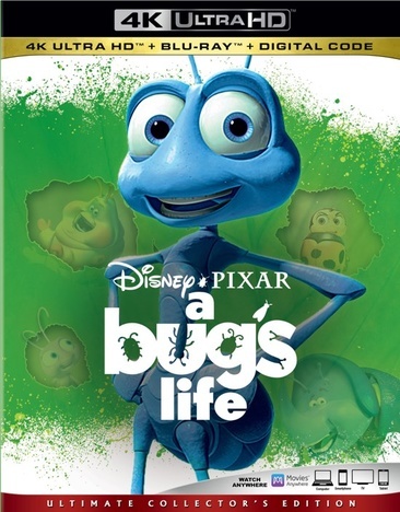
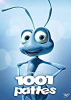
A Bug's Life:
Various Characters VHS:
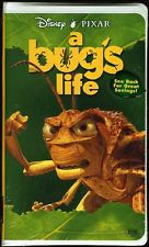
Widescreen Edition (VHS):
DVD 1:
DVD 2:
Blu-ray 1:
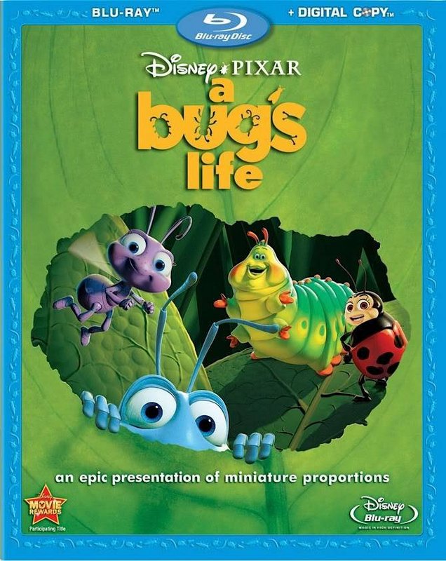
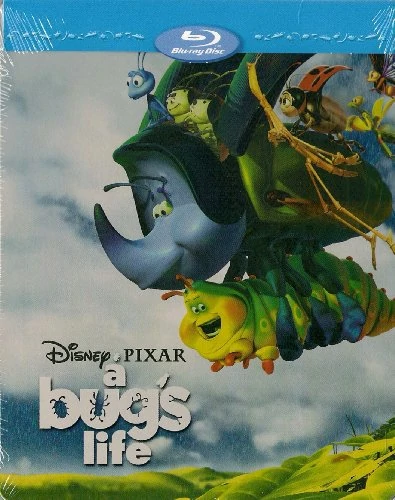
Blu-ray 2:
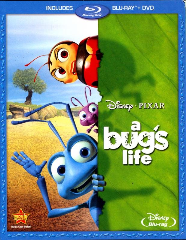
Blu-ray 3:
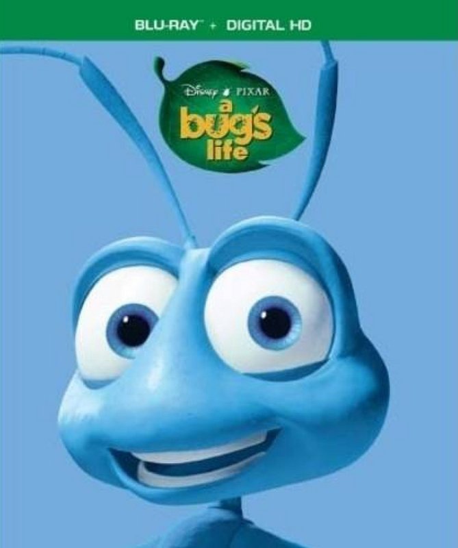
4K UHD:
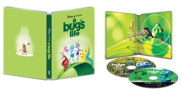
4K Steelbook
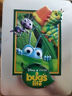
DMC Limited Series Tin DVD:
Future Shop Exclusive Steelbook (Canada):
Deluxe Box Set (France):
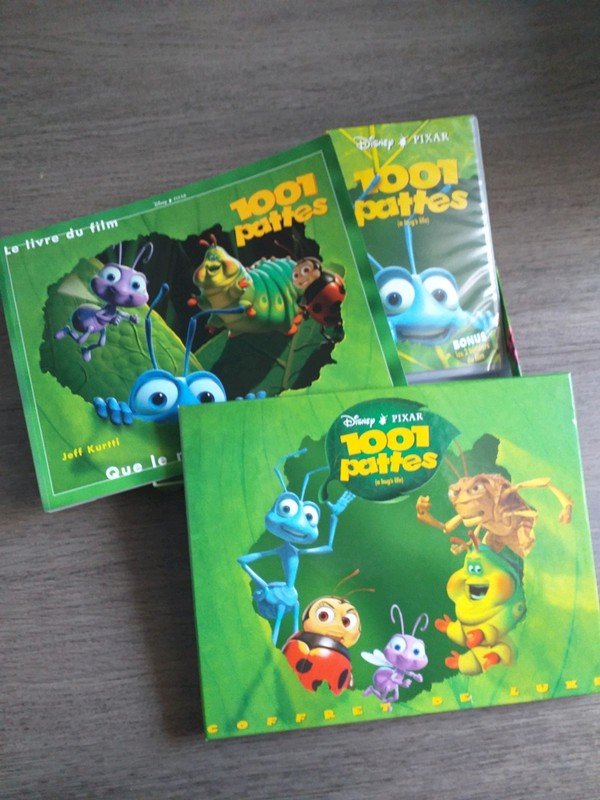
Heroes Cover (France):
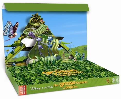
3D-Pop-Up-Box (Germany):
Various Characters VHS:
Widescreen Edition (VHS):
DVD 1:
DVD 2:
Blu-ray 1:
Blu-ray 2:
Blu-ray 3:
4K UHD:
4K Steelbook
DMC Limited Series Tin DVD:
Future Shop Exclusive Steelbook (Canada):
Deluxe Box Set (France):
Heroes Cover (France):
3D-Pop-Up-Box (Germany):
-
blackcauldron85

- Ultimate Collector's Edition
- Posts: 16717
- Joined: Sat Jun 17, 2006 7:54 am
- Gender: Female
- Contact:
Re: Comparing Home Releases Cover Arts
4K Steelbook & Future Shop Exclusive Steelbook (Canada) are my faves!

Re: Comparing Home Releases Cover Arts
I'm glad to see ABL got some more interesting covers than TS... not amazing, but at least there is an attempt here!
So here we go!
1) 4K Steelbook: Lovely. Artistic. Simple. The main characters rendered in a painterly style. Bold for them not to use CG artwork.
2) Blu ray1: this is a tossup, between this one and DVD1. It's virtually the same cover (see comments for DVD1 below), only zoomed in to a specific spot. And in a way, it works better. We get the outline, the scale of the leaf, but more space is dedicated to the characters. It's a bit of a tie for me.
3) DVD1: Pretty cool cover... the leaf gives us a sense of scale, plus we get the cool outline of Flik's body. And we get some of the fun, colorful characters, so we aren't overwhelmed by green, like a lot of the covers for this movie.
4) Widescreen VHS: This is a better version of the VHS cover. Shows less of Flik's face, but it's a more intriguing expression, plus we get to his his outline behind the leaf. AND, we get to see the leaf, which gives a hint of the scale! Much better...
5) 4K UHD: it's not great, but there is an attempt here. The splash of paint in the background, the hazy characters in the holes in the leaf. It's Ok.
6) Future Shop: Well.. at least it's original artwork. But feels so unbalanced. Big clutter of stuff on the upper right corner, everything else, empty. Why???
7) VHS: I didn't know there were several versions of this! I think i only remember the one with Flik... It's an OK cover, but it solely relies on the appeal of the characters. And I think most of the characters in this film are not that memorable (I don't dislike the film). But it's an ok cover.
8 ) DMC Limited series tin: I mentioned the bluray1 is a zoomed in cover... this way is WAY too zoomed in. Feels claustrophobic, like the characters don't fit, but they arent showing anything to justify that.
9) Blu ray 2: Ugh... bland. It's like recycled concepts of other covers. And why THOSE characters? Where is Heimlich?? Probably the most popular character in the film. I give them extra points for displaying the setting of the film in the back.
10) DVD2: this one is darn bland. Look! Characters!... doing nothing interesting. In front of an empty background.... yay? Please buy this movie?
Honorable mention: 3D Pop Up: I think it's super cool, but it's not really a home release cover, is it?
Looking back, none of the covers are actually bad. I see what I rated at the bottom of the list, and it isn't bad. Good for them!
Re: Comparing Home Releases Cover Arts
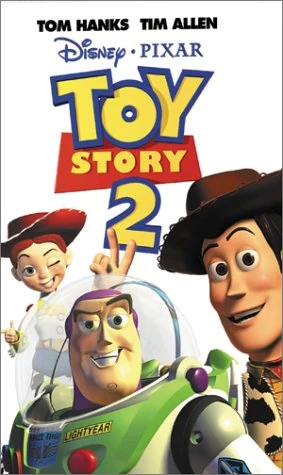
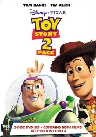
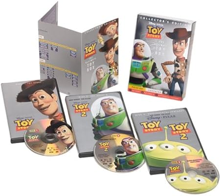
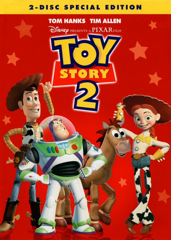
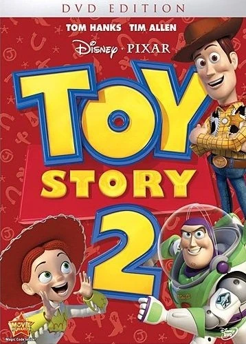
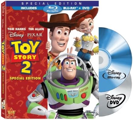
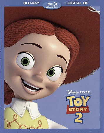
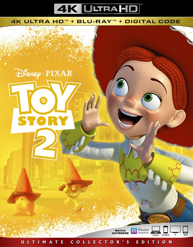
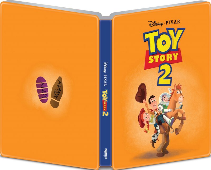
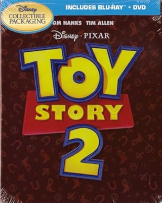
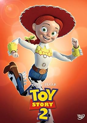
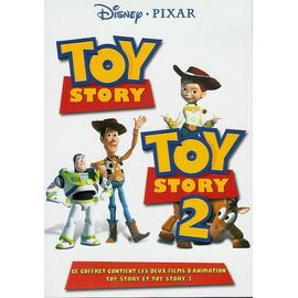
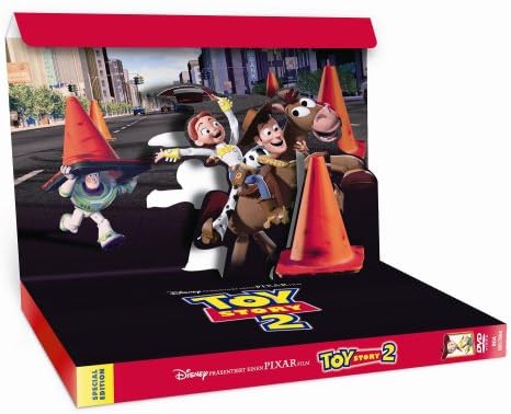
Toy Story 2:
VHS:
2 Movies DVD:
Ultimate Toy Box Collector's Edition DVD:
Special Edition DVD:
Standard DVD:
Blu-ray 1:
Blu-ray 2:
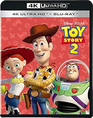
4K UHD:
4K Best Buy Steelbook:
DVD (UK):
2-Movie Collection (UK) 1:
2-Movie Collection (UK) 2:
Ironpack (Canada):
Heroes Cover (France):
2-Movie Collection (France):
Steelbook (Germany):
3D-Pop-Up-Box (Germany):
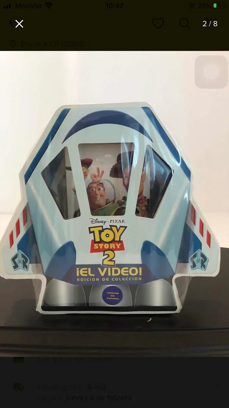
Collector's Edition (Mexico):
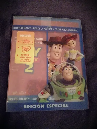
Blu-ray + CD (Mexico):
4K UHD (Japan):
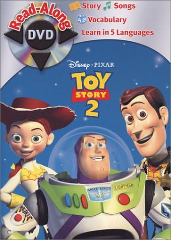
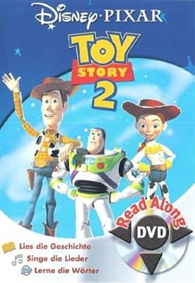
Read-Along DVD:
Read-Along DVD (Germany):
VHS:
2 Movies DVD:
Ultimate Toy Box Collector's Edition DVD:
Special Edition DVD:
Standard DVD:
Blu-ray 1:
Blu-ray 2:
4K UHD:
4K Best Buy Steelbook:
DVD (UK):
2-Movie Collection (UK) 1:
2-Movie Collection (UK) 2:
Ironpack (Canada):
Heroes Cover (France):
2-Movie Collection (France):
Steelbook (Germany):
3D-Pop-Up-Box (Germany):
Collector's Edition (Mexico):
Blu-ray + CD (Mexico):
4K UHD (Japan):
Read-Along DVD:
Read-Along DVD (Germany):
-
blackcauldron85
- Ultimate Collector's Edition
- Posts: 16717
- Joined: Sat Jun 17, 2006 7:54 am
- Gender: Female
- Contact:
Re: Comparing Home Releases Cover Arts
4K Best Buy Steelbook is the only one that's super creative IMO (besides the pop-up, but that's not a normal cover..
Re: Comparing Home Releases Cover Arts
I agree... It's weird how the earlier Pixar films got such an uninspired treatment with their covers. I also find it funny that the 4K covers seems to be the better ones while WDAS' are the worst.
Re: Comparing Home Releases Cover Arts
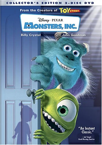
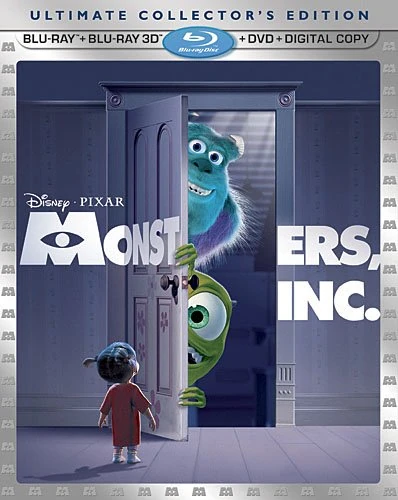
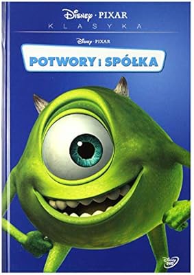
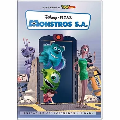
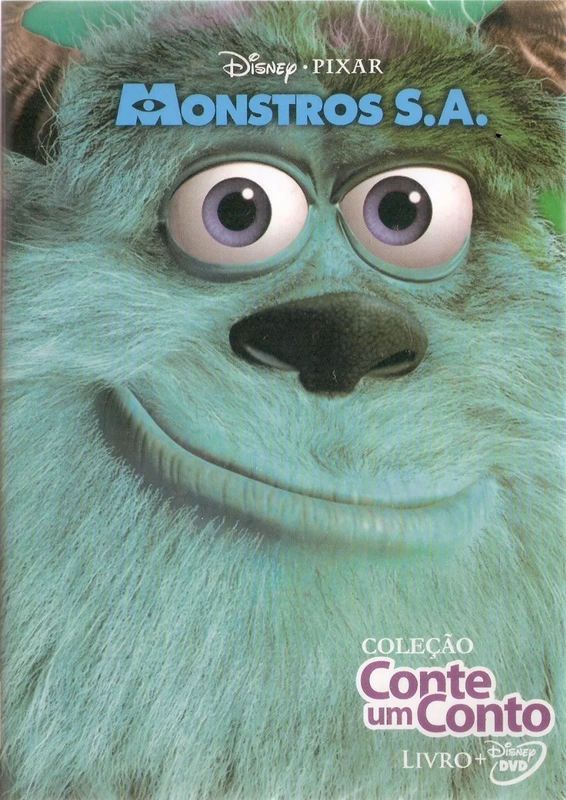
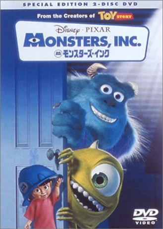
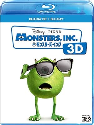
Monsters Inc:
Collector's Edition DVD:
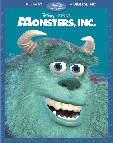
Blu-ray 1:
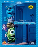
Blu-ray 2:

Blu-ray 3:
3D Blu-ray:
4K UHD:
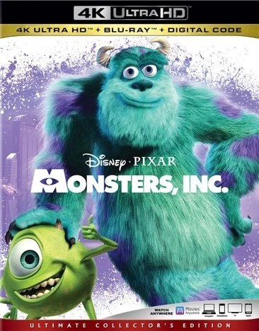
4K Steelbook:

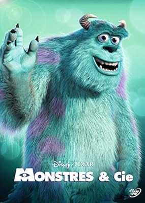
Heroes Cover (France):
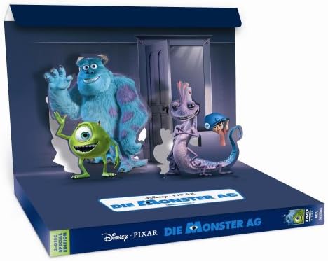
3D Pop-Up Box (Germany):
DVD (Poland):
Collector's Edition (Brazil):
DVD + Book (Brazil):
DVD (Japan):
Limited Collector's Box (Japan):

3D Blu-ray (Japan):
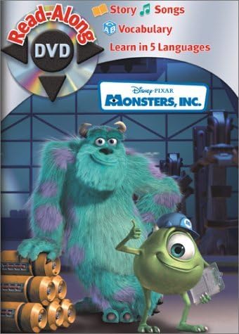
Read-Along DVD:
Collector's Edition DVD:
Blu-ray 1:
Blu-ray 2:
Blu-ray 3:
3D Blu-ray:
4K UHD:
4K Steelbook:
Heroes Cover (France):
3D Pop-Up Box (Germany):
DVD (Poland):
Collector's Edition (Brazil):
DVD + Book (Brazil):
DVD (Japan):
Limited Collector's Box (Japan):
3D Blu-ray (Japan):
Read-Along DVD:
-
DisneyBluLife

- Gold Classic Collection
- Posts: 381
- Joined: Sun Oct 14, 2012 10:36 am
- Location: Sweden
Re: Comparing Home Releases Cover Arts
Monsters Inc (Swedish Blu-ray edition, the editions in the other Scandinavian countries like Denmark and Norway have this cover art too )
https://cdon.se/film/disney-pixar-klass ... ay-4201636
https://cdon.se/film/disney-pixar-klass ... ay-4201636
-
Disney Duster

- Ultimate Collector's Edition
- Posts: 14161
- Joined: Fri Jun 17, 2005 6:02 am
- Gender: Male
- Location: America
Re: Comparing Home Releases Cover Arts
Toy Story 2:
VHS and 4K Best Buy Steelbook
Monsters Inc.:
Collector's Edition DVD, 3D Blu-ray, 4K Steelbook, Collector's Edition (Brazil).
VHS and 4K Best Buy Steelbook
Monsters Inc.:
Collector's Edition DVD, 3D Blu-ray, 4K Steelbook, Collector's Edition (Brazil).


Re: Comparing Home Releases Cover Arts
That cover seems to be part of the same line as these other Pixar titles below, right? However, it wasn't released domestically like the others, was it? I wonder why.DisneyBluLife wrote:Monsters Inc (Swedish Blu-ray edition, the editions in the other Scandinavian countries like Denmark and Norway have this cover art too )
https://cdon.se/film/disney-pixar-klass ... ay-4201636


And here are a couple of curiosities. First, here's the French rental version DVD (left), which is slightly different from the version for sale (right). This last one is the same cover as the Japanese DVD farerb posted. In Spain we also got this cover.


And here's a Collector's Edition from the UK which has the same cover as the 3D Blu-ray but with a different title and the Brazilian Collector's Edition as an inside cover:


