1. Zavvi Steelbook ~ My favorite of the two posters… Well, I prefer the other poster (used for the Best Buy Steelbook) OVERALL, but *Tiana* looks much nicer in this poster than that one, so I have a preference for it, especially for a Blu-ray cover.
2. 4K Best Buy Exclusive Steelbook
3. Blu Ray 2
4. DVD + CD Edition (Mexico) ~ Oooh, I love this. I don’t think I’ve ever seen this image before, although I have seen that pose of Tiana. I love that it includes her father. However minor his cameo in the film, most of the plot centers around her relationship with him.
5. DVD + Blu-ray ~ I put this one above the 4K UHD cover simply for the background of the balcony and the boat. Louis is oddly placed… Otherwise I like the cover.
6. Heroes Cover (UK) ~ Tiana looks very pretty here.
7. 4K UHD
8. DVD + Book Edition (Spain)
9. Villains Cover (UK) ~ The green background suits him more than other villain covers in the past.
10. Villains Cover (France)
11. Heroes Cover (France)
12. Disney Princess Cover Series (Australia)
Comparing Home Releases Cover Arts
-
Disney's Divinity

- Ultimate Collector's Edition
- Posts: 16407
- Joined: Thu Mar 17, 2005 9:26 am
- Gender: Male
Re: Comparing Home Releases Cover Arts

Listening to most often lately:
Christina Aguilera ~ "Cruz"
Sombr ~ "homewrecker"
Megan Moroney ~ "Beautiful Things"
-
JeanGreyForever

- Signature Collection
- Posts: 5335
- Joined: Sun Sep 15, 2013 5:29 pm
Re: Comparing Home Releases Cover Arts
I like both steelbooks the best because both were based off of posters. The rest are pretty generic.


We’re a dyad in the Force. Two that are one.
"I offered you my hand once. You wanted to take it." - Kylo Ren
"I did want to take your hand. Ben's hand." - Rey
-
Disney Duster

- Ultimate Collector's Edition
- Posts: 14160
- Joined: Fri Jun 17, 2005 6:02 am
- Gender: Male
- Location: America
Re: Comparing Home Releases Cover Arts
The Princess and the Frog:
1. Zavvi Steelbook - what a gorgeous cover from a gorgeous poster.
2. 4K Best Buy Exclusive Steelbook - another great poster re-used.
3. DVD/Blu-ray 1 - fun and full of many characters and elements and it looks nice.
4. DVD + CD Edition (Mexico) - I like that they took the poster and added more and rearranged it pretty nicely.
5. DVD + Book Edition (Spain) - like a fairy tale book!
6. Blu-ray 2 - sigh, at least they kept the swamp to help it look really nice actually.
7. Blu-ray (UK)- kind of a bad re-mix of the first DVD and Blu-ray, but it still looks pretty good.
8. Heroes Cover (France)
9. Disney Princess Cover Series (Australia) -at least it evokes a scene from the movie...
10. Heroes Cover (UK)
11. 4K UHD
12. Villains Cover (France)
13. Villains Cover (UK)

-
blackcauldron85

- Ultimate Collector's Edition
- Posts: 16714
- Joined: Sat Jun 17, 2006 7:54 am
- Gender: Female
- Contact:
Re: Comparing Home Releases Cover Arts
1. Zavvi Steelbook- TP&tF has some of my all-time favorite posters; very classic, very appealing.
2. 4K Best Buy- See #1!
3. DVD/Blu-ray 1
4. Blu-ray (UK)
5. DVD + CD Edition (Mexico)- I like that so many characters are represented, but I wish the background had more to it.
6. DVD + Book Edition (Spain)
7. Disney Princess Cover Series (Australia)- For these more blah Heroes-types cover, usually the backgrounds distinguish them, but it's refreshing to see a unique one! Sing, Tiana!
8. 4K UHD
9. Blu-ray 2 (it's so clip-arty)
I don't feel like ranking the rest; they're all kind of blah.


Re: Comparing Home Releases Cover Arts
1. 4K Best Buy Exclusive Steelbook - that particular poster art is gorgeous.
2. Zavvi exclusive - I love the art, but it's not as great as the Best Buy art
3. The original US Blu-ray / DVD - the characters are beautifully drawn, but the background is so awkwardly edited (the bayou with the balcony)
4. The original UK Blu-ray / DVD - I like how the characters are drawn, but I feel like they should have just kept Tiana and Naveen
5. The second US Blu-ray - That is one of the most beautiful cliparts for Tiana, and the addition of Naveen and Ray doesn't make it overcrowded
6. Heroes Cover (France) - Beautiful clipart, works great with the pink background
7. Disney Princess Cover Series (Australia) - I love it a lot, but that darn rating logo at the bottom ruins it
8. Mexican DVD - overcrowded
9. Heroes Cover (UK) - hate that background, but that beautiful picture of Tiana saved it
10. 4K Blu-ray - it's such a mess; they should have just kept the original Blu-ray art
11. DVD + Book (Spain) - I just don't like it
12. Villains Covers (both of them) - there are so great many pictures of Dr. Facilier, and they chose the ugliest clipart possible

If it's not baroque, don't fix it.
-
Disney's Divinity
- Ultimate Collector's Edition
- Posts: 16407
- Joined: Thu Mar 17, 2005 9:26 am
- Gender: Male
Re: Comparing Home Releases Cover Arts
Definitely. And it’s the only cover where the logo really pops the way it should.Sicoe Vlad wrote: 5. The second US Blu-ray - That is one of the most beautiful cliparts for Tiana, and the addition of Naveen and Ray doesn't make it overcrowded
Although, tbh, the only two images where Tiana looks perfectly like herself to me are the Heroes Cover (UK) and the Zavvi cover. Even in the poster that was used for the BestBuy cover, while it's such a beautiful picture overall, Tiana herself doesn't look quite right to me and she's the only one that I have a problem with among all those characters.
Listening to most often lately:
Christina Aguilera ~ "Cruz"
Sombr ~ "homewrecker"
Megan Moroney ~ "Beautiful Things"

Re: Comparing Home Releases Cover Arts
1. Zavvi Steelbook: I've always loved the poster used for this cover. It reminds me of the John Alvin ones from the 90s.
2. 4K Best Buy Exclusive Steelbook: This is a good poster too. It's perfectly drawn and I like that most of the film's characters are featured.
3. DVD + Book Edition (Spain): I like that pose of Tiana and Naveen and I find the cover elegant.
4. Blu-ray (UK): I think the title characters should be bigger and stand out a bit more, but at least everyone's on-model.
5. DVD/Blu-ray 1: I like the idea, but the execution not so much. What bothers me the most is Naveen's size; he looks enormous. I would've ranked it higher if not for that. Tiana could also have been drawn a bit better, in my opinion.
6. DVD + CD Edition (Mexico): I quite like Tiana and Naveen here too, but I agree with farerb that it looks a bit cheap. Maybe it's the way the characters on the lower half are arranged. I think it could've been done better. By the way, here are more pictures of that edition.
7. Heroes Cover (France): Not bad. At first I wasn't sure about the color of the background, but now I think the combination of pink and blue (from Tiana's dress) works quite well.
8. Blu-ray 2: Tiana looks beautiful here, as does the background, but I wish the characters had more interesting poses. And I don't know why but I can't help but imagine that Naveen is about to eat Ray.
9. Heroes Cover (UK): At least they chose a good clip art.
10. Disney Princess Cover Series (Australia): I like that it shows a different moment from the movie and it's OK for this type of cover.
11. 4K UHD: They recycled the poses from the first DVD/Blu-ray and made Naveen even bigger, plus I don't like that green background.
12. Villains Cover (UK): I agree with Sicoe Vlad that they could've chosen a better image of Facilier. And isn't the jacket too light?
13. Villains Cover (France)
Well, that's true.Disney's Divinity wrote:9. Villains Cover (UK) ~ The green background suits him more than other villain covers in the past.
-
Disney Duster
- Ultimate Collector's Edition
- Posts: 14160
- Joined: Fri Jun 17, 2005 6:02 am
- Gender: Male
- Location: America
Re: Comparing Home Releases Cover Arts
Yes, it is like a John Alvin poster!D82 wrote:1. Zavvi Steelbook: I've always loved the poster used for this cover. It reminds me of the John Alvin ones from the 90s.
Re: Comparing Home Releases Cover Arts
Sigh... so I guess this will be the last hand drawn covers to be judged.... at least that include human characters! (I know, I know... WTP is coming). So I'd better savor it!
Note: I didn't comment on the Bolt covers, cause like MTR, I have never seen the film, and it felt like I couldn't judge properly. But they all looked like recycled colors from The Incredibles...
So on to TPATF! Never realized there were so many juicy covers! Why can't Disney get someone to draw their princesses correctly??? Sigh. Here we go!
1) 4k best buy: Ok, it's a recycled poster, but most characters are well drawn. And at least it keeps the clutter of characters as a frame, so it works. Ironically, the only character not well drawn is Tiana. Extra points for including Charlotte. I do like the back cover a lot!!!! Beautiful landscape!
2) Blu ray2: I had actually never seen this cover before. Unlike the other blu ray (see below), this one ISN'T cluttered. It's focused. It's Tiana, Naveen and the bayou. Nothing else. Tiana is fairly well drawn, except her neck is too thin and her eyebrows are too arched and angular... she ain't Maleficent! I wish Naveen was better placed and looking at her. He looks like he was added at the last minute. Ray works, and he is small enough not to pull focus. Good cover!
3) Zaavi: Recycled poster... smart layout, interesting lighting (love how the flowers on the lilipads stand out)... but not without it's issues. Facilier's leg looks like Jack Skellington's. Naveen is too big and his pose accentuates the implausibility of his remaining balanced on two legs. And Tiana... sigh... poor Tiana. Good pose! Her face though... her cheeks are so puffed she looks like the alien in Mac & Me. Her mouth and jaw are not placed correctly... it borders on a racist caricature. ALMOST.
4) Heroes UK: this one was a tough one to place. Cause as a cover, it's darn bland. BUT: this is probably the best looking Tiana of them all. Good costume choice, face on model, beautifully shaded. Mild flaws here and there, but not worth mentioning. She looks lovely.
5) Dvd+cd Mexico: This one was tough to place too. It's a lot of recycled artwork, but at least organized in an interesting layout. And most characters are well drawn.... except Tiana and Naveen. Naveen doesn't look like he is puckering up; he looks like he has collagen injection in his lips. Tiana looks almost evil, with that insanely arched eyebrow that reaches the middle of her forehead. Aaaaalmost like Taraji P. Henson... But mainly, she doesn't look like herself, and her right hand... isn't a hand. I guess the artist got lazy there.
6) Dvd/Blu 1: this one is an illogical clutter. Three different locations awkwardly jammed together, characters photoshopped in... the pros: nice color palette. Louis, Ray and Facilier are very well drawn. The cons: Naveen is off... his proportions are off, his pose is not creative. Tiana is... I guess laying on the floor next to a precariously low balcony banister? Her pose is awkward, her face is not well drawn (both for the character and for what a human should look like. That mouth... ugh!)... and the dress choice is bad: this is a costume in the film, and it's not even hers. It's the only dress that truly does not reflect the character. It sounds like I'm complaining a lot, but this cover isn't terrible. Just mediocre.
7) Blu UK: Recycled art... and logic has left the building! It's just superimposing clip art on a nice background. Tiana looks terrible: off model and the pose is unnatural. And look at the size of her damn hand! Specially with that tiny wrist! All other characters look good. I like Naveen's pose a lot!
8 ) Heroes France: ha! Love Naveen in this one! Great pose and expression. SHe looks... off model, unnatural pose, her right hand is terribly drawn... I do like including the LaBouff mansion in the back... but why the fuchsia overlay???
9) Princess Cover Series (australia): you know... shame they didn't do this one in the "Almost there" style. That would have been cool. But credit to them for creating original art for this one. Just wish it looked better. Absurdly big teeth and tiny waist. Nose it too small and that extra wrinkle bugs me. Meh. Looks like the cover of a sticker book for the movie.
10) 4K: ugh... recycled artwork. And not even good art. Now you can really see how bad it is... PUPILS ARE SUPPOSED TO BE CIRCULAR. Yes, they become ovals as they near the edges of the eye... but they arent just round-ish shapes. The artist doesn't know how to draw a mouth, and apparently doesn't understand how a nose septum works. Naveen is wearing a lot of eyeliner it seems. Pretty bad overall.
I'm not judging both villain covers... just a bad concept in general.
It's been fun! (sounds like a farewell, but I'm not going anywhere)
Note: I didn't comment on the Bolt covers, cause like MTR, I have never seen the film, and it felt like I couldn't judge properly. But they all looked like recycled colors from The Incredibles...
So on to TPATF! Never realized there were so many juicy covers! Why can't Disney get someone to draw their princesses correctly??? Sigh. Here we go!
1) 4k best buy: Ok, it's a recycled poster, but most characters are well drawn. And at least it keeps the clutter of characters as a frame, so it works. Ironically, the only character not well drawn is Tiana. Extra points for including Charlotte. I do like the back cover a lot!!!! Beautiful landscape!
2) Blu ray2: I had actually never seen this cover before. Unlike the other blu ray (see below), this one ISN'T cluttered. It's focused. It's Tiana, Naveen and the bayou. Nothing else. Tiana is fairly well drawn, except her neck is too thin and her eyebrows are too arched and angular... she ain't Maleficent! I wish Naveen was better placed and looking at her. He looks like he was added at the last minute. Ray works, and he is small enough not to pull focus. Good cover!
3) Zaavi: Recycled poster... smart layout, interesting lighting (love how the flowers on the lilipads stand out)... but not without it's issues. Facilier's leg looks like Jack Skellington's. Naveen is too big and his pose accentuates the implausibility of his remaining balanced on two legs. And Tiana... sigh... poor Tiana. Good pose! Her face though... her cheeks are so puffed she looks like the alien in Mac & Me. Her mouth and jaw are not placed correctly... it borders on a racist caricature. ALMOST.
4) Heroes UK: this one was a tough one to place. Cause as a cover, it's darn bland. BUT: this is probably the best looking Tiana of them all. Good costume choice, face on model, beautifully shaded. Mild flaws here and there, but not worth mentioning. She looks lovely.
5) Dvd+cd Mexico: This one was tough to place too. It's a lot of recycled artwork, but at least organized in an interesting layout. And most characters are well drawn.... except Tiana and Naveen. Naveen doesn't look like he is puckering up; he looks like he has collagen injection in his lips. Tiana looks almost evil, with that insanely arched eyebrow that reaches the middle of her forehead. Aaaaalmost like Taraji P. Henson...
6) Dvd/Blu 1: this one is an illogical clutter. Three different locations awkwardly jammed together, characters photoshopped in... the pros: nice color palette. Louis, Ray and Facilier are very well drawn. The cons: Naveen is off... his proportions are off, his pose is not creative. Tiana is... I guess laying on the floor next to a precariously low balcony banister? Her pose is awkward, her face is not well drawn (both for the character and for what a human should look like. That mouth... ugh!)... and the dress choice is bad: this is a costume in the film, and it's not even hers. It's the only dress that truly does not reflect the character. It sounds like I'm complaining a lot, but this cover isn't terrible. Just mediocre.
7) Blu UK: Recycled art... and logic has left the building! It's just superimposing clip art on a nice background. Tiana looks terrible: off model and the pose is unnatural. And look at the size of her damn hand! Specially with that tiny wrist! All other characters look good. I like Naveen's pose a lot!
8 ) Heroes France: ha! Love Naveen in this one! Great pose and expression. SHe looks... off model, unnatural pose, her right hand is terribly drawn... I do like including the LaBouff mansion in the back... but why the fuchsia overlay???
9) Princess Cover Series (australia): you know... shame they didn't do this one in the "Almost there" style. That would have been cool. But credit to them for creating original art for this one. Just wish it looked better. Absurdly big teeth and tiny waist. Nose it too small and that extra wrinkle bugs me. Meh. Looks like the cover of a sticker book for the movie.
10) 4K: ugh... recycled artwork. And not even good art. Now you can really see how bad it is... PUPILS ARE SUPPOSED TO BE CIRCULAR. Yes, they become ovals as they near the edges of the eye... but they arent just round-ish shapes. The artist doesn't know how to draw a mouth, and apparently doesn't understand how a nose septum works. Naveen is wearing a lot of eyeliner it seems. Pretty bad overall.
I'm not judging both villain covers... just a bad concept in general.
It's been fun! (sounds like a farewell, but I'm not going anywhere)
Re: Comparing Home Releases Cover Arts
Yes, especially Tiana and Naveen, who look almost like silhouettes like the characters in several of his most famous posters. I think it was intentional to give us this feeling of nostalgia.Disney Duster wrote:Yes, it is like a John Alvin poster!D82 wrote:1. Zavvi Steelbook: I've always loved the poster used for this cover. It reminds me of the John Alvin ones from the 90s.
It's true, Naveen is too big in that cover too. I guess you're right about Tiana too, though personally her face there has never bothered me.Marce82 wrote:3) Zaavi: Recycled poster... smart layout, interesting lighting (love how the flowers on the lilipads stand out)... but not without it's issues. Facilier's leg looks like Jack Skellington's. Naveen is too big and his pose accentuates the implausibility of his remaining balanced on two legs. And Tiana... sigh... poor Tiana. Good pose! Her face though... her cheeks are so puffed she looks like the alien in Mac & Me. Her mouth and jaw are not placed correctly... it borders on a racist caricature. ALMOST.
I always find your comments very interesting. You point out a lot of details about the way the covers are drawn I hadn't noticed before, like the low banister of the balcony on that cover or all the times Tiana's hands are not well drawn.Marce82 wrote:6) Dvd/Blu 1: this one is an illogical clutter. Three different locations awkwardly jammed together, characters photoshopped in... the pros: nice color palette. Louis, Ray and Facilier are very well drawn. The cons: Naveen is off... his proportions are off, his pose is not creative. Tiana is... I guess laying on the floor next to a precariously low balcony banister? Her pose is awkward, her face is not well drawn (both for the character and for what a human should look like. That mouth... ugh!)... and the dress choice is bad: this is a costume in the film, and it's not even hers. It's the only dress that truly does not reflect the character. It sounds like I'm complaining a lot, but this cover isn't terrible. Just mediocre.
Regarding Tiana's dress, it may not reflect her, but she looks like the princess from the title in it and that's why I think they use it so much. She's in it on all the covers, except for two.
-
Disney Duster
- Ultimate Collector's Edition
- Posts: 14160
- Joined: Fri Jun 17, 2005 6:02 am
- Gender: Male
- Location: America
Re: Comparing Home Releases Cover Arts
OMG! She does look evil! And I looked that actress up and she does have her eyebrows!!!Marce82 wrote:Tiana looks almost evil, with that insanely arched eyebrow that reaches the middle of her forehead. Aaaaalmost like Taraji P. Henson...
Probably right!D82 wrote:Yes, especially Tiana and Naveen, who look almost like silhouettes like the characters in several of his most famous posters. I think it was intentional to give us this feeling of nostalgia.Disney Duster wrote: Yes, it is like a John Alvin poster!

Re: Comparing Home Releases Cover Arts
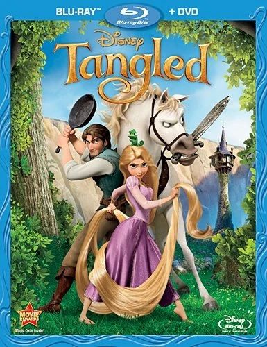
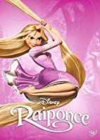
Tangled:
Blu-ray/DVD:
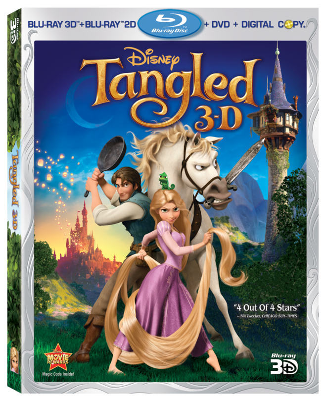
3D Blu-ray:
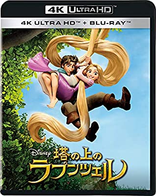
4K UHD:

4K Best Buy Steelbook Exclusive:
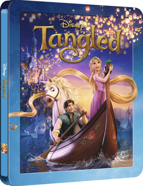
Zavvi Steelbook (UK):
Heroes Cover (UK):

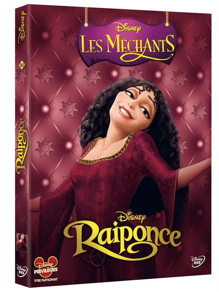
Villains Cover (UK):

Heroes Cover (France):
Villains Cover (France):
3D Blu-ray (France):

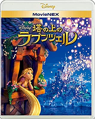
Blu-ray (Japan):
4K UHD (Japan):
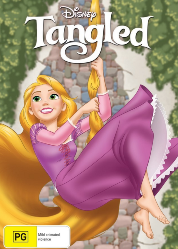
Disney Princess Cover (Australia):
Blu-ray/DVD:
3D Blu-ray:
4K UHD:
4K Best Buy Steelbook Exclusive:
Zavvi Steelbook (UK):
Heroes Cover (UK):
Villains Cover (UK):
Heroes Cover (France):
Villains Cover (France):
3D Blu-ray (France):
Blu-ray (Japan):
4K UHD (Japan):
Disney Princess Cover (Australia):
Re: Comparing Home Releases Cover Arts
1. Zavvi Steelbook - this is one of the few that actually look like a Disney Classic.
2. Blu-ray (Japan) - good concept. The execution leaves something to be desired.
3. 4K Best Buy Steelbook Exclusive - It's not bad, but it doesn't represents the more sincere tone of the film like the other two.
4. 4K UHD (Japan) - same as above.
5. 3D Blu-ray - I really despise the pose of the characters here and it's a shame they used it on most covers. At least here the background looks nice.
6. Blu-ray/DVD - same as above, but I like the background less.
7. 3D Blu-ray (France) - this works better as a soundtrack cover, otherwise it has too much space for hair and I hate the implication that they are doing it underneath.
8. 4K UHD - I will never understand what the people who made these covers were thinking. Cheap and lazy. At least Flynn isn't ridiculously holding the frying pan anymore. I also don't understand why they used a yellow background. I get that her hair is yellow, but it blends into the background. They should have used purple.
9. Disney Princess Cover (Australia) - it's fine but eventually I want a cover where the character looks the way she does in the film.
Not ranking the heroes/villains covers.
Re: Comparing Home Releases Cover Arts
First, I want to respond to a couple of comments from TPATF covers:
D82: I get what you are saying about the dress choice for a lot of the covers. But it feels more like a marketing choice rather than one based on the character's authenticity. I think we rarely see her in that silver dress these days... she is mostly in her lilly pad dress. I don't like it, but it's more true to the character.
DisneyDuster... maybe Tiana WAS secretly evil! Or maybe she had a bad forehead-lift. Damn those surgeons!
So who knew Tangled had so many covers! And so many GOOD covers at that! This will be fun! Since all but one cover were created from the CG models, all characters are "on-model"... so no need to judge that. Here we go:
1) Zaavi Steelbook: absolutely gorgeous. Beautiful use of color, layout, poses... Im even willing to forgive Maximus being on the boat with them (and not sinking it). Her hair really looks like gold! It reflects the movie perfectly. I remember some international posters used this image, and in some countries, this movie was called Rapunzel. So imagine that title, with this image. Now THAT's a perfect poster!
2) 3D blu ray: Same poses as the regular blu ray, but I like this cover better! There is more depth to the background, some atmospheric perspective, interesting use of color... and the use of colors really conveys the movie's "magic". Some issues with the main characters, see below in the regular blu ray comments.
3) Bluray/dvd: this is a good cover, not amazing. Good expressions, good layout. It really emphasizes the "adventure" side of the film. I appreciate the inclusion of the tower... that tower is almost a character in the film. Not a fan of Rapunzel's leg position: pretty sure she would be falling backward. And Pascal's presence in that spot annoys me. Flynn's arms kinda blend a little too much with the background. Still, pretty good.
4) Blu Japan: something about this cover doesn't work for me. Maybe it's too girlie... the pose, the flowers. There is also too many lanterns, which kinda kills any sense of depth. It also feels out of balance: very heavy on the left. It's ok.
5) 4K Best Buy: Hmmm... not a fan. Imagine if you close the case. The she is pulling something unseen. But overall, I was never a fan of this clip art: it kinda conveys the humor used in the teaser trailer, which really doesn't match the tone of the film. And again, like the regular blu ray, weird leg positions for her. I blame Glen Keane for this one, he likes to draw women clumsily turning their feet inward. Dunno why.
6) 4K Japan: more re-used clip art. I don't think the expressions reflect the characters accurately and the shapes of the hair are completely unnatural. What exactly are they hanging from? What are they doing for the hair to make that strange loop? AND IS THAT THE BLANDEST BACKGROUND THEY COULD FIND???? (clearly not, see the 4KUHD cover)
7) 4KUHD: Eeek. Bad. Re-used clip art. Weird that that white line in the background cuts off Flynn's body. And why yellow??? Interestingly, I now notice the shortcomings of CG in 2010: look at Rapunzel's wrist. It's like the CG model didn't want to be bent that way, and it looks like her hand is a different piece. Can't fault the cover for that, but it's a bland cover.
8 ) Disney Princess Australia: I WAS going to make this one my bottom pick, but I give them credit cause it's original art... and hand drawn. Poorly. But at least hand drawn. That is one awkward smile... I don't feel she is holding her body weight in her hands. Her hair looks like plastic, and makes waves in unnatural ways. And yet, the strand holding her is more hair-like... but absurdly thin. And why are there short tufts of hair near her head? Wasnt the whole thing that she couldnt cut it cause it would turn brown?? How did those hair strands get cut??? Her feet are fairly well drawn (not perfect)... her hands are pretty badly drawn. Challenge! Try to curl your index finger so it bends half way through the first phalange of your middle finger, like her right hand is doing. Good luck! Maybe her finger is broken, and that's why it looks swollen.
No clue what that background is supposed to be. And is it just me or she kinda looks like a young Hillary Clinton???
9) 3D blu France: Ugh. Just awful. I always hated this poster, where they needed to hide what the movie was about, so boys wouldnt run away from a princess movies. It lacks grace and artistry. And I have to assume they used Flynn's final model for this, but his face is kinda... off. Anatomically speaking. Like his eyes are too far apart, and his right eye is bulging out too much. Just bad overall.
Just noticed my ranking is very similar to Fareb's. Great minds.... :-p
Not commenting on the few covers that are just one character clip art with a flat background. If they are going to be lazy, why can't I???
THIS WAS FUN!!!
-
Disney Duster
- Ultimate Collector's Edition
- Posts: 14160
- Joined: Fri Jun 17, 2005 6:02 am
- Gender: Male
- Location: America
Re: Comparing Home Releases Cover Arts
True about the soundtrack idea, but as for what could be going on beneath that hair...farerb wrote:3D Blu-ray (France) - this works better as a soundtrack cover, otherwise it has too much space for hair and I hate the implication that they are doing it underneath.
Marce82 wrote:DisneyDuster... maybe Tiana WAS secretly evil! Or maybe she had a bad forehead-lift. Damn those surgeons!
I can't un-see it!!!Marce82 wrote:And is it just me or she kinda looks like a young Hillary Clinton???
Tangled:
1. Zavvi Steelbook (UK)- Wow, so beautiful and fairy tale-y.
2. 3D Blu-ray - Great composition and especially great background.
3. Blu-ray/DVD
4. Blu-ray (Japan) - romantic
5. Disney Princess Cover (Australia) - pretty.
6. 4K UHD (Japan
7. Heroes Cover (France)
8. Heroes Cover (UK)
9. 4K Best Buy Steelbook Exclusive
10. 4K UHD
11. 3D Blu-ray (France)
12. Villains Cover (France)
13. Villains Cover (UK)
-
DisneyBluLife

- Gold Classic Collection
- Posts: 381
- Joined: Sun Oct 14, 2012 10:36 am
- Location: Sweden
Re: Comparing Home Releases Cover Arts
The background in the Australia Princess cover is the tower. It is the moment in the movie when she lets out the hair to get down on the ground.
-
DisneyBluLife
- Gold Classic Collection
- Posts: 381
- Joined: Sun Oct 14, 2012 10:36 am
- Location: Sweden
Re: Comparing Home Releases Cover Arts
4K UDH Japan, they are hanging from the bush leaves in the top right corner of the original Blu-ray DVD cover, but the bush leaves are zoomed in here to look like a tree.
-
Disney's Divinity
- Ultimate Collector's Edition
- Posts: 16407
- Joined: Thu Mar 17, 2005 9:26 am
- Gender: Male
Re: Comparing Home Releases Cover Arts
I don't care for the DVD/Blu-ray, the 3D Blu-ray, the 4K UHD, and Heroes (UK) covers (as well as the 3D Blu-ray (France) cover that re-uses the soundtrack cover). Maximus and Pascal are the only ones I like on those covers. Rapunzel looks so unlike herself with that evil Bride of Chucky expression. And there are a couple of others I didn't rank that I didn't care for either.
1. Zavvi Steelbook ~ Love this. Wish it had been the standard cover for the Blu-ray. :/
2. Blu-ray (Japan) ~ Very nice. I had this image as a wallpaper back when Tangled was in theaters, I believe.
3. 4K UHD (Japan) ~ I like both their expressions.
4. Heroes Cover (France)
5. Villains Cover (UK) ~ I prefer the version with green smoke.
6. 4K BestBuy Steelbook Exclusive – Not fond of this either.
Listening to most often lately:
Christina Aguilera ~ "Cruz"
Sombr ~ "homewrecker"
Megan Moroney ~ "Beautiful Things"
Re: Comparing Home Releases Cover Arts
Thank you, DisneyBluLife!
So if that Australian cover is meant to be in front of the tower... it looks GOD-awful. It has zero depth or roundness to it. Just awful.
Interesting we all seem to love the Zavvi cover the best so far...
So if that Australian cover is meant to be in front of the tower... it looks GOD-awful. It has zero depth or roundness to it. Just awful.
Interesting we all seem to love the Zavvi cover the best so far...
-
JeanGreyForever
- Signature Collection
- Posts: 5335
- Joined: Sun Sep 15, 2013 5:29 pm
Re: Comparing Home Releases Cover Arts
The 3D cover is an improvement over the regular cover. I like the addition of the castle and the lanterns.
The Zaavi Steelbook was my favorite poster for the film.
However, the Japanese Blu-Ray has my favorite cover of all. It feels the most like classic Disney and if only the movie inside was more like the tone of the cover.
The Zaavi Steelbook was my favorite poster for the film.
However, the Japanese Blu-Ray has my favorite cover of all. It feels the most like classic Disney and if only the movie inside was more like the tone of the cover.
We’re a dyad in the Force. Two that are one.
"I offered you my hand once. You wanted to take it." - Kylo Ren
"I did want to take your hand. Ben's hand." - Rey